Introduction to Geospatial Data in R
Revised 15 June 2026
This tutorial covers the basic import and visualization of geospatial data in R using base graphics.
Loading Geospatial Data
The Simple Features Package
The standard library for loading and manipulating geospatial data in R is the Simple Features (sf) library.
The first time you use sf on a new machine, you may need to install it first from inside R:
install.packages("sf")
Then, you load it with the library() function. This should also be at the beginning of every script you create in R that uses the sf package:
library(sf)
st_read()
The st_read() function will read geospatial data from most established geospatial data file formats.
For this example, we will use a GeoJSON file (2019-state-energy.geojson) of state-level energy production and consumption election data.
st_read() can read from local storage or via URLs from files on the internet.
states = st_read("https://michaelminn.net/tutorials/r-spatial-intro/2019-state-energy.geojson")
Reading layer `OGRGeoJSON' from data source `2019-state-energy.geojson' using driver `GeoJSON'
Simple feature collection with 3139 features and 48 fields
geometry type:  MULTIPOLYGON
dimension:      XY
bbox:           xmin: -178.9921 ymin: 18.91747 xmax: -66.9499 ymax: 71.35256
epsg (SRID):    4269
proj4string:    +proj=longlat +ellps=GRS80 +towgs84=0,0,0,0,0,0,0 +no_defs
Once you have loaded your data into an object, you can display the available geospatial attributes in the object using the names() command:
names(states)
 [1] "ST"                              "Name"
 [3] "GEOID"                           "AFFGEOID"
 [5] "Square.Miles.Land"               "Square.Miles.Water"
 [7] "State.Name"                      "Population.MM"
 [9] "Civilian.Labor.Force.MM"         "GDP.B"
[11] "GDP.Per.Capita"                  "GDP.Manufacturing.MM"
[13] "Personal.Income.Per.Capita"      "VMT.MM"
[15] "Farm.Land.MM.Acres"              "Average.Temperature"
[17] "Precipitation.Annual"            "Consumption.Coal.B.BTU"
[19] "Consumption.Jet.Fuel.B.BTU"      "Consumption.Gasoline.B.BTU"
[21] "Consumption.Total.B.BTU"         "Consumption.Per.Capita.MM.BTU"
[23] "Production.Coal.B.BTU"           "Production.Gas.B.BTU"
[25] "Production.Oil.B.BTU"            "Production.Renewable.B.BTU"
[27] "Production.Total.B.BTU"          "Electricity.Interstate.Flow.GWH"
[29] "Electricity.Average.Cost"        "Electricity.Consumption.GWH"
[31] "Electricity.Per.Capita.KWH"      "Electricity.Hydro.GWH"
[33] "Electricity.Nuclear.GWH"         "Electricity.Solar"
[35] "Electricity.Wind.GWH"            "CO2.Total.MM.Tonnes"
[37] "CO2.Per.Capita.Tonnes"           "Renewable.Standard.Type"
[39] "Renewable.Standard.Name"         "Renewable.Standard.Year"
[41] "Senators.Party"                  "geometry"
Shapefiles
The shapefile is a geospatial data file format developed by ESRI with a standard published in 1998.
While the age of this format is reflected in its numerous limitations (such as column name length limit of 10 characters), this format is still commonly used for distributing geospatial data because it is reliable and well supported by a wide variety of GIS software.
The term shapefile is a misnomer since a shapefile is actually a collection of at least three (and usually more) separate files that store the locational data, the characteristics associated with those locations, and other information about the data.
For convenience, shapefiles are commonly distributed as .zip files to keep all the related files together. This example uses a zipped shapefile of 2016 US presidential election results by county.
You have multiple options to st_read() a shapefile.
- Download and unzip the shapefile, and then st_read() the .shp file:
counties = st_read("presidential-counties.shp")
counties = st_read("2016-presidential-counties.shz")
counties = st_read("/vsizip/2016-presidential-counties.zip")
CSV Files with Latitude/Longitude Coordinates
CSV files are commonly used for storing tabulard data, and the addition of latitude and longitude columns allows them to be used to store point data.
The CSV file for these examples is a CSV file of houses of worship in Farmingdale, NY
The st_as_sf can be used to convert a data frame with lat/long columns to an sf POINT collection.
library(sf)

data = read.csv("2018-farmingdale-bethpage-worship.csv", as.is=T)

points = st_as_sf(data, coords = c("Longitude", "Latitude"), crs = 4326)

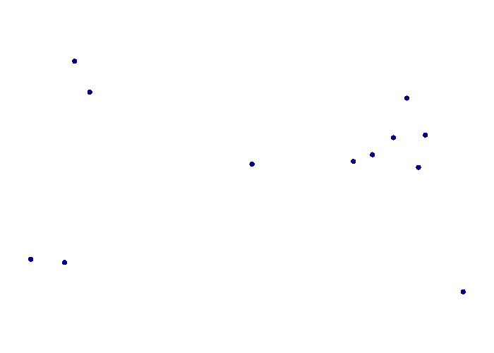
plot(st_geometry(points), pch=16, col="navy")
Since points by themselves usually don't give much context for where they are, you will likely need a base map, which is described below.
CSV Files with Addresses
You can use the nominatimlite library to use the Nominatim geocoder for geocoding addresses in a data frame to sf point features.
You will need to install the nominatimlite package once before using it. This package has a hidden dependency on dplyr.
install.packages("nominatimlite")
This example uses a CSV file of addresses for the investment bank Lazard with a base map of country polygons.
library(sf)

library(nominatimlite)

locations = read.csv("https://michaelminn.net/tutorials/r-geospatial/2022-lazard.csv")

address.columns = c("Address", "City", "ST", "PostalCode", "Country")

for (x in 1:nrow(locations)) {
	addr = paste(locations[x, address.columns], collapse=" ")

	addr = sub("#", "number ", addr)

	latlong = geo_lite(addr, lat="latitude", long="longitude")

	locations[x, "Latitude"] = latlong$latitude

	locations[x, "Longitude"] = latlong$longitude

	print(paste(x, addr, latlong$latitude, latlong$longitude))
}

points = locations[!is.na(locations$Latitude),]

points = st_as_sf(points, coords = c("Longitude", "Latitude"), crs = 4326)

countries = st_read("https://michaelminn.net/tutorials/data/2024-world-bank-indicators.geojson")

countries = st_transform(countries, "ESRI:54030")

points = st_transform(points, "ESRI:54030")

par(mar=c(1,1,1,1))

plot(st_geometry(countries), border="#00000020")

plot(st_geometry(points), pch=16, col="navy", add=T)
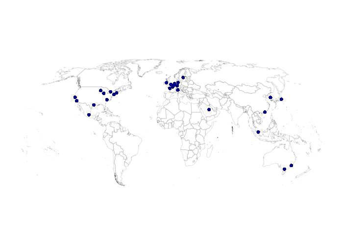
Since geocoding is time and resource intensive, you may wish to save a copy of your geocoded data for later reuse.
st_write(points, "2022-locations.geojson", delete_dsn=T)
Area Maps
These examples use county-level data from the US Census Bureau 2020-2024 five-year estimates. This code loads the sf collection, removes Alaska, Hawaii and Puerto Rico for cartoraphic convenience, and reprojects the data into a North America Albers equal area conic projection.
library(sf)

counties = st_read("https://michaelminn.net/tutorials/data/2020-2024-acs-counties.geojson")

counties = counties[!(counties$ST %in% c('AK', 'HI', 'PR', NA)),]

counties = st_transform(counties, "ESRI:102008")
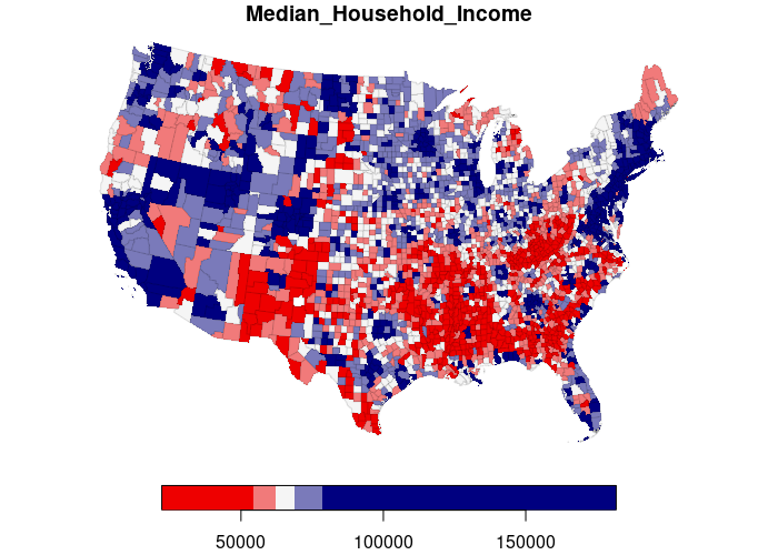
A simple choropleth can be created with plot() function. The thematic column name can be specified as a data frame field name.
plot(counties["Median_Household_Income"])

Classified Choropleth
Quantitative variables are commonly visualized as classified choropleths where ranges of values are associated with a limited number of specific colors.
- key.pos=1 places the legend at the bottom.
- border="00000020" turns the border transparency to 88% so the borders do not obscure small features.
- nbreaks=5 limits the classification to five breaks, which is improves readability.
- pal=colorRampPalette(c("navy", "whitesmoke", "red2"))) defines a diverging color ramp with navy for low values, red for high values, and intermediate values converging on gray in the middle.
plot(counties["Median_Household_Income"], key.pos=1,
	border="#00000020",
	pal=colorRampPalette(c("red2", "whitesmoke", "navy")))
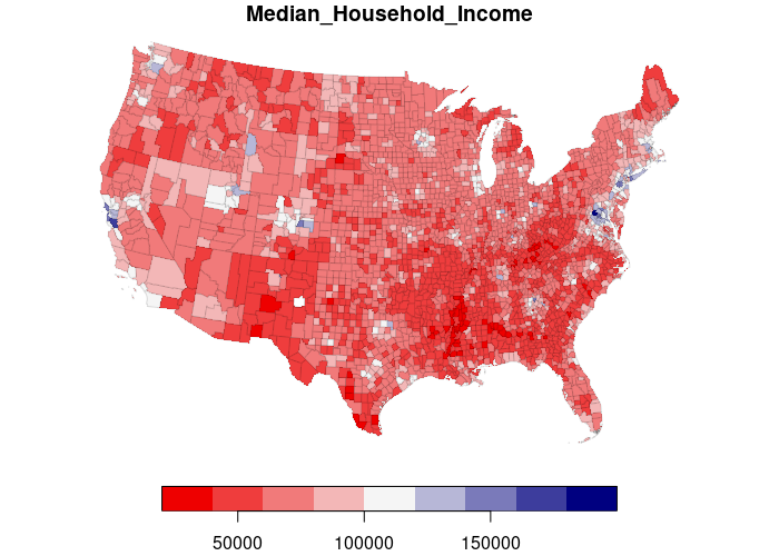
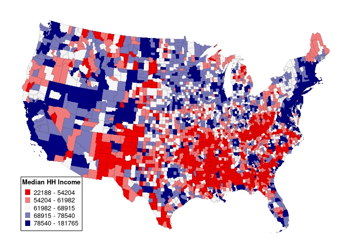
By default, the class breaks are evenly spread across the range of values (equal interval). For mapping skewed distributions, or if you just want a map with more visual variety, use breaks="quantile" classification where each class/color has the same number of features.
plot(counties["Median_Household_Income"], key.pos=1,
	border="#00000020", breaks="quantile", nbreaks=5,
	pal=colorRampPalette(c("red2", "whitesmoke", "navy")))
You can create a more-traditional box legend with the legend() function, albeit with quite a bit of additional effort.
breaks = quantile(counties$Median_Household_Income, probs = seq(0, 1, 0.2), na.rm = T)

labels = sapply(1:(length(breaks) - 1), function(x)
	sprintf("%d - %d", round(breaks[x]), round(breaks[x+1])))

palette = colorRampPalette(c("red2", "whitesmoke", "navy"))

plot(counties["Median_Household_Income"], key.pos=NULL,
	border="#00000020", main=NULL, breaks=breaks, pal=palette)

legend("bottomleft", inset=0.005, legend=labels, col=palette(length(breaks) - 1),
	pch=15, pt.cex=1.5, cex=0.8,
	title="Median HH Income", title.font=2, bg="white")
Categorical Choropleth
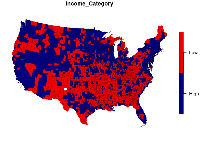
To plot categorical data, you can specify a palette (pal) with the desired colors for each category.
The example below creates an Income_Category dichotomous variable.
counties$Income_Category = ifelse(counties$Median_Household_Income
	> median(counties$Median_Household_Income, na.rm=T), "High", "Low")

plot(counties["Income_Category"], pal=c("navy", "red2"), border="#00000040")
Bubble Maps
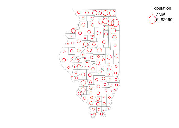
Graduated symbol (bubble) maps are best when visualizing fundamental values over features whose size may not match the variable value.
Bubble maps require a quite a bit of extra computational effort with base graphics compared to choropleths. In this case we limit the display to counties in Illinois since large numbers of small bubbles are difficult to interpret. We also plot a base map of county outlines for geographic context.
illinois = counties[counties$ST == "IL",]

illinois = st_transform(illinois, "EPSG:3857")

min_size = 0.5
max_size = 4
min_value = min(log(illinois$Total_Population), na.rm=T)
max_value = max(log(illinois$Total_Population), na.rm=T)

size = min_size + ((max_size - min_size)* (log(illinois$Total_Population) - min_value) / (max_value - min_value))

par(mar=c(1,1,1,1))

plot(st_geometry(illinois), col=NA, border="#00000040")

plot(st_geometry(st_centroid(illinois)), col="red2", pch=21, cex=size, add=T)

legend(x="topright", title="Population", legend=round(exp(c(min_value, max_value))),
pt.cex=c(min_size, max_size), pch=21, col="red2", bty="n", bg="white")
Point Maps
These examples use point data of houses of worship in Farmingdale, NY described above.
library(sf)

data = read.csv("2018-farmingdale-bethpage-worship.csv", as.is=T)

points = st_as_sf(data, coords = c("Longitude", "Latitude"), crs = 4326)

plot(st_geometry(points), pch=16, col="navy")
OpenStreetMap Base Map
Since points by themselves usually don't give much context for where they are located, it may be helpful to plot them over an OpenStreetMap base map using OpenStreetMap library functions.
Sys.setenv(NOAWT=1)

library(OpenStreetMap)

upperLeft = c(40.75, -73.50)

lowerRight = c(40.71, -73.43)

base_map  = openmap(upperLeft, lowerRight, type="osm")

plot(base_map)

points = st_transform(points, osm())

plot(st_geometry(points), pch=16, col="navy", cex=2, add=T)
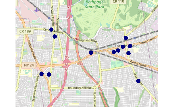
The Sys.setenv(NOAWT=1) call indicates that the OpenStreetMap package should not use the java.awt Abstract Window Toolkit classes for creating user interfaces and for painting graphics and images, since a display may not be available if you are using the OpenStreetMap library on a server installation of R Studio. This should address the java.awt.AWTError: Can't connect to X11 window server using ':0' as the value of the DISPLAY variable error. You will need to Restart R if you have already loaded OpenStreetMap before adding this line to your code.
Categorical Maps
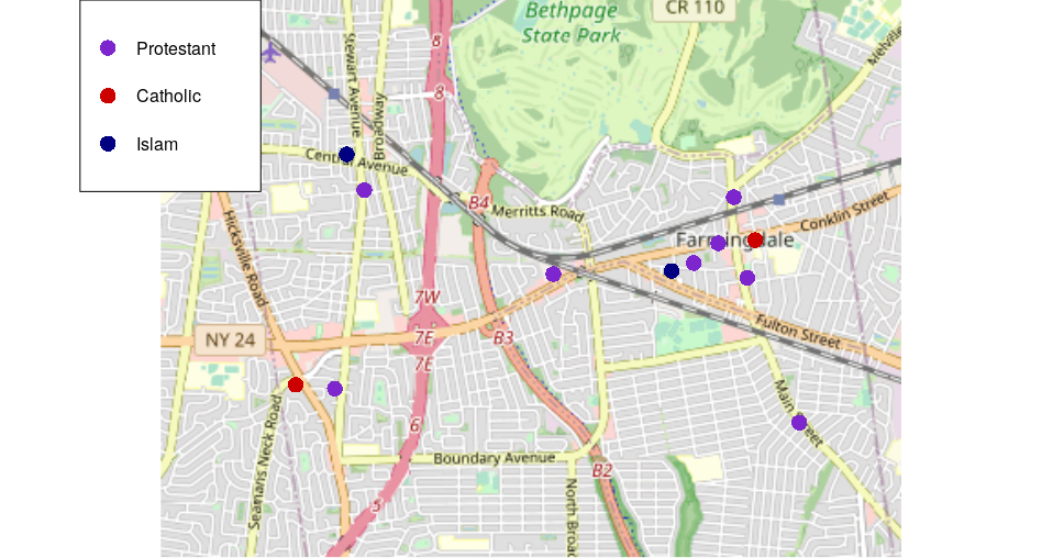
You can plot points colored by a categorical variable.
- Create a vector of desired colors. Methods for specifying colors including a list of color names is here.
- You should avoid choosing colors that require readers to distinguish between red and green, since around 8% of men and 0.5% of women have red-green color blindness (NIH 2020).
- Set the the vector element names() to the unique() categories.
- plot() the base map and the points with the palette vector indexed by the category field.
- Provide a legend() so it is clear what the colors mean.
palette = c("purple3", "red3", "navy")

names(palette) = unique(points$Tradition)

plot(base_map)

plot(st_geometry(points), pch=16, col=palette[points$Tradition], cex=2, add=T)

legend("topleft", legend=names(palette), col=palette,
	pch=16, pt.cex=2, title="Capacity")
Bubble Maps
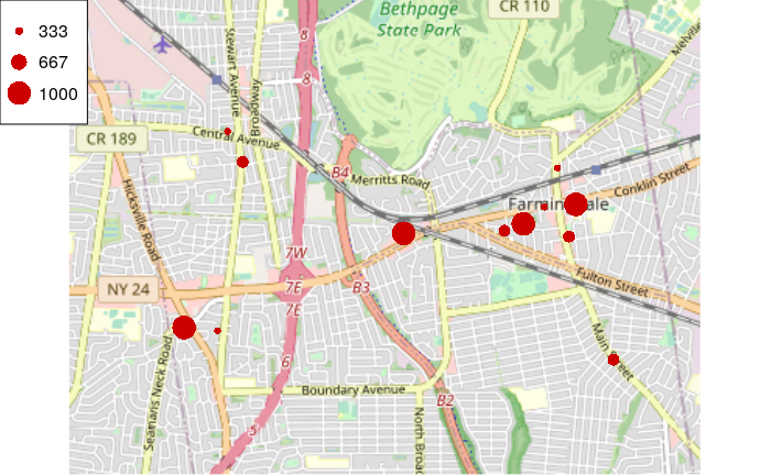
You can use the cex plot() parameter to vary the size of symbols by a quantiative variable.
plot(base_map)

scaling = 3 * points$Capacity / max(points$Capacity)

plot(st_geometry(points), pch=16, col="red3", cex=scaling, add=T)

steps = round(seq(1,3,1) * max(points$Capacity) / 3)

legend("topleft", legend=steps, col="red3", pch=16, pt.cex=1:3)
Bivariate Maps
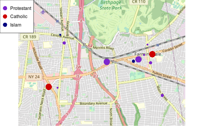
You can map both variables by varying both color and size.
plot(base_map)

plot(st_geometry(points), pch=16, col=palette[points$Tradition], cex=scaling, add=T)

legend("topleft", legend=names(palette), col=palette, pch=16, pt.cex=2)
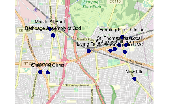
Labels
Labels can be added with the text() function.
Labeling presents a challenge with R base graphics because there is no facility for handling collisions.
This could be handled by manually adding pos and offset values to the spreadsheet to move the labels off of each other. But the simpler solution is to just avoid labels if possible.
plot(base_map)

points = st_transform(points, osm())

plot(st_geometry(points), pch=16, col="navy", cex=2, add=T)

text(st_coordinates(points), labels=points$Church, pos=3, offset=1)
Interactive Leaflet Maps
Leaflet is a popular and easy-to-use open-source JavaScript library for creating interactive maps.
The Leaflet library for R can be used to create interactive maps in notebooks.
Leaflet chunks will cause knit to a Word or PDF document to fail because paper documents cannot contain interactive maps. If you need to knit a notebook with a Leaflet chunk, you need to comment out the Leaflet code or temporarily remove the chunk while knitting the document and replacing the chunk when you are done.
library(leaflet)

map = leaflet()

map = addTiles(map)

coordinates = st_coordinates(st_transform(points, 4326))

map = addMarkers(map, coordinates[,1], coordinates[,2], label=points$Church,
	popup=paste0(points$Church, "<br/>", points$Tradition))

map