Crime Point Data Analysis in R
This tutorial demonstrates basic techniques for crime point analysis in R. These techniques are also more-broadly applicable to point data sets in general.
Acquire the Data
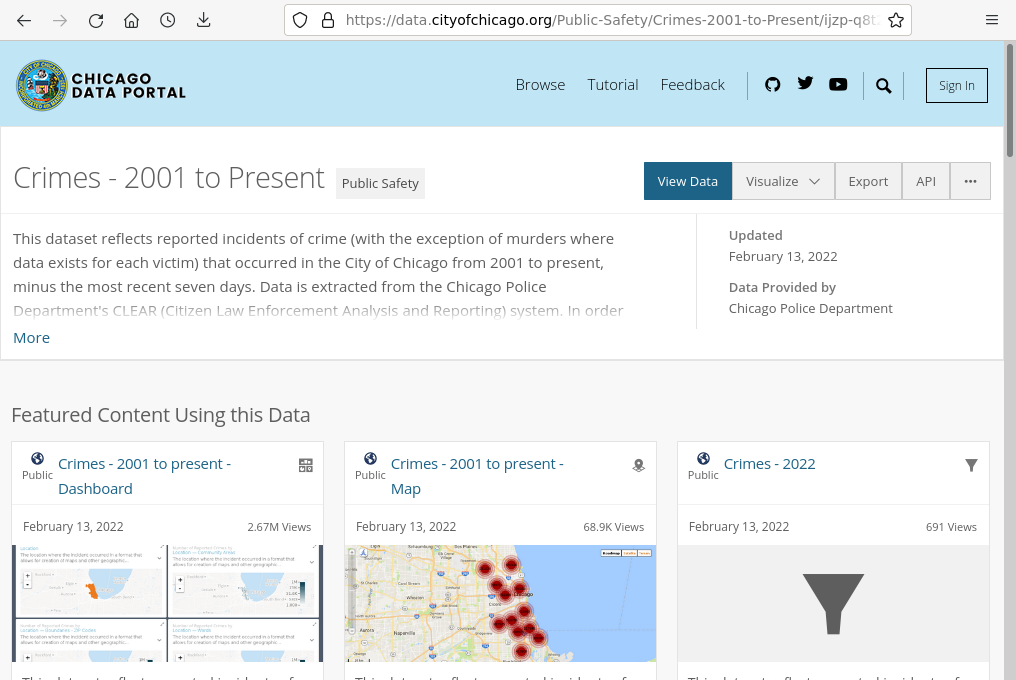
Crime Data
This tutorial will cover analysis of crime data from the City of Chicago for 2019 and 2020.
A manageable subset of the crime data covering the period 2016 - 2020 is available for download here.
It is also possible to download current data from the Chicago Data Portal, although the file is quite large (1.6 GB as of October 2021).
Neighborhood Boundaries
A GeoJSON file of neighborhood boundaries from the City of Chicago Data Portal is available for download here.
Demographic Data
A GeoJSON file of 2015-2019 five-year estimate data from the US Census Bureau's American Community Survey for Illinois census tracts is available for download here.
Crime Data Limitations
Geocoding Errors and Anonymization
Incident locations are recorded as street addresses rather than latitude and longitude, presenting the possibility that some crime points will be misplaced in the process of geocoding those addresses into latitudes and longitudes.
In addition, reported crime locations are randomly offset to protect the identities of victims. Accordingly, spatial analysis based on those crime points will have spatial inaccuracies.
Underreporting
While records of highly-visible crimes like murder and arson are fairly complete, more than half of violent crimes in general and three-quarters of rapes are not reported to police ( Bureau of Justice Statistics 2012, RAINN 2018). In neighborhoods with poor community/police relations, victims may be less inclined to report crime to the police. Accordingly, analysis based on incident data from police departments will be incomplete for some crimes.
Subjectivity
Research methods in general and qualitative methods in particular are especially prone to being affected by the unique perspectives and biases of the researchers. While some methods like phenomenology incorporate those subjectivities into the analysis, research is often designed to attempt to minimize the effect of subjectivities.
Researchers who grew up in secure, low-density suburbs will have implicit biases about neighborhoods and people that differ from the experiences of the researchers. Researchers may also be less sensitive to important physical cues that would be more obvious to people who grew up in those neighborhoods.
Rates vs. Counts
Clusters of crime points indicate high levels of criminal activity in an area. However, that activity may be driven by increased population density, which provides more opportunities for crime.
This challenge can be partially mitigated by normalizing counts by residential population to create rates, which is described below. However, this will not fully control for significant numbers of transient visitors, such as on college campuses or areas with large numbers of tourists.
The Ecological Fallacy
The ecological fallacy is making an assumption about individuals in an area based on aggregated statistics (Hsieh 2017).
It is easy to infer characteristics of the residents of neighborhoods based on the presence or absence of crime clusters in those neighborhoods. However, while clusters of values may indicate the presence of higher numbers of criminals, the majority of the residents of those neighborhoods are likely not criminals themselves, but are actually innocent people who are at higher risk of becoming victims.
Loading and Exploring the Data
Load the Crime Data
CSV files can be loaded into data frames with read.csv().
You can view the available fields with names().
crime = read.csv("2016-2020-chicago-crime.csv")

names(crime)
 [1] "X"                    "ID"                   "Case.Number"
 [4] "Date"                 "Block"                "IUCR"
 [7] "Primary.Type"         "Description"          "Location.Description"
[10] "Arrest"               "Domestic"             "Beat"
[13] "District"             "Ward"                 "Community.Area"
[16] "FBI.Code"             "X.Coordinate"         "Y.Coordinate"
[19] "Year"                 "Updated.On"           "Latitude"
[22] "Longitude"            "Location"
List Available Crime Types
In this Chicago data, the Primary Type column contains the general names of each of the different crimes.
Using the unique() function lists creates an array of the different possible values in the column.
unique(crime$Primary.Type)
 [1] "THEFT"                             "DECEPTIVE PRACTICE"
 [3] "OTHER OFFENSE"                     "MOTOR VEHICLE THEFT"
 [5] "CRIM SEXUAL ASSAULT"               "BURGLARY"
 [7] "CRIMINAL DAMAGE"                   "ASSAULT"
 [9] "OFFENSE INVOLVING CHILDREN"        "BATTERY"
[11] "SEX OFFENSE"                       "CRIMINAL SEXUAL ASSAULT"
[13] "NARCOTICS"                         "WEAPONS VIOLATION"
[15] "ROBBERY"                           "CRIMINAL TRESPASS"
[17] "LIQUOR LAW VIOLATION"              "INTERFERENCE WITH PUBLIC OFFICER"
[19] "ARSON"                             "PROSTITUTION"
[21] "PUBLIC PEACE VIOLATION"            "OBSCENITY"
[23] "STALKING"                          "KIDNAPPING"
[25] "NON-CRIMINAL"                      "INTIMIDATION"
[27] "CONCEALED CARRY LICENSE VIOLATION" "GAMBLING"
[29] "NON-CRIMINAL (SUBJECT SPECIFIED)"  "NON - CRIMINAL"
[31] "OTHER NARCOTIC VIOLATION"          "PUBLIC INDECENCY"
[33] "HUMAN TRAFFICKING"                 "HOMICIDE"
[35] "RITUALISM"
List Numbers of Different Types of Crimes
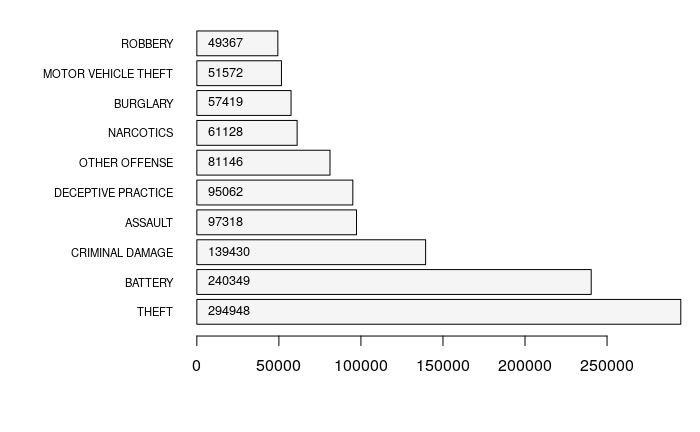
table() can be used to create a frequency table for each different Primary.Type of crime.
By default, the table is sorted by the category. order() can be used to order the table by count. In this example, we list the top ten crimes by activity.
counts = table(crime$Primary.Type)

counts = counts[order(counts, decreasing=T)]

print(counts[1:10])
              THEFT             BATTERY     CRIMINAL DAMAGE             ASSAULT
             294948              240349              139430               97318
 DECEPTIVE PRACTICE       OTHER OFFENSE           NARCOTICS            BURGLARY
              95062               81146               61128               57419
MOTOR VEHICLE THEFT             ROBBERY
              51572               49367
To visualize the counts, you can use barplot().
par(mar = c(5,10,1,1))

y = barplot(counts[1:10], horiz=T, las=1, cex.names=0.7, col="whitesmoke")

text(1000, y, counts[1:10], pos=4, cex=0.8)
Subset A Specific Type of Crime
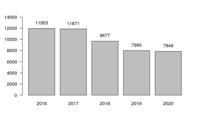
The following code creates a data frame subsetting only crimes with a specific Primary Type.
robbery.all = crime[(crime$Primary.Type == "ROBBERY") & (crime$Latitude > 41),]

year.counts = table(robbery.all$Year)

x = barplot(year.counts, las=1, ylim=c(0, 15000))

text(x, year.counts + 1000, year.counts)
Crime Codes
The names used for Primary Type are general names for categories of crimes.
The IUCR column in the data contains Uniform Crime Reporting (UCR) codes. These codes can be looked up in the Chicago Police Department Definition & Description of Crime Types.
For Robbery, the definition is:
The taking or attempting to take anything of value under confrontational circumstances from the control, custody, or care of another person by force or threat of force or violence and/or by putting the victim in fear of immediate harm.
unique(robbery.all$IUCR)
 [1] NA     "031A" "033A" "0325" "0326" "0334" "0320" "0330" "0313" "0312" "0340" "0337"
[13] "0331" "031B" "033B"
Point Map
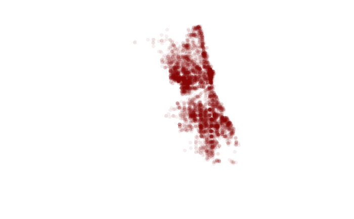
These examples use the Simple Features (sf) library for working with geospatial point and polygon data. While you may see examples on the web that use the older sp library, the sf library is easier to use and is recommended over sp.
- Use st_as_sf() to create simple features from the data frame
using the lat/long coordinates.
- The crs=4326 parameter specifies that the coordinates are WGS 1984 latitudes and longitudes (EPSG 4326).
- plot() the points.
- We plot the st_geometry() of the points so that plot() draws all features the same without considering any of the attributes.
- The pch parameter specifies the character to be drawn (a circle).
- The col parameter specifies the color for the circles. For these points we use a hex code with 50% transparency (alpha = 0x80) so the overlaping points build on each other to create darker areas where points are densely clustered.
library(sf)

robbery.2019 = robbery.all[!is.na(robbery.all$Longitude) & (robbery.all$Year == "2019"),]

robbery.2020 = robbery.all[!is.na(robbery.all$Longitude) & (robbery.all$Year == "2020"),]

robbery.2019 = st_as_sf(robbery.2019, coords = c("Longitude", "Latitude"), crs = 4326)

robbery.2020 = st_as_sf(robbery.2020, coords = c("Longitude", "Latitude"), crs = 4326)

plot(st_geometry(robbery.2020), pch=16, col="#80000010")
Base Map
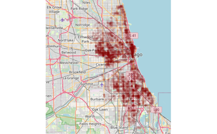
Since points by themselves usually don't give much context for where they are located, it may be helpful to plot them over an OpenStreetMap base map using OpenStreetMap library functions.
library(OpenStreetMap)

upperLeft = c(42.037, -87.975)

lowerRight = c(41.637, -87.473)

base_map  = openmap(upperLeft, lowerRight, type="osm")

plot(base_map)

robbery.osm = st_transform(robbery.2020, osm())

plot(st_geometry(robbery.osm), pch=16, col="#80000010", add=T)
Neighborhoods
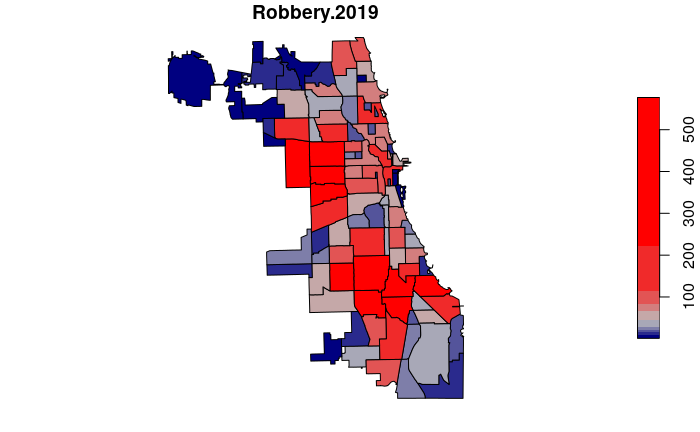
One common way of analyzing point data is to aggregate it by a set of areas, and then analyze the relationships between the areas.
For this example, we will aggregate by the Chicago neighborhood areas downloaded above. Neighborhoods are vernacular areas informally defined by the perceptions of the residents rather than as administrative areas formally defined as boundaries of governmental jurisdictions. Accordingly, while the city provides geospatial data for neighborhoods that have clear boundaries, the actual boundaries are subjective and dynamic. Neighborhoods ideally represent clusters of similar residents or activities, but neighborhoods vary in their level of homogeneity, and often serve simply as commonly understood place names.
Neighborhood Crime Counts
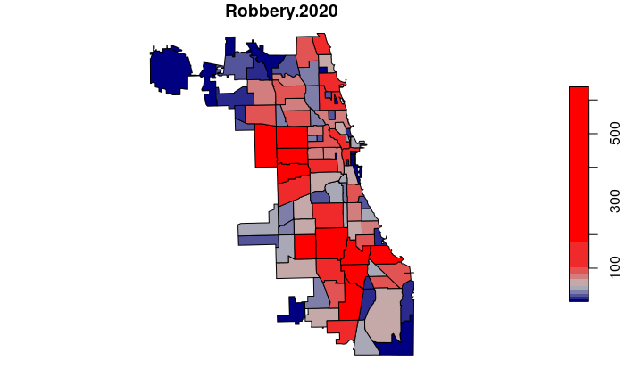
- st_intersects() returns a list of indices of robberies inside each neighborhood polygon.
- lengths() returns the count of indices in each list member, which corresponds to the count of robberies inside each neighborhood polygon.
neighborhoods = st_read("Boundaries-Neighborhoods.geojson", quiet=T)

neighborhoods$Robbery.2020 = lengths(st_intersects(neighborhoods, robbery.2020))

plot(neighborhoods["Robbery.2020"], breaks="quantile",
         pal=colorRampPalette(c("navy", "gray", "red")))

Repeat for 2019 data.
neighborhoods$Robbery.2019 = lengths(st_intersects(neighborhoods, robbery.2019))

plot(neighborhoods["Robbery.2019"], breaks="quantile",
         pal=colorRampPalette(c("navy", "gray", "red")))
High and Low Crime Neighborhoods
We can order() the data frame by number of incidents and use head() to find the neighborhood with the lowest number of crimes.
We st_drop_geometry() so the listing does not include the spatial features information.
high.low.count = neighborhoods[order(neighborhoods$Robbery.2020),
                                c("pri_neigh", "Robbery.2020")]

head(st_drop_geometry(high.low.count))
         pri_neigh Robbery.2020
74     Edison Park            1
33   Museum Campus            2
67  Millenium Park            2
23 Mount Greenwood            4
40      Grant Park            4
43   Andersonville            4
tail() can be used to list the high crime neighborhoods at the other end of the list.
tail(st_drop_geometry(high.low.count))
        pri_neigh Robbery.2020
60    South Shore          263
5   Humboldt Park          331
7  North Lawndale          379
20      Englewood          443
6   Garfield Park          491
95         Austin          639
Mapping Change
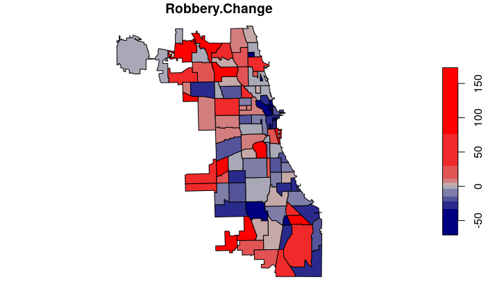
The following code calculates and maps the percentage change in neighborhood crime counts in 2020 compared to 2019.
neighborhoods$Robbery.Change = 100 * ((neighborhoods$Robbery.2020 /
	neighborhoods$Robbery.2019) - 1)

neighborhoods$Robbery.Change[is.infinite(neighborhoods$Robbery.Change)] = 1000

neighborhoods$Robbery.Change = round(neighborhoods$Robbery.Change)

plot(neighborhoods["Robbery.Change"], breaks="quantile",
         pal=colorRampPalette(c("navy", "gray", "red")))
High and Low Change Neighborhoods
We can see the neighborhoods with the greates decreases in crime counts by sorting the data frame and listing the head() of the sorted list.
high.low.change = neighborhoods[order(neighborhoods$Robbery.Change),
	c("pri_neigh", "Robbery.Change")]

head(st_drop_geometry(high.low.change))
         pri_neigh Robbery.Change
57  Millenium Park            -71
12        Boystown            -65
72    Printers Row            -55
74     River North            -48
2    Andersonville            -43
78 Rush & Division            -43
We can see the neighborhoods with the greatest increases in crime counts by listing the tail() of the sorted list.
tail(st_drop_geometry(high.low.change))
               pri_neigh Robbery.Change
61         Museum Campus            100
67          Norwood Park            111
31              Galewood            125
13            Bridgeport            135
79 Sauganash,Forest Glen            150
3         Archer Heights            173
Neighborhood Demographics
The neighborhood data from the city contains no demographic data, but we can aggregate data from the census tract data provided above.
Aggregating Counts
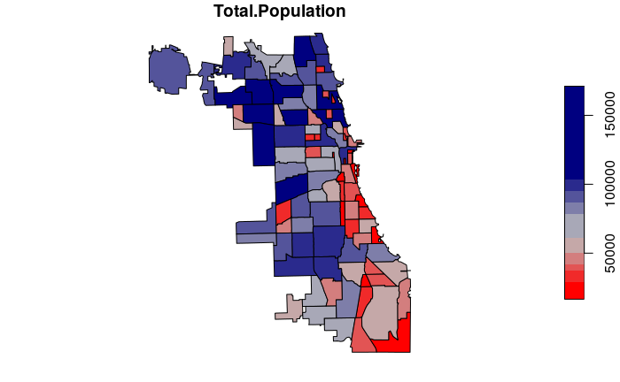
aggregate() is used to summarize tract values within each neighborhood polygon.
- Because Total.Population is a count we use the sum() function to sum the total tract population in each neighborhood.
- Because aggregate() with spatial data returns spatial polygons, we transfer only the Total.Population column back to the neighborhoods.
tracts = st_read("2015-2019-acs-il_tracts.geojson", quiet=T)

neighborhoods$Total.Population = aggregate(tracts["Total.Population"],
	neighborhoods, FUN=sum)$Total.Population

plot(neighborhoods["Total.Population"], breaks="quantile",
      pal=colorRampPalette(c("red", "gray", "navy")))
Aggregating Amounts
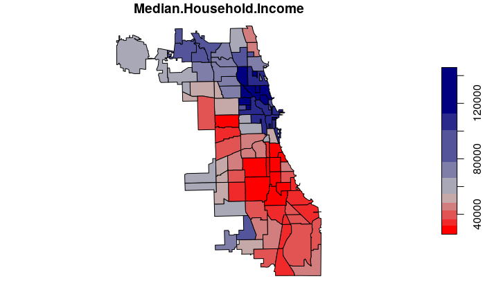
For calculated values like median household income, we can use the median() function to get the median value of all tracts within each neighborhood.
neighborhoods$Median.Household.Income = aggregate(
         tracts["Median.Household.Income"], neighborhoods,
         FUN=median, na.rm=T)$Median.Household.Income

plot(neighborhoods["Median.Household.Income"], breaks="quantile",
       pal=colorRampPalette(c("red", "gray", "navy")))

Rates
Normalized Rates
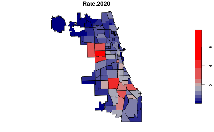
To make crime more comparable between tracts with low and high population, we can normalize the counts by population to get crime rates.
- We use rates per 1,000 residents so the numbers do not require a large number of decimal places.
- We add one to the denominator to avoid a divide by zero error in locations with no formal residential population.
neighborhoods$Rate.2019 = 1000 * neighborhoods$Robbery.2019 /
	(neighborhoods$Total.Population + 1)

neighborhoods$Rate.2020 = 1000 * neighborhoods$Robbery.2020 /
	(neighborhoods$Total.Population + 1)

plot(neighborhoods["Rate.2020"], breaks="jenks",
	pal=colorRampPalette(c("navy", "gray", "red")))
Standardized Rates
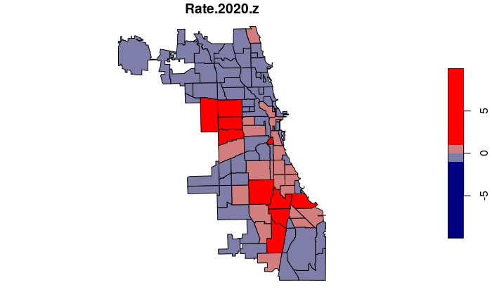
Rates can be standardized by expressing them as z-scores that reflect how many standard deviations an individual value is above or below the mean.
- Z-scores can be used to rigorously and clearly specify which areas have values that are above or below the the average for the entire region as a whole.
- In this case, a positive z-score means a neighborhood has a crime rate above the citywide mean and a negative z-score.
- For our plot(), we specify exact breaks in order to use specific colors for positive vs. negative z-scores.
neighborhoods$Rate.2020.z = (neighborhoods$Rate.2020 -
	mean(neighborhoods$Rate.2020, na.rm=T)) /
	sd(neighborhoods$Rate.2020, na.rm=T)

breaks = c(-10, -1, 0, 1, 10)

plot(neighborhoods["Rate.2020.z"], breaks=breaks,
	pal=colorRampPalette(c("navy", "gray", "red")))
Location Quotient
A challenge with expressing rates in z-scores is that z-scores are statistical jargon that are not understood by the general population. Additionally, z-scores are not applicable when the distribution is non-normal, which common with the spatial distribution of crime:
hist(neighborhoods$Rate.2020.z)
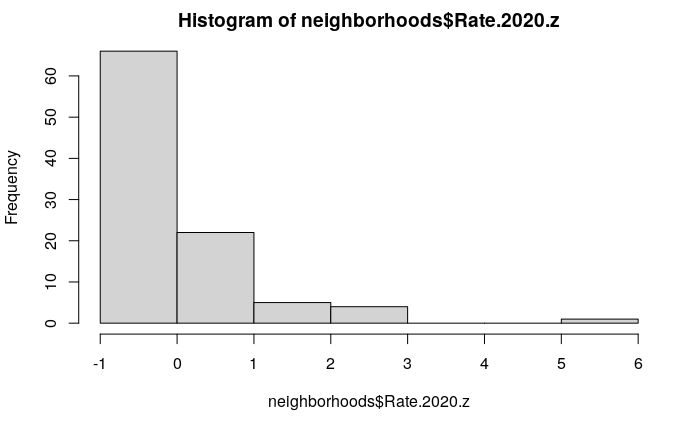
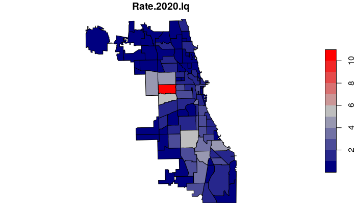
Location quotients express rates relative to the median rate for the entire region, and are somewhat more comprehensible to non-technical users than z-scores. Location quotients are calculated by dividing the individual area rates by the median rate for the entire region.
For example, a location quotient of 2 means the crime rate is two times the regional median, and a location quotient of 0.25 means the crime rate is one quarter of the regional median. A location quotient of one would mean the area is near the median rate for the region.
neighborhoods$Rate.2020.lq = neighborhoods$Rate.2020 /
         median(neighborhoods$Rate.2020, na.rm=T)

lc.breaks=c(0, 0.5, 1, 2, 20)

plot(neighborhoods["Rate.2020.lq"], breaks=lc.breaks,
         pal=colorRampPalette(c("navy", "gray", "red")))
Interactive Map
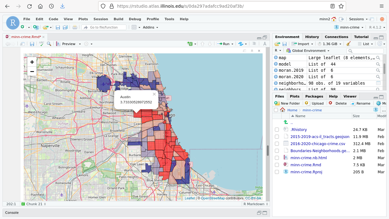
library(leaflet)

map = leaflet(neighborhoods)

pal=colorQuantile(palette=c("navy", "gray", "red"), NULL)

map = addTiles(map)

popup = paste(neighborhoods$pri_neigh, neighborhoods$Rate.2020, sep="
")

map = addPolygons(map, popup=popup, fillOpacity=0.6, color="black",
                  weight=1, fillColor=~pal(neighborhoods$Rate.2020))
map
Point Autocorrelation
One of the primary ways of analyzing the spatial distribution of phenomenon is looking where points group together, or where high or low values are clustered together.
Spatial autocorrelation is the clustering of similar values together in adjacent or nearby areas.
Spatial data is often spatially autocorrelated, and this tendency is useful since clusters often provide useful insights into the characteristics of the clustered phenomena.
While visible observation of spatial autocorrelation is useful when exploring data, more-rigorous means of quantifying autocorrelation are helpful when performing serious research.
This section presents methods for assessing autocorrelation of points.
Ripley's K
B.D. Ripley (1977) developed a modeling technique for analysing spatial point autocorrelation that is commonly called Ripley's K statistic.
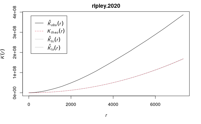
The Ripley's K function iterates through each point and counts the number of other points within a given distance. The graph of K gives distances on the x axis and the total number of points at those distances on the y axis.
- The visualized output is a graph that shows a theoretical line (Ktheo) that would be expected if points were randomly distributed across the area.
- This line can then be visually compared to the line of observed values in the data passed to the function. (Kobs).
- Areas where the observed line is above the theoretical line indicates clustering at the given distances.
- Areas where the observed line is below the theoretical line indicates even dispersion at the given distances.
The function is implemented in the spatstat library:
- envelope() takes a point pattern object of class ppp, which can be created from sf points using the as.ppp() function.
- Point patterns must be projected (rather than being lat/long), so the Illinois East State Plane Cordinate System in meters (EPSG 6454) is used. If you are analyzing a different area, you should use a planar coordinate system appropriate to your area.
- The envelope() function calculates Ripley's K by passing Kest as the function parameter. Note that this function may take a minute or two to complete if you have a large number of points.
In the graph for 2020 robberies in Chicago, the observed line consistently sits well above the theoretical line, indicating significant spatial autocorrelation.
library(spatstat)

borders = st_transform(neighborhoods$geometry, 6454)

ppp.2020 = as.ppp(st_transform(robbery.2020$geometry, 6454))

ripley.2020 = envelope(ppp.2020, fun= Kest, nsim= 100, verbose=F)

plot(ripley.2020)
Kernel Density
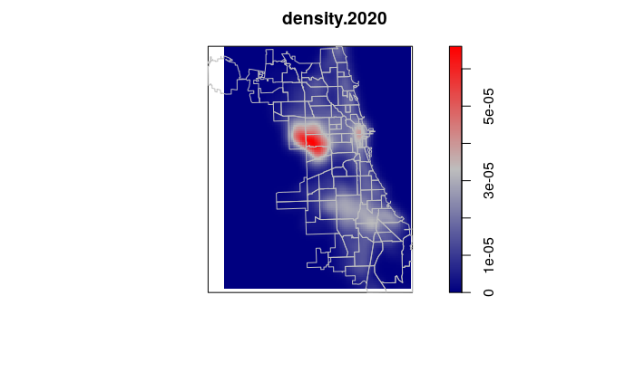
A classical method of mapping areas of high spatial autocorrelation of points is kernel density analysis, in which a kernel of a given radius is used to systematically scan an area, and the density of any particular location is the number of points within the kernel surrounding that point. Locations surrounded by clusters of points will have higher values, and areas where there are few or no points will have lower values.
A kernel density raster can be created using functions from the spatstat library:
- The density.ppp() function creates
a kernel density raster given a kernel of sigma smoothing bandwidth.
The choice of sigma depends on how sharply you want the density analysis to wrap around individual points. The value of sigma as well as the type of kernels chosen with the kernel parameter can be adjusted to reflect areas of influence or interaction. For this simple visualization example, the arbitrary choice of 2000 is used because it gives a fairly clear rendering relative to the sizes of neighborhoods.
- The w parameter defines the window (extent) of the area covered by the analysis. While this value can be automatically calculated from the points, we use a window based on the boundaries of neighborhoods so we can compare analysis across multiple years.
- The output of kernel density analysis is a raster image of kernel density values that can be visualized with plot(). The default heat map colors are replaced in this example with the blue/gray/red diverging color palette so that high and low values are more clearly identifiable.
- We plot the neighborhood borders over the image to provide geographic context.
density.2020 = density.ppp(ppp.2020, w=as.owin(borders), sigma=1000)

plot(density.2020, col=colorRampPalette(c("navy", "gray", "red")))

plot(borders, col=NA, border="gray", add=T)
Kernel Density Change
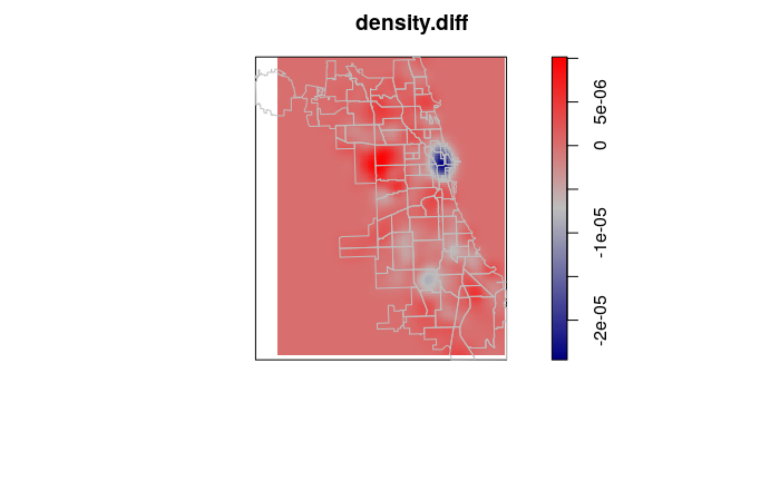
Since kernel density analysis results in rasters, we can subtract rasters to identify change between years.
With crime point analysis, this can be used to validate the effects of increased crime mitigation measures in specific areas, or to identify emerging high crime areas that may deserve increased law enforcement attention.
The area of significant decrease in robbery around The Loop in downtown Chicago likely reflects the decrease in visitor traffic during the 2020 Covid pandemic lockdown.
ppp.2019 = as.ppp(st_transform(robbery.2019$geometry, 6454))

density.2019 = density.ppp(ppp.2019, w=as.owin(borders), sigma=1000)

density.diff = density.2020 - density.2019

plot(density.diff, col=colorRampPalette(c("navy", "gray", "red")))

plot(borders, col=NA, border="gray", add=T)
Area Autocorrelation
There are also techniques for analyzing and visualing where and to what extent high and low values of a variable are clustered together in area features.
Neighbors
In order to detect autocorrelation between neighboring areas, we must first answer the ancient question, "Who is my neighbor?"
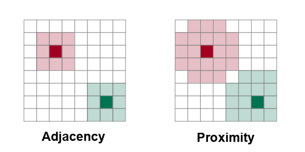
Neighboring areas can be defined by adjacency or proximity.
- Adjacency means that areas are considered neighbors if they share either a common border or a common corner (vertex). Adjacency based on a common vertex is called a queen rule after the rule in chess that allows queens to move diagonally.
- Proximity means that areas are considered neighbors if they are within a specific distance of each other.
Many of the spatial autocorrelation functions in the spdep library require a list of weights that indicates whether areas are neighbors or not.
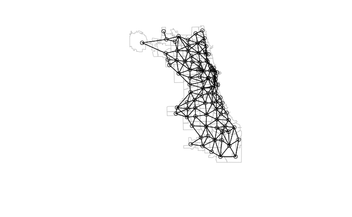
When defining neighbors by adjacency, the poly2nb() function is used to create a neighbors (nb) list.
- The queen rule should usually be set to T unless there is some specific reason why you only want neighbors defined by adjacent boundaries.
- Because these are older functions that use the older sp library, as_Spatial needs to be used to convert the sf (simple features) objects into sp objects.
- The nb2listw() function then takes that nb list and creates a list of weights. By default all neighbors are treated equally, but nb2listw() provides the ability to treat some regions as more important than others, such as when dealing with areas of uniquely important economic activity.
- The zero.policy=T parameter indicates that locations with no neighbors (such as islands) will be passed rather than throwing the Empty neighbour sets found error.
library(spdep)

neighbors = poly2nb(as_Spatial(neighborhoods), queen=T)

weights = nb2listw(neighbors, style="W", zero.policy=T)

plot(st_geometry(neighborhoods), border="gray")

plot(neighbors, coords=st_coordinates(st_centroid(neighborhoods)), add=T)
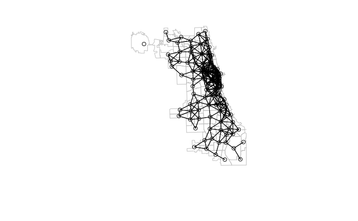
When defining neighbors by proximity (distance), the dnearneigh() function can be used.
- d1 and d2 specify the mininum and maximum distance range of neighbors. This example chooses an arbitrary value of four kilometers.
- Distances should be specified using some kind of linear (rather than angular) measurement, so the data should be in planar projection. For this example we use State Plane Coordinate System EPSG 6454 (Illinois East in meters) which is suitable for Chicago.
neighborhoods = st_transform(neighborhoods, 6454)

centroids = st_centroid(st_geometry(neighborhoods))

neighbors = dnearneigh(as_Spatial(centroids), d1 = 0, d2 = 4000)

weights = nb2listw(neighbors, style="W", zero.policy=T)

plot(st_geometry(neighborhoods), border="gray")

plot(neighbors, coords=st_coordinates(st_centroid(neighborhoods)), add=T)
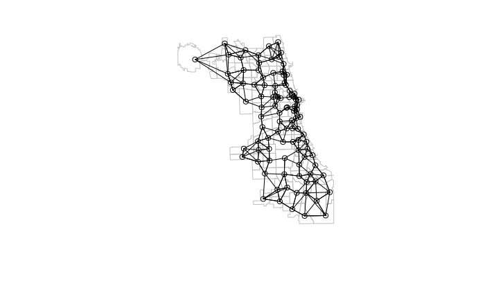
Proximity neighbors can also be defined by taking a specific number (k) of the closest features using the knearneigh() function. This can help to compensate when working with areas of widely varying sizes, although there may be no objective rationale for the choice of k, and different values of k will yield different autocorrelation analysis results.
centroids = st_centroid(st_geometry(neighborhoods))

nearest = knearneigh(centroids, k=4)

neighbors = knn2nb(nearest)

weights = nb2listw(neighbors, style="W", zero.policy=T)

plot(st_geometry(neighborhoods), border="gray")

plot(neighbors, coords=st_coordinates(st_centroid(neighborhoods)), add=T)
Global Moran's I
Patrick Alfred Pierce Moran (1950) developed a technique for quantifying autocorrelation within values associated with areas. Moran's I is a method for assessing area autocorrelation analogous to the use of Ripley's K with points.
There are two types of Moran's I statistics: global and local.
Global Moran's I assesses autocorrelation over the entire area of analysis as a single number. Values of the global Moran's I statistic vary from -1 (evenly dispersed = evenly spread out) to 0 (no autocorrelation) to +1 (completely clustered).
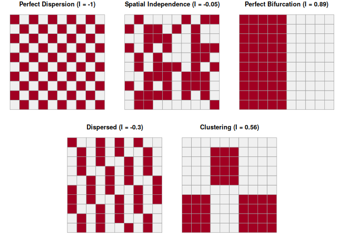
Once you have a weights list (see above), moran.test() calculates the Moran's I statistic for the areas being analyzed.
moran.2020 = moran.test(neighborhoods$Rate.2020, weights)

print(moran.2020)
	Moran I test under randomisation

data:  neighborhoods$Rate.2020
weights: weights

Moran I statistic standard deviate = 6.1072, p-value = 5.071e-10
alternative hypothesis: greater
sample estimates:
Moran I statistic       Expectation          Variance
      0.376993256      -0.010309278       0.004021823
Moran's I is useful for identifying differences in spatial autocorrelation between groups or across time periods.
Comparing the Moran's I values for robbery density in 2019 vs. 2020, we see a slight but, probably, insignificant difference, indicating that the clustering of robbery was fairly stable over time.
moran.2019 = moran.test(neighborhoods$Rate.2019, weights)

print(moran.2019)
	Moran I test under randomisation

data:  neighborhoods$Rate.2019
weights: weights

Moran I statistic standard deviate = 6.1181, p-value = 4.734e-10
alternative hypothesis: greater
sample estimates:
Moran I statistic       Expectation          Variance
      0.385268367      -0.010309278       0.004180485
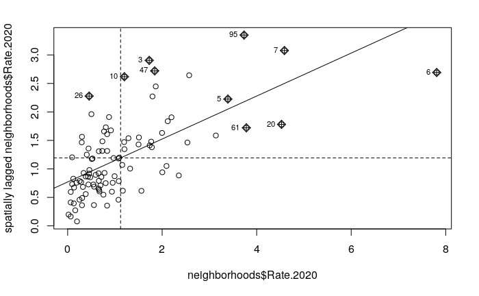
The moran.plot() function can be used to visualize and diagnose the autocorrelation.
- The x axis is the values and the y axis are the spatially-lagged (adjacent) values.
- The fairly-clear upward pattern from left to right indicates that like values tend to be closer together, especially the low crime values clustered at the bottom left corner.
moran.plot(neighborhoods$Rate.2020, weights)
Local Moran's I
Local indicators of spatial association (LISA) were initially developed by Luc Anselin (1995) to decompose global indicators of spatial autocorrelation (like global Moran's I) and assess the contribution of each individual area.
- LISA analysis with the local Moran's I statistic is used to identify clusters of areas with similar values and outlier areas with values that stand out among the neighbors.
- Local Moran's I is implemented in the spdep library (same library as global Moran's I) using the localmoran() function.
Because the values of local Moran's I only have meaning relative to the other local Moran's I values in the areas being analyzed, local Moran's I is commonly displayed as a z-score (Z.Ii).
- A positive z-score indicates an area that is surrounded by areas with similar values.
- A negative z-score indicates an outlier area that is unusually low or high compared to its neighbors.
local = localmoran(neighborhoods$Rate.2020, weights)

neighborhoods$Morans.2020 = local[,"Z.Ii"]

breaks=c(-10, -1, 1, 10)

plot(neighborhoods["Morans.2020"], breaks=breaks,
         pal=colorRampPalette(c("navy", "gray", "red")))
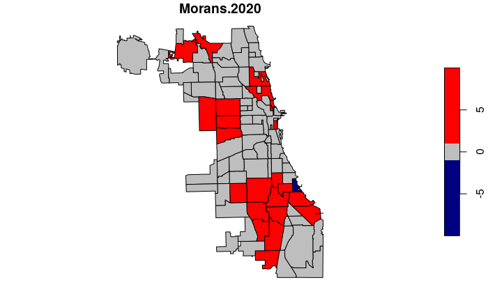
You can list the outliers by ordering the neighborhood data frame and listing the head().
neighborhoods = neighborhoods[order(neighborhoods$Morans.2020),]

head(st_drop_geometry(neighborhoods[,c("pri_neigh","Morans.2020")]))
       pri_neigh Morans.2020
26  Jackson Park  -1.7129756
75     Hyde Park  -0.6186466
72       Beverly  -0.4717760
9  Armour Square  -0.4178828
91      Galewood  -0.3358428
22       Ashburn  -0.2603334
Getis-Ord GI*
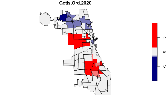
The Getis-Ord GI* statistic was developed by Arthur Getis and J.K. Ord and introduced in 1992. This algorithm locates areas with high values that are also surrounded by high values.
Unlike simple observation or techniques like kernel density analysis, the Getis-Ord GI* algorithm uses statistical comparisons of all areas to create p-values indicating how probable it is that clusters of high values in a specific areas could have occurred by chance. This rigorous use of statistics makes it possible to have a higher level of confidence (but not complete confidence) that the patterns are more than just a visual illusion and represent clustering that is worth investigating.
The Getis-Ord GI* statistic is a z-score on a normal probability density curve indicating the probability that an area is in a cluster that did not occur by random chance. A z-score of 1.282 represents a 90% probability that the cluster did not occur randomly, and a z-score of 1.645 represents a 95% probability.
neighborhoods$Getis.Ord.2020 = localG(neighborhoods$Rate.2020, weights)

plot(neighborhoods["Getis.Ord.2020"],
	breaks=c(-10, -1.645, -1.282, 1.282, 1.645, 10),
	pal=colorRampPalette(c("navy", "#f0f0f0", "red")))
Regression
One common spatial analysis technique is the use of regression to analyze the relationships between different variables across space.
Regression is "a functional relationship between two or more correlated variables that is often empirically determined from data and is used especially to predict values of one variable when given values of the others" (Merriam-Webster 2022).
Bivariate Correlation
Correlation is "a relation existing between phenomena or things or between mathematical or statistical variables which tend to vary, be associated, or occur together in a way not expected on the basis of chance alone" (Merriam-Webster 2022). While it is important to always remember that correlation and causation are two different things, correlation analysis is a very powerful exploratory technique.
The simplest correlation analysis is to simply plot two variables on an x/y scatter chart and look for an upward or downward pattern across the chart.
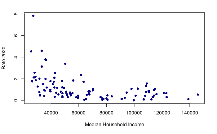
Since we have earlier joined some demographic variables to the neighborhood features, we can look for a relationships between neighborhood demographics and reported robbery rates. A plot() of median household income against robbery rates shows that the neighborhoods with the highest robbery rates tend to be low income.
- The pch=16 parameter indicates to plot point character #16, which is a filled circle.
- The col="navy" parameter indicates to draw the point in navy blue.
This plot uses formula notation, which separates a dependent variable on the left with a tilde (~) from one or more independent variables on the right .
- A dependent variable represents the characteristic or quantity in analysis that is being affected.
- An independent variable represents the forces that act on the dependent variable.
plot(Rate.2020 ~ Median.Household.Income, data=neighborhoods, pch=16, col="navy")
Logarithmic Scale
In the plot above, we see that the distributions of these two values are both skewed. The robbery rate in most neighborhoods is fairly low, and the handful of high crime neighborhoods are clustered on the left in the lower income areas.
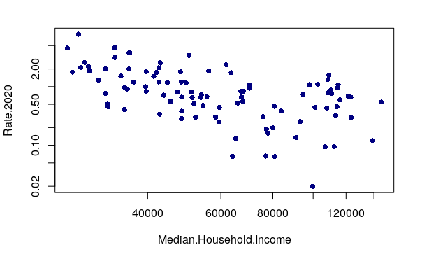
When the distribution of values is is heavily skewed to the low end, changing the plot to use logarithmic axis scales using the log="xy" parameter can clarify visualization of the relationship between the variables.
plot(Rate.2020 ~ Median.Household.Income, data=neighborhoods, pch=16, col="navy" log="xy")
Correlation Direction
A negative correlation means that as one variable goes up, the other goes down. When two variables with a negative correlation are plotted on the two axes of an X/Y scatter chart, the points form a rough line or curve downward from left to right. This is visible on the plot of neighborhood income vs. robbery rates.
plot(Rate.2020 ~ Median.Household.Income, data=neighborhoods, pch=16, col="navy" log="xy")

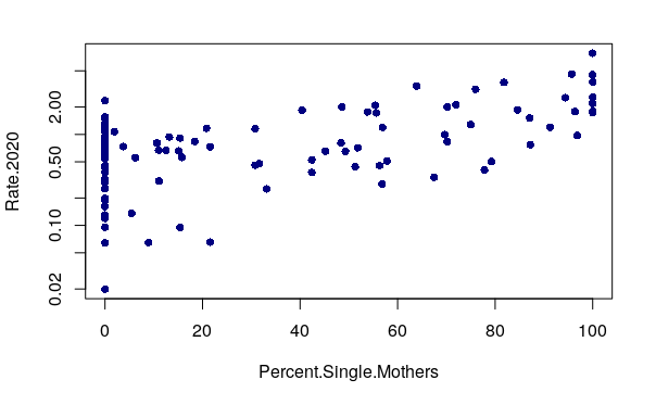
A positive correlation means that as one variable goes up, the other goes up as well. When two variables with a positive correlation are plotted on the two axes of an X/Y scatter chart, the points form a rough line or curve upward from left to right. For example, robbery rates positively correlate with the percentage of mothers in a neighborhood who are single.
plot(Rate.2020 ~ Percent.Single.Mothers, data=neighborhoods, pch=16, col="navy" log="y")
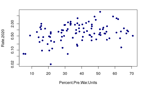
When there is no correlation, the X/Y scatter chart dots have no clear upward or downward pattern. For example, robbery rates have no clear correlation with the percentage of units in a neighborhood that were built before World War II.
plot(Rate.2020 ~ Percent.Pre.War.Units, pch=16, col="navy", log="y")
Linear Model
To evaluate the direction and strength of correlation, you can create a linear model using the lm() function and then display the model parameters using the summary() function.
lm() uses the ordinary least squares (OLS) method to estimate the formula for a line that best fits the data.
y = βx + e
- y is the dependent variable.
- x is the independent variable.
- β is the regression coefficient to be estimated from the data.
- e is the error term.
model = lm(Rate.2020 ~ Median.Household.Income, data=neighborhoods)

summary(model)
Call:
lm(formula = Rate.2020 ~ Median.Household.Income, data = neighborhoods)

Residuals:
    Min      1Q  Median      3Q     Max
-1.2283 -0.6987 -0.2367  0.4040  6.0441

Coefficients:
                          Estimate Std. Error t value Pr(>|t|)
(Intercept)              2.227e+00  2.499e-01   8.915 3.19e-14 ***
Median.Household.Income -1.695e-05  3.460e-06  -4.899 3.89e-06 ***
---
Signif. codes:  0 ‘***’ 0.001 ‘**’ 0.01 ‘*’ 0.05 ‘.’ 0.1 ‘ ’ 1

Residual standard error: 1.056 on 96 degrees of freedom
Multiple R-squared:    0.2,	Adjusted R-squared:  0.1917
F-statistic:    24 on 1 and 96 DF,  p-value: 3.894e-06
R-Squared
The strength of a correlation is measured using the coefficient of determination which is more commonly called R squared.This can be written as R2, R squared, R-squared, or R^2.
Evaluation of R2 to determine whether correlation should be considered strong or not depends on the type of phenomena being studied.
- The range of R2 is from 0.000 (no correlation) to 1.000 (perfect correlation).
- Values of less than 0.100 can usually be considered to represent no meaningful correlation.
- In the social sciences where relationships often involve the complex interplay of ambiguous factors, values in the 0.200s or 0.300s can be considered strongly correlated enough to merit further investigation.
- In the natural sciences, values above 0.600 are often expected from variables that are strongly correlated.
The Adjusted R-squared value in the lm() listing is the R2 value you should use to evaluate your model. The adjusted qualifier means it is calculated to compensate for increases in R2 that will occur as additional variables are added but do not necessarily add explanatory power to the model.
The Estimate value in the listing beside the independent variable is the regression coefficient (β) whose sign indicates whether the correlation is positive or negative.
The adjusted R2 of 0.1917 indicates a weak correlation between reported robbery rates and neighborhood median household income, and the negative coefficient estimate of -1.695e-05 indicates that correlation is negative. Neighborhoods that have higher rates of reported robbery tend to have lower income.
Call:
lm(formula = Rate.2020 ~ Median.Household.Income, data = neighborhoods)

Residuals:
    Min      1Q  Median      3Q     Max
-1.2283 -0.6987 -0.2367  0.4040  6.0441

Coefficients:
                          Estimate Std. Error t value Pr(>|t|)
(Intercept)              2.227e+00  2.499e-01   8.915 3.19e-14 ***
Median.Household.Income -1.695e-05  3.460e-06  -4.899 3.89e-06 ***
---
Signif. codes:  0 ‘***’ 0.001 ‘**’ 0.01 ‘*’ 0.05 ‘.’ 0.1 ‘ ’ 1

Residual standard error: 1.056 on 96 degrees of freedom
Multiple R-squared:    0.2,	Adjusted R-squared:  0.1917
F-statistic:    24 on 1 and 96 DF,  p-value: 3.894e-06
Log Transform
In the X/Y scatter chart above, we found that the correlation was more apparent when the chart was plotted with a logarithmic scale. Likewise, if we estimate our linear model with the logarithm of the values, we get a better model fit.
A logarithmic transform (log transform) is a technique commonly used in models with skewed data that involves using the logarithm of one or more of the model variables.
par(mfrow=c(1,2))

par(cex=0.7)

hist(neighborhoods$Median.Household.Income, prob=T, main="Distribution")

lines(density(neighborhoods$Median.Household.Income), lwd=3, col="navy")

hist(log(neighborhoods$Median.Household.Income), prob=T, main="Log Transformed")

lines(density(log(neighborhoods$Median.Household.Income)), lwd=3, col="navy")
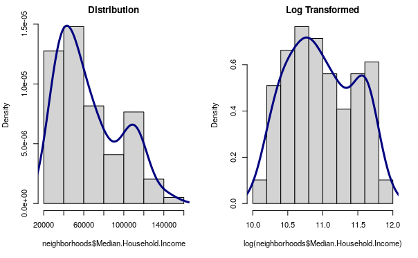
The log() function can be wrapped around the variables in an lm() formula that you want to log transform.
With robbery rates and median household income, use of a log transform improves the R2 to 0.277.
model = lm(log(Rate.2020) ~ log(Median.Household.Income), data=neighborhoods)

summary(model)
Call:
lm(formula = log(Rate.2020) ~ log(Median.Household.Income), data = neighborhoods)

Residuals:
     Min       1Q   Median       3Q      Max
-2.93493 -0.47634  0.06851  0.67803  1.53577

Coefficients:
                             Estimate Std. Error t value Pr(>|t|)
(Intercept)                   12.7132     2.1168   6.006 3.40e-08 ***
log(Median.Household.Income)  -1.1900     0.1927  -6.176 1.57e-08 ***
---
Signif. codes:  0 ‘***’ 0.001 ‘**’ 0.01 ‘*’ 0.05 ‘.’ 0.1 ‘ ’ 1

Residual standard error: 0.8931 on 96 degrees of freedom
Multiple R-squared:  0.2844,	Adjusted R-squared:  0.2769
F-statistic: 38.15 on 1 and 96 DF,  p-value: 1.575e-08
Note that if one of your variables has any zero or negative values, the log() call will fail with the following message, and the log() should be removed.
Error in lm.wfit(x, y, w, offset = offset, singular.ok = singular.ok,  :
  NA/NaN/Inf in 'y'
Alternatively, you can subset your data to remove the offending values.
neighborhoods = neighborhoods[neighborhoods$Rate.2020 > 0,]
Regression Line
The model output of lm() can be passed to the abline() function to draw a regression line across the x/y scatter plot which represents the modeled values.
plot(Rate.2020 ~ Median.Household.Income, data=neighborhoods, pch=16, col="navy")

model = lm(Rate.2020 ~ Median.Household.Income, data=neighborhoods)

abline(model, lwd=3, col="red")
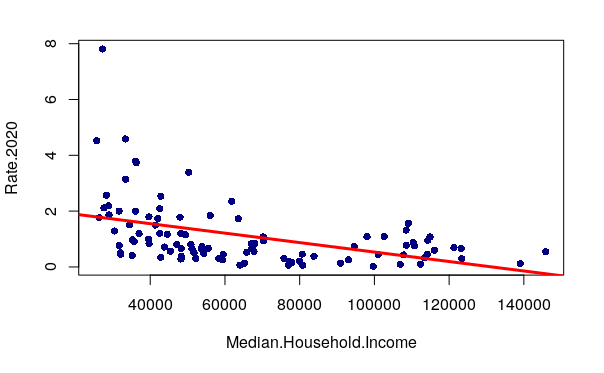
If you create a log-transformed model, you will also need to plot() the log-transformed values so abline() will know where to plot the line.
plot(log(Rate.2020) ~ log(Median.Household.Income), data=neighborhoods, pch=16, col="navy")

model = lm(log(Rate.2020) ~ log(Median.Household.Income), data=neighborhoods)

abline(model, lwd=3, col="red")
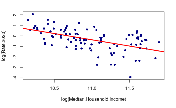
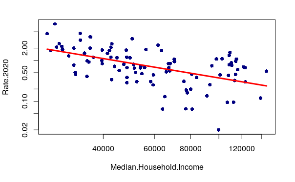
Alternatively, you can use lines() function to plot the fitted values as a line across a plot() with logarithmic scales, after detransforming the fitted values using exp(). This technique has the advantage of preserving the scale labels in the same units used by the data, rather than the log-transformed values.
plot(Rate.2020 ~ Median.Household.Income, data=neighborhoods, pch=16, col="navy", log="xy")

model = lm(log(Rate.2020) ~ log(Median.Household.Income), data=neighborhoods)

lines(neighborhoods$Median.Household.Income, exp(model$fitted.values), lwd=3, col="red")
The Post Hoc Fallacy
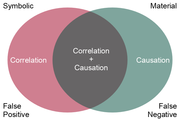
While correlation may be interesting, what we are usually more interested in is causation. Correlation is a simple mathematical relationship between two variables, but causation means that there is a material cause-and-effect relationship between the two phenomenon we are measuring with our variables.
Correlation is empirical (based on observation), and causation is based on reason. When we observe two phenomena occurring together and we observe that there is some mechanism connecting the two phenomena, we use reason and logic to tie those two phenomena together in a cause and effect relationship.
Assuming that correlation proves causation is the post hoc fallacy, from the Latin phrase post hoc ergo propter hoc (after this, therefore because of this). A logical fallacy is an often plausible argument using false or invalid inference.
For example, the fallacious inference we could make from the correlation between neighborhood income and robbery rates is that being poor causes you to rob people. While that may be true of some people, there are certainly poor people who do not commit robbery, and there are acts committed by wealthy people in the world of business that could be considered robbery if they were done with a gun or knife.
Correlation points to possible causal relationships, but does not prove them, and there are a variety of logical arguments to show how making a simple assumption that correlation is causation will lead you astray. Determining whether there is a cause-and-effect relationship requires more sophisticated techniques and domain knowledge beyond simple mathematical correlation.
Multiple Regression
Multiple regression is a statistical technique that uses multiple explanatory (independent) variables to predict the values of a response (dependent) variable (Hayes 2022).
Adding additional variables beyond simple bivariate correlation can improve both the explanatory and predictive value of a model.
y = β1x1 + β2x2 ... + e
- y is the dependent variable.
- xn are the independent variables.
- βn are the regression parameters estimated from the data.
- e is the error term.
In this example, creating a multiple regression model with the robbery rate as the dependent variable and a variety of independent demographic variables has an R-squared of 0.48, meaning that these variables model around 48% of the variance in robbery rates across neighborhoods.
The negative Estimate coefficients indicate that higher income, higher median ages, and higher percentages of foreign-born residents are all associated with lower robbery rates.
neighborhoods = st_transform(neighborhoods, st_crs(tracts))

neighborhoods$Median.Age = aggregate(
	tracts["Median.Age"], neighborhoods,
         FUN=median, na.rm=T)$Median.Age

neighborhoods$Percent.Foreign.Born = aggregate(
	tracts["Percent.Foreign.Born"], neighborhoods,
         FUN=median, na.rm=T)$Percent.Foreign.Born

model = lm(log(Rate.2020) ~ log(Median.Household.Income) + Median.Age +
	log(Percent.Foreign.Born), data=neighborhoods)

summary(model)
Call:
lm(formula = log(Rate.2020) ~ log(Median.Household.Income) +
    Median.Age + log(Percent.Foreign.Born), data = neighborhoods)

Residuals:
    Min      1Q  Median      3Q     Max
-2.2000 -0.4167  0.1060  0.4762  2.0426

Coefficients:
                             Estimate Std. Error t value Pr(>|t|)
(Intercept)                  16.23169    2.10563   7.709 1.30e-11 ***
log(Median.Household.Income) -1.05282    0.17728  -5.939 4.81e-08 ***
Median.Age                   -0.11464    0.02110  -5.432 4.36e-07 ***
log(Percent.Foreign.Born)    -0.37190    0.08661  -4.294 4.27e-05 ***
---
Signif. codes:  0 ‘***’ 0.001 ‘**’ 0.01 ‘*’ 0.05 ‘.’ 0.1 ‘ ’ 1

Residual standard error: 0.7547 on 94 degrees of freedom
Multiple R-squared:  0.4996,	Adjusted R-squared:  0.4837
F-statistic: 31.29 on 3 and 94 DF,  p-value: 4.097e-14
Multicollinearity
One of the assumptions of ordinary least squares regression is that the independent variables are not correlated with each other.
Multicollinearity is when two or more independent variables in a regression model are correlated with each other in a way that biases the model coefficients and makes them unreliable.
We can use variance inflation factors (VIFs) to detect multicollinearity.
High VIFs (above five) indicate that a variable may have a problem with multicollinearity, which can be corrected by removing one of the correlated variables.
The vif() function from the Companion to Applied Regression (car) library lists VIF values for a model.
library(car)

print(vif(model))
In this example, the VIFs are low, so multicollinearity is not a problem.
log(Median.Household.Income)                   Median.Age    log(Percent.Foreign.Born)
                    1.185776                     1.072226                     1.221422
Residuals
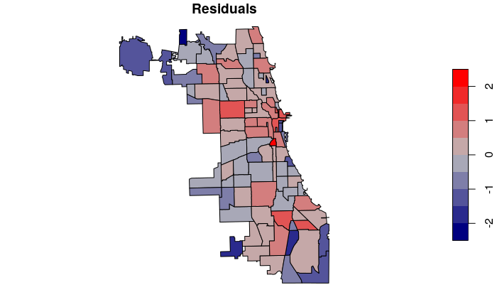
Residuals are the discrepancies between the modeled values and the actual values.
If you see spatial autocorrelation in your residuals, that can be a guide to finding the missing variable(s) and / or can indicate that you need to use a spatial regression technique that considers spatial autocorrelation (see below).
neighborhoods[names(model$residuals), "Residuals"] = model$residuals

plot(neighborhoods["Residuals"], pal=colorRampPalette(c("navy", "gray", "red")))
Spatial Regression
One of the major issues encountered when using multiple regression with geospatial data is that the ordinary least squares algorithm used to build the model assumes that the variables are not autocorrelated, meaning that that there is no correlation between a sequence of values at different parts of the distribution.
Geographical phenomena are very commonly clustered together in space, which means that geospatial variables very commonly exhibit autocorrelation that causes regression model coefficients and outputs to be biased and untrustworthy.
This issue can sometimes be addressed by using one of two regression techniques that incorporates analysis of spatial autocorrelation in the model.
Spatial Lag Regression
Spatial lag regression performs multiple regression modeling by adding a model term that considers diffusion of the dependent variable across adjacent areas (Sparks 2015).
y = ρWY +βX + e
- y is the dependent variable.
- X is the matrix of independent variables.
- β is the vector of regression parameters to be estimated from the data.
- ρ is the autoregressive coefficient, which tells us how strong the resemblance is, on average, between Yi and it's neighbors.
- Y is the matrix of dependent variables.
- W is the spatial weight matrix that indicates indicates which the influence of neighbors.
- e is the error term.
For example, neighborhood demographics may effectively model the number of criminals that live in an area, but they may travel to adjacent neighborhoods to commit their crimes. The spatial lag model may account for that diffusion.
Another example might involve areas with a type of manufacturing that emits a toxic air pollutant that spreads in the wind (diffuses) to adjacent neighborhoods, causing the levels of that pollutant to be spatially autocorrelated. That diffusion can be accounted for by using a spatial lag model. The transport mechanism describing how that pollutant tends to disperse can be incorporated in the weights matrix.
The functions for spatial regression are in the spatialreg library.
- Prior to performing spatial lag regression, you need to create a matrix of neighbors using the dnearneigh() function and a list of weights using the nb2listw() function. This is described above.
- The lagsarlm() function performs the regression. The first parameter is a model specified in the same way as with lm(). The additional parameters (including the list of weights) are specific to spatial lag regression.
library(spatialreg)

model.lag = lagsarlm(log(Rate.2020) ~ log(Median.Household.Income) + Median.Age +
	log(Percent.Foreign.Born), data=neighborhoods,
	listw=weights, tol.solve=1.0e-30, zero.policy=T)

summary(model.lag)
The lag parameter is rho (ρ), which indicates how neighboring dependent variable values are autocorrelated. The positive value (0.317) that is in line with the other model coefficients (-0.89, -0.09, -0.27) indicates that spatial autocorrelation in the dependent variable is important in this model.
The coefficients are similar to the non-spatial model, although the effect of median household income is slightly reduced, while the effect of median age and percentage of foreign born residents is slightly increased.
Call:lagsarlm(formula = log(Rate.2020) ~ log(Median.Household.Income) +
    Median.Age + log(Percent.Foreign.Born), data = neighborhoods,
    listw = weights, zero.policy = T, tol.solve = 1e-30)

Residuals:
     Min       1Q   Median       3Q      Max
-1.99895 -0.43865  0.12673  0.46161  1.82607

Type: lag
Coefficients: (asymptotic standard errors)
                              Estimate Std. Error z value  Pr(>|z|)
(Intercept)                  13.466788   2.416163  5.5736 2.495e-08
log(Median.Household.Income) -0.890744   0.195344 -4.5599 5.118e-06
Median.Age                   -0.092350   0.020943 -4.4095 1.036e-05
log(Percent.Foreign.Born)    -0.269077   0.085888 -3.1329  0.001731

Rho: 0.31715, LR test value: 5.8784, p-value: 0.015328
Asymptotic standard error: 0.11133
    z-value: 2.8487, p-value: 0.0043904
Wald statistic: 8.1148, p-value: 0.0043904

Log likelihood: -106.4956 for lag model
ML residual variance (sigma squared): 0.50285, (sigma: 0.70912)
Number of observations: 98
Number of parameters estimated: 6
AIC: 224.99, (AIC for lm: 228.87)
LM test for residual autocorrelation
test value: 0.0072986, p-value: 0.93192
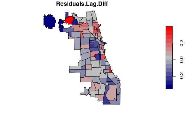
You can map the difference in residuals between the spatial lag and non-spatial model to identify where the spatial model improved model fit (smaller residuals).
neighborhoods[names(model.lag$residuals), "Residuals.Lag"] = model.lag$residuals

neighborhoods$Residuals.Lag.Diff = abs(neighborhoods$Residuals.Lag) - abs(neighborhoods$Residuals)

plot(neighborhoods["Residuals.Lag.Diff"], pal=colorRampPalette(c("navy", "gray", "red")))
Spatial Error Regression
In contrast to the focus of spatial lag regression on autocorrelation in the dependent variable, spatial error regression models spatial interactions in the independent variables that is reflected in the error terms (Eilers 2019).
y = βX + u
u = λWU + e
- y is the dependent variable.
- X is the matrix of independent variables.
- β is the vector of regression coefficients to be estimated from the data.
- u is the error term.
- λ is the autoregressive coefficient, which tells us how strong the autocorrelation of independent variables are with their neighbors.
- W is the spatial weights matrix that indicates indicates which areas are neighbors.
- U is the matrix of error terms.
- e is random error.
Spatial error regression is implemented in the errorsarlm(). function from the spatialreg library. This function uses the same parameters as the lagsarlm() function used for spatial lag regression above.
model.error = errorsarlm(log(Rate.2020) ~ log(Median.Household.Income) + Median.Age +
	log(Percent.Foreign.Born), data=neighborhoods,
	listw=weights, tol.solve=1.0e-30, zero.policy=T)

summary(model.error)
This model gives a set of coefficients that are similar to the spatial lag model above.
With spatial error models, the error term is lambda (λ). As with rho above, the high lambda (0.37829) indicates that spatial autocorrelation is meaningful in this model.
Call:errorsarlm(formula = log(Rate.2020) ~ log(Median.Household.Income) +
    Median.Age + log(Percent.Foreign.Born), data = neighborhoods,
    listw = weights, zero.policy = T, tol.solve = 1e-30)

Residuals:
     Min       1Q   Median       3Q      Max
-2.10397 -0.42299  0.14683  0.43578  1.87910

Type: error
Coefficients: (asymptotic standard errors)
                              Estimate Std. Error z value  Pr(>|z|)
(Intercept)                  17.388013   2.588022  6.7186 1.834e-11
log(Median.Household.Income) -1.231081   0.223678 -5.5038 3.717e-08
Median.Age                   -0.098550   0.024662 -3.9961 6.439e-05
log(Percent.Foreign.Born)    -0.308789   0.106544 -2.8982  0.003753

Lambda: 0.37829, LR test value: 5.8639, p-value: 0.015454
Asymptotic standard error: 0.12215
    z-value: 3.0969, p-value: 0.0019558
Wald statistic: 9.5905, p-value: 0.0019558

Log likelihood: -106.5029 for error model
ML residual variance (sigma squared): 0.49769, (sigma: 0.70547)
Number of observations: 98
Number of parameters estimated: 6
AIC: 225.01, (AIC for lm: 228.87)
Choosing Between Spatial Lag and Spatial Error
You can choose between using spatial lag vs. spatial error based on your understanding of the phenomenon being modeled, although such a choice assumes a level of accurate understanding that will likely not be present if you are performing this kind of modeling.
A more quantifiably justifiable selection method is to choose the model with the best fit. The Akaike information criterion (AIC) is an estimate of model prediction error, with lower values representing better fit (Akaike 1974; Wikipedia 2022). In choosing between two models, the model with the lower AIC is the model with the better fit.
In the examples above, the model summaries indicate that the spatial error model has the lowest AIC, although the difference between the three models is so small that they all fit fairly well. Accordingly, we can say that spatial autocorrelation appears unimportant with this particular set of variables.
- Non-spatial linear model: 228.87
- Spatial lag model: 225.01
- Spatial error model: 224.99
Another option is to use the Lagrange multiplier test (LMT) (i.e. score test). The LMT is implemented in the spatialreg library with the lm.LMtests() function. The model with the lowest Lagrange multiplier value is the best-fitting model.
In the listing below, the LMT is consistent with the AIC comparisons above, where the LM for the error model (LMerr = 5.7009) and the lag model (LMlag = 5.8053) are nearly identical.
The all listing also includes entries for versions of the lag (RLMlag) and error (RLMerr) models that are "robust" to the presence of both lag and error.
lm.LMtests(model, listw=weights, test="all")
	Lagrange multiplier diagnostics for spatial dependence

data:
model: lm(formula = log(Rate.2020) ~
log(Median.Household.Income) + Median.Age +
log(Percent.Foreign.Born), data = neighborhoods)
weights: weights

LMerr = 5.7009, df = 1, p-value = 0.01696


	Lagrange multiplier diagnostics for spatial dependence

data:
model: lm(formula = log(Rate.2020) ~
log(Median.Household.Income) + Median.Age +
log(Percent.Foreign.Born), data = neighborhoods)
weights: weights

LMlag = 5.8053, df = 1, p-value = 0.01598


	Lagrange multiplier diagnostics for spatial dependence

data:
model: lm(formula = log(Rate.2020) ~
log(Median.Household.Income) + Median.Age +
log(Percent.Foreign.Born), data = neighborhoods)
weights: weights

RLMerr = 0.3522, df = 1, p-value = 0.5529


	Lagrange multiplier diagnostics for spatial dependence

data:
model: lm(formula = log(Rate.2020) ~
log(Median.Household.Income) + Median.Age +
log(Percent.Foreign.Born), data = neighborhoods)
weights: weights

RLMlag = 0.45658, df = 1, p-value = 0.4992


	Lagrange multiplier diagnostics for spatial dependence

data:
model: lm(formula = log(Rate.2020) ~
log(Median.Household.Income) + Median.Age +
log(Percent.Foreign.Born), data = neighborhoods)
weights: weights

SARMA = 6.1575, df = 2, p-value = 0.04602