Cancer Data Analysis in R
Cancer is "a disease in which some of the body’s cells grow uncontrollably and spread to other parts of the body" (National Cancer Institute 2021). There are many different types of cancer, and those different types are usually named for the part of the body where the cancer starts. There is a one in three chance that you will have to deal with cancer somewhere in your body in your lifetime (American Cancer Society 2021).
Current and former industrial activities almost always result in the release of toxic chemicals into the environment, some of which are possible or known carcinogens (National Institutes of Health 2018). While plant operators can implement technical and operational procedures to minimize these releases, and governments can implement policies to motivate plant operators to do so, no industrial process can be 100% clean, and industrially-produced toxins are a cost of living in an industrialized society.
Publicly-available geospatial data can be used to investigate potential links between industrial activities and cancer hot spots. While the exact causes of individual cancers are complex and usually unknowable with any meaningful level of certainty, analysis of aggregated data can provide useful insights and pathways for targeting additional (and often scarce) investigatory resources.
This tutorial will cover basic analysis of ZIP Code level cancer registry data, behavioral risk factors, and industrial toxins in the environment using R.
Acquire the Data
Illinois State Cancer Registry
There are three common statistics associated with health conditions like cancer:
- Incidence is the number of new diagnoses within a given area and time period. This is a commonly used statistic with reportable diseases like cancer.
- Prevalence is the number of people who have a particular health condition within a given area and time period. This statistic is commonly used with chronic, manageable health conditions that can last for years, like diabetes or hypertension.
- Mortality is the number of people who die from a health condition within a given area and time period.
Cancer data for this tutorial comes from the Illinois State Cancer Registry, which makes both incidence and mortality data available, although mortality is only published on a state-wide basis. Publicly released disease data is commonly aggregated (summarized by geographic areas) to preserve privacy, while facilitating accurate reporting and analysis.
To get the most spatially-detailed data available (ZIP code), we use the incidence data for this tutorial.
- Go to the Cancer in Illinois: Statistics page.
- Roll over Cancer Incidence and select By ZIP Code.
- Under Select Data, click the top entry, scroll down to the bottom of the list, hold the shift key down, and click the bottom entry to select all year ranges. Note that because cancer is (thankfully) somewhat rare and because there is randomness to where and when cancer occurs, cancer data is commonly aggregated over five-year periods to smooth out this short-term variability.
- Under Cancer Group, select all types of cancer.
- Click Go.
- Ignore the Please enter a zip code message as the page will display all ZIP codes.
- If data rows do not appear, repeat the steps above.
- Under the Actions, click the Excel icon (the "X") to download the .csv file. Depending on your browser configuration, it may automatically place it in your default Downloads directory.
- Create a new working directory (if you haven't already), and move the .csv file to that directory. You may wish to give it a more meaningful name, such as 1994-2018-il-cancer-zip.csv.
American Community Survey
The Census Bureau's American Community Survey (ACS) is an ongoing survey that provides information on an annual basis about people in the United States beyond the basic information collected in the decennial census. The ACS is commonly used by a wide variety of researchers when they need information about the general public.
For this tutorial, we will use a GeoJSON file of commonly-used variables for Illinois ZIP Codes from the 2015-2019 American Community Survey five-year estimates from the US Census Bureau. This data also contains polygons that can be joined with the cancer data for choropleth mapping.
You can download the data and view the metadata here.
Process the Data
Load the Cancer Data
You import the cancer data into R with the read.csv() function.
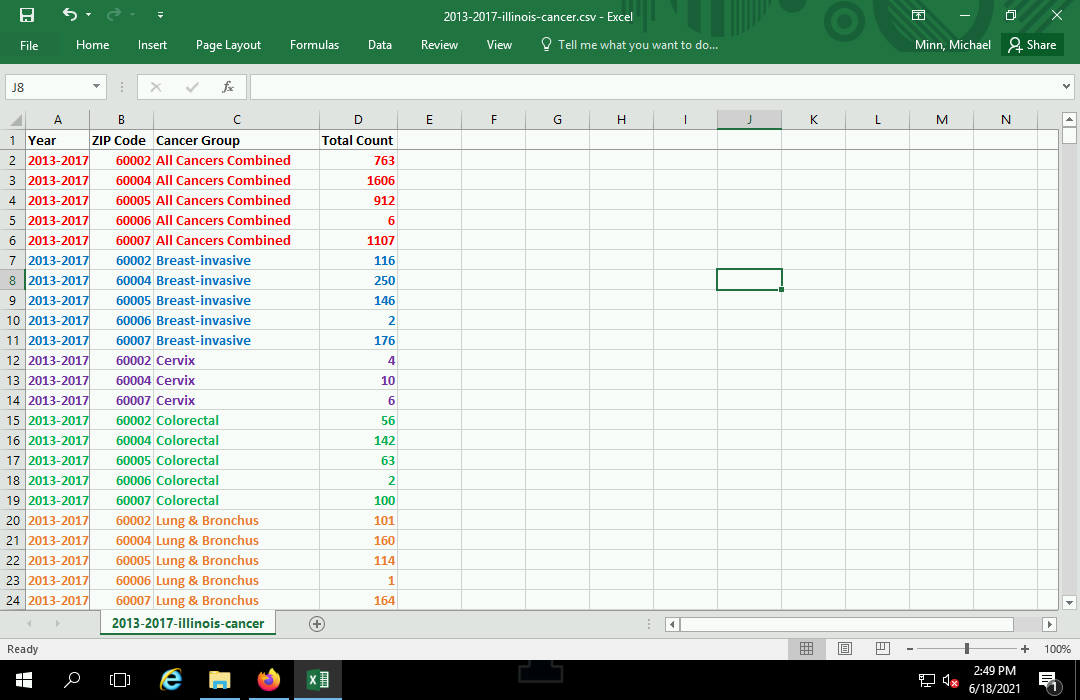
cancer = read.csv("1994-2018-il-cancer-zip.csv", as.is=T)
The names() function will show you the field names available in the data.
names(cancer)

	[1] "Year"         "ZIP.Code"     "Cancer.Group" "Male.Count"   "Female.Count"
	[6] "Total.Count"  "X"
Subset the Cancer Data
This data contains multiple values for each ZIP code representing the different types of cancer during the different time periods of data collection. The data as downloaded from the website is arranged in long format, where there is one column for all data values, with adjacent columns used to specify location (ZIP code) as well as category (type of cancer).
Using the unique() function on the Year and Cancer.Group fields will show you the available year ranges and cancer types, respectively.
The dollar sign ($) is used after the name of the data frame object to select a specific field from that data frame.
unique(cancer$Cancer.Group)

	 [1] "All Cancers Combined"  "All Other Cancers"     "Breast-in situ"
	 [4] "Breast-invasive"       "Cervix"                "Colorectal"
	 [7] "Leukemias & Lymphomas" "Lung & Bronchus"       "Nervous System"
	[10] "Oral Cavity"           "Prostate"              "Urinary System"

unique(cancer$Year)

	[1] "2014-2018" "2009-2013" "2004-2008" "1999-2003" "1994-1998"
In order to get a data frame of cancer rates for a specific type of cancer, you will need to take a subset of the rows in the data associated with the specific year and type of cancer.
- Rows are subsetted using an expression in the form: object[rows, columns].
- In this example, rows must meet the condition that the Cancer.Group field is All Cancers Combined and the Year field is 2014-2018. Note the use of the double equals sign (==) for the comparison, as opposed to the single equalis sign (=) used to assign values to objects.
- The separate conditions are both wrapped in parentheses and connected with the ampersand (&) AND operator, meaning both must be true to select the row.
- The selection of columns is performed with a vector of the desired column names. You need the ZIP.Code field to know where the value is located. With this data set, you have a choice of case count columns: Male.Count, Female.Count, and Total.Count.
cancer.count = cancer[(cancer$Cancer.Group == "All Cancers Combined") & (cancer$Year == "2014-2018"),
	c("ZIP.Code", "Total.Count")]

head(cancer.count)

	  ZIP.Code Total.Count
	1    60002         763
	2    60004        1583
	3    60005         941
	4    60006           5
	5    60007        1160
	6    60008         619
Load the ACS Data
The American Community Survey data downloaded above provides both spatial polygons associated with each ZIP Code in the cancer data, as well as demographic information for each of those ZIP Code areas.
The file can be loaded with the st_read() function from the sf library.
library(sf)

acs = st_read("2015-2019-acs-il_zcta.geojson", stringsAsFactors=F)
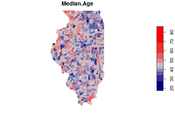
A plot() of one of the fields gives you a preview of the data.
- border=NA turns off the black borders so small areas are not obscured.
- pal=colorRampPalette(c("navy", "lightgray", "red"))) defines the color ramp (range of colors) used to map the values. These range from navy blue for low values, light gray for middle values, and red for high values.
plot(acs["Median.Age"], border=NA, pal=colorRampPalette(c("navy", "lightgray", "red")))
Join the Cancer and ACS Data
A join is an operation where two data frames are combined based on common key values.
The merge() function can be used to join the cancer data and the ACS data based on a common key of ZIP Code specified in the by parameters. In this case, the ACS data uses the Name field while the cancer data uses the ZIP.Code field.
zip.codes = merge(x = acs, y = cancer.count, by.x = "Name", by.y = "ZIP.Code")
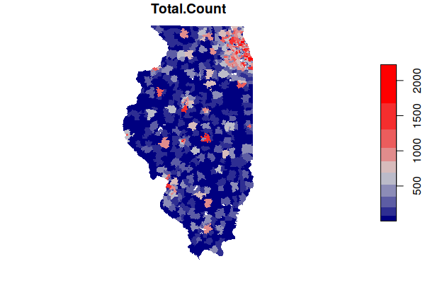
As with the ACS data, you can now plot the total counts of cancer by ZIP Code.
Note that this is largely a map of population, since places with more people tend to have more cancer. Conversion to rates for comparison is discussed below.
plot(zip.codes["Total.Count"], border=NA, pal=colorRampPalette(c("navy", "lightgray", "red")))
Calculating Crude Rates
The map of cancer counts above shows that most cancer occur where there are more people. This data on its own is not particularly useful, since it is largely data about where more people live.
Of greater interest in epidemiology is the rate of cancer rather than the absoute count, since we usually want to know where there are more cancer cases than you would expect for the size of the population.
Rates in general are often expressed as percents (per 100 residents). But with comparatively rare health conditions like cancer, disease rates are expressed in annual cases per 100,000 residents (per 100k) so the numbers are more readable as whole numbers (e.g. 200 per 100k is easier to read than 0.2%).
Since the ACS data contains population values, we can calculate the rate by dividing by population, multiplying by 100,000 (to get the per 100k) and dividing by five (since the counts are total counts over a five year period).
This rate is called a crude rate because it is calculated with simple division and does not take into account any differences in demographic characteristics between areas.
There may be some cases where cancer cases are reported in ZIP Codes where there is zero population. Dividing by zero in R results in an infinite value, which can confuse the statistical functions used below. The second line below sets any infinite values to NA.
zip.codes$Crude.Rate = zip.codes$Total.Count * 100000 / zip.codes$Total.Population / 5

zip.codes$Crude.Rate[is.infinite(zip.codes$Crude.Rate)] = NA
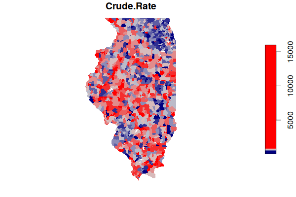
This map of rates shows a much more complex landscape, with the populous (and comparatively affluent) suburbs around Chicago actually showing lower rates than some sparsely-populated rural areas around the state.
plot(zip.codes["Crude.Rate"], border=NA, breaks="quantile",
	pal=colorRampPalette(c("navy", "lightgray", "red")))
Estimated Rates
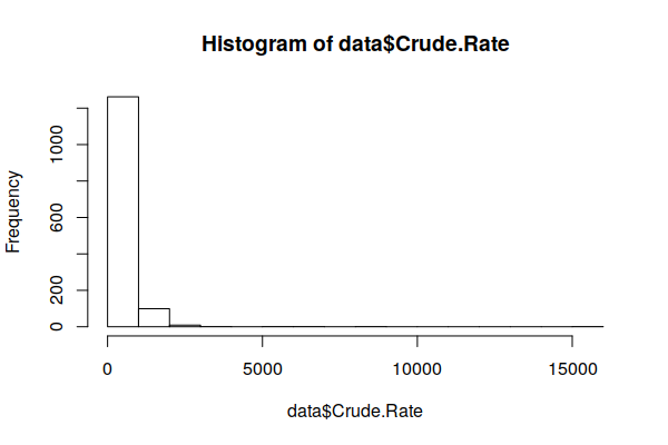
Disease rates ordinarily follow a normal distribution (bell curve). However, when we use the hist() function to create a histogram showing the distribution of values, we see the curve is strongly skewed to the right.
hist(zip.codes$Crude.Rate)
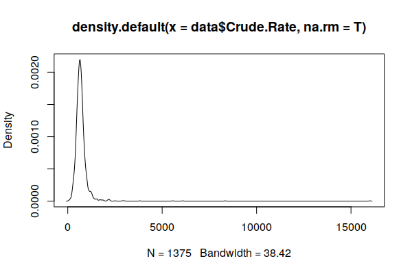
A plot() of a smoothed density() curve is another way to visualize a distribution that makes the skewing clearer.
plot(density(zip.codes$Crude.Rate, na.rm=T))
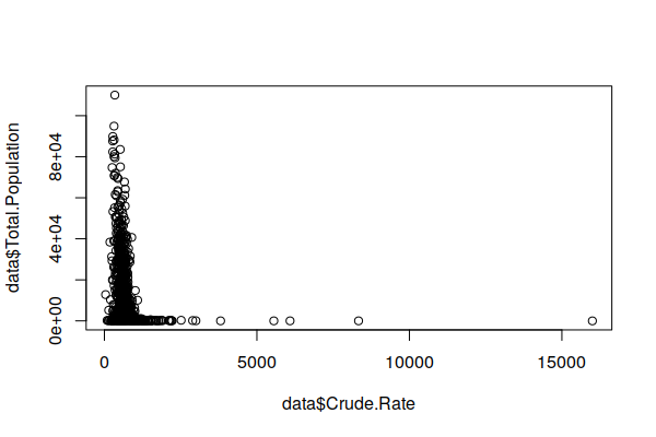
Because cancer is rare and many ZIP Codes have small populations, one or two cancer cases in a ZIP Code can cause the cancer rate to be exceptionally high, and an absence of cases can make an area appear to be a cancer-free paradise. This issue is referred to as the small numbers problem (BioMedware 2011) or variance instability (Anselin 2018).
This exaggeration of variance in sparsely populated areas is visible in an X/Y scatter chart comparing population and crude rates. Note that the most extreme rates (high and low) stretch along the bottom of the chart in low population ZIP Codes.
plot(zip.codes$Crude.Rate, zip.codes$Total.Population)
Because areas with high crude rates may indeed be areas of concern, we do not want to discard those areas as outliers or use a log transform to indiscriminantly squeeze all high rate areas into normality.
There are a variety of techniques for addressing this issue, although none can be seen as universal solutions for making high certainty inferences from the limited data available in low population areas ( Wang, Guo, and McLafferty 2012; Przbysz and Bunch 2017).
One technique developed by Marshall (1990) and available in the spdep library is empirical Beyes estimation, which calculates overall distribution (priors) from the data, and then shrinks the values in low population areas to conform to that distribution around the global mean. For a more detailed explanation of empirical Beyes estimation, see Robinson (2015), Anselin (2018), and Klaas (2019).
If you have not already installed the spdep package, you should do so.
install.packages("spdep")
The EBest() function from the spdep package creates a smoothed estimate of counts based on population values and raw counts.
- The population values to EBest() cannot be zero, so a copy of the zip.codes data frame is created with only rows that have a nonzero population.
- The estmm column from the matrix returned by EBest() contains the smoothed proportion of residents expected to be diagnosed with cancer in the five year period on a scale of zero to one. This is converted into per 100k by multiplying by 100,000 and divided by five to get the annual rate.
- The estimated value is added as a column to the original data frame using the merge() function.
library(spdep)

estimator = zip.codes[zip.codes$Total.Population > 0, ]

estimate = EBest(estimator$Total.Count, estimator$Total.Population)

estimator$Estimated.Rate = 100000 * estimate$estmm / 5

zip.codes = merge(zip.codes, st_drop_geometry(estimator[c("Name", "Estimated.Rate")]))
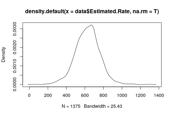
A plot() of the density() curve shows a distribution that is much closer to the expected normal distribution.
plot(density(zip.codes$Estimated.Rate, na.rm=T))
Estimating Age-Adjusted Rates
Like most diseases, cancer risk tends to increase as you get older (National Institutes of Health 2014).
We can see this fairly clearly on an X/Y scatter plot comparing the percent of 65+ with the (estimated) crude rate, with a rough pattern going upward from left to right.
The lm() function can be used to create a simple linear model of cancer rates as a function of age (weighted by population). The output of the model is passed to the abline() function to draw a regression line on the plot.
plot(x = zip.codes$Median.Age, y = zip.codes$Estimated.Rate, col="#00000040")

model = lm(Estimated.Rate ~ Median.Age, weight = Total.Population, data=zip.codes)

abline(model, col="navy", lwd=3)
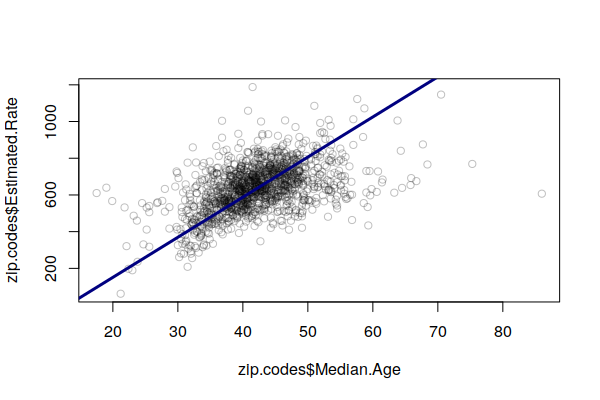
Accordingly, areas with high cancer crude rates tend to simply be areas with larger numbers of older residents, and this obscures other issues that may be increasing cancer risk in different areas.
A common technique used in epidemiology to address this issue is to modify rates based on the proportions of residents in different age groups, so that rates across areas can be compared to consider factors other than whether some areas have unusually high numbers of older (or younger) residents.
Age-adjusted rates have been modified to reflect what the rate would be if the distribution of ages in the population matched a standard population distribution, usually the 2000 U.S. standard population for rates calculated in the USA.
Rigorous calculation of age-adjusted rates requires a detailed breakdown of the ages of people diagnosed with cancer, which is not publicly available in Illinois. However, the linear model output from the lm() function can be used to create a estimated age adjustment.
In this case the coefficient from median age term in the model represents the number of cases per 100k that increase for each year that the median age in an area increases. Basing our formula off the weighted mean for the median age, for every year that the median age in a ZIP Code is above the mean for the state of Illinois (38.6), cases per 100k increase by 23.
model = lm(Estimated.Rate ~ Median.Age, weight = Total.Population, data=zip.codes)

national.median.age = 35.3

age.adjustment = model$coefficients[2] * (zip.codes$Median.Age - national.median.age)

zip.codes$Age.Adjusted.Rate = zip.codes$Estimated.Rate - age.adjustment

zip.codes$Age.Adjusted.Rate[zip.codes$Age.Adjusted.Rate < 0] = NA

weighted.mean(zip.codes$Age.Adjusted.Rate, zip.codes$Total.Population, na.rm=T)

	[1] 485.3436
The weighted mean of this adjusted rate for both sexes across the state is consistent with the published rates of 503.6 for men and 444.5 for women (IDPH 2021).
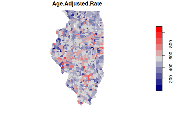
A map of the estimated age-adjusted rates is much more complex than the map of crude rates.
plot(zip.codes["Age.Adjusted.Rate"], border=NA,
	pal=colorRampPalette(c("navy", "lightgray", "red")))
Save a GeoJSON File
It may be helpful to save this processed data to a GeoJSON file in case you need it in the future and either can't get the original data files or don't want to re-run all the processing steps.
st_write(zip.codes, "2021-minn-all-cancers.geojson", delete_dsn=T)
Data Summary
You can view a summary of the fields in the combined data set using the summary() function.
print(summary(zip.codes))

	     Name           FactFinder.GEOID       FIPS                ST
	 Length:1375        Length:1375        Length:1375        Length:1375
	 Class :character   Class :character   Class :character   Class :character
	 Mode  :character   Mode  :character   Mode  :character   Mode  :character

	    Latitude       Longitude       Square.Miles   Pop.per.Square.Mile
	 Min.   :37.07   Min.   :-91.42   Min.   :  0.0   Min.   :    0.14
	 1st Qu.:39.26   1st Qu.:-89.74   1st Qu.:  8.0   1st Qu.:   20.90
	 Median :40.56   Median :-88.99   Median : 32.0   Median :   55.42
	 Mean   :40.38   Mean   :-89.01   Mean   : 40.2   Mean   : 1317.70
	 3rd Qu.:41.68   3rd Qu.:-88.13   3rd Qu.: 58.0   3rd Qu.:  695.70
	 Max.   :42.48   Max.   :-87.55   Max.   :265.0   Max.   :44498.00
							  NA's   :61
				...

	Percent.No.Vehicle Percent.No.Vehicle.MOE  Total.Count       Crude.Rate
	 Min.   :  0.000    Min.   :  0.300        Min.   :   1.0   Min.   :   40.57
	 1st Qu.:  1.800    1st Qu.:  1.600        1st Qu.:  25.0   1st Qu.:  541.01
	 Median :  3.800    Median :  2.500        Median :  65.0   Median :  656.28
	 Mean   :  5.801    Mean   :  5.805        Mean   : 257.4   Mean   :  716.98
	 3rd Qu.:  6.800    3rd Qu.:  4.400        3rd Qu.: 334.0   3rd Qu.:  783.69
	 Max.   :100.000    Max.   :100.000        Max.   :2226.0   Max.   :16000.00
	 NA's   :1          NA's   :1

	 Estimated.Rate             geometry
	 Min.   :  59.81   MULTIPOLYGON :1375
	 1st Qu.: 546.02   epsg:4326    :   0
	 Median : 630.34   +proj=long...:   0
	 Mean   : 627.79
	 3rd Qu.: 706.67
	 Max.   :1294.51
Analyze the Data
Mean Rate
With health conditions, we commonly want to know what the normal rates are so that we can give added attention to groups of people or areas where the rates are above normal.
With a collection of values, the common approach is to find the mean (average) value, which can be done in R using the mean() function.
mean(zip.codes$Crude.Rate, na.rm=T)

	[1] 716.983
However, because the population is not evenly distributed across different ZIP Codes, this mean may not be valid. One option for addressing this situation is to use the weighted.mean() function that increases or decreases each value's contribution to the mean calculation based on a weighting value. In this case we can use the Total.Population field as a weight.
weighted.mean(x = zip.codes$Crude.Rate, w = zip.codes$Total.Population)

	[1] 554.2852
The weighted mean of the estimated rates is slightly different because of the modifications introduced by the empirical Beyes estimation algorithm.
weighted.mean(x = zip.codes$Estimated.Rate, w = zip.codes$Total.Population, na.rm=T)

	[1] 550.3392
And, as indicated earler, the weighted mean of the age-adjusted rates is significantly lower because age-adjustment lowers the rates in ZIP Codes with high percentages of older residents.
weighted.mean(x = zip.codes$Age.Adjusted.Rate, w = zip.codes$Total.Population, na.rm=T)

	[1] 485.3436
Correlations
One of the primary advantages of spatial data is being able to identify correlation between different characteristics of different areas.
While simple correlation between two characteristics does not prove that one characteristic causes the other, identification of correlation can be used as a starting point to more deeply examine relationships between characteristics that can lead to useful insights and proposals for addressing social challenges.
This analysis lists correlation between our cancer rate and all other numeric variables in the data set.
- The Filter() function is used to create a data frame that contains only numeric variables identified with the function is.numeric(). Correlation does not apply to non-numeric values like names.
- The second line uses grepl() to keep columns that do not (the ! symbol) have names that indicate that they are margin of error columns (MOE).
- The st_drop_geometry() removes the polygons information from the data, since polygons can't be tested for correlation.
- The cor() function creates a vector of correlations between the cancer rate variable (zip.codesdata$All.Cancers.per.100k) and all other columns in the data. The use="pairwise.complete.obs" parameter ignores any missing (NA) values.
- The t() function transposes the vector into a matrix that is then squared to convert correlations into R2 values. The round() function then rounds the values to three decimal places so they are easier to read.
- The order() function with the decreasing=T parameter is used to calculate a list of row numbers where the values in those rows are sorted in decreasing order (high to low). Those row numers are then used as an index into the correlation matrix to sort it from high to low.
numerics = Filter(is.numeric, zip.codes)

numerics = numerics[,!grepl("MOE", names(numerics))]

numerics = st_drop_geometry(numerics)

correlations = cor(numerics$Estimated.Rate, numerics, use="pairwise.complete.obs")

correlations = t(round(correlations, 3))

correlations = correlations[order(correlations, decreasing=T),]

print(head(correlations, n=10))

             Estimated.Rate                  Median.Age
                      1.000                       0.494
            Percent.65.Plus    Old.age.Dependency.Ratio
                      0.445                       0.422
                 Crude.Rate           Age.Adjusted.Rate
                      0.420                       0.408
       Age.Dependency.Ratio            Percent.Disabled
                      0.328                       0.303
         Percent.Homeowners Percent.Drove.Alone.to.Work
                      0.296                       0.281


print(tail(correlations, n=10))

	   Pop.per.Square.Mile       Total.Households Average.Household.Size
			-0.335                 -0.337                 -0.344
	Grad.School.Enrollment        K.12.Enrollment       Total.Population
			-0.352                 -0.355                 -0.364
	  Percent.Foreign.Born   Undergrad.Enrollment     Enrolled.in.School
			-0.375                 -0.376                 -0.397
	   Women.Aged.15.to.50
			-0.405
Notably, the strongest positive correlations are associated with higher percentages of older residents, such as Median.Age and Percent.65.Plus.
Conversely, the strongest negative correlations are associated with higher percentages of younger residents, such as school enrollment, renters, and women of reproductive age.
Spatially, rates correlate positively with ZIP Code area size, and negatively with overall population and population density. This may reflect a tendency toward higher rates in low-population rural areas, although since rural areas also tend to be older, this may just be another correlation wit age.
Hot Spots
Similar disease rates tend to cluster together in space. These clusters can represent common social norms for risky behaviors (like smoking or diet) or from naturally-occurring or man-made carcinogens in the environment. The randomness of disease incidence can obscure such clustering.
Autocorrelation is the formal term for clustering of similar values, and spatial autocorrelation is the formal term for clustering of similar values in close proximity on the surface of the earth.
The Getis-Ord GI* statistic was developed by Arthur Getis and J.K. Ord and introduced in 1992. This algorithm locates areas with high values that are also surrounded by high values. However, unlike simple observation or techniques like kernel density analysis, this algorithm uses statistical comparisons of all areas to create p-values indicating how probable it is that clusters of high values in a specific areas could have occurred by chance. This rigorous use of statistics makes it possible to have a higher level of confidence (but not complete confidence) that the patterns are more than just a visual illusion and represent clustering that is worth investigating.
- The is.finite() function is used to subset only valid rates (not infinite and not NA).
- The st_centroid() function gets the centroid points of the ZIP Code areas.
- The dnearneigh() function creates an object containing information about the distance from each point to its neighbors.
- The d2 = 50 parameter indicate to consider neighbors as points within 50 kilometers of each other. This can be increased or decreased to adjust the smoothing based on what is considered a neighboring area.
- The nb2listw() function creates a matrix of weights based on neighbor relationships.
- the localG() function calculates the Getis-Ord GI* statistic.
library(spdep)

getis.ord = zip.codes[is.finite(zip.codes$Age.Adjusted.Rate),]

centroids = st_centroid(st_geometry(getis.ord))

neighbors = dnearneigh(as_Spatial(centroids), d1 = 0, d2 = 30)

weights = nb2listw(neighbors, zero.policy=T)

getis.ord$Getis.Ord = localG(getis.ord$Age.Adjusted.Rate, weights)
The Getis-Ord GI* statistic is a z-score on a normal probability density curve indicating the probability that an area is in a cluster that did not occur by random chance. A z-score of 1.282 represents a 90% probability that the cluster did not occur randomly, and a z-score of 1.645 represents a 95% probability.
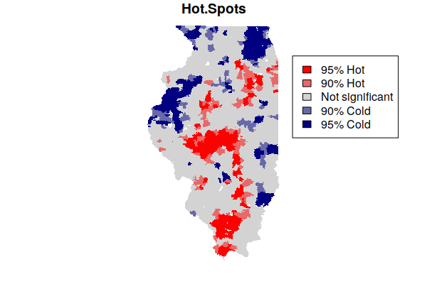
The Getis-Ord GI* statistic is commonly converted to classes for mapping.
- The breaks object is a vector of z-scores separating the five different classes.
- The cut() function places each area in one of the five classes depending on where the value is within a pair of breaks.
- The as.numeric() converts those classes to numbers (1 - 5) for easier mapping.
breaks=c(-4, -1.645, -1.282, 1.282, 1.645, 4)

getis.ord$Hot.Spots = as.numeric(cut(getis.ord$Getis.Ord, breaks))
The hot and cold spots can then be mapped.
- The colorRampPalette() function is used to create five standard mapping colors, with shades of blue for cold spots, shades of red for hot spots, and gray for area that are in neither.
- The plot() draws the map.
- A legend() is needed to explain the categories to readers.
colors = colorRampPalette(c("navy", "lightgray", "red"))(5)

plot(getis.ord["Hot.Spots"], border=NA, pal=colors, key.pos=NULL)

legend(x="topright", fill=rev(colors),
	legend=c("95% Hot", "90% Hot", "Not significant", "90% Cold", "95% Cold"))
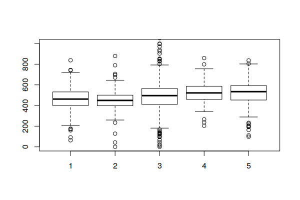
Note that being in a hot spot does not necessarily mean that all rates within the hot spot are high. Rather, this indicates that the general level across a hot spot is high, while some areas within the hot spot may be low. This box plot showing the distribution of rates within the five hot/cold spot categories varies widely, although the values in the 95% hot spots (category 5) are generally higher than the values in the 95% cold spots (category 1).
boxplot(Age.Adjusted.Rate ~ Hot.Spots, data=getis.ord, ylim=c(0, 1000))
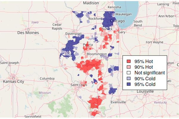
Mapping Hot Spots over a Base Map
Since hot and cold spots are specific areas that deserve attention, a map needs some geographic context so readers know where those spots are.
A common technique for providing geographic context for area maps is to plot the areas on top of a base map that shows notable human and environmental features like cities and rivers.
The OpenStreetMap library provides functions for accessing base map tiles from OpenStreetMap (OSM), which is a common open source geographic information source. OpenStreetMap is like Wikipedia for geospatial data.
- The openmap() function loads the base map from OpenStreetMap based on the area defined by the upperLeft and lowerRight point coordinates.
- The zoom=6 parameter specified the zoom level for the map. You may need to decrease this if the map features are too small or increase it if they are too large (or fuzzy).
- plot(basemap) the base map first so the hot spots sit on top of it.
- The st_transform() function changes the projection of the geographic data. A projection is how the three-dimensional world is displayed on a two-dimensional map. OSM uses the spherical mercator projection common to most web maps.
- The colors are modified here to be semi-transparent, so that the base map features can be seen through the areas. Note that the middle color is completely transparent so that areas that are not hot or cold spots are not visible.
- A legend() is needed to explain meaning of the colors.
library(OpenStreetMap)

basemap = openmap(upperLeft = c(43, -95.5), lowerRight = c(37, -83.5), zoom=6)

plot(basemap)

getis.ord = st_transform(getis.ord, osm()@projargs)

colors = c("#000080a0", "#00008040", "#00000000", "#ff000040", "#ff0000a0")

plot(getis.ord["Hot.Spots"], border=NA, pal=colors, key.pos=NULL, add=T)

legend(x="bottomright", fill=rev(colors), bg="white",
	legend=c("95% Hot", "90% Hot", "Not significant", "90% Cold", "95% Cold"))
Mapping Hot Spots in ArcGIS Online
You can export your hot spots to a geoJSON file and import them into ArcGIS Online for interactive mapping and exploration. The st_transform() function is needed here to put the hot spot features back into latitude and longitude rather than the projection used by OSM.
getis.ord = st_transform(getis.ord, 4326)

st_write(getis.ord, "2021_minn_cancer_hot_spots.geojson", delete_dsn=T)
When you have exported your GeoJSON file, you can upload it into a new ArcGIS Online map.
- From your ArcGIS Online home page, create a new Map.
- If you are placed in the "new" map viewer, select "Open in Map Viewer Classic" at the top of the page.
- Select Add and Add Layer from File.
- Upload the GeoJSON file of hot spots.
- Under Choose and attribute to show, select the Hot.Spots attribute.
- Under Select a drawing style, select Types (Unique Symbols) and modify the options.
- Click each color to select the standard hot spot colors for each numeric category value.
- Click each label and give it an name reflecting the type of hot spot and probability.
- Reorder the symbols from hot to cold.
- Click Done so your changes are confirmed.
- Click the ellipsis (...) beside the layer and set the transparency to 50% so the base map is visible below the hot spot features.
- Save the map under a meaningful name.
- Click Share and share with Everyone to get a shared link.