Geographic Correlation and Causation
Revised 2 February 2026
Correlation is "a relation existing between phenomena or things or between mathematical or statistical variables which tend to vary, be associated, or occur together in a way not expected on the basis of chance alone" (Merriam-Webster 2019).
The analysis of correlation is one of the most common and useful tools in statistics. However, it is also very easy to confuse correlation and causation. Accordingly, correlation is also a useful but dangerous tool in the analysis of spatial data.
Mapping Spatial Correlation
When we look at maps of two related variables, we will often notice that they look similar: the areas with high levels on one map are high on the other map, and the low areas on one map are low on the other map.
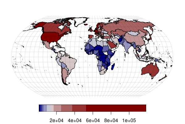
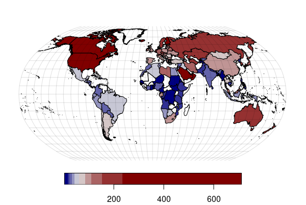
For example, these are maps of GDP per capita (a rough estimate of how wealthy people in a country are) and energy use per capita. In general, the more money people have, the more energy they use to travel, purchase material goods, or heat/air condition their buildings. That is evident by the strong similarity between these two maps:
While visual comparison of maps is helpful for detecting correlation, it is not particularly useful for rigorously determining how strong that relationship is, especially if the patterns are complex. For that, you need to use scatter charts and regression.
library(sf)

countries = st_read("https://michaelminn.net/tutorials/data/2022-world-data.geojson")

graticule = st_graticule(lon = seq(-180, 180, 10), lat=seq(-80, 80, 10))

world_robinson = "+proj=robin +lon_0=0 +x_0=0 +y_0=0 +datum=WGS84 +units=m +no_defs"

countries = st_transform(countries, world_robinson)

graticule = st_transform(graticule, world_robinson)

par(mar=c(0,0,0,0))

america = colorRampPalette(c("#000080", "#e0e0e0", "#800000"))

plot(countries["GDP.per.Capita"], pal=america, breaks="quantile", reset=F, key.pos=1, main="")

plot(graticule$geometry, col="#00000020", add=T)

plot(countries["MM.BTU.per.Capita"], pal=america, breaks="quantile", reset=F, key.pos=1, main="")

plot(graticule$geometry, col="#00000020", add=T)
Positive vs. Negative Correlation
Correlation is commonly visualized using an X/Y scatter chart, where one variable is plotted on the X axis and the other on the Y axis. If there is a correlation, the plotted points will form a clear pattern from left to right.
Positive Correlation
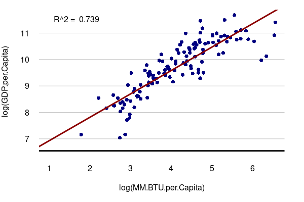
A positive correlation means that as one variable goes up, the other goes up as well. When two variables with a positive correlation are plotted on the two axes of an X/Y scatter chart, the points form a rough line or curve upward from left to right.
For example, in the aforementioned strong correlation between GDP per capita and energy use per capita, the correlation is positive:
library(sf)

countries = st_read("https://michaelminn.net/tutorials/data/2022-world-data.geojson")

par(mar=c(5,4,1,2))

plot(log(GDP.per.Capita) ~ log(MM.BTU.per.Capita), data=countries,
	col="navy", pch=16, las=1, fg="white")

model = lm(log(GDP.per.Capita) ~ log(MM.BTU.per.Capita), data=countries)

abline(model, col="darkred", lwd=3)

legend("topleft", bty="n", legend=paste("R^2 = ", round(summary(model)$r.squared, 3)))

grid(nx=NA, ny=NULL, lty=1, col="#00000040")

abline(h=par("usr")[3] + 0.1, lwd=3)
Negative Correlation
A negative correlation means that as one variable goes up, the other goes down. When two variables with a negative correlation are plotted on the two axes of an X/Y scatter chart, the points form a rough line or curve downward from left to right.
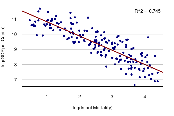
Using our prior example, there is a negative geographic correlation between GDP per capita and infant mortality. Wealthier countries tend to have better nutrition, medical care, and social order than poorer countries. The wealthier the country, the lower the chance that a child will make it past their first birthday.
library(sf)

countries = st_read("https://michaelminn.net/tutorials/data/2022-world-data.geojson")

par(mar=c(5,4,1,2))

plot(log(GDP.per.Capita) ~ log(Infant.Mortality), data=countries,
	col="navy", pch=16, las=1, fg="white")

model = lm(log(GDP.per.Capita) ~ log(Infant.Mortality), data=countries)

abline(model, col="darkred", lwd=3)

legend("topright", bty="n", legend=paste("R^2 = ", round(summary(model)$r.squared, 3)))

grid(nx=NA, ny=NULL, lty=1, col="#00000040")

abline(h=par("usr")[3] + 0.1, lwd=3)
plot(log(Infant.Mortality) ~ log(GDP.per.Capita), data=countries, pch=16, col="navy")

model = lm(log(Infant.Mortality) ~ log(GDP.per.Capita), data=countries)

abline(model, col="darkred", lwd=3, untf=T)

legend("topright", bty="n", legend=paste("R^2 = ", round(summary(model)$r.squared, 3)))
Strong vs. Weak Correlation
Strong Correlation
When there is a strong correlation between two variables, the pattern of dots on an X/Y scatter chart will cluster tightly together in a clear line from the left to right sides of the chart.
The strength of this correlation can be quantified as R2, the coefficient of determination.
Evaluation of R2 to determine whether correlation should be considered strong or not on the type of phenomena being studied.
- The range of R2 is from 0.000 (no correlation) to 1.000 (perfect correlation).
- In the natural sciences, values above 0.600 are often expected from variables that are strongly correlated.
- In the social sciences where relationships often involve the complex interplay of ambiguous factors, values in the 0.200s or 0.300s can be considered meaningful for further investigation.
For example, there is a strong correlation between GDP per capita and energy consumption per capita by country. Residents in countries at a higher level of development use more energy for transportation, heating/cooling, food, appliances, etc.
Weak Correlation
When there is a weak correlation between two variables, the pattern of dots on an X/Y scatter chart will be spread out across the chart with only a vague linear pattern.
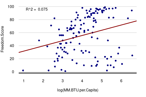
For example, the graph below shows that there is a weak correlation between GDP per capita and the level of political freedom as indexed by Freedom House.
An outlier is "a statistical observation that is markedly different in value from the others of the sample" (Merriam-Webster 2022). Weakly correlated variables often have numerous outliers fall outside the general linear pattern on an X/Y scatter chart.
For example, while wealthier countries tend to be a bit more free politically, there
are distinct outliers that are wealthy but not free (Saudi Arabia: GDP/capita = $46.7k, freedom = 7)
or poor but free (Uruguay: GDP/capita = $22.7k, freedom = 98).
library(sf)

countries = st_read("https://michaelminn.net/tutorials/data/2022-world-data.geojson")

par(mar=c(5,4,1,2))

plot(Freedom.Score ~ log(MM.BTU.per.Capita), data=countries,
	col="navy", pch=16, las=1, fg="white")

model = lm(Freedom.Score ~ log(MM.BTU.per.Capita), data=countries)

abline(model, col="darkred", lwd=3)

legend("topleft", bty="n", legend=paste("R^2 = ", round(summary(model)$r.squared, 3)))

grid(nx=NA, ny=NULL, lty=1, col="#00000040")

abline(h=par("usr")[3] + 1, lwd=3)
No Correlation
When two variables with no correlation are plotted on the two axes of an X/Y scatter chart, the points form a diffuse cloud with no obvious line pattern.
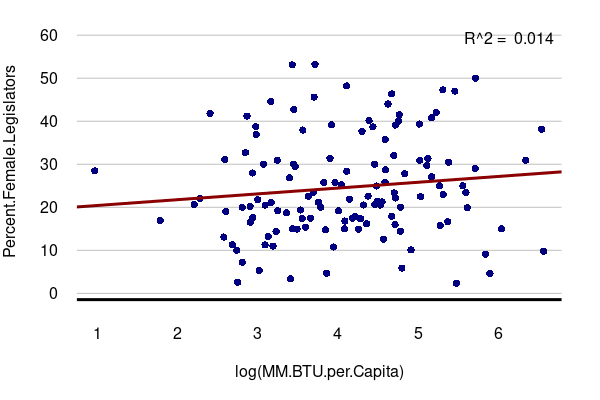
A rule of thumb is that R2 values below 0.1 indicate an absence of any meaningful correlation.
For example, there is no correlation between GDP per capita and the proportion of seats held by women in the national legislature. There are wealthy countries such as Sweden that have a high percentage of female legislators and there are poor countries like Rwanda that also have a high percentage of female legislators.
plot(Percent.Female.Legislators ~ log(GDP.per.Capita), data=countries, pch=16, col="navy")

model = lm(Percent.Female.Legislators ~ log(GDP.per.Capita), data=countries)

abline(model, col="darkred", lwd=3, untf=T)

legend("topright", bty="n", legend=paste("R^2 = ", round(summary(model)$r.squared, 3)))


library(sf)

countries = st_read("https://michaelminn.net/tutorials/data/2022-world-data.geojson")

par(mar=c(5,4,1,2))

plot(Percent.Female.Legislators ~ log(MM.BTU.per.Capita), data=countries,
	col="navy", pch=16, las=1, fg="white")

model = lm(Percent.Female.Legislators ~ log(MM.BTU.per.Capita), data=countries)

abline(model, col="darkred", lwd=3)

legend("topright", bty="n", legend=paste("R^2 = ", round(summary(model)$r.squared, 3)))

grid(nx=NA, ny=NULL, lty=1, col="#00000040")

abline(h=par("usr")[3] + 1, lwd=3)
Temporal Correlation
The examples given above involve spatial correlation between values that represent multiple areas or locations at a single point in time.
Correlation can analyzed as temporal (time) correlation between variables measured in a single location at multiple points or time.
For example, in the United States, gross domestic product (adjusted for inflation) in each year historically has correlated strongly with electricity generation.
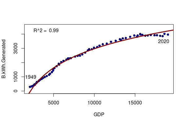
x = read.csv("2022-gdp-vs-electricity.csv")

plot(B.kWh.Generated ~ GDP, data=x, pch=16, col="navy", ylim=c(0,4500))

labels = x[x$Year %in% c(1949, 2020),]

model = lm(B.kWh.Generated ~ log(GDP), data=x)

regression = data.frame(GDP = seq(1000,20000,500))

regression$B.kWh.Generated = predict(model, regression)

lines(B.kWh.Generated ~ GDP, data=regression, type="l", col="darkred", lwd=3)

legend("topleft", bty="n", legend=paste("R^2 = ", round(summary(model)$r.squared, 3)))

text(x = c(2200, 18500), y = c(1000, 3500), labels=c(1949, 2020))
Logical Limitations: Problems Of Interpretation
The Post Hoc Fallacy
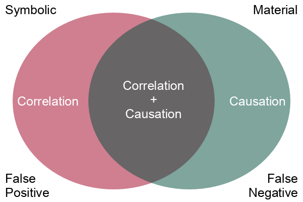
While correlation may be interesting, what we are usually more interested in is causation. Correlation is a simple mathematical relationship between two variables, but causation means that there is a material cause-and-effect relationship between the two phenomenon we are measuring with our variables.
Correlation is empirical (based on observation), and causation is based on reason. When we observe two phenomena occurring together and we observe that there is some mechanism connecting the two phenomena, we use reason and logic to tie those two phenomena together in a cause and effect relationship.
Assuming that correlation proves causation is the post hoc fallacy, from the Latin phrase post hoc ergo propter hoc (after this, therefore because of this). A logical fallacy is an often plausible argument using false or invalid inference.
Correlation points to possible causal relationships, but does not prove them, and there are a variety of logical arguments to show how making a simple assumption that correlation is causation will lead you astray. Determining whether there is a cause-and-effect relationship requires more sophisticated techniques and domain knowledge beyond simple mathematical correlation.
Covariates
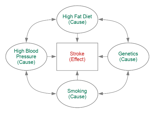
Covariates are additional independent variables that might influence the dependent variable.
For example, stroke risk correlates smoking rates, but stroke risk also correlates with a wide range of other factors like diet, high blood pressure, family history, that also correlate with each other. Separating out how much each factor contributes to stroke risk requres in-depth subject area knowledge and contextual information beyond simple mathematical correlations.
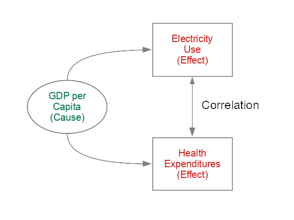
Confounders: The Third Variable Problem
Two variables that correlate with each other may individually have causation rooted in a third variable. In complex systems, these indirect relationships are often hard to identify and are referred to as confounding.
For example, per capita health expenditures is strongly correlated with per capita electricity use. In this case the electricity use is not caused by health expenditures or vice versa. Both of those two variables are correlated with economic development - a third variable which is more-reflective of the causes of increase electricity use and increased health care expenditures.
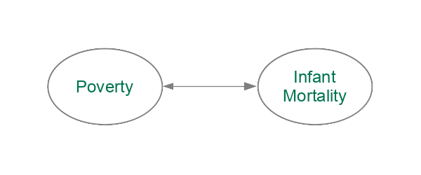
Asymmetry: Which is the Cause and Which is the Effect?
Reverse causation is when the assumed cause in a cause-and-effect relationship is actually the effect. For example, if a recreational drug user also has symptoms of mental illness, the assumption that the drug use is causing the mental illness may be reversed - the person may be self-medicating to attempt to ameliorate the symptoms of pre-existing mental illness.
Simultaneity occurs when cause and effect occur together, often in a feedback loop. For example, children from wealthy families often have opportunities to get into more-presitgious schools which improves their chances of being wealthy and passing on those advantages to their own children. Wealth causes improved educational opportunity which causes wealth.
Correlation shows the regularity of the relationship between two variables, but does not indicate which is the cause and which is the effect. This can often be seen as the classic chicken and egg problem: which came first, the chicken or the egg?
Using the correlation between GDP per capita and childhood death as an example, does poverty cause childhood death or does childhood death cause poverty? Societies respond to high levels of childhood death by having more children to increase the chances of having some children survive, and those high birth rates place burdens on families that prevent more-active participation in economic growth. In such a case, we could say that wealth and childhood survival are mutually constitutive.
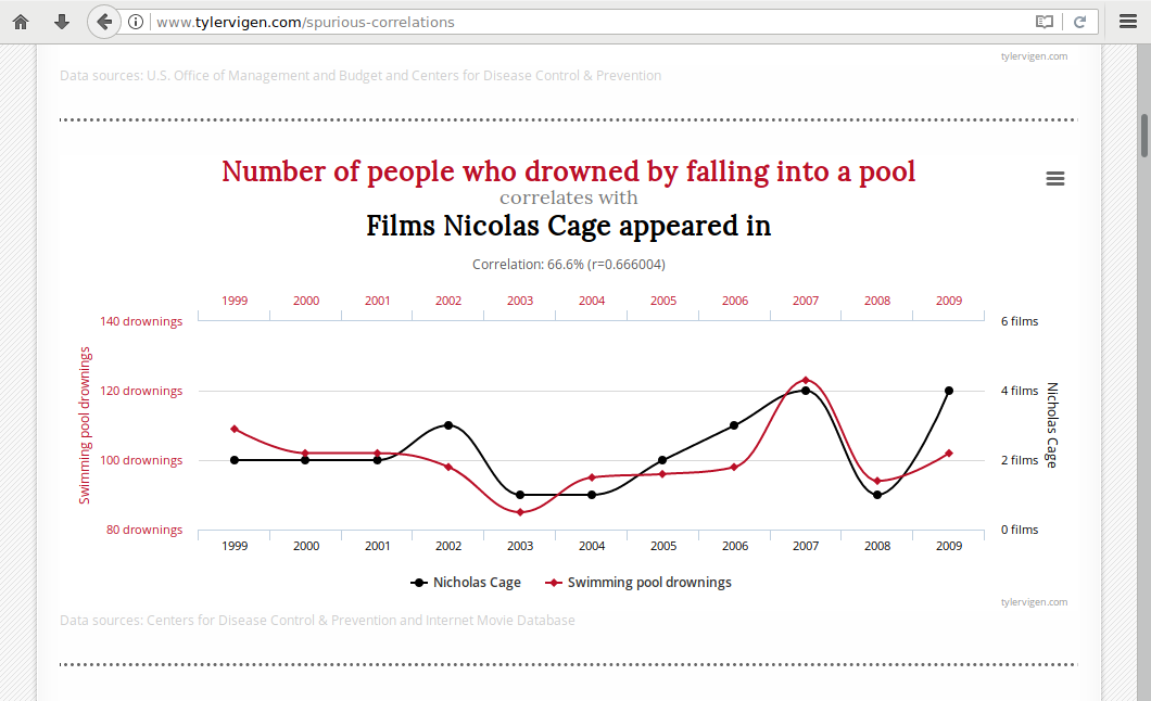
Irrelevance: Spurious Correlations
There are numerous instances where correlations between variables are clearly either accidents or have a root cause that is so indirect as to be meaningless. Indeed, Tyler Vigen has devoted a website to celebrating these statistical oddities.
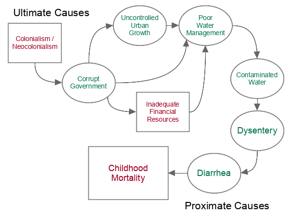
Chains of Causation
Effects are commonly the result of chains of causation. The causes most directly associated with the effect are called proximate causes while the causes further up the chain are called ultimate causes or root causes.
Since correlations are simple comparison of two values, correlation will not identify these chains of causation, often leading to an oversimplified understanding of what exactly is going on.
For example:
- High levels of childhood death are often caused by diarrhoea (WHO 2011), which results in fatal levels of under-nutrition and dehydration (proximate cause).
- Childhood diarrhoea can be caused by dysentery, which is a bacterial infection.
- The dysentery bacteria is transmitted through contaminated food and water.
- Water contamination with bacteria-infested human waste is caused by inadequate water management (WHO 2023).
- Inadequate water management is caused by a variety of factors, such as uncontrolled urban population growth, inadequate financial resources, and ineffectual or corrupt governments that divert resources to personal projects and defense,
- Corrupt government structures were often set up by colonial powers to keep the colonies subservient as a source of raw materials and inexpensive labor for those colonial powers rather than responsive to the needs of their own citizens (ultimate cause).
In cases like this, correlations may provide evidence for proximate causes, but may not identify what are often more important ultimate causes that need to be addressed to solve problematic effects further down the chain of causation.
The Problem of Induction
By offering an explanation in the form of a cause and effect relationship, we are making an inference that when that cause or set of causes exists, the effect will occur or has an increased probability of occurring.
But while correlation can tell us that this was true in a specific set of places in the past, that does not offer any logical proof that has to continue to be true in the future or in a different set of locations, since we cannot directly observe all possible locations in all possible futures.
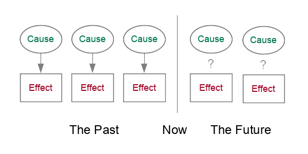
This is the problem of induction identified by the Scottish philosopher David Hume (1711 - 1776).

This is similar to the statement, you cannot prove a negative. While you can offer empirical evidence from the past that something has never happened, you cannot offer direct evidence that something will never happen in a future you haven't experienced yet.
One way to mitigate this problem is the concept of falsification proposed by the Austrian philosopher Karl Popper (1902 - 1994).
While you cannot prove a hypothesis will always be true, you only have to find one situation where a hypothesis is false to show that it is not true and needs to be modified or abandoned. If you fail to falsify a theory, you corroborate that theory. Corroboration does not prove a hypothesis is true, but multiple corroborations increase your confidence that your theory may be applicable in other times and places. This approach is the basis of the concept of the null hypothesis used in inferential statistics.
Empirical Limitations: Problems With Data
The use of simple correlation between geographic variables is a very useful tool for exploratory data analysis, but this technique has numerous weaknesses that require more-sophisticated statistical techniques to overcome.
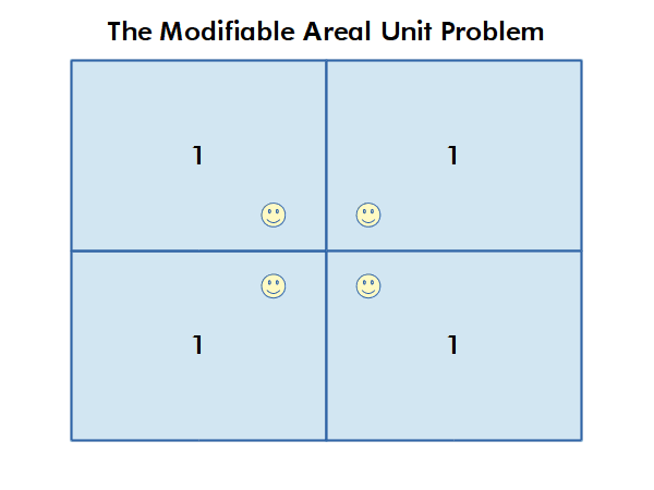
The Modifiable Area Unit Problem
The modifiable area unit problem (MAUP) arises when working with data aggregated by areas or regions. If different area boundaries are used, that analysis can yield different results, even if the underlying phenomena is the same.
For example, county boundaries reflect historical and political processes rather than clear boundaries between areas where health outcomes are different. Therefore, use of these boundaries, which is often necessary to preserve confidentiality, limits the accuracy of analysis that is performed using data aggregated within those boundaries.
Autocorrelation
An issue related to the MAUP is that many human phenomena tend to correlate spatially with themselves. For example, areas of high income often cluster together as a reflection of a variety of social processes, including a desire by wealthy homeowners to maintain property values. That clustering can make observed correlations overestimate or underestimate the strength of the actual relationship between the phenomena under investigation.
Data Quality
Survey data subject to a number of issues that affect its accuracy. For example, areas with sparse populations limited medical facilities might underreport stroke diagnoses to researchers. People in some areas might also be suspicious, unresposive, or untruthful to researchers, resulting in less-accurate data.
Data quality can also be affected by the methodology by which it is created. In this example, data on fast food consumption is (apparently) modeled marketing research data which may reflect questionable modeling assumptions or limited availability of accurate data for model calibration.
Absolute vs Relative Values
When looking for correlations between characteristics in geographic area like countries that have a wide range of sizes, you will generally want to compare relative rather than absolute values.
Comparisons of countries using absolute values will often show correlation, but that correlation is between the size of the countries rather than the phenomena being analyzed. This is a specific case of confounding.
For example, when comparing absolute values of overall GNI (gross national income, or GDP plus income from overseas activities) to population, you see a strong correlation that implies that more-populous countries are also wealthier countries.
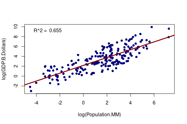
plot(log(GDP.B.Dollars) ~ log(Population.MM), data=countries, pch=16, col="navy")

model = lm(log(GDP.B.Dollars) ~ log(Population.MM), data=countries)

abline(model, col="darkred", lwd=3, untf=T)

legend("topleft", bty="n", legend=paste("R^2 = ", round(summary(model)$r.squared, 3)))
However, that comparison does not consider how many people that wealth is distributed over. In analyzing the lives of people in a country, the overall wealth of the country is usually less important than how much of that wealth is available to individual people and families in that country.
If you compare relative values of GDP per capita with population, we see that there is no correlation. There are large countries where the residents (on average) are poor and small countries where the people (on average) are rich. The population of a country is not related to how wealthy individual people in a country are.
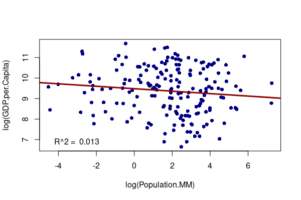
plot(log(GDP.per.Capita) ~ log(Population.MM), data=countries, pch=16, col="navy")

model = lm(log(GDP.per.Capita) ~ log(Population.MM), data=countries)

abline(model, col="darkred", lwd=3, untf=T)

legend("bottomleft", bty="n", legend=paste("R^2 = ", round(summary(model)$r.squared, 3)))
Imperfect Regularities
Because causal relationships are often probabilistic and part of complex chains of causation, the absence of a correlation does not mean there is no causal relationship:
Non-linear Correlation
In the simplest forms of correlation, the relationship between the two variables forms a simple line. As one variable goes up one unit, the other variable goes up by one unit.
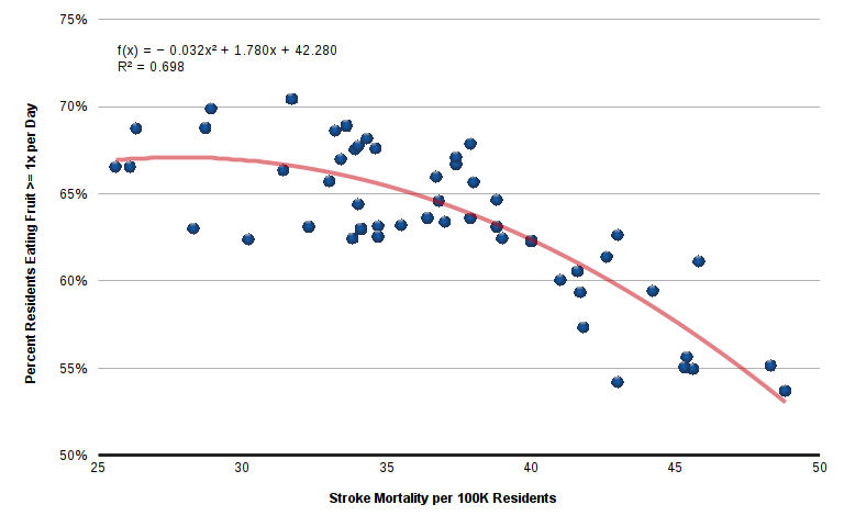
However, there are numerous instances where there is a relationship, but it forms a curve of some kind. For example, the relationship between stroke mortality by state and fruit consumption is non-linear. While stroke rates increase as fruit consumption drops, the effect is more extreme in states with unusually high stroke rates. In this case, a polynomial fits the pattern better than a straight line.
Probabilistic Causation
In some simple situations, the effect resulting from a cause is immediate and clear, such as dropping a ball (cause) resulting in the ball falling to the ground (effect). These are called deterministic causal relationships. The cause always determines the effect and a correlation between cause and effect is readily observable as correlation.
However, in most real-world situations, especially those involving people, effects have multiple causes, causes do not always result in effects, and/or effects follow causes by varying lengths of time (if at all). Causes increase the probability of effects, so these are called probabilistic causal relationships.
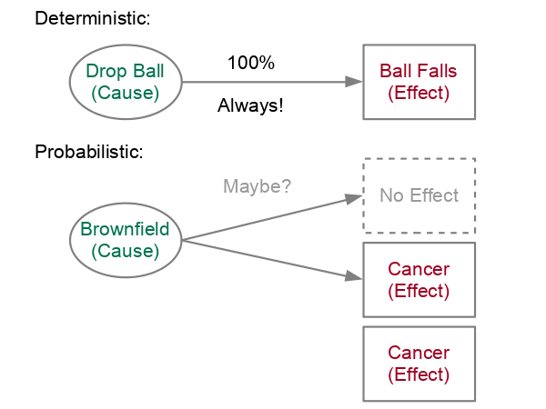
As a geographic example: Proximity to a former industrial site (brownfield) that is contaminated with carcinogenic polycyclic aromatic hydrocarbons may correlate with increased rates of cancer for people that live close to that site. However, there are people who live close to that site that do not get cancer, and there are people who do not live close to any source of that carcinogen who will get that same type of cancer. In addition, carcinogens often take years to show their negative affects, and different genetic characteristics make some people more vulnerable than others to the effects of that carcinogen.
Techniques more sophisticated than simple correlation are needed for for clearly identifying probabilistic causes and separating all the myriad factors that could also be causes. For example, the Neyman-Rubin causal model involves finding pairs of people that are identical by all considered characteristics other than the characteristic that is suspected of being a cause, and observing them over time to see if the characteristic of interest affects the probability of the studied effect.
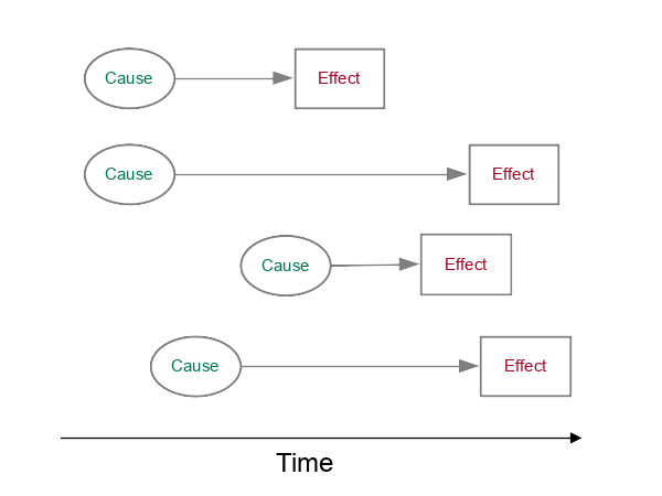
Temporal Lag
Causes may take time to manifest as an effect. This results in a delay (temporal lag) between one variable and another.
For example, stroke can be the result of years of unhealthy lifestyle choices that may have been made in locations other than the home of the stroke victim at the time of onset. Indeed, a stroke victim might be making very different lifestyle choices in retirement than they made when they were younger and began accumulating comorbidities. Accordingly, there may be a temporal (time) lag between data that would reflect the risk factors and the data that measures stroke. Such temporal lag can hide clear connections between risk factors and stroke incidence.
Spatial Lag
Human mobility is also a problem. Because people usually change locations during the day (home, work, school) and occasionally relocate residences, there may be a spatial lag between data reflecting risk factors and data on where people are when they have strokes.
Causes may result in effects that occur in different geographical areas. For example: A West Nile virus infection that was contracted from a mosquito bite in a recreational area may be diagnosed in a separate residential area (spatial lag)
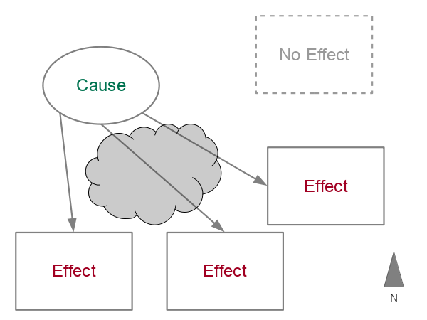
Example: Monocausal Oversimplification
The post hoc fallacy stems from a common aspiration to seek simple monocausal explanations for complex phenomena.
For example, on September 10, 2025, conservative activist Charlie Kirk was murdered at Utah Valley University in Orem, Utah (Wikipedia 2026). At almost the exact same time, about 500 miles to the east, a 16-year-old male student at Evergreen High School in Evergreen, Colorado shot and seriously injured two students before taking his own life (Wikipedia 2026).

While shootings at schools are nothing new, there has been a notable increase in incidents over three decades.
The proximate cause of the injuries in Evergreen was that the shooter discharged a revolver into the students and then himself. But the ultimate cause of why these shooting have become so common becomes important in seeking to reverse the trend.
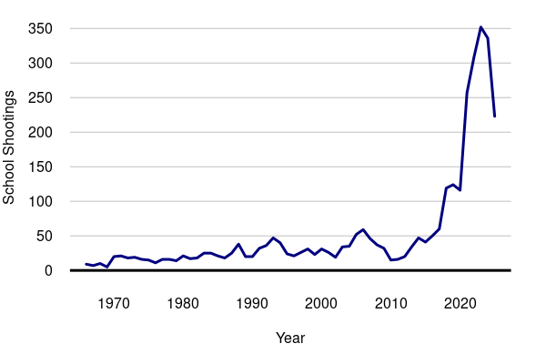
years = read.csv("https://michaelminn.net/tutorials/correlation/2026-evergreen-years.csv")

par(mar=c(5,4,1,2))

plot(years$Year, years$School_Shootings, type='l',
	col="navy", lwd=3, las=1, fg="white",
	xlab="Year", ylab="School Shootings")

grid(nx=NA, ny=NULL, lty=1, col="#00000040")

abline(h=0, lwd=3)
Too Many Guns
One common correlation noted when shootings occur is that the United States is exceptional in both gun violence and gun ownership among other developed countries.
The Rockefeller Institute of Government (2024) reported 109 public mass shootings in the United States and 35 public mass shootings in 35 other economically and politically comparative countries between 2000 and 2022. The Graduate Institute of International and Development Studies (GIIDS) in Geneva, Switzerland (2017) noted similarly high rate of small arms ownership in the US relative to comparative countries.
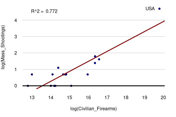
countries = read.csv("https://michaelminn.net/tutorials/correlation/2026-evergreen-countries.csv")

countries = countries[!is.na(countries$Mass_Shootings) & (countries$Mass_Shootings > 0),]

par(mar=c(5,4,1,2))

plot(log(Mass_Shootings) ~ log(Civilian_Firearms), data=countries, pch=16, col="navy", fg="white", las=1)

grid(nx=NA, ny=NULL, lty=1, col="#00000040")

model = lm(log(Mass_Shootings) ~ log(Civilian_Firearms), data=countries)

abline(model, lwd=3, col="darkred")

abline(a=0, b=0, lwd=3)

legend("topleft", bty="n", legend=paste("R^2 = ", round(summary(model)$r.squared, 3)))

text(19.3, 4.7, "USA")
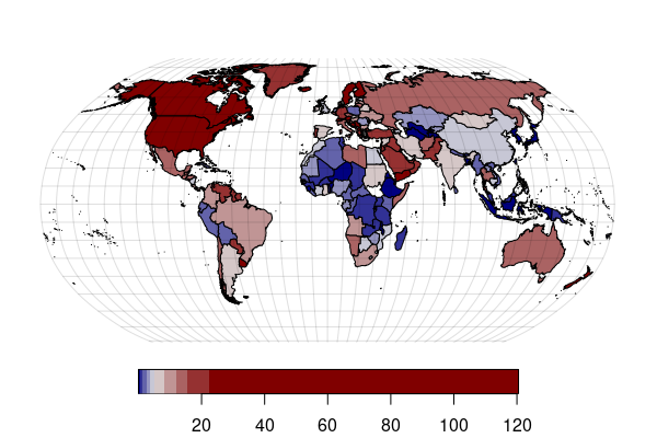
library(sf)

data = read.csv("https://michaelminn.net/tutorials/correlation/2026-evergreen-countries.csv")

data = data[!is.na(countries$Firearms_per_100),]

countries = st_read("https://michaelminn.net/tutorials/data/2022-world-data.geojson")

countries = merge(countries, data, on="ISO3")

graticule = st_graticule(lon = seq(-180, 180, 10), lat=seq(-80, 80, 10))

world_robinson = "+proj=robin +lon_0=0 +x_0=0 +y_0=0 +datum=WGS84 +units=m +no_defs"

countries = st_transform(countries, world_robinson)

graticule = st_transform(graticule, world_robinson)

par(mar=c(0,0,0,0))

america = colorRampPalette(c("#000080", "#e0e0e0", "#800000"))

plot(countries["Firearms_per_100"], pal=america, breaks="quantile", reset=F, key.pos=1, main="")

plot(graticule$geometry, col="#00000020", add=T)
Mental Illness
While people with diagnosed mental illness account for a small proportion of the perpetrators of mass shootings in the United States (Girgis 2022), most school shooters experienced psychological, behavioral, or developmental issues (National Threat Assessment Center 2019). Accordingly, the correlation between incidence of psychological distress and the number of school shootings could be inferred to attribute the rise in school shootings to increase in mentally ill students.
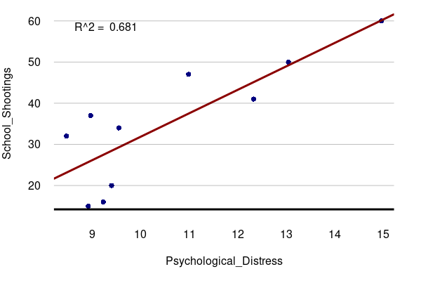
years = read.csv("https://michaelminn.net/tutorials/correlation/2026-evergreen-years.csv")

years = years[!is.na(years$Psychological_Distress),]

par(mar=c(5,4,1,2))

plot(School_Shootings ~ Psychological_Distress,
	col="navy", pch=16, las=1, fg="white", data=years)

model = lm(School_Shootings ~ Psychological_Distress, data=years)

abline(model, lwd=3, col="darkred")

legend("topleft", bty="n", legend=paste("R^2 = ", round(summary(model)$r.squared, 3)))

grid(nx=NA, ny=NULL, lty=1, col="#00000040")

abline(h=par("usr")[3] + 1, lwd=3)
Inadequate Security
The number of casualties at Evergreen was significantly reduced by effective lockdown protocols that included locked doors that limited the shooter's access to potential victims.
However, there was no school resource officer (SRO) on duty at the time that could have
While the data on school resource officer counts is limited, there is no clear correlation between shootings over the period 2003 - 2016, implying that SRO deployment has been inadequate to address the increasing threat.
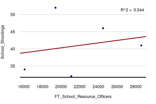
years = read.csv("https://michaelminn.net/tutorials/correlation/2026-evergreen-years.csv")

years = years[!is.na(years$FT_School_Resource_Officers),]

par(mar=c(5,4,1,2))

plot(School_Shootings ~ FT_School_Resource_Officers, data=years,
	col="navy", pch=16, las=1, fg="white")

model = lm(School_Shootings ~ FT_School_Resource_Officers, data=years)

abline(model, lwd=3, col="darkred")

legend("topright", bty="n", legend=paste("R^2 = ", round(summary(model)$r.squared, 3)))

grid(nx=NA, ny=NULL, lty=1, col="#00000040")

abline(h=par("usr")[3] + 0.5, lwd=3)
Social Media
Amid reports that the shooter had been radicalized online to embrace conspiriatorial neo-Nazi views (Paul and Prentzel 2025), longstanding concerns about the corrosive effect of social media were highlighted by a temporal correlation between the increase in school shootings and the growth in the percent of Americans using social media over the prior two decades.
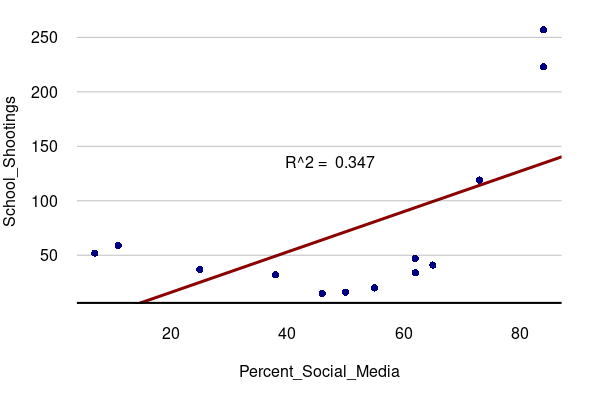
years = read.csv("https://michaelminn.net/tutorials/correlation/2026-evergreen-years.csv")

years = years[!is.na(years$Percent_Social_Media),]

par(mar=c(5,4,1,2))

plot(School_Shootings ~ Percent_Social_Media,
	col="navy", pch=16, las=1, fg="white", data=years)

model = lm(School_Shootings ~ Percent_Social_Media, data=years)

abline(model, lwd=3, col="darkred")

legend("center", bty="n", legend=paste("R^2 = ", round(summary(model)$r.squared, 3)))

grid(nx=NA, ny=NULL, lty=1, col="#00000040")

abline(h=par("usr")[3] + 0.5, lwd=3)
Antisemitism
The increase in school shootings was accompanied
by an increase in antisemitic incidents in the US over
the period 2015-2024. Since one of the Evergreen victims was Jewish,
the implication is that the Evergreen shooting was caused by the same
antisemitism that societies under stress have exhibited in
scapegoating Jews for centuries.

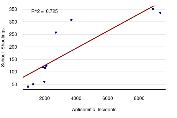
years = read.csv("https://michaelminn.net/tutorials/correlation/2026-evergreen-years.csv")

years = years[!is.na(years$Antisemitic_Incidents),]

par(mar=c(5,4,1,2))

plot(School_Shootings ~ Antisemitic_Incidents,
	col="navy", pch=16, las=1, fg="white", data=years)

model = lm(School_Shootings ~ Antisemitic_Incidents, data=years)

abline(model, lwd=3, col="darkred")

legend("topleft", bty="n", legend=paste("R^2 = ", round(summary(model)$r.squared, 3)))

grid(nx=NA, ny=NULL, lty=1, col="#00000040")

abline(h=par("usr")[3] + 0.5, lwd=3)
Alienation of Late Capitalism
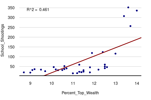
A Marxist critique of American society might see school shootings as a consequence of the alienation of late capitalism. When humans are reduced to consumption and production, life ceases to have inherent meaning. This notion could be drawn from a correlation between school shootings and the rise of inequality represented by the increasing share of total wealth held by the top 0.1% wealthiest Americans.
years = read.csv("https://michaelminn.net/tutorials/correlation/2026-evergreen-years.csv")

years = years[!is.na(years$Percent_Top_Wealth),]

par(mar=c(5,4,1,2))

plot(School_Shootings ~ Percent_Top_Wealth,
	col="navy", pch=16, las=1, fg="white", data=years)

model = lm(School_Shootings ~ Percent_Top_Wealth, data=years)

abline(model, lwd=3, col="darkred")

legend("topleft", bty="n", legend=paste("R^2 = ", round(summary(model)$r.squared, 3)))

grid(nx=NA, ny=NULL, lty=1, col="#00000040")

abline(h=par("usr")[3] + 1, lwd=3)
Moral Decay
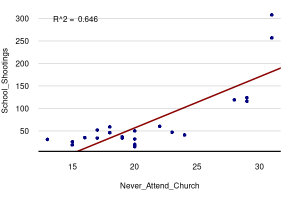
A common mainstream (and often secular) media assertion is that the decline of religion in American public life is associated with the rise of a variety of social ills (e.g. Brooks 2013). Writer Robert Robinson (2022) even went so far to assert that athiests are responsible for a majority of school shootings. The notion that America turning its back on God has led God to turn his back on America could be drawn from a correlation between school shootings and the decline in regular church attendance.
years = read.csv("https://michaelminn.net/tutorials/correlation/2026-evergreen-years.csv")

years = years[!is.na(years$Never_Attend_Church),]

par(mar=c(5,4,1,2))

plot(School_Shootings ~ Never_Attend_Church,
	col="navy", pch=16, las=1, fg="white", data=years)

model = lm(School_Shootings ~ Never_Attend_Church, data=years)

abline(model, lwd=3, col="darkred")

legend("topleft", bty="n", legend=paste("R^2 = ", round(summary(model)$r.squared, 3)))

grid(nx=NA, ny=NULL, lty=1, col="#00000040")

abline(h=par("usr")[3] + 1, lwd=3)
Crisis of Masculinity
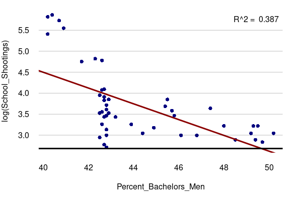
Discourses around a "crisis of masculinity" have been dismissed as a "crisis of accountability" representing "a refusal on the part of men to regulate themselves emotionally and behave like adults" (Sehgal 2025). However, boys’ educational achievement, mental health and transitions to adulthood indicate that many are not thriving (Miller 2025). In this context, the negative correlation between school shootings and the percent of bachelor's degrees awarded to men could be seen as tying the rise in school shootings to the crisis of masculinity.
years = read.csv("https://michaelminn.net/tutorials/correlation/2026-evergreen-years.csv")

years = years[!is.na(years$Percent_Bachelors_Men),]

par(mar=c(5,4,1,2))

plot(log(School_Shootings) ~ Percent_Bachelors_Men,
	col="navy", pch=16, las=1, fg="white", data=years)

model = lm(log(School_Shootings) ~ Percent_Bachelors_Men, data=years)

abline(model, lwd=3, col="darkred")

legend("topright", bty="n", legend=paste("R^2 = ", round(summary(model)$r.squared, 3)))

grid(nx=NA, ny=NULL, lty=1, col="#00000040")

abline(h=par("usr")[3] + 0.1, lwd=3)
Which Is It?
Almost any phenomenon of any importance also involves a complex interaction of factors. Once you start unpacking correlation, you reveal the complexity in social and environmental phenomena hidden by the oversimplifications of correlation and the post hoc fallacy.
Correlation is a useful exploratory tool, but if you are looking for cause, correlation won't get you there. You need a more nuanced analysis that looks through the chains of relationships to unpack the ultimate causes, and the solutions needed to begin addressing those causes.
Why Does Causation Matter?
Critical Thinking
In contemporary life we are constantly bombarded with numerous streams of narratives and contradictory information. Sorting out these narratives and recognizing fallacies is easier when you have a clearer understanding of what causation is and how it can be evaluated.
The post hoc fallacy is dangerous because it can lead to falsely assigning credit (or blame) for a positive (or negative) effect and lead to unnecessary, misleading, or dangerous actions that will do little to achieve the desired outcomes, and might even be counterproductive.
For example, there is a strong negative correlation between fruit consumption and lowered risk of stroke mortality by US state. Interpreting this correlation by saying that low fruit consumption causes stroke death would fall into the post hoc fallacy. If you take this further and assume that all that needs to be done is encourage more fruit consumption while ignoring all the other risk factors (smoking, sedentary lifestyles, high consumption of sodum and fat, family history, etc.), at best you probably would be wasting your effort, and, at worst, you would be distracting people from making the lifestyle changes that would more-significantly reduce their chances of dying from a stroke.
Liability
In many areas of life like management and law, determining responsibility for actions and activities is important to hold members of an organization or society accountable, and promote justice.
Forecasting and Planning
Understanding the causes of the effects that impact our lives can help us anticipate what those effects could be in the future. This can aid us both collectively and individually in planning for possible futures.
Intervention
Understanding causation can often allow us to intervene and prevent undesirable effects or promote desirable effects. These interventions can be at the individual level, up to the level of public policy. For example, in health, understanding the etiology of a disease is essential for determining how that disease can be prevented or mitigated.