Point Data Analysis in Python
Geospatial point data is used to represent things that exist or events that occurred at specific locations on the surface of the earth. Examples of points include crime locations, animal nests, street trees, vehicle charging stations, cellphone towers, WiFi hotspots, GPS waypoints, etc. Areas are sometimes represented with points (centroids) to simplify mapping and navigation, such as with restaurants, houses, stores, or transit stations.
This tutorial demonstrates basic techniques for analysis of point data in Python.
Loading Point Data
The example point data used for this tutorial is 2022 electrical power plant location data from the US Energy Information Administration.
The oil market disruptions of 1973 resulted in the creation of a wide variety of federal systems and organizations for collecting and managing national energy data, and these functions were centralized in the US Energy Information Administration by The Department of Energy Organization Act of 1977. The US Energy Information Administration (EIA) "collects, analyzes, and disseminates independent and impartial energy information to promote sound policymaking, efficient markets, and public understanding of energy and its interaction with the economy and the environment" (EIA 2023).
A GeoJSON file and metadata containing field information is available here.
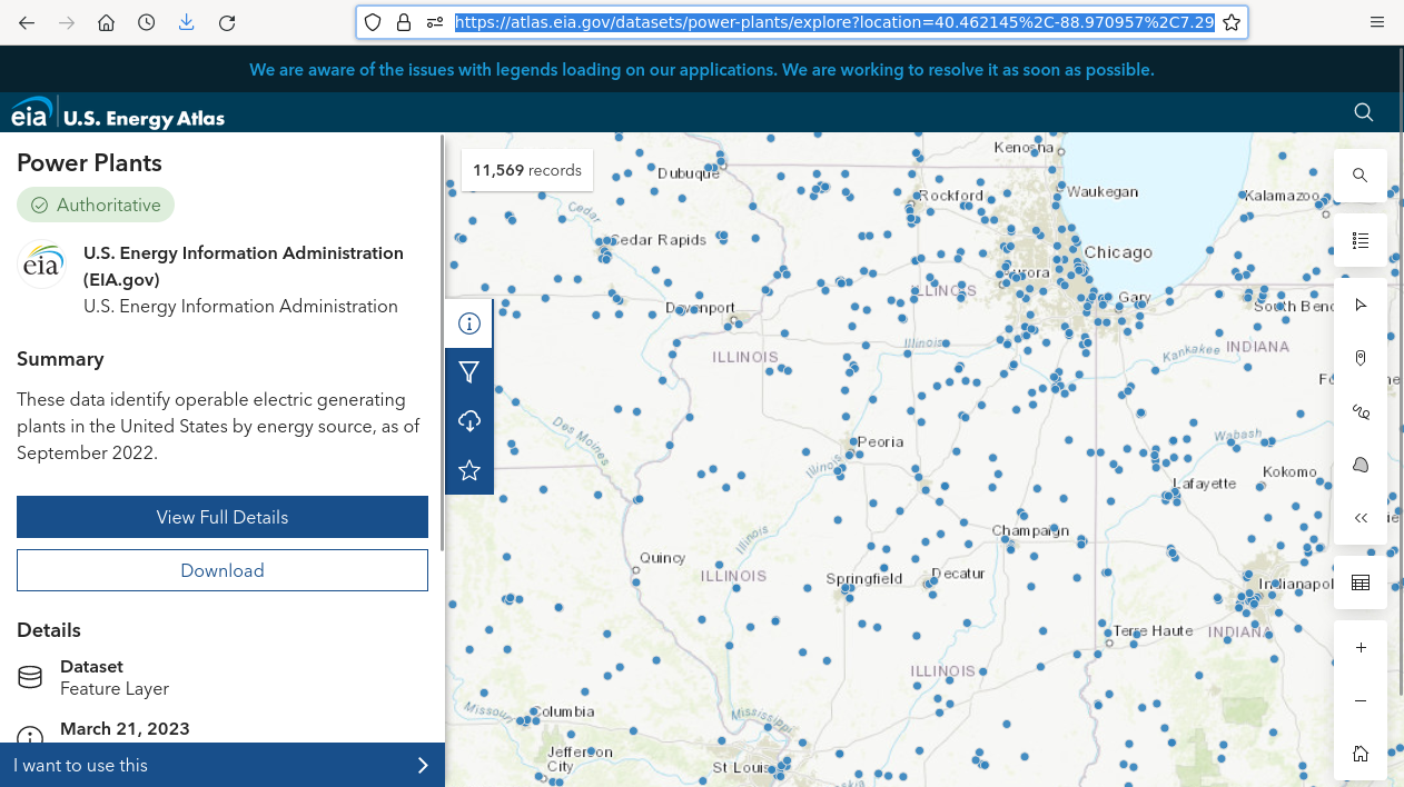
Current data is also available directly from the EIA's US Energy Atlas.
Loading Geospatial Data Files
The following code shows how to load an online GeoJSON file into a GeoPandas GeoDataFrame for visualization and analysis.
- GeoPandas is an extension of Pandas and Shapely libraries for working with geospatial data.
- Matplotlib is a visualization library. matplotlib.pyplot is a state-based interface into matplotlib.
- The GeoPandas read_file() function reads a geospatial data file into a GeoDataFrame.
- The figure.figsize in rcParams sets the size of plots. Your value may vary depending on the type of display you are using and your aesthetic preferences.
- The GeoDataFrame plot() method creates a plot using matplotlib.
- For this example, we will color the dots by the categorical PrimSource variable representing the primary fuel source for the plants.
- The legend=True parameter indicates to plot a legend so the reader can tell what the dot colors mean.
- The markersize=2 parameter indicates to plot a two point dot that is smaller than the default, which makes the large number of dots easier to distinguish on this small map. As a graphical size unit, a point is 1/72nd of an inch (Merriam-Webster 2023)
- The plt.show() function needs to be called after plotting to display plots set up with prior plot() calls.
import geopandas

import matplotlib.pyplot as plt

plt.rcParams['figure.figsize'] = [9, 6]

plants = geopandas.read_file('https://michaelminn.net/tutorials/data/2022-power-plants.geojson')

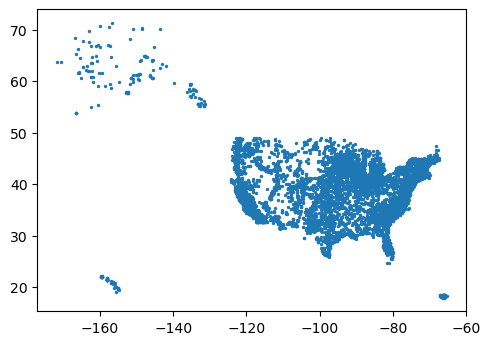
plants.plot(markersize = 2)

plt.show()
The info() method list the attribute columns along with the data types and number of non-null (not empty) values.
plants.info()
RangeIndex: 11569 entries, 0 to 11568
Data columns (total 33 columns):
 #   Column          Non-Null Count  Dtype
---  ------          --------------  -----
 0   OBJECTID        11569 non-null  int64
 1   Plant_Code      11569 non-null  int64
 2   Plant_Name      11569 non-null  object
 3   Utility_ID      11569 non-null  int64
 4   Utility_Name    11565 non-null  object
 5   sector_name     11569 non-null  object
 6   Street_Address  11541 non-null  object
 7   City            11549 non-null  object
 8   County          11534 non-null  object
 9   State           11569 non-null  object
 10  Zip             11547 non-null  float64
 11  PrimSource      11569 non-null  object
 12  source_desc     11569 non-null  object
 13  tech_desc       11569 non-null  object
 14  Install_MW      11569 non-null  float64
 15  Total_MW        11569 non-null  float64
 16  Bat_MW          379 non-null    float64
 17  Bio_MW          667 non-null    float64
 18  Coal_MW         258 non-null    float64
 19  Geo_MW          67 non-null     float64
 20  Hydro_MW        1456 non-null   float64
 21  HydroPS_MW      40 non-null     float64
 22  NG_MW           2034 non-null   float64
 23  Nuclear_MW      54 non-null     float64
 24  Crude_MW        1115 non-null   float64
 25  Solar_MW        4816 non-null   float64
 26  Wind_MW         1300 non-null   float64
 27  Other_MW        95 non-null     float64
 28  Source          11569 non-null  object
 29  Period          11569 non-null  object
 30  Longitude       11569 non-null  float64
 31  Latitude        11569 non-null  float64
 32  geometry        11569 non-null  geometry
dtypes: float64(17), geometry(1), int64(3), object(12)
memory usage: 2.9+ MB
Load CSV Points
Points can also be loaded from CSV files using the GeoPandas points_from_xy function if you are working with data files that have columns of latitude and longitude.
import pandas

csv = pandas.read_csv('https://michaelminn.net/tutorials/data/2019-mlb-ballparks.csv')

points = geopandas.points_from_xy(csv['Longitude'], csv['Latitude'])

baseball = geopandas.GeoDataFrame(csv, geometry = points, crs='EPSG:4326')

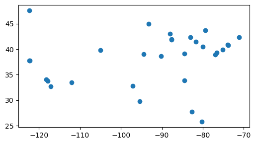
baseball.plot()

plt.show()
Point Maps
Simple Point Map
As explained above, a simple point map can be created with the plot() method.
plants.plot(markersize = 2)

plt.show()

Filtering and Reprojecting
Additional processing can be used to clarify point visualizations.
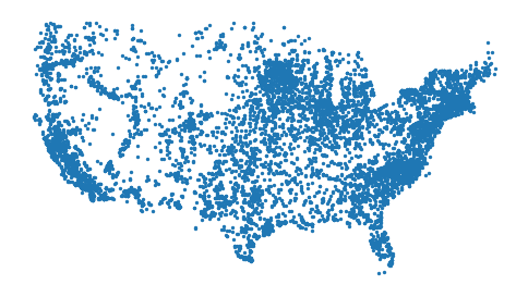
- To simplify analysis for this tutorial, we will filter using the Pandas isin() method to include only facilities in the 48 continental United States.
- The parameter to isin() is a list of values, and the method returns True for all rows in the series where the field is a member of that list of values.
- The tilde (~) is used with this negative filter to take the opposite (logical NOT) of the isin() results. This filter selects rows where the state is not in the list of non-continental states/territories.
- To improve cartographic representation we use to_crs() to reproject the data from WGS 84 lat/long to a web Mercator projection commonly used on web maps (WKID EPSG 3857). Projections are described in greater detail in this tutorial on Map Projections.
- The set_axis_off() method turns off the unnecessary map frame and axis labels, which are largely meaningless when mapping in a web Mercator projection. Unfortunately, there is no global parameter to turn axes off, so this function must be called before each plt.show().
plants = plants[~plants['State'].isin(['Alaska', 'Hawaii', 'Puerto Rico'])]

plants = plants.to_crs('EPSG:3857')

axis = plants.plot(markersize=2)

axis.set_axis_off()

plt.show()
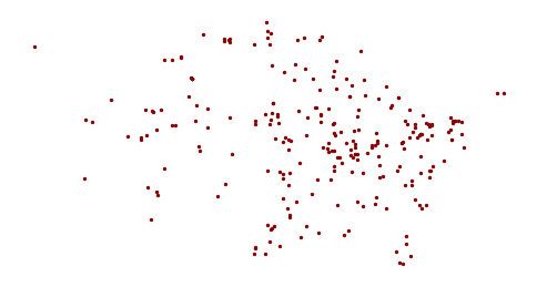
An example of positive filtering can be used to create a list of coal-fired power plants.
The *_MW parameters give the rated power for each plant in megawatts from the different fuel sources. Commercial-scale fossil-fueled or nuclear electricity plants typically range from 500 MW to 2,000 MW or more.
coal_plants = plants[plants['Coal_MW'] > 0]

axis = coal_plants.plot(markersize=2, color='darkred')

axis.set_axis_off()

plt.show()
Base Map
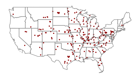
A base map is a simple reference map that you place under mapped features to provide geographic context for where those features are located on the surface of the earth.
While area map borders can provide geographic context on their own, point maps usually need base maps so it is possible for the user to see where the points are located relative to other known features.
For these maps of power plants, we will use a GeoDataFrame of states for state outlines as a base map.
states = geopandas.read_file("https://michaelminn.net/tutorials/data/2015-2019-acs-states.geojson")

states = states[~states["ST"].isin(['AK', 'HI', 'PR'])]

states = states.to_crs(plants.crs)
To plot two GeoDataFrames on the same plot, we need to pass the axis return value from the first plot to the map as an ax parameter to subsequent calls to modify the map.
axis = coal_plants.plot(markersize = 4, color = 'darkred')

states.plot(facecolor='none', edgecolor='gray', ax=axis)

axis.set_axis_off()

plt.show()
Tiled Base Map
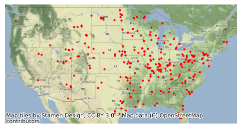
Contextily can be used to display tiled base maps using the add_basemap function.
Contextily base maps can be slow to load, and highly-detailed base maps can make it difficult to distinguish point symbology. Therefore, state outlines are used for base maps in subsequent examples in this tutorial.
import contextily

axis = coal_plants.plot(markersize = 4, color = "red")

contextily.add_basemap(axis)

axis.set_axis_off()

plt.show()
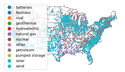
Mapping a Categorical Attribute
If your point data has a categorical attribute, you can map it by passing the name of the attribute as the first parameter to the plot() call.
You will also need to set legend=True to add a legend that will allow the user to know what the different dot colors mean.
axis = plants.plot("PrimSource", legend=True, markersize=2)

states.plot(facecolor="none", edgecolor="gray", ax=axis)

axis.set_axis_off()

plt.show()
Mapping a Quantitative Variable
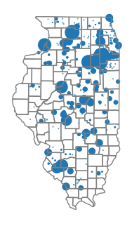
A common method of visualizing points with a quantitative attribute is the graduated symbol (bubble) map that uses differently sized shapes based on the variable being mapped. Although circles are most common, other types of icons can be used for aesthetic variety.
- Bubble maps can be implemented with point maps where the point markersize is varied by feature.
- The bubble size is in points, and the scaling factor given below (200) may vary depending on your display resolution and the number of points you need to display.
- Because bubble maps are less effective where there are large numbers of closely spaced points, for this example we will filter to map only power plants in Illinois.
il_plants = plants[plants["State"] == "Illinois"]

bubble_size = 200 * plants["Install_MW"] / max(plants["Install_MW"])

axis = il_plants.plot(markersize=bubble_size)
As with all point maps, a base map should be used with bubble maps to provide geographic context. For this example we will use county border polygons.
il_state = geopandas.read_file("https://michaelminn.net/tutorials/data/2015-2019-acs-counties.geojson")

il_state = il_state[il_state["ST"] == "IL"]

il_state = il_state.to_crs(plants.crs)

il_state.plot(facecolor="none", edgecolor="gray", ax=axis)

axis.set_axis_off()

plt.show()
As would be expected, we see a clustering of large power plants in
the northern urban parts of Illinois that is more densely populated than the
rural areas in the central and southern parts of the state.
Voronoi Polygons
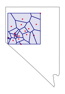
Voronoi polygons are polygons around points that each contain one point and have edges that evenly divide the areas between adjacent points. Voronoi diagrams are named after Russian mathematician Georgy Feodosievych Voronoy. They are also sometimes called Thiessen polygons after American meterologist Alfred Thiessen (Wikipedia 2023).
While Voronoi polygons are a useful way of visualizing points as areas, the polygons are mathematical abstractions that may not represent actual areas of influence or jurisdiction in the real world, and care must be taken to communicate that limitation.
import numpy

import libpysal.cg.voronoi

geothermal = plants[(plants["Geo_MW"] > 0) & (plants["State"] == "Nevada")]

points = numpy.column_stack((geothermal.geometry.x, geothermal.geometry.y))

regions, vertices = libpysal.cg.voronoi.voronoi_frames(points)

axis = geothermal.plot(color="Red", markersize=4)

regions.plot(facecolor="#00008020", edgecolor="navy", ax=axis)

nevada = states[states["ST"] == "NV"]

nevada.plot(facecolor="none", edgecolor="gray", ax=axis)

axis.set_axis_off()

plt.show()
Hulls
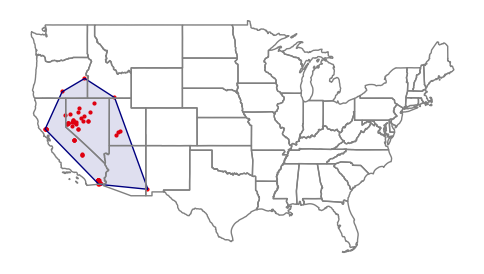
Points can also be bound by hulls to more-clearly demonstrate the spatial extent of the points.
Convex hulls can be created with the GeoPandas convex_hull() function.
geothermal = plants[plants["Geo_MW"] > 0]

axis = geothermal.plot(color = "Red", markersize = 4)

hull = geopandas.GeoSeries(geothermal.unary_union.convex_hull)

hull.plot(facecolor="#00008020", edgecolor="navy", ax=axis)

states.plot(facecolor="none", edgecolor="gray", ax=axis)

axis.set_axis_off()

plt.show()
Point Autocorrelation
One of the primary ways of analyzing the spatial distribution of phenomenon is looking where points group together, or where high or low values are clustered together.
Spatial autocorrelation is the clustering of similar values together in adjacent or nearby areas.
Spatial data is usually spatially autocorrelated, and this tendency is useful since clusters often provide insights into the characteristics of the clustered phenomena.
While visible observation of spatial autocorrelation is useful when exploring data, more-rigorous means of quantifying autocorrelation are helpful when performing serious research.
Ripley's K
B.D. Ripley (1977) developed a collection of lettered techniques for analyzing spatial point correlation.
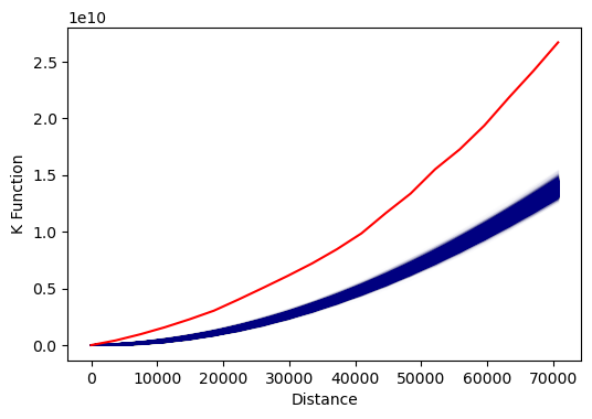
The Ripley's K function iterates through each point and counts the number of other points within a given distance.
- The graph of K gives distances on the x axis and the total number of points at those distances on the y axis.
- The visualized output below has blue lines from the simulations showing what would be expected theoretically if points were randomly distributed across the area.
- This red line is the line of observed values from the data.
Autocorrelation is evaluated by analyzing the position of the observed line relative to the theoretical lines.
- Areas where the observed line is above the theoretical line indicates clustering at the given distances.
- Areas where the observed line is below the theoretical line indicates even dispersion at the given distances.
Projected x/y locations must first be converted to a DataFrame of points.
The k_test() function from the pointpats runs the Ripley's K test.
Note that if you have a large number of points, k_test() may a minute or more to complete the analysis.
import numpy

import pointpats

il_plants = plants[plants["State"] == "Illinois"]

il_points = numpy.column_stack((il_plants.centroid.x, il_plants.centroid.y))

k_test = pointpats.k_test(il_points, keep_simulations=True)

plt.plot(k_test.support, k_test.simulations.T, color='navy', alpha=.01)

plt.plot(k_test.support, k_test.statistic, color='red')

plt.xlabel('Distance')

plt.ylabel('K Function')

plt.show()
Kernel Density
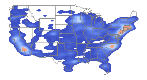
A classical method of mapping areas of high spatial autocorrelation of points is kernel density analysis, in which a kernel of a given radius is used to systematically scan an area, and the density of any particular location is the number of points within the kernel surrounding that point. Locations surrounded by clusters of points will have higher values, and areas where there are few or no points will have lower values.
A kernel density raster can be created using the kdeplot() function from the seaborn graphing package.
The bw_adjust=0.3 parameter determines the radius of the kernel and can be increased for greater smoothing or reduced for greater detail.
import seaborn

axis = seaborn.kdeplot(x = plants.centroid.x, y = plants.centroid.y,
        fill=True, gridsize=100, bw_adjust=0.3, cmap="coolwarm")

states.plot(facecolor="none", edgecolor="gray", ax=axis)

axis.set_axis_off()

plt.show()
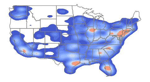
Weighting the graph by the plant installed capacity shows clusters associated with larger facilities in the south and midwest.
import seaborn

axis = seaborn.kdeplot(x = plants.centroid.x, y = plants.centroid.y,
        weights = plants["Install_MW"],
        fill=True, gridsize=100, bw_adjust=0.3, cmap="coolwarm")

states.plot(facecolor="none", edgecolor="gray", ax=axis)

axis.set_axis_off()

plt.show()
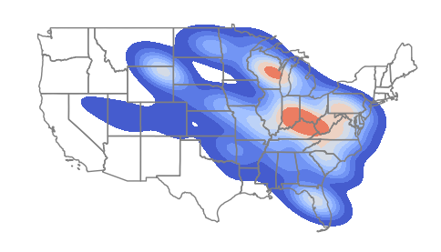
Focusing specifically on coal plants shows a distinct clustering in Appalachia that is not immediately visible from the facilities location dot map.
axis = seaborn.kdeplot(x = coal_plants.centroid.x, y = coal_plants.centroid.y,
        weights = plants["Install_MW"],
        fill=True, gridsize=100, bw_adjust=0.3, cmap="coolwarm")

states.plot(facecolor="none", edgecolor="gray", ax=axis)

axis.set_axis_off()

plt.show()
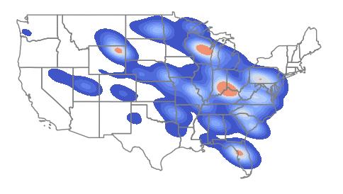
The code below increases the bw_adjust parameter to 0.5 to increase the level of smoothing. This demonstrates the arbitrary nature of kernel density estimation, which can be overcome somewhat by the use of more rigorous areal techniques like local Moran's I and Getis-Ord GI* as described below.
axis = seaborn.kdeplot(x = coal_plants.centroid.x, y = coal_plants.centroid.y,
        weights = plants["Install_MW"],
        fill=True, gridsize=100, bw_adjust=0.5, cmap="coolwarm")

states.plot(facecolor="none", edgecolor="gray", ax=axis)

axis.set_axis_off()

plt.show()
Attribute Aggregation
When analyzing point data, it can be helpful to aggregate counts and attribute values by areas and then analyze the values in those areas for relationships.
For this example of coal-fired plants, we will aggregate by state. Because this power plant data set has a State attribute we can use the Pandas groupby() method to find total installed value by state.
If your data does not have an attribute that can be used for aggregating by area, you will need to use spatial aggregation as described below.
Note that because power plants are interconnected by grids that extend across state lines, the aggregated production values may not reflect actual consumption values within state lines.
coal_states = coal_plants.groupby("State")["Install_MW"].sum()

coal_states = coal_states.sort_values(ascending = False)

coal_states = coal_states.reset_index()

print(coal_states.head())
           State  Install_MW
0          Texas     20586.1
1        Indiana     15835.6
2       Kentucky     13389.7
3  West Virginia     13090.2
4       Missouri     11888.7
print(coal_states.tail())
           State  Install_MW
36      Delaware       464.1
37  South Dakota       451.0
38    New Jersey       285.0
39    California        62.5
40         Idaho        10.2
Attribute Join
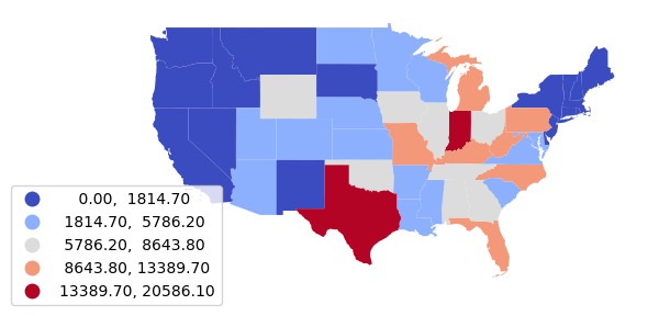
Because the point data contains no state polygon information need to perform an attribute join to be able to map the aggregated data as a choropleth.
An attribute join connects two datasets based on common key values.

The GeoPandas merge() method can be used to merge the aggregated attributes with the states polygons loaded above.
- The left_on and right_on parameters are used to indicate the attributes in the polygon data set (left) and the table data set (right) that will be used for the join.
- The how="left" parameter indicates to perform a left join that includes all state polygons (the left term in the merge) regardless of whether there are any values in the table (the right term).
- The Pandas fillna() method is used to fill the missing (NA) values with zero.
coal_states = states.merge(coal_states, how="left", left_on="Name", right_on="State")

coal_states["Install_MW"] = coal_states["Install_MW"].fillna(0)

axis = coal_states.plot("Install_MW", legend=True,
        scheme="naturalbreaks", cmap="coolwarm",
        legend_kwds={"bbox_to_anchor":(0.2, 0.4)})

axis.set_axis_off()

plt.show()
Normalization
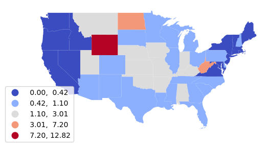
States with larger populations will have higher electricity demands and larger amounts of installed power plant capacity. What is often more meaningful for the purposes of analysis is the capacity per resident of the state (per capita).
Normalization is the adjustment of variable values to a common scale so they are comparable across space and time (Wikipedia 2023).
For this example, we normalize by population to get per capita installed capacity values.
We multiply by 1000 to get kilowatts from megawatts since home energy use is usually measured in kilowatt-hours.
Note that in this case, states with high levels of coal production (and strong political influence from coal producers) now stand out with the highest per capita electricity generation from coal.
coal_states["KW_Per_Capita"] = 1000 * coal_states["Install_MW"] / coal_states["Total Population"]

axis = coal_states.plot("KW_Per_Capita", legend=True,
        scheme="naturalbreaks", cmap="coolwarm",
        legend_kwds={"bbox_to_anchor":(0.2, 0.4)})

axis.set_axis_off()

plt.show()

Analyzing Change
If you have data for two different time periods, you can analyze spatiotemporal change between those two time periods.
For this example, we use an older data file of power plants from 2018 and groupby() to get the sum() of installed capacity for coal plants by state.
coal_2018 = geopandas.read_file("https://michaelminn.net/tutorials/data/2018-power-plants.geojson")

coal_2018["Coal_2018"] = coal_2018["Install_MW"]

coal_2018 = coal_2018[coal_2018["Coal_MW"] > 0]

coal_2018 = coal_2018.groupby("State")["Coal_2018"].sum()

coal_2018 = coal_2018.reset_index()

coal_2018.head()
State
Alabama       9130.2
Alaska         196.4
Arizona       6510.9
Arkansas      5487.0
California      62.5
Name: Install_2018, dtype: float64
Next calculate the same total coal capacity from the 2022 data.
Note that we rename Install_MW to Coal_2018 and Coal_2022 to avoid a name conflict when the two data frames are joined.
coal_2022 = coal_plants

coal_2022["Coal_2022"] = coal_2022["Install_MW"]

coal_2022 = coal_2022.groupby("State")["Coal_2022"].sum()

coal_2022 = coal_2022.reset_index()

coal_2022.head()
Name 		Coal_Change
Alabama 	-18.671004
Arizona 	-43.362669
Arkansas 	0.000000
California 	0.000000
Colorado 	-6.846350
We merge both DataFrames with the states polygons and calculate the percentage change in installed capacity.
coal_change = states.merge(coal_2018, left_on="Name", right_on="State")

coal_change = coal_change.merge(coal_2022, left_on="Name", right_on="State")

coal_change["Coal_Change"] = 100 * ((coal_change["Coal_2022"] / coal_change["Coal_2018"]) - 1)

coal_change[["Name", "Coal_Change"]].head()
Name 		Coal_Change
Alabama 	-18.671004
Arizona 	-43.362669
Arkansas 	0.000000
California 	0.000000
Colorado 	-6.846350
Finally, we can map the polygons as a choropleth styled by the percentage change.
axis = coal_change.plot("Coal_Change", legend=True,
        scheme="stdmean", cmap="coolwarm",
        legend_kwds={"bbox_to_anchor":(0.2, 0.4)})

axis.set_axis_off()

plt.show()
Spatial Aggregation
In situations where your point data does not contain an attribute that you can use to aggregate, or if you want to aggregate into areas that are different from any specified in the point attributes, it is possible to aggregate using a spatial join.
An spatial join connects two datasets based on a spatial relationship.
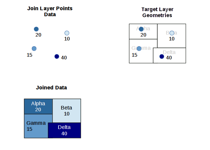
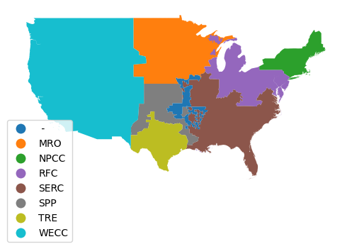
For this example, we will aggregate power plants by North American Electric Reliability Corporation (NERC) administrative regions that are used to manage the North American electrical grid. NERC "develops and enforces reliability standards; annually assesses seasonal and long‐term reliability; monitors the bulk power system through system awareness; and educates, trains, and certifies industry personnel" (NERC 2023).
The NERC region polygons are read directly from a GeoJSON service provided by the EIA through the US Energy Atlas.
nerc_regions = geopandas.read_file("https://services7.arcgis.com/FGr1D95XCGALKXqM/arcgis/rest/services/NERC_Regions_EIA/FeatureServer/0/query?outFields=*&where=1%3D1&f=geojson")

nerc_regions = nerc_regions.to_crs(plants.crs)

axis = nerc_regions.plot("NERC", legend=True, legend_kwds={"bbox_to_anchor":(0.2, 0.4)})

axis.set_axis_off()

plt.show()
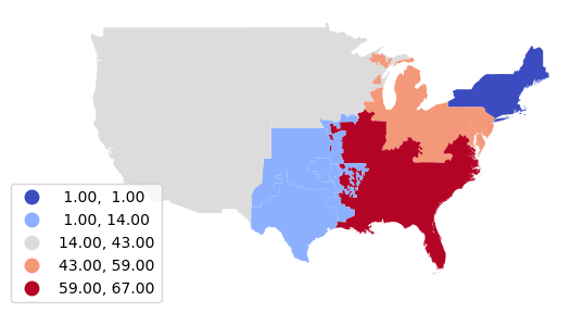
For this example, we use a spatial join to get the count of coal-fired plants by NERC region.
- The GeoPandas sjoin() method is used for spatial joins.
- Unfortunately, sjoin() only copies attributes from one set of features to another, so we first need to use the sjoin() to get the region name for each plant.
- We assign a Count variable to each plant, then groupby() and count() to get a table of counts by region.
- We can then merge() the table back on top of the state polygons to for mapping.
nerc_plants = coal_plants.sjoin(nerc_regions)

nerc_plants["Count"] = 1

nerc_plants = nerc_plants.groupby("NERC")["Count"].count()

nerc_plants = nerc_plants.reset_index()

nerc_plants = nerc_regions.merge(nerc_plants, how="left")

nerc_plants["Count"] = nerc_plants["Count"].fillna(0)

axis = nerc_plants.plot("Count", scheme="naturalbreaks", cmap="coolwarm",
		legend=True, legend_kwds={"bbox_to_anchor":(0.2, 0.4)})

axis.set_axis_off()

plt.show()
Joined Sum
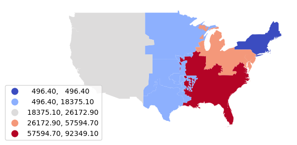
We can sum() the installed capacity to get installed capacity by region.
nerc_installed = coal_plants.sjoin(nerc_regions)

nerc_installed = nerc_installed.groupby("NERC")["Install_MW"].sum()

nerc_installed = nerc_installed.reset_index()

nerc_installed = nerc_regions.merge(nerc_installed)

axis = nerc_installed.plot("Install_MW",
                scheme="naturalbreaks", cmap="coolwarm", legend=True,
                         legend_kwds={"bbox_to_anchor":(0.2, 0.4)})

axis.set_axis_off()

plt.show()
Normalized Sum
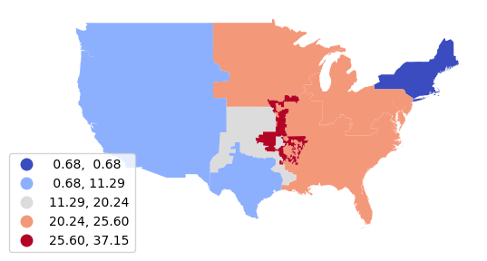
We can use a similar spatial join to find the total installed capacity in each region and normalize and get a percentage of electricity generated by coal-fired plants.
nerc_percent = plants.sjoin(nerc_regions)

nerc_percent["Total_MW"] = nerc_percent["Install_MW"]

nerc_percent = nerc_percent.groupby("NERC")["Total_MW"].sum()

nerc_percent = nerc_percent.reset_index()

nerc_percent = nerc_installed.merge(nerc_percent)

nerc_percent["Coal_Percent"] = 100 * nerc_percent["Install_MW"] / nerc_percent["Total_MW"]

axis = nerc_percent.plot("Coal_Percent",
                scheme="naturalbreaks", cmap="coolwarm", legend=True,
                         legend_kwds={"bbox_to_anchor":(0.2, 0.4)})

axis.set_axis_off()

plt.show()
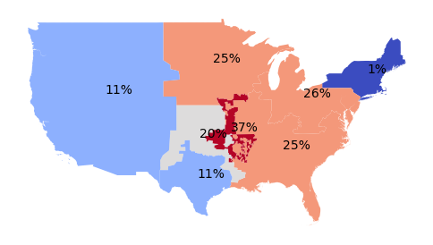
Area Labels
To label the areas we can use the pyplot text() function.
axis = nerc_percent.plot("Coal_Percent",
                scheme="naturalbreaks", cmap="coolwarm")

for row in range(len(nerc_percent)):
    plt.text(nerc_percent.centroid.x[row],
             nerc_percent.centroid.y[row],
             str(round(nerc_percent["Coal_Percent"].loc[row])) + "%")

axis.set_axis_off()

plt.show()
Categorical Aggregation
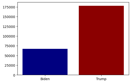
After completing a spatial join, aggregation can be performed on attributes other than area.
For this example, we spatially join the coal plants with state-level election results from the 2020 presidential election to find installed capacity by political leaning.
- The matlab pyplot bar() function is used to create a bar plot.
- The first parameter is the categories (x-axis).
- The second parameter is the bar heights (y-axis total installed capacity by category).
- The color parameter is an optional list containing colors for the bars.
electoral_states = geopandas.read_file("https://michaelminn.net/tutorials/data/2020-electoral-states.geojson")

electoral_states = electoral_states.to_crs(coal_plants.crs)

electoral_plants = coal_plants.sjoin(electoral_states)

electoral_plants = electoral_plants.groupby("Winner 2020")["Install_MW"].sum()

electoral_plants = electoral_plants.reset_index()

plt.bar(electoral_plants["Winner 2020"], electoral_plants["Install_MW"], color=["navy", "darkred"])

plt.show()
Nearest Aggregation
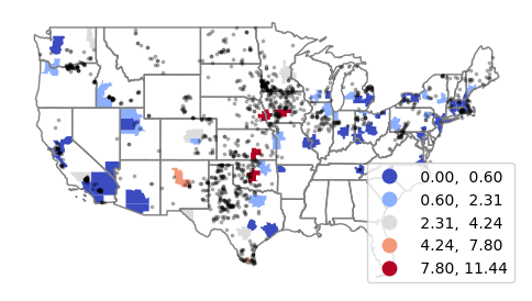
The GeoPandas sjoin_nearest() can be used to find nearest feature for each point in another layer. Analysis of proximity is covered in more detail in the tutorial Proximity Analysis in Python.
For example, this code sums the installed wind capacity in the nearest metropolitan statistical area (MSA) with over 500,000 residents.
wind_plants = plants[plants['Wind_MW'] > 0]

msa = geopandas.read_file('https://michaelminn.net/tutorials/data/2015-2019-acs-cbsa.geojson')

msa = msa.to_crs(wind_plants.crs)

msa = msa[msa['Total Population'] >= 500000]

wind_msa = wind_plants.sjoin_nearest(msa)

wind_msa = wind_msa.groupby('Name')['Install_MW'].sum()

wind_msa = wind_msa.reset_index()

wind_msa = msa.merge(wind_msa)

wind_msa['Wind_KW_Per_Capita'] = 1000 * wind_msa['Install_MW'] / wind_msa['Total Population']
A map shows that only a handful of Midwestern MSAs have significant local wind resources. This demonstrates why visions of a renewable energy future often include long-distance electricity transmission lines to carry wind energy from the Midwest to the high-density population areas on the coasts (Holmes 2022).
axis = wind_msa.plot("Wind_KW_Per_Capita", scheme="naturalbreaks", cmap="coolwarm", legend=True, ax=axis)

states.plot(facecolor="none", edgecolor="gray", ax=axis)

wind_plants.plot(markersize=3, color="#00000040", ax=axis)

axis.set_axis_off()

plt.show()
Area Autocorrelation
After points have been aggregated into areas, techniques with areas can be used to analyze and visualize autocorrelation.
Example Data
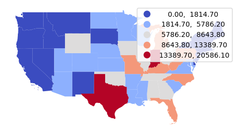
For these examples we will use total installed coal-fired power plant capacity in megawatts by state.
Note that the merge() method uses how="left" to perform a left join that keeps all state polygons regardless of whether there are any coal-fired power plants in the state.
Because the autocorrelation tools fail on data with missing (NA) values, the Pandas fillna() method is used to fill the NA kilowatts per capita with zero for states with no coal-fired power plants.
coal_states = coal_plants.groupby("State")["Install_MW"].sum()

coal_states = states.merge(coal_states, how="left", left_on="Name", right_on="State")

coal_states["Install_MW"] = coal_states["Install_MW"].fillna(0)

axis = coal_states.plot("Install_MW", scheme="naturalbreaks", cmap="coolwarm", legend=True)

axis.set_axis_off()

plt.show()
Neighbors
In order to detect autocorrelation between neighboring areas, we must first answer the ancient question, "Who is my neighbor?"
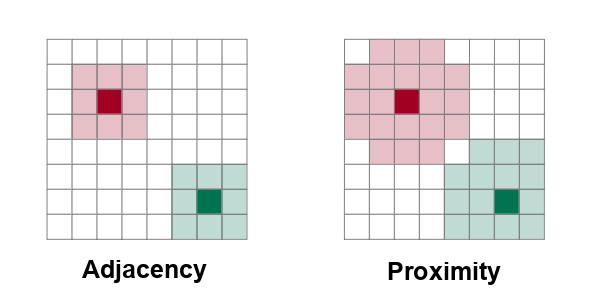
Neighboring areas can be defined by adjacency or proximity.
- Adjacency means that areas are considered neighbors if they share either a common border or a common corner (vertex). Adjacency based on a common vertex is called a queen rule after the rule in chess that allows queens to move diagonally.
- Proximity means that areas are considered neighbors if they are within a specific distance of each other.
To use the spatial regression tools in pysal, we must first create a weights matrix that indicates how each feature is to every other feature.
PySal is a Python package that includes non-spatial and spatial regression functions.
import pysal.lib

import pysal.model
pysal functions require matrices of weights that indicate whether areas are neighbors or not.
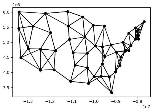
For proximity neighbors, the KNN() function creates a nearest neighbor weights matrix based on taking a specific number (k) of the closest features to each features.
- Defining neighbors by proximity compensates for areas of widely varying sizes, although there may be no objective rationale for the choice of k, and different values of k will yield different autocorrelation analysis results.
- The code below adds an ID column so the weight matrix calculation has a unique indentifier for features specified with the ids="ID" parameter.
coal_states["ID"] = range(coal_states.shape[0])

state_weights = pysal.lib.weights.KNN.from_dataframe(coal_states, ids="ID", k=4)

state_weights.plot(gdf=coal_states, indexed_on="ID")

plt.show()
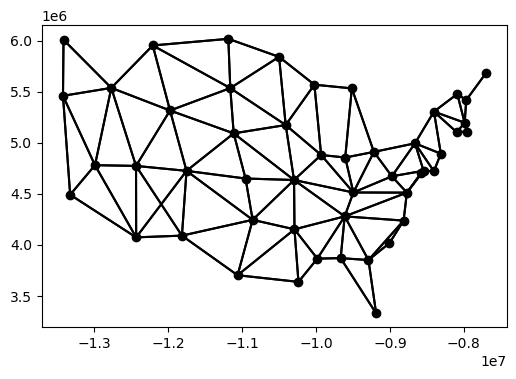
Matrices of adjacent neighbors can be created with the Queen() or Rook() function, depending on what direction of adjacency is desired.
coal_states["ID"] = range(coal_states.shape[0])

state_weights = pysal.lib.weights.Queen.from_dataframe(coal_states, ids="ID")

state_weights.plot(gdf=coal_states, indexed_on="ID")

plt.show()
Global Moran's I
Patrick Alfred Pierce Moran (1950) developed a technique for quantifying autocorrelation within values associated with areas. Moran's I is a method for assessing area autocorrelation analogous to the use of Ripley's K with points.
There are two types of Moran's I statistics: global and local.
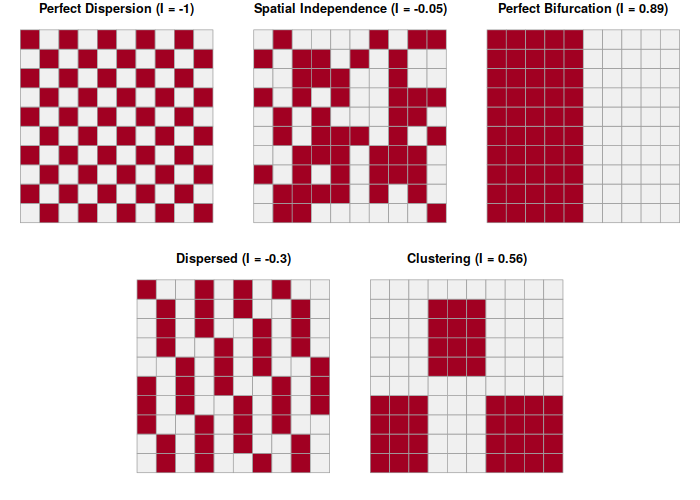
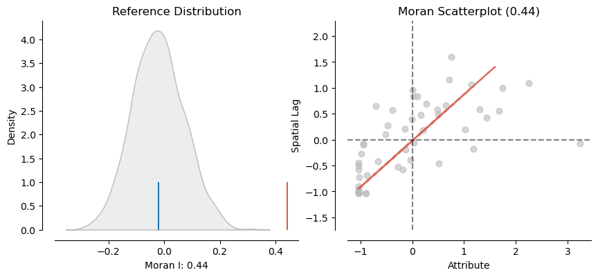
Global Moran's I assesses autocorrelation over the entire area of analysis as a single number, with values of the global Moran's I statistic varying from -1 (evenly dispersed = evenly spread out) to 0 (no autocorrelation) to +1 (completely clustered).
Once you have a weights matrix, the Moran() function calculates the Moran's I statistic for the areas being analyzed.
Because Moran() cannot handle NA values, the Pandas fillna() method is used below to fill the missing Install_MW values with zeroes under the assumption that there are no coal plants in those states.
The splot.esda functions create plots for Moran's I. The plot_moran() function can be used to visualize and analyze autocorrelation.
- The Moran's I value of 0.4 indicates significant autocorrelation of coal-fired power plants.
- The x axis is standardized values.
- The y axis are the spatial distance of adjacent values (spatial lag).
- The upward pattern from left to right in the scatter plot indicates that like values are closer together (autocorrelated).
import esda.moran

import splot.esda

coal_states["Install_MW"] = coal_states["Install_MW"].fillna(0)

moran = esda.moran.Moran(coal_states["Install_MW"], state_weights)

splot.esda.plot_moran(moran, zstandard=True, figsize=(10,4))

plt.show()
Local Moran's I
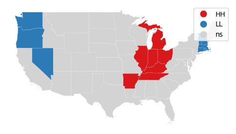
Local indicators of spatial association (LISA) were initially developed by Luc Anselin (1995) to decompose global indicators of spatial autocorrelation (like global Moran's I) and assess the contribution of each individual area.
LISA analysis with the local Moran's I statistic is used to identify clusters of areas with similar values and outlier areas with values that stand out among the neighbors.
- HH means a high value surrounded by high values (hot spots)
- HL means a high value surrounded by low values (high outlier)
- LH means a low value surrounded by high values (low outlier)
- LL means low value surrounded by low values (cold spot)
coal_states["Install_MW"] = coal_states["Install_MW"].fillna(0)

moran_local = esda.moran.Moran_Local(coal_states["Install_MW"], state_weights)

splot.esda.lisa_cluster(moran_local, coal_states[["Install_MW", "geometry"]])

plt.show()
Getis-Ord GI*
The Getis-Ord GI* statistic was developed by Arthur Getis and J.K. Ord and introduced in 1992. This algorithm locates areas with high values that are also surrounded by high values.
Unlike simple observation or techniques like kernel density analysis, the Getis-Ord GI* algorithm uses statistical comparisons of all areas to create p-values indicating how probable it is that clusters of high values in a specific areas could have occurred by chance. This rigorous use of statistics makes it possible to have a higher level of confidence (but not complete confidence) that the patterns are more than just a visual illusion and represent clustering that is worth investigating.
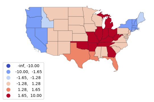
The Getis-Ord GI* statistic is a z-score on a normal probability density curve indicating the probability that an area is in a cluster that did not occur by random chance. A z-score of 1.282 represents a 90% probability that the cluster did not occur randomly, and a z-score of 1.645 represents a 95% probability.
The esda.G_Local() function implements Getis-Ord GI*, with the returned Zs field representing the z-score.
import esda.getisord

getisord = esda.getisord.G_Local(coal_states["Install_MW"],
	state_weights, star=True, transform="B")

getis_states = coal_states

getis_states["G"] = getisord.Zs

bins = [-10, -1.645, -1.282, 1.282, 1.645, 10]

getis_states.plot("G", cmap="coolwarm", legend=True,
	scheme="user_defined", classification_kwds={'bins':bins},
        edgecolor = "#00000040", legend_kwds={"bbox_to_anchor":(0.2, 0.2)})

plt.show()
