Point Data Analysis in ArcGIS Pro
Rev. 8 March 2025
Geospatial point data is used to represent things that exist or events that occurred at specific locations on the surface of the earth. Examples of points include crime locations, animal nests, street trees, vehicle charging stations, cellphone towers, WiFi hotspots, GPS waypoints, etc. Areas are sometimes represented with points (centroids) for mapping and navigation, such as with restaurants, houses, stores, or transit stations.
This tutorial demonstrates basic techniques for analysis of point data in ArcGIS Pro.
- Loading Point Data
- Filtering
- Point Maps
- ModelBuilder
- Point Autocorrelation
- Area Aggregation
- Area Autocorrelation
- Points to Polygons
- Colocation
- Centrographics
Loading Point Data
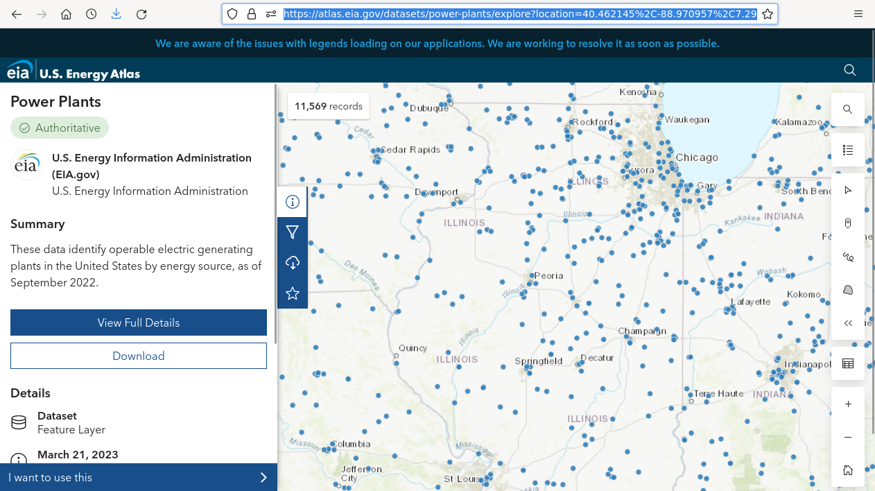
The example point data used for this tutorial is 2022 electrical power plant location data from the US Energy Information Administration.
The oil market disruptions of 1973 resulted in the creation of a wide variety of federal systems and organizations for collecting and managing national energy data, and these functions were centralized in the US Energy Information Administration by The Department of Energy Organization Act of 1977. The US Energy Information Administration (EIA) "collects, analyzes, and disseminates independent and impartial energy information to promote sound policymaking, efficient markets, and public understanding of energy and its interaction with the economy and the environment" (EIA 2023).
Current data is also available directly from the EIA's US Energy Atlas.
An older CSV file and metadata containing field information is also available here.
Loading a Feature Service
The following code shows how to import the power plant data from a feature service into the project geodatabase for visualization and analysis.
- Go to the US Energy Atlas, find the Power Plants data and copy the Geoservice feature service URL.
- Under Analysis and Tools, open the Export Features tool to copy the data from the feature service into a new feature class in the project geodatabase.
- Input Features: Paste in the URL. Remove the ending starting with "query..."
- Output Feature Class: Power_Plants
- Symbolize as Unique Values from the Primary Source attribute to map the plants by fuel source.
Viewing the Attribute Table
You can view the available data and fields in the Attribute Table.
Fields View offers data type information for each field.
Load CSV Points
Points can also be loaded in from CSV files containing fields with latitude and longitude.
- For this example we use the power plant CSV file available from the US Energy Atlas.
- Under Analysis and Tools, open the XY Table to Point tool to import the data as a new point feature class.
- Input Table: Find the CSV in your local storage
- Output Feature Class: Power_Plants
- X Field: Longitude
- Y Field: Latitude
ModelBuilder
The examples in this tutorial will use ArcGIS Pro ModelBuilder.
ModelBuilder is a visual programming language in ArcGIS Pro that allows you use a graphical editor to create custom tools that allow you to automate complex, tedious, or repetitive tasks where there are consistent step-by-step workflow sequences of operations.
Using ModelBuilder, you graphically chain together sequences of tools from the toolbox.
Advantages:
- ModelBuilder diagrams allow you to change parameters and re-run tools without having to retype and remember your prior settings.
- ModelBuilder creates accessible diagrams as documentation for reports.
- ModelBuilder's only prerequisite requirement is familiarity with ArcGIS Pro tools and workflows.
- ModelBuilder is a simpler alternative to Python scripting in ArcPy and requires no background in coding.
- ModelBuilder can be a good solution for GIS people who infrequently create automated workflows.
Disadvantages:
- ModelBuilder provides no ability to automate symbology or layout.
- ModelBuilder creates an illusion of simplicity by hiding important details.
- ModelBuilder promotes vendor lock-in to ESRI products.
- ModelBuilder is a specialized skill, as opposed to Python programming as a general skill.
- ModelBuilder diagrams of complex workflows can be incomprehensible.
- ModelBuilder does not facilitate modular decomposition.
- When you create spaghetti code in a visual programming language, it actually looks like spaghetti.
ModelBuilder might be better called WorkflowBuilder since what you are usually creating in ModelBuilder are automated workflows for complex sequences of processing tasks rather than models that are analytical representations of real-world phenomena.
- A workflow is "the sequence of steps involved in moving from the beginning to the end of a working process" (Merriam-Webster 2023).
- ModelBuilder allows you to transform conceptual workflows into sequences of tool operations while also documenting those workflows as diagrams that facilitate communication of information about those workflows with non-technical audiences.
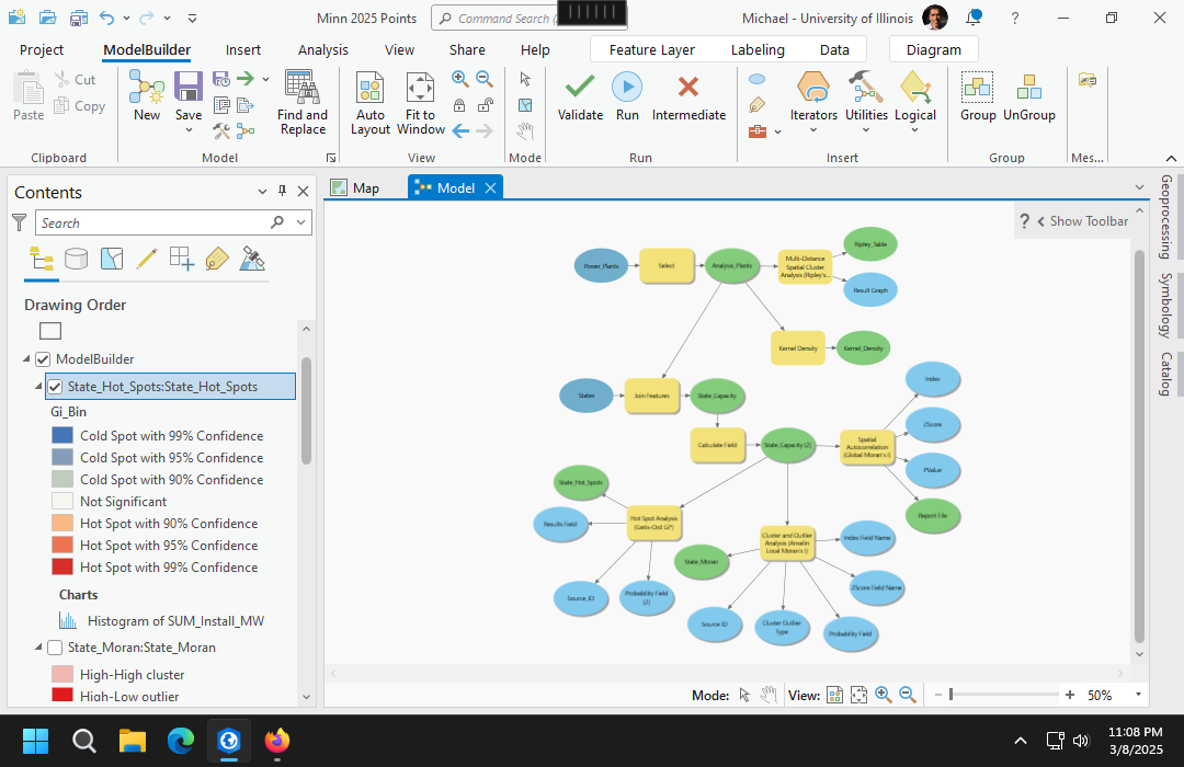
Creating a ModelBuilder Diagram
To start the ModelBuilder editor, on the Analysis ribbon, select ModelBuilder.
To add a tool, on the View ribbon, select Geoprocessing, search for the tools and drag them into ModelBuilder. Tools are represented in model builder as rectangles and data is represented with ovals.
Note that ModelBuilder has a separate Save button on the ModelBuilder ribbon. You must save your diagram before saving your project or saving a project package, or your diagram may be missing some or all components when you reopen the project or project package.
ModelBuilder can cause project packaging to fail. See this tutorial for common errors and workarounds for those errors.
View Python
Behind the scenes, ModelBuilder creates Python code that you can view.
On the ModelBuilder ribbon, click the Export options (green arrow) and select Send To Python Window to view or copy the code.
Filtering
A filter selects a specified subset of the data.
Data can be filtered into a separate feature class with the Select tool. In this example we filter coal-fired power plants into a new feature class.
- Input Features: Power_Plants
- Output Feature Class: Analysis_Plants
- Expression: Primary Source is equal to Coal
Select Add to Display on the output feature class to show the new feature class on your map.
Point Maps
Simple Point Map
As shown above, after a point data set is imported into the project geodatabase, it is automatically added to the current map.
You can right-click on the layer in the Contents pane and select Symbology to change the default symbology.
Mapping a Quantitative Variable
A common method of visualizing points with a quantitative attribute is the graduated symbol (bubble) map that uses differently sized shapes based on the variable being mapped.
- Although circles are most common, other types of icons can be used for aesthetic variety.
- This example uses the Total Nameplate Capacity (Install_MW) attribute, which is the maximum rated power for each plant in megawatts (MW). Commercial-scale fossil-fueled or nuclear electricity plants typically range from 500 MW to 2,000 MW or more.
- If you have overlapping symbols, hollow symbols permit smaller symbols to be visible under larger symbols.
Point Autocorrelation
One of the primary ways of analyzing the spatial distribution of phenomenon is looking where points group together, or where high or low values are clustered together.
Spatial autocorrelation is the clustering of similar values together in adjacent or nearby areas.
Spatial data is usually spatially autocorrelated, and this tendency is useful since clusters often provide insights into the characteristics of the clustered phenomena.
While visible observation of spatial autocorrelation is useful when exploring data, more-rigorous means of quantifying autocorrelation are helpful when performing serious research.
Ripley's K
B.D. Ripley (1977) developed a collection of lettered techniques for analyzing spatial point correlation.
The Ripley's K function iterates through each point and counts the number of other points within a given distance.
- The graph of K gives distances on the x axis and the total number of points at those distances on the y axis.
- The visualized output below has blue lines from the simulations showing what would be expected theoretically if points were randomly distributed across the area.
- This red line is the line of observed values from the data.
Autocorrelation is evaluated by analyzing the position of the observed line relative to the theoretical lines.
- Areas where the observed line is above the theoretical line indicates clustering at the given distances.
- Areas where the observed line is below the theoretical line indicates even dispersion at the given distances.
- The example diagram below with observed consistently above the theoretical indicates clustering at all distances.
While ArcGIS Pro does not create Ripley's K graphics, it can be used to create a table that can be mapped as a line chart.
- Under Analysis and Tools, open the Multi-Distance Spatial Cluster Analysis (Ripley's K Function) too.
- Input Feature Class: Analysis_Plants
- Output Table: Ripley_Table
- Number of Distance Bands: 10 (default)
- Compute Confidence Envelope: 0 permutations
- Add to Display, click on the table in the Contents pane and select Visualize, Create Chart, Line Chart.
- Date or Number: ExpectedK
- Numeric field(s): Add ExpectedK and ObservedK
- Under Properties and Series, change the Symbol for the ExpectedK to blue and the ObservedK to red.
Kernel Density
A classical method of mapping areas of high spatial autocorrelation of points is kernel density analysis, in which a kernel of a given radius is used to systematically scan an area, and the density of any particular location is the number of points within the kernel surrounding that point. Locations surrounded by clusters of points will have higher values, and areas where there are few or no points will have lower values.
A kernel density raster can be created using the Kernel Density tool.
The search radius parameter will define how much smoothing will be applied to create the raster. While the search radius can be thought of as an area of influence around each point, the choice is often arbitrary, which reduces the rigor of kernel density analysis.
- Input point or polyline features: Analysis_Points
- Population field: Set to Total Nameplate Capacity if you want to consider plant size.
- Output raster: Kernel_Density
- Search radius: 300000 (meters)
Heat Map
A heat map symbology is similar to a kernel density except that the smoothing radius changes depending on your level of zoom. Accordingly, this is another arbitrary visualization technique that is primarily of value as an interactive exploratory technique.
Area Aggregation
Aggregation of points into areas adds attributes to the areas that summarize information about the points within each area.
When analyzing point data, it can be helpful to aggregate counts and attribute values by areas and then analyze the values in those areas for relationships.
Spatial joins can be used to aggregate points in a join layer to area polygons in a target layer.

Aggregation States
For this example, we will aggregate by US states using polygons from the Minn 2024 Electoral States feature service in the University of Illinois ArcGIS Online organization.
Under Analysis and Tools, open the Export Features tool to copy the data from the feature service into a new feature class in the project geodatabase. Perform this operation separately from ModelBuilder so that ArcGIS Pro does not re-read the entire feature service when you save your project package.
- Input Features: Search in ArcGIS Online for Minn 2024 Electoral States
- Output Feature Class: States
Aggregate by Areas
- Add the Join Features tool to your ModelBuilder diagram.
- Target Layer: States
- Join Layer: Analysis_Plants
- Output Dataset: State_Capacity
- Spatial Relationship: Intersects
- Summary Fields: Nameplate Capacity (sum)
- Add to Display, and modify the Symbology to show the Sum_Install_MW.
Normalization
States with larger populations will have higher electricity demands and larger amounts of installed power plant capacity. What is often more meaningful for the purposes of analysis is the capacity per resident of the state (per capita).
Normalization is the adjustment of variable values to a common scale so they are comparable across space and time (Wikipedia 2023).
- Use the Calculate Field tool to normalize by population.
- Input Feature Class: State_Capacity
- Field Type: Double. Set this before setting the field name, or the tool will default to a Text type and you will be unable to symbolize the field quantitatively.
- Field Name: KW_per_Capita
- Expression: Sum_InstallMW / Total_Population * 1000 (Multiply by 1000 to get kilowatts from megawatts since home energy use is usually measured in kilowatt-hours.)
- After running the tool, remove the old State_Capacity layer and Add to Display the updated feature class so the new field is visible.
- Note that in this case, states with high levels of coal production and strong political influence from coal producers (Wyoming and West Virginia) now stand out with the highest per capita electricity generation from coal.
Categorical Comparison
If your area data contains a meaningful categorical variable, you can compare aggregated values by category.
For this example, we spatially join the coal plants with state-level election results from the 2012 presidential election to find installed capacity by political leaning. Republican (Romney) states are significantly more dependent on coal plants than Democratic (Obama) states.
Select the State_Capacity layer in the Contents pane and select Data, Visualize, Create Chart, Box Plot.
- Category: Winner_2012
- Numeric field(s): KW_per_Capita
- Remove the unnecessary chart title.
Area Autocorrelation
After points have been aggregated into areas, techniques with areas can be used to analyze and visualize autocorrelation.
For these examples we will use total installed coal-fired power plant capacity in megawatts by state.
Neighbors
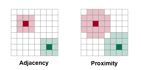
In order to detect autocorrelation between neighboring areas, we must first answer the ancient question, "Who is my neighbor?"
Neighboring areas can be defined by adjacency or proximity.
- Adjacency means that areas are considered neighbors if they share either a common border or a common corner (vertex). Names of adjacency relationships in ArcGIS Pro include Contiguity edges only and Contiguity edges corners, also called the "queen rule" after the rule in chess that allows queens to move diagonally.
- Proximity means that areas are considered neighbors if they are within a specific distance of each other. Names of proximity relationships in ArcGIS Pro include Inverse distance, Inverse distance squared, and K nearest neighbors.
Global Moran's I
Patrick Alfred Pierce Moran (1950) developed a technique for quantifying autocorrelation within values associated with areas. Moran's I is a method for assessing area autocorrelation analogous to the use of Ripley's K with points.
There are two types of Moran's I statistics: global and local.
The global Moran's I tool in ArcGIS Pro assesses autocorrelation over the entire area of analysis as a z-score (number of standard deviations away from the expected mean if the distribution was random).
- High z-scores (> +1.96) indicate high levels of clustering.
- Low z-scores (< -1.96) indicate high levels of even dispersion.
- z-scores between those extremes around zero indicate a random distribution and an absence of autocorrelation.
To evaluate autocorrelation using Moran's I in ArcGIS Pro:
- Add the Spatial Autocorrelation (Global Moran's I) tool to your ModelBuilder diagram.
- Input Feature Class: State_Capacity
- Input Field: SUM_Install_MW
- Generate Report: Check this box
- Conception of Spatial Relationships: Inverse distance (proximity)
- View the HTML report link to see the graphical report showing the results.
Local Moran's I
Local indicators of spatial association (LISA) were initially developed by Luc Anselin (1995) to decompose global indicators of spatial autocorrelation (like global Moran's I) and assess the contribution of each individual area.
LISA analysis with the local Moran's I statistic is used to identify clusters of areas with similar values and outlier areas with values that stand out among the neighbors.
- High-High cluster means a high value surrounded by high values (hot spots)
- High-Low outlier means a high value surrounded by low values (high outlier)
- Low-High outlier means a low value surrounded by high values (low outlier)
- Low-Low cluster means low value surrounded by low values (cold spot)
Add the Cluster and Outlier Analysis (Anselin Local Moran's I) tool to your diagram.
- Input Feature Class: State_Capacity
- Input Field: SUM_Install_MW
- Output Feature Class: State_Moran
- Conception of Spatial Relationships: Inverse distance (proximity)
Add to Display to see the clusters and outliers. In this case we see the expected high clustering in the Midwest, with Oklahoma as a low outlier among other coal dependent southern states.
Getis-Ord GI*
The Getis-Ord GI* statistic was developed by Arthur Getis and J.K. Ord and introduced in 1992. This algorithm locates areas with high values that are also surrounded by high values.
Unlike simple observation or techniques like kernel density analysis, the Getis-Ord GI* algorithm uses statistical comparisons of all areas to create p-values indicating how probable it is that clusters of high values in a specific areas could have occurred by chance. This rigorous use of statistics makes it possible to have a higher level of confidence (but not complete confidence) that the patterns are more than just a visual illusion and represent clustering that is worth investigating.
The Getis-Ord GI* statistic is a z-score on a normal probability density curve indicating the probability that an area is in a cluster that did not occur by random chance. A z-score of 1.282 represents a 90% probability that the cluster did not occur randomly, and a z-score of 1.645 represents a 95% probability.
Add the Hot Spot Analysis (Getis-Ord Gi*) tool to your ModelBuilder diagram.
- Input Feature Class: State_Capacity
- Input Field: SUM_Install_MW
- Output Feature Class: State_Hot_Spots
- Conception of Spatial Relationships: Inverse distance (proximity)
With this data, Getis-Ord GI* analyzes the clusters as Not Significant but notes the outlier hot spot states with large plants that are not surrounded by other states with large plants.
Points to Polygons
Voronoi Polygons
Voronoi polygons are polygons around points that each contain one point and have edges that evenly divide the areas between adjacent points. Voronoi diagrams are named after Russian mathematician Georgy Feodosievych Voronoy. They are also sometimes called Thiessen polygons after American meterologist Alfred Thiessen (Wikipedia 2023).
While Voronoi polygons are a useful way of visualizing points as areas, the polygons are mathematical abstractions that may not represent actual areas of influence or jurisdiction in the real world, and care must be taken to communicate that limitation.
- Insert a new map and give it a meaningful name (Voronoi Map).
- Under Analysis and Tools, open the Select tool to create a feature class with a small enough number of points to have a visible group of polygons.
- Input Features: Power_Plants
- Output Feature Class: NV_Geothermal
- Expression: Where State is equal to Nevada and Geothermal_MW is greater than 0
- Under Analysis and Tools, open the Create Thiessen Polygons tool.
- Input Features: NV_Geothermal
- Output Feature Class: NV_Geothermal_Polygons
- Output Fields: All fields
Hulls
Points can also be bound by hulls to more-clearly demonstrate the spatial extent of the points, such as when you need to visualize a service area for a utility or transit service.
This example uses the Nevada geothermal points selected above.
Under Analysis and Tools, open the Minimum Bounding Geometry tool.
- Input Features: NV_Geothermal
- Output Feature Class: NV_Geothermal_Hull
- Geometry Type: Convex hull
Colocation
Colocation analysis assesses how closely two sets of points are located to each other. The two sets of points can be in different feature classes or distinguished by a categorical variable in the same feature class.
For this example, we examine colocation between coal-fired power plants and natural gas-fired power plants.
ArcGIS Pro provides a Colocation Analysis tool.
- Input Type: Single dataset
- Input Features of Interest: Power_Plants
- Field of Interest: Primary Source
- Category of Interest: coal
- Neighboring Category: natural gas
- Output Features: Plant_Colocation
In this output we see few coal plants colocated with natural gas plants, which confirms the visual observation that areas served by coal plants tend to be separate from areas served by natural gas plants.
Centrographics
Centrographics summarize point patterns as a single central feature.
Mean Center
Mean center is the location that is at the minimum possible total distance from all points. Mean center can be calculated by taking the mean (average) of all latitudes and the mean of all longitudes.
ArcGIS Pro provides the Mean Center tool.
Standard Deviational Ellipse
A standard deviational ellipse is an ellipse formed around the mean center with the distances based on the standard deviation of the X and Y values.
The standard deviational ellipse clarifies the spatial distribution of points more rigorously than simple visual observation.
You can create a standerd deviational ellipse with the Directional Distribution tool.