Descriptive Statistics in ArcGIS Pro
Revised 31 May 2026
When you begin working with a new data set, your first step is usually to explore that data to find out what is in the data and whether it will meet the needs of your project.
Descriptive statistics are calculated values that summarize data. ArcGIS Pro provides a number of tools for calculating and visualizing descriptive statistics to facilitate exploration of data.
This tutorial covers techniques for exploring geospatial data with descriptive statistics in ArcGIS Pro.
Loading and Mapping Data
ArcGIS Pro is fundamentally a mapping program, so the first step in exploring data in ArcGIS Pro is to import and map the data.
For the examples in this tutorial, we will use two feature classes:
- The Minn 2020-2024 ACS feature service in the University of Illinois ArcGIS Online organization features a wide variety of commonly-used demographic variables from the 2020-2024 ACS five-year estimates data profile (DP) tables at state, county, and census tract aggregation levels. The data has full metadata and is also available as GeoJSON.
- The Minn 2024 US Hospitals feature service in the University of Illinois ArcGIS Online organization is point locations of hospitals in the US. This data was originally available from the US Department of Homeland Security Homeland Infrastructure Foundation-Level Data (HIFLD) set, but was password protected in 2025.
Mapping permits visual analysis of geospatial data for answering general where questions.
- What regions of the state have the highest income?
- What regions of the state are underserved by hospitals?
In ArcGIS Pro, Under Analysis, run the Export Features tool to export the feature service data into the project geodatabase.
- Input Features: Search ArcGIS Online for the desired feature service (Minn 2020-2024 ACS) and select the tracts layer.
- Output Features: Provide a meaningful name (Tracts)
- Filter: Filter to import only tracts in one state (IL).
- After the tool adds the layer to your map, symbolize by the desired variable (Median_Household_Income).
- Repeat for any additional data sets (Minn 2024 US Hospitals). Note that for this particular data set we filter both for the state and to remove features with negative BEDS values (-999), which are used to represent missing data.
Metadata
Metadata is data about your data. When working with a data set for the first time, you should investigate whether metadata is available for the data set that will answer critical questions about whether your data is appropriate and trustworthy.
- What were the original sources for the data?
- What time period does the data cover?
- Who published the data?
- When was the data published?
- What do the different data fields represent?
- What units are used by the different data fields?
- Are there any legal restrictions on reuse or redistribution of the data?
- Are there warnings about possible problems with the quality or validity of the data?
Because metadata is created separately from the data and is tedious to create and maintain, metadata is often incomplete and out-of-date.
When working with an ArcGIS Online feature layer, you will need to go into ArcGIS Online, create a map, add the layer, and then view the information page.
In some cases, the information page will link to additional information on the data.
Attribute Table
You can view the attribute table for a feature class by right-clicking on the layer in the Contents pane and selecting Attribute Table.
The total number of features in the feature class is listed below the table.
To view details on the attribute data types, click the menu icon at the top right of the attribute table and select Fields View.
The Fields View can be used to answer questions like:
- What fields are available in the data?
- What are the data types of the available fields?
ArcGIS Pro fields can have a variety of has a variety of different data types. When you are creating new feature classes or modifying existing feature classes, you will need to decide which types to use.
- Long integer: These are 32-bit fields used for representing quantitiative values that are whole numbers (e.g. counts - no decimal part). The possible range is -2,147,483,648 - +2,147,483,647, which is usually adequate for most counts.
- Big integer: These are 64-bit fields for whole numbers. These match the number of bits used in memory for integers on contemporary machines for maximum computational efficiency, but will usually consume unnecessary space compared to long integers when storing a feature class containing large numbers of features.
- Short integer: These are 16-bit fields also used for representing small whole numbers when conserving storage space is important, or if the data comes from an old source. The range is -32768 - +32767, so you will generally want to avoid this type on modern computers.
- Float: These are 32-bit floating point fields that can be used with decimal numbers.
- Double: These are high precision 64-bit floating point fields that can also be used with decimal numbers. Double may give marginally higher performance on contemporary machines, at the cost of additional storage requirements with large data sets.
- Text: These are strings of characters that can be used to represent any data type, although conversion to one of the quantitative types above will be needed when mapping quantitative data in ArcGIS Pro
- Date: These are used to represent dates and times. Although internally stored as numbers, these should only be used for date or time information.
Distribution
The distribution of a variable is the manner in which the values are spread across the range of possible values.
- Distributions are commonly summarized with a central tendency like mean or median.
- The mean (commonly called average) is the sum of all values divided by the number of values.
- Normal distributions are further summarized with standard deviation that indicates how far values are spread away from the mean.
- Skew is the extent to which values are evenly distributed around the mean compared to a normal distribution. Skew will be negative if the left tail of the distribution is longer, and positive if the right tail of the distribution is longer. The skewness of a normal distribution is zero.
- Kurtosis is a measurement of how flat or peaked the distribution is compared to a normal distribution. Kurtosis is positive for a sharply peaked distribution and negative for a distribution that is flatter than a normal distribution. The kurtosis of a normal distribution is zero.
A quantile shows the values in a distribution below given percentages of the population.
- The 0% quantile is the minimum value.
- The 50% quantile is the median where 50% of the values in the distribution are at or below the median value.
- The 100% quantile is the maximum value.
- Medians are often preferred over means because medians give a clearer value for central tendency than means that can be distorted by skew and outliers.
- Quantiles that divide the distribution into four groups are called quartiles and quantiles that divide the distribution into five groups are called quintiles.
Calculate Statistics
Descriptive statistics available in ArcGIS Pro allow you to answer questions about individual data fields.
- What are the poorest and wealthiest tracts in Cook County (minimum and maximum)?
- What is the median income across census tracts in Illinois (mean or median)?
- How many neighborhoods do not have valid income data in this data set (Nulls)?
- How evenly is income distributed across neighborhoods in Chicago (skew and kurtosis)?
To view descriptive statistics for selected attributes:
- In the Contents pane, select the layer.
- Select Data, Data Engineering.
- Drag fields into the viewing area, or just select Add all fields and calculate.
Histograms
Histograms are charts commonly used to visualize distributions by showing bars with the number of entries in different ranges of values.
Histograms are used to answer the question, "How are the values in a variable distributed across the range of possible values?"
- A normal distribution has most of the values clustered in the middle of the histogram around the mean (central tendency) value.
- A left skewed distribution has most values clustered in the higher part of the range, with a tail of lower values extending to the left on the histogram.
- A right skewed distribution has most values clustered in the lower part of the range, with a tail of higher values extending to the right on the histogram.
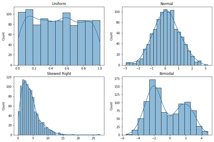
The histogram below shows that half of all census tracts in Illinois over the 2020-2024 period had a median household income of 87,860 and the distribution is skewed to the left, with a handful of tracts having unusually high incomes.
- In the Contents pane, select the layer.
- Select Data, Visualize, Create Chart, Histogram
- Number: Median_Household_Income
- Statistics: Mean, Median and Std.Dev.
- Under General properties, remove the unnecessary title to leave more space for the visualization.
- If desired, Export As Graphic.
Rank Order Bar Plot
The rows with the highest and lowest values in the distribution can be displayed by viewing the Attribute Table and right-clicking on the field you want to use to sort the table.
A rank order graphic or table displays the values in a variable sorted highest to lowest.
To create a bar plot showing the highest and lowest values in rank order:
- Copy and Paste the data layer in the Contents pane to duplicate it (Top Hospitals).
- View the attribute table to find the threshold for highest and lowest values (18 and 651 beds).
- Under Properties, add a Definition Query to list only the highest and lowest values based on thresholds from the attribute table.
- You can select rows in the attribute table to find the features on the map.
- Under Data, Visualize, Create Chart, create a Bar Chart.
- The Category is the feature name.
- Aggregation is None.
- Add the Numeric Field to plot (BEDS)
- Select Label bars
- Sort Y-axis Descending.
- Under Axis, increase the X-axis character limit if needed to fully display the feature names.
- If needed, Export the chart.
Categories
If you have a categorical variable that divides your features into groups, you have a variety of options for exploring the differences between the groups.
Classification
Classification of a continuous value involves assigning features to specific classes or groups based on ranges of values.
ArcGIS Pro has a number of classification methods that can be used when mapping quantitative values (ESRI 2026):
- Natural breaks: Class boundaries are automatically set to group similar values and maximize differences between classes. This is the default in ArcGIS Pro. The algorithm used for this method was developed by cartographer George Jenks (1967).
- Quantile: Each category has approximately the same number of features. This ensures visual variety in maps, but can exaggerate minor differences compared to natural breaks.
- Equal interval: Ranges for values are equally distributed from lowest to highest. Generally only useful for uniform distributions or where absolute value is especially relevant.
- Standard deviation: Ranges are specified in standard deviations from the mean. Primarily useful for fields with unskewed normal distributions and few outliers. Can be difficult for non-technical viewers to interpret.
- Geometric interval: Class breaks follow a geometric distribution. Useful for fields with highly skewed distributions.
- Manual interval: Range thresholds are set by the user. This should be used with caution to avoid biasing visualizations to reinforce preconceptions.
If you need to preserve categories for analysis, you can use the Reclassify Field tool to create a field with classified categories based on ranges of values in a quantitative field.
- Input Table: Hospitals
- Field to Reclassify: BEDS
- Reclassification Method: For this example we use a natural breaks classification of hospital size into large, medium, and small.
- Number of Classes: 3
- Output Field Name: Hospital_Size
- Duplicate the layer, rename it (Classified Values), and symbolize by the new variable.
- The classifications are numeric and you can change the legend labels if you want descriptive class names.
Category Counts
You can create a chart of counts for the number of rows associated with the different values of a categorical variable to answer questions like: How many more small hospitals are there than large hospitals.
- Select Data, Visualize, Create Chart, Bar Chart.
- Category or Date: Hospital_Size_RANGE
- Aggregation: Count
- Check Label bars
- Under General, unclick Chart title to remove the redundant chart title and leave more space for the bars.
- If needed, Export the chart as a PNG file to import to a document as a figure.
Distribution Comparison
Box and whisker plots (box plots) display distributions as quartile boxes with whiskers and outlier dots showing the full range of values.
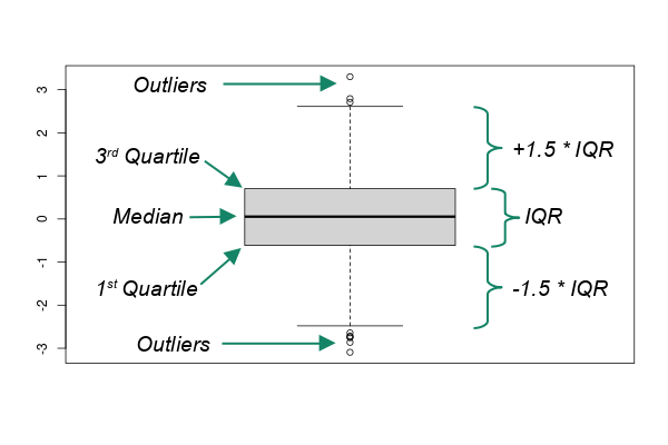
Box and whisker plots are useful for comparing the distributions of quantitative variable for different groups defined by a categorical variable and answering questions like: Are level 1 trauma centers generally larger than level 2 trauma centers?
For this hospital data set, there is a TRAUMA categorical variable that indicates whether it level 1 or 2 trauma center. We can use that to compare bed capacities between the different types of hospitals.
- Select the layer and in the Data ribbon select Create Chart, Box Plot.
- Numeric Field: Beds
- Category: The categorical variable (TRAUMA)
Points and Polygons
While points and polygons are very different representations of spatial phenomena, there are situations where your data is in polygons and your analysis would be easier with points, or vice versa.
Centroids
The centroid of a polygon is the geometric center that is at the minimum distance from all possible points that could be located in a polygon. Centroids are are useful simplifications of areas for cartographic or analytical purposes when area representations would add unnecessary clutter to a map. Points are also useful for symbology with pictograms, such as a map of restaurants or hospitals.
Open the Feature to Point tool to create a feature class of centroids for the areas (census tracts).
- Input Features: Tracts
- Output Feature Class: Tract_Centroids
- Inside: Check to create centroids
Symbolize the features. You can adjust the drawing order if you want a particular class of centroids to be displayed over others.
Voronoi Polygons
Voronoi polygons are polygons around points that each contain one point and have edges that evenly divide the areas between adjacent points. Voronoi diagrams are named after Russian mathematician Georgy Feodosievych Voronoy. They are also sometimes called Thiessen polygons after American meterologist Alfred Thiessen (Wikipedia 2023).
While Voronoi polygons are a useful way of visualizing points as areas, the polygons are mathematical abstractions that may not represent actual areas of influence or jurisdiction in the real world, and care must be taken to communicate that limitation.
Open the Create Thiessen Polygons tool.
- Input Features: Hospitals
- Output Feature Class: Hospital_Polygons
- Output Fields: All fields
Hulls
Points can also be bound by hulls to more-clearly demonstrate the spatial extent of the points, such as when you need to visualize a service area for a utility or transit service.
- This example uses a selection of psychiatric hospitals from the Illinois hospitals feature class.
- Open the Minimum Bounding Geometry tool.
- Input Features: Psychiatric_Hospitals
- Output Feature Class: Hospital_Hull
- Geometry Type: Convex hull
- You can create a buffer around the hull if you need smoother edges.
- Input Features: Hospital_Hull
- Output Feature Class: Hospital Buffer
- Distance: 50 kilometers
Centrographics
Centrography is "statistical analyses concerned with centers of population, median centers, median points, and related methods" (Sviatlovsky and Eells 1939). Much like general statistical measures of central tendency, centrographic measures can be useful for summarizing large amounts of data, assessing change over time, and optimizing proximity.
Mean Center
The mean center is the point at the mean of all latitudes and mean of all longitudes for a group of features.
When working with points of interest, the mean center represents an optimal location with the minimum amount of Euclidean distance to each point of interest. Mean centers can be useful for answering questions line:
- What would be the location to hold a conference that minimizes travel distance for participants?
- Where would the optimal location be for a new fire station that minimizes distance to currently underserved communities?
Although mean centers can be used in planning to minimize travel distance from peripheral locations (such as for distribution hubs or professional conferences), mean centers may not represent perfectly optimized travel distance since transportation networks or physical obstacles may impose indirect routing and access.
The Mean Center tool creates a new feature class with one point at the mean center.
- Input Feature Class: Hospitals
- Output Feature Class: Hospital_Center
- Weight Field: BEDS
Repeating with the mean center of the population by census tract shows that hospital beds are generally well aligned with population in Illinois.
Standard Deviational Ellipse
A standard deviational ellipse visually summarizes the center, dispersion, and directional trend of a set of features. Standard deviational ellipses can be used to visually compare spatial distributions of differing sets of points.
- Open the Directional Distribution (Standard Deviational Ellipse) tool.
- Input Feature Class: Hospitals
- Output Ellipse Feature Class: Hospital_Ellipse
- Weight Field: Beds
- Repeating with tract population (centroids) we see a longer ellipse that is reflective of greater population dispersion compared to the concentration of large hospitals in Chicagoland and the St. Louis metropolitan area.