Creating a Print Layout in R
While R has strong capabilities for creating data visualizations, including map figures, interactive GIS and graphics programs (like ArcMap, QGIS and Adobe Illustrator) are much more flexible when creating complex print layouts. However, it is possible to create acceptable printable maps assuming you have patience and don't ask for too much.
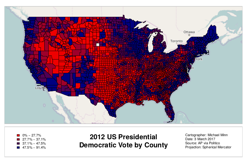
The following is a script that creates a county-level election data map for the 2012 US presidential election using data that is available here.

# Open the device to print to a PDF file
pdf(file="2012-election.pdf", height=8.5, width=11, title="2012 US Presidential Election Results by County")

# Plot the base map with extra space on the bottom
library(OpenStreetMap)

upperLeft = c(51, -130)
lowerRight = c(15, -60)
basemap = openmap(upperLeft, lowerRight, type="osm")

par(mar=c(1,1,1,1))
plot(basemap, mar=c(1,1,1,1), removeMargin=F)


# Import county polygons and data
library(rgdal)

counties = readOGR(dsn=".", layer="2016-presidential-counties", stringsAsFactors=F)

# Show only the continental US
counties = counties[!(counties$ST %in% c("AK", "HI")),]

# Transform to the OSM spherical Mercator projection
counties = spTransform(counties, osm())


# Cut counties into quantiles by percent of vote going to Democrats
quant = quantile(counties$PCDEM2012)

# Use the quantiles to pick colors from a red-blue color ramp
palette = colorRampPalette(c("red2", "navy"))
ramp = palette(4)
colors = ramp[cut(counties$PCDEM2012, quant)]

plot(counties, col = colors, add=T)

# Functions to calculate plot locations based on percent from left and bottom, respectively
plotx = function(percent) {
	return(basemap$bbox$p1[1] + ((basemap$bbox$p2[1] - basemap$bbox$p1[1]) * percent)) }

ploty = function(percent) {
	return(basemap$bbox$p2[2] + ((basemap$bbox$p1[2] - basemap$bbox$p2[2]) * percent)) }


# Function to draw boxed areas
drawbox = function(left, top, right, bottom, ...) {
	polygon(x = c(left, right, right, left, left), y = c(top, top, bottom, bottom, top), ...) }

# White out marginalia area
drawbox(left = plotx(0), top = ploty(0.22), right = plotx(1), bottom = ploty(0), col="white", border=NA)

# Marginalia border
drawbox(left = plotx(0), top = ploty(0.2), right = plotx(1), bottom = ploty(0), col="white", border="gray", lwd=2)

# Neatline
drawbox(left = plotx(0), top = ploty(1), right = plotx(1), bottom = ploty(.22), col=NA, border="gray", lwd=2)


# Draw legend

ranges = sapply(1:4, function(x) paste0(quant[x], '% - ', quant[x + 1], '%'))

legend(x = plotx(0.04), y = ploty(0.17), cex=0.9, bty='n',
	legend = ranges, fill=ramp, bg="white", inset=0.05 )

# Title and metadata

text(x = plotx(0.5), y = ploty(0.15), pos=1, font=2, cex=1.8,
	labels="2012 US Presidential\nDemocratic Vote by County")

text(x = plotx(0.75), y = ploty(0.09), pos=4, font=1, cex=0.9,
	labels="Cartographer: Michael Minn\nDate: 3 March 2017\nSource: AP via Politico\nProjection: Spherical Mercator")

# Close the output PDF file
dev.off()