The Normal Distribution in R
Distributions
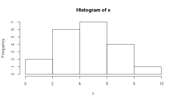
A distribution is the manner in which a set of values are spread across a possible range of values. A common way of visualizing a distribution is a histogram which shows the number of elements, or frequency, within ranges of values:
> x = c(3, 5, 2, 3, 3, 6, 3, 10, 5, 5, 5, 7, 8, 7, 1, 5, 5, 4, 4, 7)
> hist(x)
The Normal Distribution
One of the most commonly-encountered distributions in statistics is the normal distribution. The distribution of values for a wide variety of measurements of social and environmental phenomena roughly follow a normal distribution. Examples:
- The heights and weights of people in the United States
- The heights and weights of frogs
- Standardized test scores
- The deviations of actual weights of potato chips from the weights marked on the package
Although the formula for the normal distribution is complex, R contains a number of functions that allow analysis of data. The smoothed histogram associated with the normal distribution is popularly known as the bell curve:
> x = seq(-3, 3, 0.1)
> plot(x = x, y = dnorm(x), type="l", bty="n")
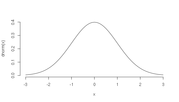
The bell curve is a density curve, and the area under the bell curve between a set of values represents the percent of numbers in the distribution between those values.
The middle value of a normal distribution is the mean, and the width of the bell curve is defined by the standard deviation.
- 68.2% of the values are within one standard deviation of the mean
- 95.4% of the values are within two standard deviations of the mean
- 99.7% of the values are within three standard deviations of the mean

The number of standard deviations a value departs from the mean is called the z-score. The Z-score of the mean is zero. For example, if the mean of a distribution is 7 and the standard deviation is 2, a value of 4 has a z-score of -1.5.
> meanval = 7
> stdev = 2
> x = 3:11
> z = (x - meanval) / stdev
> data.frame(x, z)
   x    z
1  3 -2.0
2  4 -1.5
3  5 -1.0
4  6 -0.5
5  7  0.0
6  8  0.5
7  9  1.0
8 10  1.5
9 11  2.0
Normal Distribution Functions
For all major types of distributions, R provides four different functions:
- A density function (starts with the letter 'd')
- A distribution or probability function (starts with the letter 'p')
- A quantile function (starts with the letter 'q')
- A random number generator (starts with the letter 'r')
For the normal distribution, these functions are:
> ?dnorm
dnorm(x, mean = 0, sd = 1, log = FALSE)
pnorm(q, mean = 0, sd = 1, lower.tail = TRUE, log.p = FALSE)
qnorm(p, mean = 0, sd = 1, lower.tail = TRUE, log.p = FALSE)
rnorm(n, mean = 0, sd = 1)
dnorm is the density function for the normal distribution. This was used to draw the figures above.
pnorm is the probability function (the integral of the density function) and returns the percentage of values below the given value:
> z = seq(-3, 3, 0.1)
> plot(z, pnorm(z), type="l")

pnorm() can be used to calculate the percentage of values between a specific range of values.
For example, the normal distribution of height for men in the United States has a mean of 70 inches (5'10") and a standard deviation of four inches. To find the percent of men between 5' (60 inches) and 6' (72 inches) tall in the USA:
> pnorm(72, mean=70, sd=4) - pnorm(60, mean=70, sd=4)
[1] 0.6852528
# approximately 68.5% of American men are between 5' and 6' tall
qnorm() is the quantile function which returns distribution value for a given probability.
Continuing on the example given above, if you want to find the maximum height for 75% of the men in the USA:
> qnorm(0.75, mean=70, sd=4)
[1] 72.69796
# 75% of the men in the USA are 72.7 inches or shorter
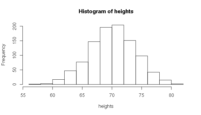
rnorm() will generate a pseudo-random sequence of numbers with a normal distribution. This function is useful for creating simulated data for testing. For example, if we wanted to generate 1,000 simulated heights for men in the USA:
> heights = rnorm(1000, mean=70, sd=4)
> mean(heights)
[1] 70.07384
> sd(heights)
[1] 3.880646
> hist(heights)
Evaluating Set of Normally Distributed Numbers
When you have a set of numbers, R provides functions for evaluating the distribution of those numbers.
Two fundamental functions are mean() and sd(), which return the mean and standard deviation of a sequence of numbers, respectively. This example is a final point tally for a geography class:
> points = c(452, 437, 542, 447, 411, 484, 392, 317, 502, 526, 455,
	454, 628, 500, 457, 478, 511, 365, 407, 440, 357, 298,
	594, 395, 617, 505, 541, 458, 381)
> mean(points)
[1] 460.3793
> sd(points)
[1] 81.33239
> hist(points)
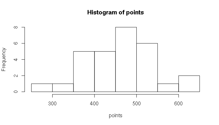
As is obvious from the histogram, the distribution is not a smooth bell. The normal curve is theoretical and complex reality will rarely line up perfectly with that theoretical construct. In this example, there were a few high-performing students, and a number of students who struggled, stretching the left tail of the bell curve out a bit.
The shifting of the mean of a bell curve off-center is called skew. The skewness() function in the e1071 library will evaluate how skewed a curve is. In this example, the positive value for skew fits our perception that the center of the curve is shifted to the right.
> library(e1071)
> skewness(points)
[1] 0.1320943
If you do not have the e1071 library installed on your system, you can install it with:
> install.packages("e1071")
Another way in which a distribution can be distorted away from normal is kurtosis, which indicates whether the middle is stretched up higher or lower than would be in a clean normal distribution. The negative value returned from the kurtosis() function for the distribution above indicates that the distribution is more spread out than it would be if it were perfectly normal.
> kurtosis(points)
[1] -0.4461787
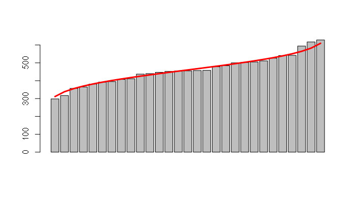
You can also visualize a normal distribution by creating a rank-order bar chart with the point totals displayed from low to high. Since each bar represents 1/count percent of the distribution, the number of bars can be use to create a vector of percentiles, which can then be used with the qnorm() function to generate the expected normal values for each point total.
This type of chart can be useful for showing students how they stand when a class is graded on a normal curve.
> points = points[order(points)]
> x = barplot(points)
> percentile = (1:length(points)) / (length(points) + 1)
> y = qnorm(percentile, mean=mean(points), sd=sd(points))
> lines(x, y, lwd=3, col="red")
Tests For Normality
When dealing with a set of numbers where you are not certain if the distribution is actually normal you can use the ks.test() to perform a Kolmogorov-Smirnov test against a normal distribution. In the results a high p-value indicates normality:
> ks.test(points, "pnorm", mean=mean(points), sd=sd(points))

        One-sample Kolmogorov-Smirnov test

data:  points
D = 0.097876, p-value = 0.9186
alternative hypothesis: two-sided
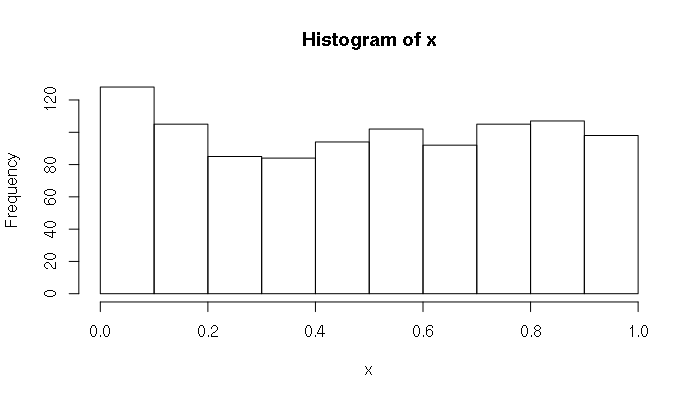
In contrast, a low p-value indicates the distribution is not normal. In this example, the runif() function is used to generate a random sequence of numbers from a uniform distribution, which is not a normal distribution:
> x = runif(1000)
> ks.test(x, "pnorm", mean=mean(x), sd=sd(x))

        One-sample Kolmogorov-Smirnov test

data:  x
D = 0.071493, p-value = 7.269e-05
alternative hypothesis: two-sided
Another test for normality is the Shapiro-Wilks test, and the shapiro.test() function has a simpler set of function parameters than ks.test() if all you want to know is how normal a distribution of numbers is. As with the Kolmogorov-Smirnov test, higher p-values indicate the closer a distribution is to normal.
> shapiro.test(points)

        Shapiro-Wilk normality test

data:  points
W = 0.98271, p-value = 0.9009