Hurricane Data Analysis in R
A hurricane is a large, powerful tropical storm "with winds of 74 miles (119 kilometers) per hour or greater that is usually accompanied by rain, thunder, and lightning, and that sometimes moves into temperate latitudes" (Merriam-Webster 2022).
The National Hurricane Center (NHC) is part of the National Weather Service and National Oceanic and Atmospheric Administration. The NHC and its predecessor agencies have been tracking hurricanes since the 1870s as part of their broader mission to "provide weather, water, and climate data, forecasts and warnings for the protection of life and property and enhancement of the national economy" (National Weather Service 2019).
NOAA provides hurricane tracking points through their National Hurricane Center Data Archive.
This tutorial demonstrates basic visualization and analysis of HURDAT2 historic hurricane tracking data.
Data Frame
The first step in analyzing the hurricane data is getting it into a data frame of panel data.
Panel data is multi-dimensional data. The dimensions of data can be thought of as the dimensions of the spreadsheet that would be needed to represent the data.
The different dimensions of panel data can represent different characteristics depending on the phenomena the data represents, and with geospatial panel data, the three dimensions of data are commonly where, what, and when.
Panel data is often used in the social science in longitudinal studies that record characteristics of multiple individuals over multiple time periods.
This hurricane data records locations (where) and multiple characteristics
of individual hurricanes (what) over six-hour intervals during their life cycle (when).
Download
Separate datasets are available for the Atlantic and Pacific Oceans. The video below demonstrates how to download the Atlantic Ocean dataset from the National Hurricane Center Data Archive.
Import
While the HURDAT2 data is nominally a CSV file, it is arranged with two different types of rows:
- Header rows that contain a unique hurricane identifier and (where applicable) name
- Data rows contain six-hour interval tracking points with lat/long, windspeed, barometric pressure, and a variety of wind radius distance values (quadrant, speed, distance)
In order to turn this into a simpler dataframe of track points, we first read the data into a data frame and reshape the data by moving the header data into columns for each point.
csv = read.csv("hurdat2-1851-2020-052921.txt", header=F, as.is=T)

names(csv) = c("DATE", "TIME_UTC", "POINT_TYPE", "STATUS",
	"LATITUDE", "LONGITUDE", "WINDSPEED_KT", "PRESURE_MB",
	"NE_34KT", "SE_34KT", "NW_34_KT", "SW_34_KT",
	"NE_50KT", "SE_50KT", "NW_50_KT", "SW_50_KT",
	"NE_64KT", "SE_64KT", "NW_64_KT", "SW_64_KT")

panel = cbind(HID = NA, HNAME = NA, csv)

panel$HID = ifelse(grepl("AL|EP|CP", panel$DATE), panel$DATE, NA)

panel$HNAME = ifelse(grepl("AL|EP|CP", panel$DATE), panel$TIME_UTC, NA)

library(zoo)

panel$HID = na.locf(panel$HID)

panel$HNAME = na.locf(panel$HNAME)

panel = panel[!grepl("AL|EP|CP", panel$DATE), ]
We convert the latitudes and longitudes from hemispheric values (NSEW) to decimal values (southern and western values are negative):
We also add a DECADE column that can be used for grouping features by color.
panel$LATITUDE = trimws(panel$LATITUDE)

panel$LONGITUDE = trimws(panel$LONGITUDE)

panel$LATITUDE = ifelse(grepl("S", panel$LATITUDE), paste0("-", panel$LATITUDE), panel$LATITUDE)

panel$LONGITUDE = ifelse(grepl("W", panel$LONGITUDE), paste0("-", panel$LONGITUDE), panel$LONGITUDE)

panel$LATITUDE = as.numeric(sub("N|S", "", panel$LATITUDE))

panel$LONGITUDE = as.numeric(sub("E|W", "", panel$LONGITUDE))

panel$STATUS = trimws(panel$STATUS)

panel$DECADE = paste0(substr(panel$DATE, 1, 3), "0")
Save your processed data frame to a .csv file so that you can reuse it in the future without having to go through all the steps above.
write.csv(panel, "2022-hurricane-panel.csv", row.names=F)
Panel Statistics
A .csv file of panel data as processed above can be downloaded here.
Use read.csv() to load the data into a data frame:
panel = read.csv("2022-hurricane-panel.csv")
You can use use basic descriptive statistics to explore the scope of the panel data.
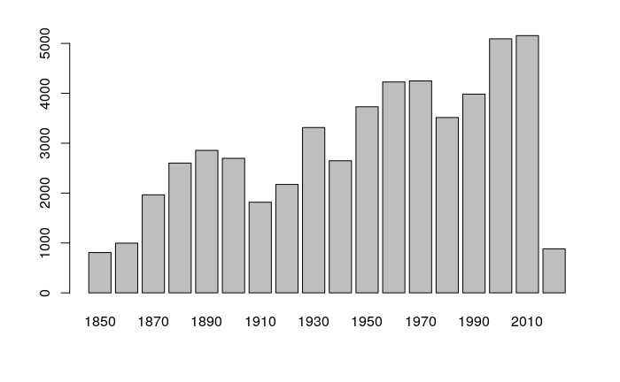
nrow(panel)

	[1] 52717

range(panel$DATE)

	[1] 18510625 20201118

table(panel$STATUS)

	   DB    EX    HU    LO    SD    SS    TD    TS    WV
	  163  5532 15192  1376   309   636 10184 19187   138

barplot(table(panel$DECADE))
Spatial Features
Once you have the panel data frame of lat/long, you can convert the data to spatial features (sf library) for analysis with a variety of spatial analysis tools.
Waypoints
The simplest spatial representation of the data is to use the lat/long values to create individual waypoints. A waypoint is "an intermediate point on a route or line of travel" (Merriam-Webster 2022).
library(sf)
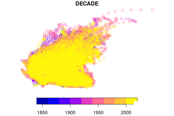
waypoints = st_as_sf(panel, coords = c("LONGITUDE", "LATITUDE"), crs = 4326)
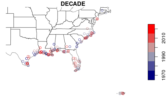
plot(waypoints["DECADE"])
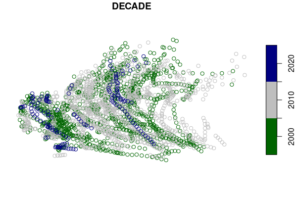
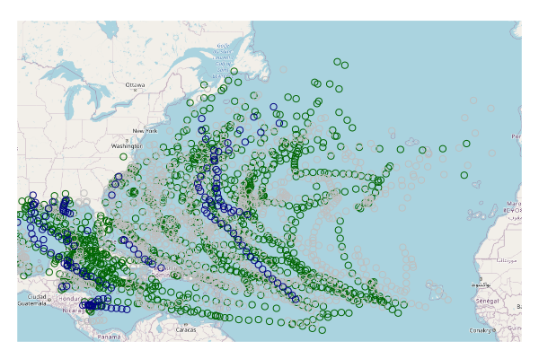
Because this data set is so large, a subset of the waypoints should be easier to read. In this example we subset only hurricanes in 2000 or later.
waypoints.hurricanes = waypoints[(waypoints$STATUS == "HU") & (waypoints$DATE >= "20000101"),]

palette = colorRampPalette(c("darkgreen", "gray", "navy"))

plot(waypoints.hurricanes["DECADE"], pal=palette)
Base Map
A base map is "a map having only essential outlines and used for the plotting or presentation of specialized data of various kinds" (Wikipedia 2022).
- To provide some geographic context, we can use the openmap() function from the OpenStreetMap library to bring in a base map that we plot under the points.
- OpenStreetMap is analogous to a Wikipedia of maps that is "built by a community of mappers that contribute and maintain data about roads, trails, cafés, railway stations, and much more, all over the world" (OpenStreetMap 2022).
- Unlike commercial services like Google Maps that have limitations on how their publicly-available data can be used, OpenStreetMap is open data where "you are free to use it for any purpose as long as you credit OpenStreetMap and its contributors" (OpenStreetMap 2022).
The world is in three dimensions, but most maps are in two dimensions, and a projection is the way in which the three-dimensional earth is converted to a two-dimensional map.
- While geographic features can be plotted on a simple x/y graph using unprojected longitude (x) and latitude (y), this results in severe distortions of size and shape as you move farther from the equator.
- OpenStreetMap, like most web maps, uses a spherical Mercator projection, and st_transform() must be used to transform the lat/long points to that projection so those points are plotted at the correct locations over the map.
Sys.setenv(NOAWT=1)

library(OpenStreetMap)

base_map  = openmap(c(55, -101), c(5, -6), type="osm")

plot(base_map)

waypoints.hurricanes = st_transform(waypoints.hurricanes, crs=osm())

palette = colorRampPalette(c("darkgreen", "gray", "navy"))

plot(waypoints.hurricanes["DECADE"], pal=palette, add=T)
If you want to save the waypoints for use later, you should use the st_write() function to save them in a GeoJSON file.
st_write(waypoints, "2022-hurricane-waypoints.geojson", delete_dsn=T)
You can reload the points with the st_read() function.
waypoints = st_read("2022-hurricane-waypoints.geojson")
Path Lines
Because individual storms are represented as sequences of waypoints, we can connect those waypoints to form lines that visualize the paths of the storms.
We also do another subset for paths since 2010 so there is a visually manageable number of lines.
- aggregate() uses the hurricane identifier number (HID) to combine the groups of point features into rows with multipoint collections of points.
- st_cast() converts the multipoints into line strings.
- st_make_valid() makes the invalid single point linestrings into empty geometries so the plot() doesn't fail on invalid geometries.
- A table of attributes for each path is created from the waypoints using the first row for each storm that are selected with the first row for each hurricane identifier that is not duplicated().
- The attributes are joined to the paths with merge().
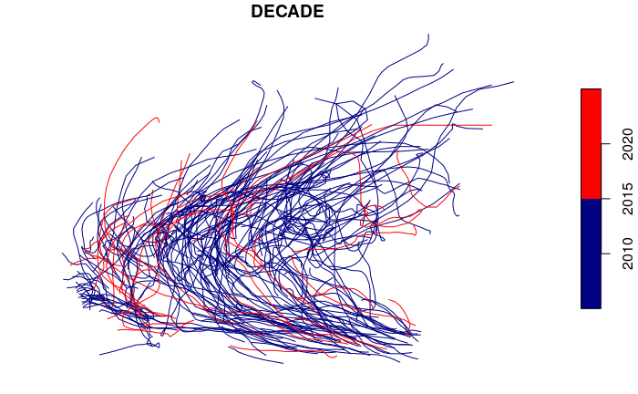
storms = aggregate(waypoints, by=list(waypoints$HID), FUN=max, do_union=F)
storms = st_cast(storms, "LINESTRING")
storms = st_make_valid(storms)
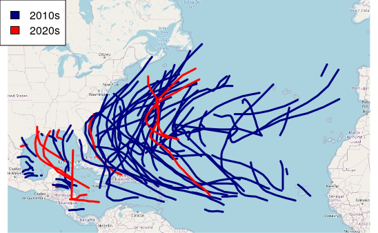
storms.2010s = storms[storms$DATE >= "20100101",]
palette = colorRampPalette(c("navy", "lightgray", "red"))
plot(storms.2010s["DECADE"], pal=palette)
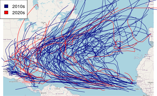
Plotting over a base map gives geographic context.
plot(base_map)

storms.2010s = st_transform(storms.2010s, osm())

palette = colorRampPalette(c("navy", "gray", "red"))

plot(storms.2010s["DECADE"], pal=palette, add=T)

legend("topleft", legend=c("2010s", "2020s"), fill=palette(2))
Hurricane Segments
Because hurricane paths encompass the full life cycle of the storms, isolating portions of the path with the highest winds can be helpful for knowing which areas have historically been most strongly impacted by storms.
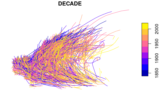
hurricanes = waypoints[waypoints$STATUS == "HU",]

hurricanes = aggregate(hurricanes, by=list(hurricanes$HID), FUN=max, do_union=F)

hurricanes = st_cast(hurricanes, "LINESTRING")

hurricanes = st_make_valid(hurricanes)

plot(hurricanes["DECADE"])
For legibility, we limit the display to storms since 2010 and plot() over a base map.
hurricanes.2010s = hurricanes[hurricanes$DATE >= "20100101",]

hurricanes.2010s = st_transform(hurricanes.2010s, osm())

palette = colorRampPalette(c("navy", "gray", "red"))

plot(base_map)

plot(hurricanes.2010s["DECADE"], pal=palette, lwd=3, add=T)

legend("topleft", legend=c("2010s", "2020s"), fill=palette(2))
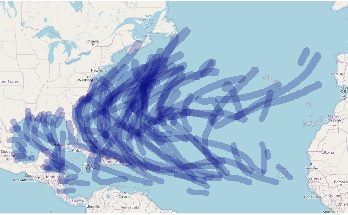
Path Buffers
A buffer is "a zone of a specified distance around features in a geographic layer" (GISLounge 2022). Hurricanes are large storms that have high winds and rain for many miles beyond the centers of the storm, and buffers can be use with phenomena like this to model areas of influence or effect.
The st_buffer() function can be used to create buffers around points, lines, or polygons.
The meaning of the dist (distance) parameter depends on the version and configuration of the sf library you are using.
- On older versions, when used with lat/long data, dist is in degrees. In South Florida one degree represents about 70 miles (latitude) and about 62 miles (longitude).
- On newer versions, despite what the documentation says, dist is in meters, presumably using great circle distance.
In the code below, we use an arbitrary distance of 80 kilometers (around 50 miles). If the results you get on your system are extraordinarily large, your library may want the parameter in degrees and you should use dist=1.
Because of the time and memory needed to calculate buffers for all segments in the panel data, we limit the buffers to 21st century storms.
buffers = st_buffer(hurricanes.2010s, dist=80000, endCapStyle = "FLAT")

plot(base_map)

plot(st_geometry(buffers), col="#00008040", border=NA, add=T)
Descriptive Statistics
You can run length() and dim() functions to get the number of features and attributes.
length(unique(waypoints$HID))
[1] 1894
dim(waypoints)
[1] 50794 25
An x/y scatter chart of the maximum wind speeds for tropical storms and hurricanes over time shows no overall change in maximum storm windspeeds. Only the period 1970 - 2019 is used so results reflect more-accurate measurement capabilities available in recent years.
waypoints.1970s = waypoints[(waypoints$WINDSPEED_KT >= 34) &
		(waypoints$DATE >= "19700101"),]

maximums = aggregate(waypoints.1970s[,c("HID","DATE","DECADE","WINDSPEED_KT")],
	by=list(waypoints.1970s$HID), FUN=max)

maximums$DATE = as.Date(as.character(maximums$DATE), format="%Y%m%d")

scatter.smooth(maximums$DATE, maximums$WINDSPEED_KT, las=1,
	col="#00000040", lpars=c(lwd=3, col="navy"))
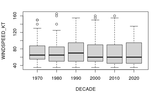
A boxplot() of quantiles shows the pattern more clearly, with most of the change in median occurring in the 1980s and 1990s.
boxplot(WINDSPEED_KT ~ DECADE, data=maximums, las=1)
This map shows the hurricane-strength waypoints since the 1970s that have been over land.
The GeoJSON file of state polygons can be downloaded here.
hurricanes.1970s = waypoints[(waypoints$WINDSPEED_KT >= 64) &
	(waypoints$DATE >= "19700101"),]

states = st_read("2015-2019-acs-states.geojson")

hurricanes.1970s = st_intersection(hurricanes.1970s, st_geometry(states))

palette = colorRampPalette(c("navy", "gray", "red"))

plot(hurricanes.1970s["DECADE"], pal=palette, reset=F)

plot(st_geometry(states), col=NA, border="#00000080", add=T)
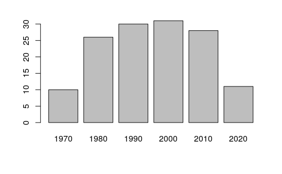
A bar plot of waypoints by decade shows an increase in hurricane waypoints increasing over the 1980s and 1990s before dropping back in 2010s.
The low numbers in the 1970s likely reflect less accurate record keeping, and the low numbers in the 2020s reflect the decade being unfinished.
barplot(table(hurricanes.1970s$DECADE))
Centrographics
Centrography is "statistical analyses concerned with centers of population, median centers, median points, and related methods" (Sviatlovsky and Eells 1939). Much like general statistical measures of central tendency, centrographic measures can be useful for summarizing large amounts of data and assessing change over time.
Mean Centers
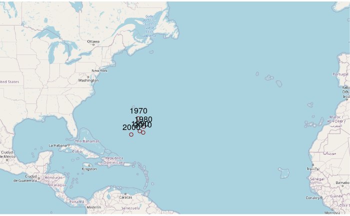
The mean center is the point at the mean of all latitudes and mean of all longitudes for a group of features. When used with data containing a temporal component, mean centers can be used to analyze movement in general location over time.
This code will aggregate() using mean() to find the mean center for hurricanes in each decade.
For these examples, to make our visualizations more legible we will use points only for storms with hurricane force winds since 1970.
hurricanes.1970s = waypoints[(waypoints$DATE >= "19700101") &
	(waypoints$DATE <= "20191231") & (waypoints$STATUS == "HU"),]

centers = aggregate(st_coordinates(hurricanes.1970s),
	by=list(hurricanes.1970s$DECADE), FUN=mean)

print(centers)
 Group.1         X        Y
1    1970 -63.45724 29.62764
2    1980 -61.98541 27.65595
3    1990 -63.05398 26.58216
4    2000 -65.37358 25.74777
5    2010 -62.12851 26.23727
Plotting on a base map:
plot(base_map)

centers_osm = st_as_sf(centers, coords = c("X", "Y"), crs = 4326)

centers_osm = st_transform(centers_osm, osm())

plot(centers_osm, col="#800000", add=T)

text(st_coordinates(centers_osm), labels=centers$Group.1, pos=3)
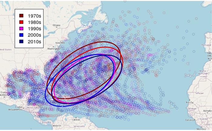
Standard Deviation Ellipse
In addition to using mean or median centers for identifying the central tendency in point locations, you can use a standard deviation ellipse to identify whether the distribution of points over space has become more or less concentrated.
The standard deviations of longitude (a) and latitude (b) define a cross of dispersion for the dimensions of the ellipse, the ellipse is rotated by the arc tangent of those standard deviations in order to visually encompass the points within those standard deviations.
hurricanes.1970s = waypoints[(waypoints$DATE >= "19700101") &
	(waypoints$DATE <= "20191231") & (waypoints$STATUS == "HU"),]

centers = aggregate(st_coordinates(hurricanes.1970s), by=list(hurricanes.1970s$DECADE), FUN=mean)

stdevs = aggregate(st_coordinates(hurricanes.1970s), by=list(hurricanes.1970s$DECADE), FUN=sd)

angles = atan2(stdevs$Y, stdevs$X)
The ellipse() function from the spatstat library creates a standard deviation ellipse border.
library(spatstat)

ellipses = lapply(1:nrow(centers), function(z) {
                e = ellipse(a = stdevs$X[z], b = stdevs$Y[z],
                        centre = c(centers$X[z], centers$Y[z]), phi = angles[z])
                return(st_linestring(as.matrix(as.data.frame(e$bdry[[1]]))))
        })

library(sf)

ellipses = st_as_sf(data.frame(DECADE = centers$Group.1, geom=st_sfc(ellipses, crs=4326)))
Plot over a base map:
plot(base_map)

points = st_as_sf(recent, coords = c("LONGITUDE", "LATITUDE"), crs = 4326)

points = st_transform(points, osm())

palette = c("#800000", "#e00000", "#e000e0", "#0000e0", "#000080")

points$COLOR = paste0(palette[(as.numeric(points$DECADE) - 1960) / 10], "40")

plot(st_geometry(points), col=points$COLOR, add=T)

ellipses = st_transform(ellipses, osm())

plot(ellipses, col=palette, lwd=3, add=T)

legend(x="topleft", inset=0.07, legend = paste0(seq(1970, 2010, 10), "s"), fill=palette, bg="white")
Overlay
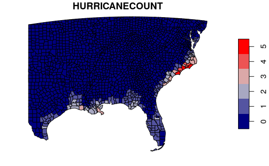
County Hurricane Counts
An overlay is a common spatial analysis operation where feature attributes from one layer are copied to features from another layer that in some way intersect with features in the first layer.
In this example, we get the number of hurricanes that have affected each county by overlaying the county polygons with the hurricane path segment buffers.
- st_intersects() returns the indices of all buffers that have affected each county.
- Because each storm has multiple segments, we have to sapply() over each county and count the number of unique() hurricane identifiers (HID) for all intersecting segments returned by st_intersects().
A GeoJSON file of county polygons can be downloaded here.
counties = st_read("2015-2019-acs-counties.geojson")

southeast = st_crop(counties, xmin=-100, ymin=23, xmax=-70, ymax=40)

buffers = st_transform(buffers, crs=4326)

indices = st_intersects(southeast, buffers)

hurricane_counter = function(x) nrow(unique(st_drop_geometry(buffers[x,"HID"])))

southeast$HURRICANECOUNT = sapply(indices, hurricane_counter)

palette = colorRampPalette(c("navy", "lightgray", "red"))

plot(southeast["HURRICANECOUNT"], pal=palette)
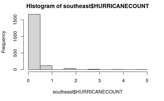
County Hurricane Histogram
A histogram of hurricane counts by county shows a heavily skewed distribution. Most counties in this area are not affected by hurricanes, but a handful were hit repeatedly over the past 10 years.
southeast = southeast[order(southeast$HURRICANECOUNT),]

tail(st_drop_geometry(southeast[,c("Name", "ST", "HURRICANECOUNT")]))
            Name ST HURRICANECOUNT
1955 New Hanover NC              4
1959     Pamlico NC              4
1961      Pender NC              4
1900   Brunswick NC              5
1906    Carteret NC              5
1957      Onslow NC              5
hist(southeast$HURRICANECOUNT)
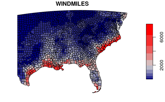
County Wind Miles
Slow-moving, persistent storms can cause more damage than fast-moving storms that quickly dissipate. For example, passage of a storm with category-five winds, or passage of a slow moving storm that exposes an area to high wind and rain for extended periods would cause more damage than a fast-moving, low-intensity storm even though the count of hurricanes (one) would be the same for all three scenarios.
Wind miles are the sum of windspeed over time that can give us a slightly clearer picture of areas most affected during our period of analysis. For example, a storm with 90 mph that sits over the same area for five hours would result in total wind miles of 5 * 90 = 450 wind miles.- As with hurricane counts above, we have to sapply() over each county and sum the wind speeds for for all intersecting buffer segments returned by st_intersects().
- The st_buffer() call may take a minute or two depending on the number of waypoints.
- The multiplication factor is based on waypoints representing observations every six hours in knots (1.1508 knots = 1 MPH).
- Using wind miles on this map shows us a deeper inland area of potential impact from rain and high winds.
waypoints.2010s = waypoints[waypoints$DATE >= "20100101",]

buffers.2010s = st_buffer(waypoints.2010s, dist=80000)

indices = st_intersects(southeast, buffers.2010s)

sum_windmiles = function(x) {
  sum(st_drop_geometry(buffers.2010s[x, "WINDSPEED_KT"]) * 6 / 1.1508) }

southeast$WINDMILES = sapply(indices, sum_windmiles)

palette = colorRampPalette(c("navy", "lightgray", "red"))

plot(southeast["WINDMILES"], breaks="jenks", pal=palette)
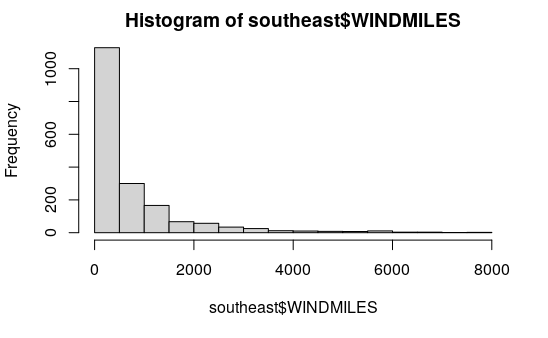
County Wind Miles Histogram
southeast = southeast[order(southeast$WINDMILES),]

tail(st_drop_geometry(southeast[,c("Name", "ST", "WINDMILES")]))
             Name ST WINDMILES
2361 Williamsburg SC  6569.343
2342        Horry SC  6751.825
1900    Brunswick NC  6934.307
1906     Carteret NC  7273.201
2338   Georgetown SC  7559.958
2326   Charleston SC  7872.784
hist(southeast$WINDMILES, breaks=20)
Poisson Distribution
The probability of a specific number of comparatively rare and largely random events like hurricanes occurring in any particular year can be modeled using a Poisson distribution (McGrew 2014, 85).
This distribution is named after French mathematician Siméon Denis Poisson (1781–1840), who used it as a model of wrongful convictions based on rates over time calculated from past occurrences. However, the distribution had already been introduced 26 years earlier by another French mathematician, Abraham de Moivre (Wikipedia 2022).
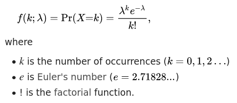
The dpois() function can be used to calculate the Poisson distribution density value. The parameter defining the rate used for calculating the distribution is λ (lambda).
In the diagram below for λ = 10, we see a peak mode around the lambda value, with the probability of higher or lower values dropping off on both sides of λ.
par(mfrow=c(1,2))

x = 1:50
y = dpois(x, lambda=0.8)
plot(x, y, type="l", lwd=3, col="navy", main="lambda = 0.8")

y = dpois(x, lambda=10)
plot(x, y, type="l", lwd=3, col="navy", main="lambda = 10")
Probability of a Specific Number of Incidents
The dpois() density distribution function can be used to estimate the probability of a specific number of incidents using the Poisson distribution.
With λ = 10, the probability of 10 events occurring in that period of time is 12.5%. The probability of five events occurring is only 3.7%.
print(dpois(10, lambda=10))

	[1] 0.12511

print(dpois(5, lambda=10))

	[1] 0.03783327
Probability of a Maximum Number of Incidents
The ppois() quantile function can be used to estimate the probability of a maximum number of incidents using the Poisson distribution.
With λ = 10, the probability of ten or fewer events occurring in that period of time is 58.3%. The probability of five or fewer events occurring is only 6.7%.
print(ppois(10, lambda=10))

	[1] 0.5830398

print(ppois(5, lambda=10))

	[1] 0.06708596
Probability of a Minimum Number of Incidents
The ppois() quantile function with lower.tail=F parameter will use the upper tail of the Poisson distribution above the selected count of incidents to to estimate the probability of at least a given number of incidents occurring in a given time period.
With λ = 10, the probability of at least ten events occurring in that period of time is 41.7%. The probability of at least five events occurring is only 9.3%.
print(ppois(10, lambda=10, lower.tail=F))

	[1] 0.4169602

print(ppois(5, lambda=10, lower.tail=F))

	[1] 0.932914
The Poisson Distribution and Hurricanes
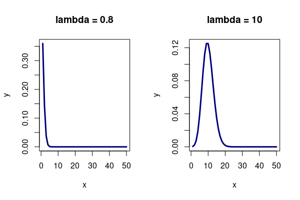
For this example, we can calculate the average rate of hurricanes per year (given the 20 year time frame of the data), and then use the Poisson distribution to estimate the probability that zero hurricanes will hit an area in any given year.
southeast$PROB_HURRICANE_0 = dpois(0, lambda = southeast$HURRICANECOUNT / 20.0)

palette = colorRampPalette(c("red", "lightgray", "navy"))

plot(southeast["PROB_HURRICANE_0"], breaks="jenks", pal=palette, key.pos=4)
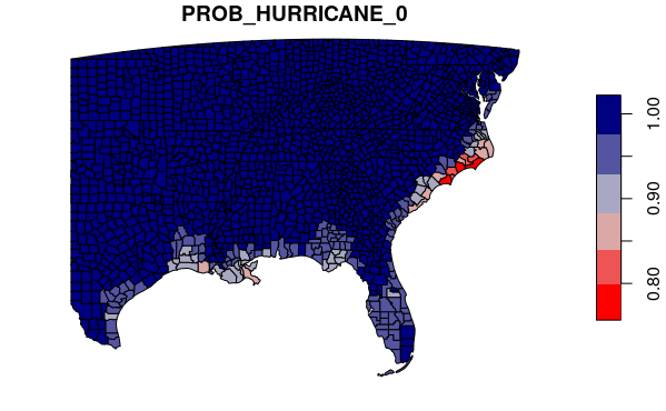
Similarly, we can get the probability that two or more hurricanes will hit an area in any given year.
The map visualizes almost identically, but notice on the scale that the probabilities in high-impact areas are dramatically lower.
southeast$PROB_HURRICANE_2 = ppois(2,
	lambda = southeast$HURRICANECOUNT / 20.0, lower.tail=F)

palette = colorRampPalette(c("navy", "lightgray", "red"))

plot(southeast["PROB_HURRICANE_2"], breaks="jenks", pal=palette, key.pos=4)
Local Analysis
County Wind Miles List
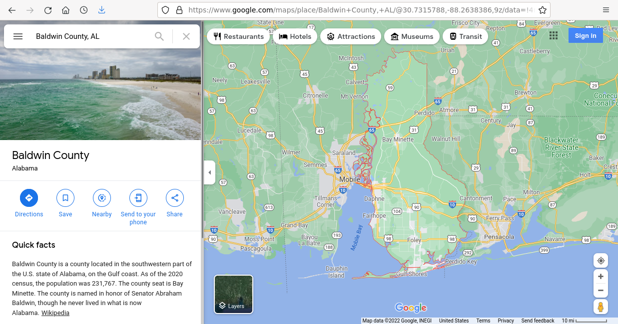
Looking specifically at Alabama, we see that the most heavily affected county in the state is coastal Baldwin county.
alabama = southeast[southeast$ST == "AL",]

alabama = alabama[order(alabama$WINDMILES),]

tail(st_drop_geometry(alabama[,c("Name", "HURRICANECOUNT", "WINDMILES")]))
        Name HURRICANECOUNT WINDMILES
50    Monroe              1  4535.975
20 Covington              0  4874.870
27  Escambia              1  6699.687
49    Mobile              1  9228.363
2    Baldwin              1  9775.808
head(st_drop_geometry(alabama[,c("Name", "HURRICANECOUNT", "WINDMILES")]))
       Name HURRICANECOUNT WINDMILES
10 Cherokee              0  912.4088
36  Jackson              0  938.4776
25   DeKalb              0 1016.6840
8   Calhoun              0 1042.7529
15 Cleburne              0 1068.8217
38    Lamar              0 1147.0282
Hurricane List
We can list the hurricanes that have impacted the county.
baldwin = southeast[southeast$FIPS == "01003",]

local = hurricanes[st_intersects(hurricanes, baldwin, sparse=F),]

local$YEAR = as.numeric(substr(local$DATE, 1, 4))

local = local[order(local$DATE),]

print(st_drop_geometry(local[,c("YEAR", "HNAME")]))
    YEAR               HNAME
360 1859             UNNAMED
681 1893             UNNAMED
111 1911             UNNAMED
819 1916             UNNAMED
532 1926             UNNAMED
136 1950               BAKER
425 1995                ERIN
662 2004                IVAN
911 2020               SALLY
County Demographics
Because our county data included 2015-2019 American Community Survey data, we can subset and print the attributes to get demographic information on the county.
baldwin = southeast[southeast$FIPS == "01003",]

print(st_drop_geometry(baldwin))
  FactFinder.GEOID  FIPS    Name ST Latitude Longitude Square.Miles
2   0500000US01003 01003 Baldwin AL 30.72956 -87.72261         1590
  Pop.per.Square.Mile Total.Households Total.Households.MOE
2            133.8553            80930                 1127
  Average.Household.Size Average.Household.Size.MOE Percent.Foreign.Born
2                   2.59                       0.04                  3.7
  Percent.Foreign.Born.MOE Percent.Veterans Percent.Veterans.MOE
2                      0.4             11.8                  0.6
  Percent.Disabled Percent.Disabled.MOE Percent.Bachelors.Degree
2             14.2                  0.7                       21
  Percent.Bachelors.MOE Percent.Graduate.Degree Percent.Graduate.MOE
2                   1.1                    10.8                  0.7
  Percent.Broadband Percent.Broadband.MOE Median.Household.Income
2              81.8                   1.2                   58320
  Median.Household.Income.MOE Mean.Minutes.To.Work Mean.Minutes.To.Work.MOE
2                        1564                 26.9                      0.7
  Percent.Unemployment Percent.Unemployment.MOE Percent.Health.Insurance
2                  2.5                      0.3                     91.1
  Percent.Health.Insurance.MOE Median.Monthly.Mortgage
2                          0.7                    1372
  Median.Monthly.Mortgage.MOE Median.Monthly.Rent Median.Monthly.Rent.MOE
2                          23                1020                      31
  Percent.Vacant.Units Percent.Vacant.Units.MOE Percent.Pre.War.Units
2                 29.1                        1                   2.2
  Percent.Pre.War.Units.MOE Percent.Homeowners Percent.Homeowners.MOE
2                       0.4               75.2                    1.1
  Percent.Renters Percent.Renters.MOE Gini.Index Gini.Index.MOE
2            24.8                 1.1     0.4587           0.01
  Total.Population Percent.Under.5 Percent.Under.5.MOE Percent.Under.18
2           212830             5.5                 0.1             21.7
  Percent.Under.18.MOE Percent.65.Plus Percent.65.Plus.MOE Median.Age
2                   NA              20                 0.1         43
  Median.Age.MOE Age.Dependency.Ratio Age.Dependency.Ratio.MOE
2            0.3                 71.5                      0.3
  Old.age.Dependency.Ratio Old.age.Dependency.Ratio.MOE Child.Dependency.Ratio
2                     34.3                          0.2                   37.3
  Child.Dependency.Ratio.MOE Mean.Commute.Minutes Mean.Commute.Minutes.MOE
2                        0.1                 26.9                      0.7
  Percent.Drove.Alone.to.Work Percent.Drove.Alone.MOE Percent.Transit.to.Work
2                        83.8                     1.5                       0
  Percent.Transit.MOE Percent.Walk.to.Work Percent.Walk.to.Work.MOE
2                 0.1                  0.6                      0.2
  Percent.Bike.to.Work Percent.Bike.to.Work.MOE Percent.Work.at.Home
2                  0.1                      0.1                  6.5
  Percent.Work.at.Home.MOE Women.Aged.15.to.50 Women.Aged.15.to.50.MOE
2                      0.8               45637                     269
  Percent.Single.Mothers Percent.Single.Mothers.MOE Annual.Births.per.1K.Women
2                   27.2                       12.7                         40
  Annual.Births.per.1K.Women.MOE Enrolled.in.School Enrolled.in.School.MOE
2                              9              45187                   1090
  K.12.Enrollment K.12.Enrollment.MOE Undergrad.Enrollment
2           34434                 707                 6724
  Undergrad.Enrollment.MOE Grad.School.Enrollment Grad.School.Enrollment.MOE
2                      762                   1271                        298
  Percent.No.Vehicle Percent.No.Vehicle.MOE Housing.Units Urban.Housing.Units
2                3.3                    0.4        104061               35531
  Urban.Cluster.Housing.Units Rural.Housing.Units STORMCOUNT HURRICANECOUNT
2                       25261               43269         18              4
  WINDMILES
2  10944.11