Formatting Charts in R
The default plot() layout is functional, but of dubious aesthetic value. While the ggplot2 does somewhat better, it is possible to configure the native plot() command with a few extra parameters.
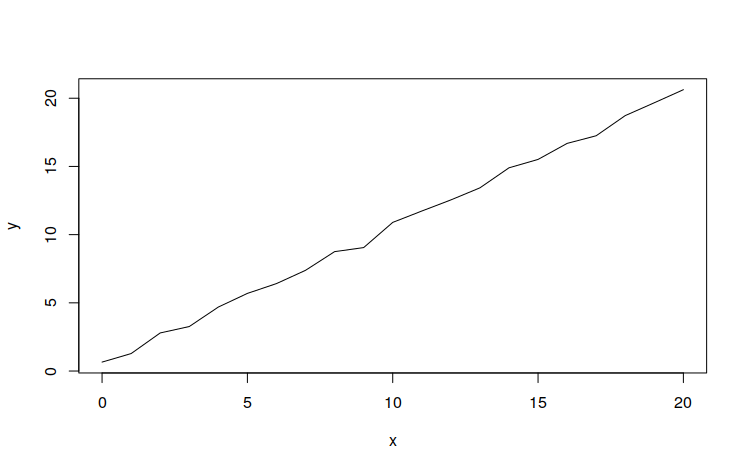
This is an example of a default plot:
x = 0:20
y = x + runif(length(x))

plot(x, y, type='l')
This particular layout is clean and minimalist:
x = 0:20
y = x + runif(length(x))

plot(x, y, type='l',
	col="navy", lwd=3,
	las=1, fg="white",
	xaxs='i', yaxs='i',
	xlim=c(0, 20), ylim=c(0,25),
	xlab="X", ylab="f(X)")

grid(nx=NA, ny=NULL, lty=1, col="#00000040")

abline(a=0, b=0, lwd=3)
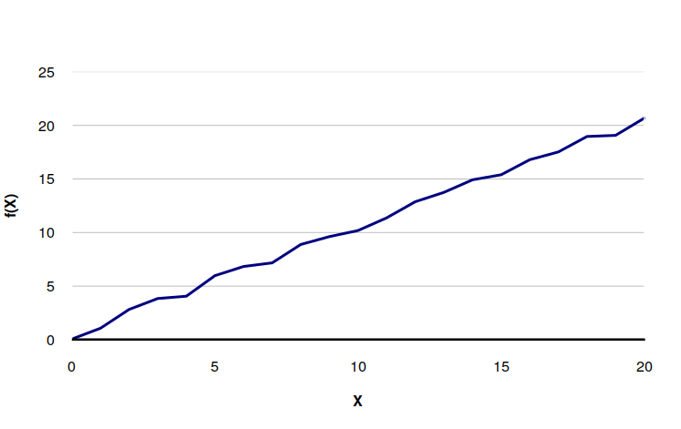
- col = "navy" makes the line color navy blue. Web RGB hex strings can also be used (ex. "#000080" for navy).
- lwd = 3 makes the line width 3 pixels. The actual unit is device specific.
- las = 1 makes all axis labels horizontal.
- fg = "white" changes the foreground color to white so no border or axis lines are visible.
- xaxs = "i" and yaxs = "i" makes the X- and Y-axis extend the full height of the chart rather than being padded.
- xlim and ylim set the ranges for the X and Y axes, respectively, so the automatic ranges don't give odd intervals. These may be unnecessary, depending on your data.
- xlab and ylab set the X and Y axis labels, respectively
- grid() draws grid lines. Note the lines are black with an alpha (transparency) of 0x04 so the data lines are visible through the grid lines.
- abline() draws a dark black line on the X-axis