Correlation, Simple Linear Regression, and X-Y Scatter Charts in R
Correlation is the strength of the relationship between two variables. The measurement of correlation is one of the most common and useful tools in statistics.
Reading CSV Files Into Data Frames
The examples below use data from a variety of sources on US counties in a CSV (comma-separated variable) file you can download here.
CSV files can be loaded with the read.csv() function in R. The colnames() function will list the names of the variables from the column names. The rownames() function lists the names of the rows from column one, in this case the names of countries.
> counties = read.csv("2017-county-data.csv", stringsAsFactors = F)

> colnames(counties)
 [1] "X"          "FIPS"       "ST"         "COUNTYNAME" "CBSA"
 [6] "CBSAPOP"    "COUNTYPOP"  "URBAN2013"  "URBAN2006"  "URBAN1990"
[11] "REGION"     "VOTES2012"  "OBAMA"      "ROMNEY"     "WINNER"
[16] "PCOBAMA"    "PCROMNEY"   "PCOBESITY"  "OBESITY"    "MEDHHINC"
[21] "MEDHOUSE"

> rownames(counties)
  [1] "1"   "2"   "3"   "4"   "5"   "6"   "7"   "8"   "9"   "10"  "11"  "12"
 [13] "13"  "14"  "15"  "16"  "17"  "18"  "19"  "20"  "21"  "22"  "23"  "24"
 [25] "25"  "26"  "27"  "28"  "29"  "30"  "31"  "32"  "33"  "34"  "35"  "36"
...
Types of Correlation
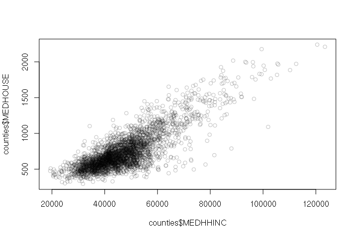
A positive correlation means that as one variable goes up, the other goes up as well. When two variables with a positive correlation are plotted on the two axes of an X-Y scatter chart, the points form a rough line or curve upward from left to right.
The plot() function can be used to quickly create X-Y scatter plots. The first parameter is the X-axis and the second parameter is the Y-axis.
For example: Counties with higher annual median household income tend to have higher median monthly housing costs:
> plot(counties$MEDHHINC, counties$MEDHOUSE, col="#00000040")
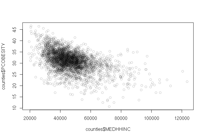
A negative correlation means that as one variable goes up, the other goes down. When two variables with a negative correlation are plotted on the two axes of an X-Y scatter chart, the points form a rough line or curve downward from left to right.
For example, wealthier counties tend to have fewer residents with obesity problems:
> plot(counties$MEDHHINC, counties$PCOBESITY, col="#00000040")
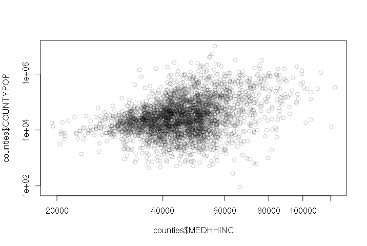
When two variables with no correlation are plotted on the two axes of an X-Y scatter chart, the points form a diffuse cloud.
For example, there is no correlation between median household income and county size. There are small wealthy counties and there are large poor counties.
> plot(counties$MEDHHINC, counties$COUNTYPOP, col="#00000040", log="xy")
Correlation Does Not Imply Causation
One major warning about the interpretation of correlation is that correlation does not imply causation. This is also commonly referred to as the post hoc fallacy, from the Latin phrase post hoc ergo propter hoc (after this, therefore because of this).
Causation can be indirect - poor infant mortality is caused by poor nutrition and medical care, which in turn are a reflection of the economic capabilities of parents.
Correlations can also be spurious, such as the strong correlation between iPhone sales in the USA and the number of deaths from falling down stairs. See Tyler Vigen's collections of spurious correlations if you find such things amusing.
Simple Linear Regression
Correlation can be assessed by performing regression.
The term regression was first used by 19th century statistician Francis Galton to describe how the decendants of exceptional individuals tend to regress toward average with each successive generation. The term was later generalized to describe a statistical process for estimating the relationships among variables.
Perhaps the simplest form of model is simple linear regression. This expresses a correlation relationship between two variables x and y as a line formula:
yi = α + Βxi + εi
- y is called the dependent variable.
- x is called the independent variable. Changing the independent variable changes the value of the dependent variable.
- α and Β are coefficients.
- ε is the error term for the residuals that reflect how different the model is from each of the data points i that the model is supposed to represent.
Software that implements regression usually uses an ordinary least squares (OLS) algorithm that systematically tries different values for the coefficients to get the line to fit the data points as closely as possible and keep the error term as small as possible.
Excel implements this with trendlines on X-Y scatter charts.
R implements this with the lm() function. The first parameter is a formula with the dependent variable (y) and independent variable (x) separated by a tilde (~). You can think of this as y depends on x.
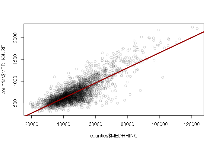
When the variables are plotted on an x-y scatter plot, you can draw a regression line from the model using the abline() function:
> plot(counties$MEDHHINC, counties$MEDHOUSE, col="#00000040")
> model = lm(MEDHOUSE ~ MEDHHINC, data=counties)
> abline(model, col="darkred", lwd=3)
> summary(model)

Call:
lm(formula = MEDHOUSE ~ MEDHHINC, data = counties)

Residuals:
    Min      1Q  Median      3Q     Max
-712.46  -86.20   -1.02   85.85  617.81

Coefficients:
              Estimate Std. Error t value Pr(>|t|)
(Intercept) -7.873e+01  1.076e+01   -7.32 3.13e-13 ***
MEDHHINC     1.734e-02  2.221e-04   78.08  < 2e-16 ***
---
Signif. codes:  0 ‘***’ 0.001 ‘**’ 0.01 ‘*’ 0.05 ‘.’ 0.1 ‘ ’ 1

Residual standard error: 152.4 on 3137 degrees of freedom
  (8 observations deleted due to missingness)
Multiple R-squared:  0.6602,    Adjusted R-squared:  0.6601
F-statistic:  6096 on 1 and 3137 DF,  p-value: < 2.2e-16
The regression coefficients are listed with their estimated values. For the model listing above, the model function is:
MEDHOUSE = -78.73 + (0.01734 * MEDHHINC)
The t value beside each coefficient is the coefficient divided by it's standard error, and that t value is used with a t-distribution to calculate Pr(>|t|), which is the probability that the coefficient is actually zero and the independent variable has no effect on the dependent variable. Low Pr(>|t|) means that the variable is important.
The R-squared is the coefficient of determination that indicates how well the model fits the data. The range is zero to one, and higher values are better.
Other values in the summary are explained here...
Logarithmic Relationships
Many phenomena in both the social and non-human realms are exponential. For example, populations (at least initially) tend to increase exponentially:
- Two people (21) have eight children (23)
- Eight children have 32 grandchildren (25)
- 32 grandchildren have 128 great-grandchildren (27)...
Such phenomena are commonly modeled as logarithms, which would be the exponents in the series above.
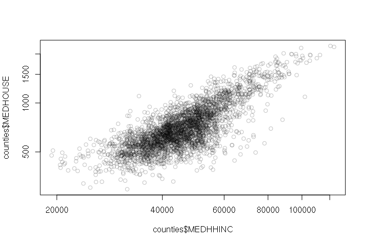
For example, because there are only a few wealthy counties with high housing costs in the US, the points tend to be bunched on the lower left side of the graph:

By making the axes space numbers logarithmically with the log="xy" parameter, the values are spread out and made more visible:
> plot(counties$MEDHHINC, counties$MEDHOUSE, col="#00000040", log="xy")
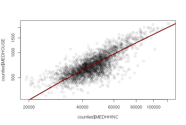
When a figure is plotted with logarithmic axes, the abline() function will not draw an appropriate line. In such cases, you will need to create a model, use the predict() function to create modeled Y values for a set of X values you provide, then use the lines() function to draw an appropriate line.
plot(counties$MEDHHINC, counties$MEDHOUSE, col="#00000040", log="xy")
model = lm(MEDHOUSE ~ MEDHHINC, data=counties)
x = seq(0, 200000, 10000)
y = predict(model, newdata=data.frame(MEDHHINC = x))
lines(x, y, lwd=3, col="darkred")
When the pattern of dots has a general trend upward or downward, but there are a large number of points that do not conform to this relationship, the correlation is weak and is said to exhibit heteroskedacity.
Models With Multiple Independent Variables (Multiple Regression)
Most phenomena have multiple causes, and the spread of residuals (deviation from a straight line) on the plot hints that more than income determines whether someone will be obese or not. While true spatial epidemiology would need to involve a more fine-grained investigation of individuals, there are some neighborhood characteristics that are related to the prevelance of obesity.
The use of multiple variables is one way to control for different characteristics and help isolate characteristics that are more important than others.
Included in the county data are a couple of categorical variables: REGION is the US census region and URBAN2013 is National Center for Health Statistics 2013 rural-urban classification of counties.
A boxplot() displays a box-and-whisker plot, where:
- The dark line in the center is the median
- The outsides of the box are the 25th and 75th percentiles (50% of the values are within the box)
- The "whiskers" are 1.5x the interquartile range of the values between the 25th and 75th percentiles
- Outliers are single dots
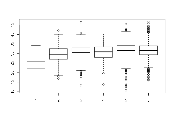
Boxplots of obesity by region and by urban area classification (1 is most urban, 6 is most rural) show the differences in prevalance of obesity in different areas. People who live in dense urban areas tend to be less obese than folks in suburban and rural areas.
> boxplot(counties$PCOBESITY ~ counties$URBAN2013)
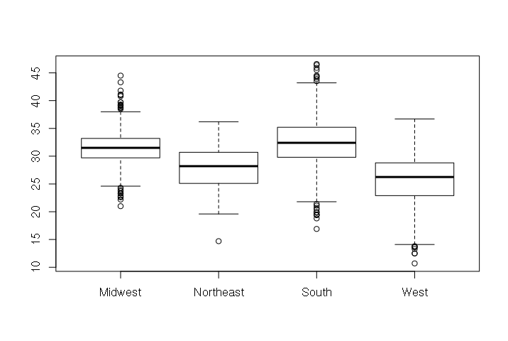
And people who live in the West to be less obese than folks from other parts of the country.
> boxplot(counties$PCOBESITY ~ counties$REGION)
Because these are categorical variables, they are difficult (but not impossible) to use directly in regression. Since we are only concerned with whether a county is in the West or if it is urban (category 1), we can create dummy variables. The name is a bit deceptive. Dummy variable means that the value is either zero or one.
> counties$WEST = ifelse(counties$REGION == "West", 1, 0)
> counties$URBAN = ifelse(counties$URBAN2013 == 1, 1, 0)
We can now create a model with the three independent variables. This has an R2 of 0.4213, which is far from a perfect fit, but which is much better than the prior one-variable model value of 0.2353.
> model = lm(PCOBESITY ~ MEDHHINC + WEST + URBAN, data=counties)
> summary(model)

Call:
lm(formula = PCOBESITY ~ MEDHHINC + WEST + URBAN, data = counties)

Residuals:
     Min       1Q   Median       3Q      Max
-11.5495  -2.1546  -0.0198   2.1271  12.7662

Coefficients:
              Estimate Std. Error t value Pr(>|t|)
(Intercept)  3.938e+01  2.426e-01 162.346  < 2e-16 ***
MEDHHINC    -1.635e-04  5.068e-06 -32.256  < 2e-16 ***
WEST        -5.462e+00  1.792e-01 -30.472  < 2e-16 ***
URBAN       -3.281e+00  4.182e-01  -7.844 5.93e-15 ***
---
Signif. codes:  0 ‘***’ 0.001 ‘**’ 0.01 ‘*’ 0.05 ‘.’ 0.1 ‘ ’ 1

Residual standard error: 3.384 on 3102 degrees of freedom
  (41 observations deleted due to missingness)
Multiple R-squared:  0.4251,    Adjusted R-squared:  0.4245
F-statistic: 764.6 on 3 and 3102 DF,  p-value: < 2.2e-16
Visualizing Multiple Regression
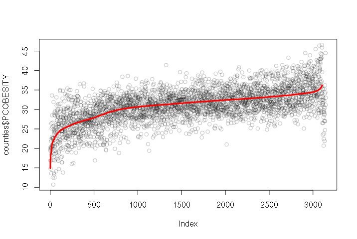
One challenge with visualizing multiple regression is that since there are multiple variables, you cannot simply make an X-Y scatter chart (which uses only two variables). One solution is to create a line graph of the predicted output of the model plotted over the actual dependent variable values.
The predict() function takes the model created with lm() and the independent variables, and outputs a vector of the values from the model function. In this example, we add those values as a column to the data frame, sort the data frame using the order() function, plot() the actual values and then draw a line with the predicted values on top:
model = lm(PCOBESITY ~ MEDHHINC + WEST + URBAN, data=counties)
counties$PREDICTED = predict(model, newdata = counties)
counties = counties[order(counties$PREDICTED), ]
plot(counties$PCOBESITY, col="#00000040")
lines(counties$PREDICTED, type="l", col="red", lwd=3)
Improving X-Y Scatter Plot Appearance
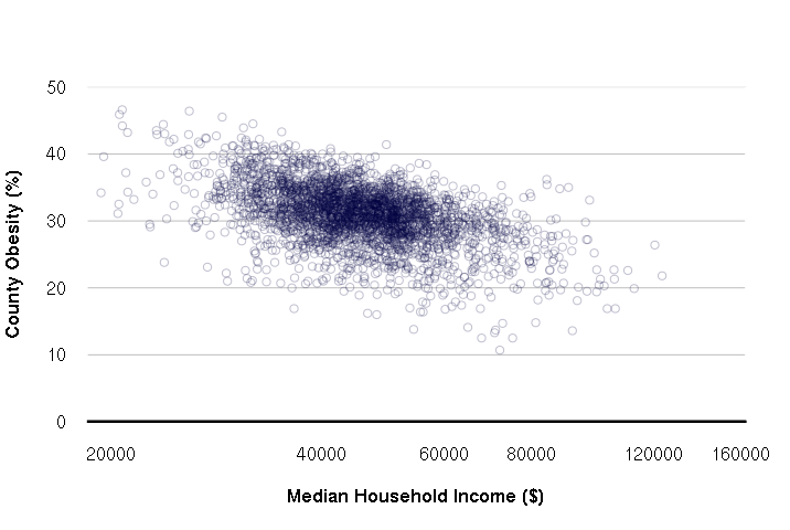
The default plot() layout is functional, but of dubious aesthetic value. While the ggplot2 does somewhat better, it is possible to configure the native plot() command with a few extra parameters. This particular layout is clean minimalist.
- las = 1 makes all axis labels horizontal
- yaxs = "i" makes the Y-axis extend the full height of the chart
- fg = "white" changes the foreground color to white so no border or axis lines are visible
- font.lab = 2 makes the axis labels bold
- xlim and ylim set the ranges for the X and Y axes, respectively, so the automatic ranges don't give odd intervals
- panel.first defines a function run after the plot is set up but before the points are drawn. This is used so grid lines are behind the points
- xlab and ylab set the X and Y axis labels, respectively
- abline() draws the dark black line on the X-axis
plot(counties$MEDHHINC, counties$PCOBESITY, col="#00004040", log="x",
	las=1, yaxs="i", fg="white", font.lab=2,
	xlim=c(20000, 150000), ylim=c(0,50),
	panel.first = grid(nx=NA, ny=NULL, lty=1, col="gray"),
	xlab="Median Household Income ($)",
	ylab="County Obesity (%)")

abline(a=0, b=0, lwd=3)
Nonlinear Regression
As the name implies, linear regression assumes that the relationship between the variables is linear. Ideally, the X-Y scatter would form a straight line and the model is simply the formula for that straight line.
However, there are often cases where the relationship is not a line: it is nonlinear.
For example: when a species begins to populate an area, they begin with a handful of individuals that then expand exponentially: two individuals have 8 offspring, who have 64 offspring, who have 512 offspring, and so on.
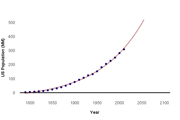
To model this relationship, you need the exp() function. For example: below is the US population from the decennial census from 1790 to 2010:
pop = c(3,5,7,10,12,17,23,31,39,50,62,76,92,106,123,132,152,181,205,227,250,282,309)
year = seq(1790, 2010, 10)
data = data.frame(year, pop)
The lm() function can handle exponential relationships with the exp() function in the formula, although in this case we need to scale the years by 0.01 to keep the range of values within what lm() can handle. The predict() function is then used to get predicted values from the model for plotting:
plot(data$year, data$pop,
	pch=19, col="navy", bty="n", fg=NA, las=1, font.lab=2,
	xlim=c(1790,2100), ylim=c(0,500),
	xlab="Year", ylab="US Population (MM)")
abline(a=0, b=0, lwd=3)

model = lm(pop ~ exp(year * 0.01), data=data)
pyears = 1790:2100
lines(x = pyears, y = predict(model, data.frame(year = pyears)), lwd=3, col="#80000080")
Although population growth start exponential, eventually that growth levels off as the carrying capacity of an area is reached and resources can no longer support additional population. Long-term, population often follows an s-shaped sigmoid curve. One common type of sigmoid curve is a logistic curve.
For situations like this, you need nls() (nonlinear least squares). This function requires that you specify the model coefficients in your formula AND give estimated starting values that the function will start from in fitting the curve.
nls() supports the SSlogis() (self-starting logistic) function in formulas. The coefficients are the time period (years), the peak population, the point in time when growth is halfway to the maximum, and a scaling parameter that represents the growth rate relative to time. Given some reasonable starting values in the start parameter, nls() function will tweak those coefficients to fit a logistic curve to the data.
The example below fits a logistic curve to historic US population and predicts population out to 2100:
plot(data$year, data$pop,
   pch=19, col="navy", bty="n", fg=NA, las=1, font.lab=2,
   xlim=c(1790,2200), ylim=c(0,500),
   xlab="Year", ylab="US Population (MM)")
abline(a=0, b=0, lwd=3)

model = nls(pop ~ SSlogis(year, peak, half, scale), data=data, start=list(peak = 600, half=1950, scale=70))
pyears = 1790:2200
lines(x = pyears, y = predict(model, data.frame(year = pyears)), lwd=3, col="#00800080")
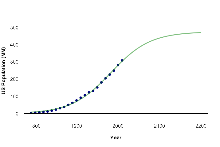
The summary shows that this crude model predicts a peaking of US population at 475 million people (peak coefficient) and that the halfway point in US population growth was 1982 (half coefficient). Of course, this model does not consider the actual drivers and limits to population growth, so it can only be guide for speculation and, perhaps, more-careful modeling.
> print(summary(model))

Formula: pop ~ SSlogis(year, peak, half, scale)

Parameters:
      Estimate Std. Error t value Pr(>|t|)
peak   475.804     32.381   14.69 3.52e-12 ***
half  1982.963      6.708  295.60  < 2e-16 ***
scale   47.332      1.978   23.93 3.42e-16 ***
---
Signif. codes:  0 ‘***’ 0.001 ‘**’ 0.01 ‘*’ 0.05 ‘.’ 0.1 ‘ ’ 1

Residual standard error: 5.005 on 20 degrees of freedom

Number of iterations to convergence: 7
Achieved convergence tolerance: 1.971e-06