Climate Model Output Data Analysis in R
Perhaps the major challenge with studying the future is that you can't empirically measure or analyze something that doesn't exist yet. To address this issue, researchers build models that are simplified representations (often as mathematical formulas or algorithms) that use known information about the past and assumptions about future conditions to make logical assumptions about what might happen in the future.
Complex atmospheric processes are commonly modeled using general circulation models (GCM) that mimic the dynamic interaction of air, water, and solar energy in our atmosphere.
Although these models are primarily useful for anticipating long-term climate trends, their outputs are steps on shorter time scales that can be used to understand how short-term weather might be different in the future.
This tutorial covers the visualization and basic descriptive analysis of climate model output data in R.
Climate Research Organizations
The World Climate Research Programme (WCRP) was established in 1980 under the joint sponsorship of the International Science Council (ISC) and the World Meteorological Organization (WMO) to coordinate research into the multi-scale dynamic interactions between natural and social systems that affect climate. (WCRP 2021).
The WCRP's Working Group on Coupled Modeling (WGCM) is responsible for the Coupled Model Intercomparison Project (CMIP), which was established in 1995 to foster standardized development and review of climate models (WCRP 2021).
CMIP members coordinate their work around assessment reports released by the Intergovernmental Panel on Climate Change (IPCC), which was established in 1988 by the United Nations to "provide policymakers with regular scientific assessments on the current state of knowledge about climate change" (IPCC 2021).
IPCC assessment reports are numbered, with the fifth assessment
report (AR5) released in 2013. Groups of CMIP models follow that
same numbering scheme, with the CMIP6 models planned for inclusion
in AR6 for release in 2022.
(Hausfather 2019)
Scenarios
Because future levels of greenhouse gas releases by humans could change based on economic, technological, and political forces, models are commonly run with different scenarios where the input values and formulas in the model are adjusted to represent plausible possibilities based on current choices and future conditions. While the future rarely ends up exactly matching the any of the scenarios exactly, scenario modeling can be useful guidance to individuals and organizations as they consider the costs and benefits of different options in their planning for the future.
The CMIP climate change scenarios represent different future levels of radiative forcing, which is the ratio between the energy absorbed by the Earth's atmosphere and the energy reflected back into space in watts per square meter. Higher values represent increased greenhouse gasses, more trapped heat in the atmosphere, and more climate disruption compared to the past. For comparison, radiative forcing is commonly expressed in values that are offset so that zero is the start of the industrial revolution around 1750 (NOAA 2021).
- 0.0: Radiative forcing reference value at the start of the industrial revolution in the year 1750
- 2.3: Radiative forcing in the year 2011
- 2.6: A target for radiative forcing in the year 2100 that is considered ideal, but improbable
- 4.5: A target for radiative forcing by 2100 that is considered practical
- 8.5: A probable level of radiative forcing by 2100 if no significant actions are taken to mitigate CO2 emissions
The CMIP uses five shared socioeconomic pathway (SSP) scenarios that can each incorporate different levels radiative forcing, which are described in greater detail by Hausfather (2018). The modeled scenarios with data availble from the CMIP modelers (as of this writing) include:
- SSP1-2.6: Sustainability – Taking the Green Road (Low challenges to mitigation and adaptation)
- SSP2-4.5: Middle of the Road (Medium challenges to mitigation and adaptation)
- SSP3-7.0: Regional Rivalry – A Rocky Road (High challenges to mitigation and adaptation)
- SSP4-3.4: Inequality – A Road Divided (Low challenges to mitigation, high challenges to adaptation)
- SSP5-8.5: Fossil-fueled Development – Taking the Highway (High challenges to mitigation, low challenges to adaptation)
R Libraries
The following R libraries will be used by code in this tutorial and you should install them if you haven't already.
install.packages("raster")
install.packages("RNetCDF")
install.packages("OpenStreetMap")
install.packages("sf")
install.packages("tsbox")
install.packages("leaflet")
Acquire the Data
Model outputs of land-based conditions like temperature and precipitation are sequences of grids covering the world over time, yielding data in three dimensions: latitude, longitude, and time.
The WCRP makes CMIP climate data available for download from the Earth System Grid Federation (ESGF) of the US Department of Energy's Lawrence Livermore National Laboratory. Data as monthly scenes in NetCDF (Network Common Data Form) files, which can be converted to rasters in R for visualization and analysis.
- Go to the WCRP's cimp6 data search page.
- Under Institution ID, select the desired modeling organization. For this example, we will use model outputs from NOAA-GFDL - the US National Oceanic and Atmospheric Administration's Geophysical Fluid Dynamics Laboratory.
- Under Experiment ID, select the scenario you wish to download. For this example we will use ssp126 for the SSP1-2.6 scenario.
- Under Frequency, select mon for monthly.
- Under Variable, select the
variable you wish to download.
Options used for the data in this tutorial include:
- pr: precipitation_flux, kg m-2 s-1, includes both liquid and solid phases
- tas: daily-mean near-surface (usually, 2 meter) air temperature (K)
- tasmin: daily-minimum near-surface (usually, 2 meter) air temperature (K)
- tasmax daily-maximum near-surface (usually, 2 meter) air temperature (K)
- Press Search.
- The displayed values may list multiple runs. For this example we use r1i1p1f1.
- Click List Files and the HTTP Download link to download the NetCDF file to your local machine.
Process the Data
In order to use gridded data from NetCDF files as rasters in R, some additional processing is needed.
Maximum Monthly Temperatures
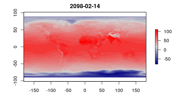
This script converts the monthly grids for the tasmax (mean high temperature) variable in the downloaded NetCDF file into a list of raster scenes.
- NetCDF files can be read in R using functions from the RNetCDF package (Michna and Woods 2013).
- The sapply() function runs a function over a list of values. In this case it is each grid in the file.
- Temperatures are in degrees Kelvin, which are converted to degrees Fahrenheit using a standard formula.
- This script can be modified to process tas (average monthly temperature) or tasmin (minimum monthly temperature) by replacing the tasmax variable name.
- This code may take a few minutes to run, depending on the speed of your processor.
The rotate(), flip(), and t() functions are used to change the orientation and indexing of the data grid from the file to the conventional lat/long raster scene representation.
library(raster)
library(RNetCDF)

nc = open.nc("tasmax_Amon_GFDL-ESM4_ssp585_r1i1p1f1_gr1_201501-210012.nc")

tasmax.dates = as.Date(var.get.nc(nc, "time"), origin="1850-01-01 00:00:00")

tasmax.scenes = sapply(1:length(tasmax.dates), function(z) {
	grid = var.get.nc(nc, "tasmax", start=c(NA, NA, z), count=c(NA, NA, 1))
	x = raster(grid, xmn=-90, xmx=90, ymn=0, ymx=360,
		crs="+proj=longlat +ellps=WGS84 +datum=WGS84 +no_defs")
	x = rotate(flip(t(x), 2))
	x = ((x - 273.15) * 1.8) + 32
	return(x) })

close.nc(nc)

plot(tasmax.scenes[[1000]], main=tasmax.dates[[1000]],
	col=colorRampPalette(c('navy', 'lightgray', 'red'))(32))
Precipitation
This code creates a list of scenes of monthly precipitation. The primary differences from the code above are the variable name and the conversion factor.
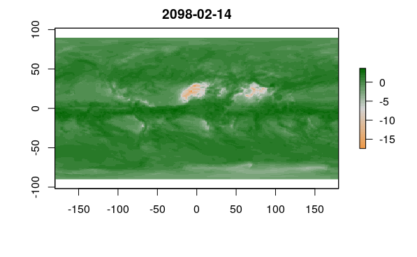
Precipitation in the model file is expressed as precipitation_flux, which is a rate of precipitation in the unit kg m-2 s-1. The constants convert water to inches per day and then multiply by the number of days per month (since this is monthly data) to get inches per month.
The plot() displays logarithm of the raster so that small areas of very high precipitation around the Equator to not hide the detail across the rest of the planet.
nc = open.nc("pr_Amon_GFDL-ESM4_ssp585_r1i1p1f1_gr1_201501-210012.nc")

pr.dates = as.Date(var.get.nc(nc, "time"), origin="1850-01-01 00:00:00")

pr.scenes = sapply(1:length(pr.dates), function(z) {
	grid = var.get.nc(nc, "pr", start=c(NA, NA, z), count=c(NA, NA, 1))
	x = raster(grid, xmn=-90, xmx=90, ymn=0, ymx=360,
		crs="+proj=longlat +ellps=WGS84 +datum=WGS84 +no_defs")
	x = rotate(flip(t(x), 2))
	x = x * 3401.575 * 30
	return(x) })

close.nc(nc)

plot(log(pr.scenes[[1000]]), main=pr.dates[[1000]],
	col=colorRampPalette(c('tan2', 'lightgray', 'darkgreen'))(32))
Average Monthly Temperatures
This code creates a list of scenes of average monthly temperatures that can be used for HDD/CDD calculation.
nc = open.nc("tas_Amon_GFDL-ESM4_ssp585_r1i1p1f1_gr1_201501-210012.nc")

tas.dates = as.Date(var.get.nc(nc, "time"), origin="1850-01-01 00:00:00")

tas.scenes = sapply(1:length(tas.dates), function(z) {
	grid = var.get.nc(nc, "tas", start=c(NA, NA, z), count=c(NA, NA, 1))
	x = raster(grid, xmn=-90, xmx=90, ymn=0, ymx=360,
		crs="+proj=longlat +ellps=WGS84 +datum=WGS84 +no_defs")
	x = rotate(flip(t(x), 2))
	x = ((x - 273.15) * 1.8) + 32
	return(x) })

close.nc(nc)

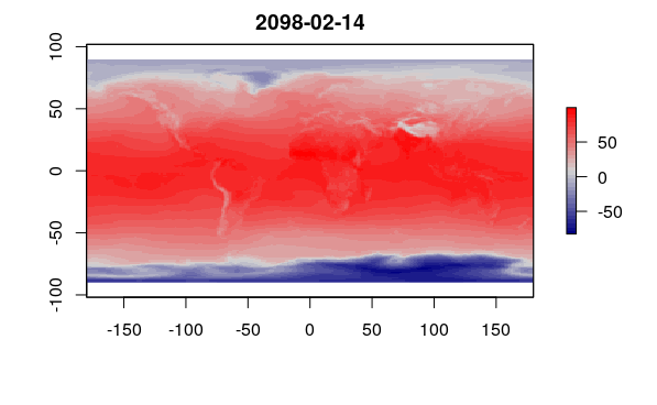
plot(tas.scenes[[1000]], main=tas.dates[[1000]],
	col=colorRampPalette(c('navy', 'lightgray', 'red'))(32))
Aggregated Temperature
Because of the random variability captured in the models, you may want to aggregate raster values by year or decade to create visualizations that reflect changes in conditions compared to the present.
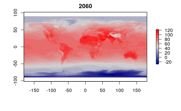
This code creates a raster scene with the maximum monthly high temperatures over all modeled scenes during the year 2060.
indices = which((tasmax.dates >= as.Date(paste0("2060-01-01"))) &
		(tasmax.dates <= as.Date(paste0("2060-12-31"))))

tasmax.2060 = tasmax.scenes[[indices[1]]]

for (scene in tasmax.scenes[indices[2:length(indices)]]) {
	values(tasmax.2060) = pmax(values(tasmax.2060), values(scene)) }

plot(tasmax.2060, main="2060", col = colorRampPalette(c('navy', 'lightgray', 'red'))(32))
Aggregated Precipitation
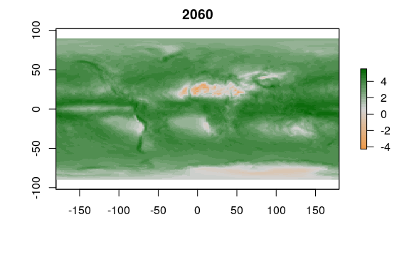
This code creates a similar raster scene with the total annual precipitation over all modeled scenes from the year 2060.
pr.2060 = pr.scenes[[indices[1]]]

for (scene in pr.scenes[indices[2:length(indices)]]) {
	pr.2060 = pr.2060 + scene }

plot(log(pr.2060), main="2060", col=colorRampPalette(c('tan2', 'lightgray', 'darkgreen'))(32))
Aggregated Baseline Rasters
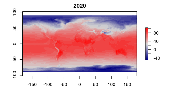
This code creates temperature and precipitation rasters for 2020 that can be used as a baseline for assessing change over time.
indices = which((tasmax.dates <= as.Date(paste0("2020-12-31"))) &
		(tasmax.dates >= as.Date(paste0("2020-01-01"))))

tasmax.2020 = tasmax.scenes[[indices[1]]]

plot(tasmax.2020, main="2020", col = colorRampPalette(c('navy', 'lightgray', 'red'))(32))

for (scene in tasmax.scenes[indices[2:length(indices)]]) {
	values(tasmax.2020) = pmax(values(tasmax.2020), values(scene)) }

indices = which((pr.dates <= as.Date(paste0("2020-12-31"))) &
		(pr.dates >= as.Date(paste0("2020-01-01"))))

pr.2020 = pr.scenes[[indices[1]]]

for (scene in pr.scenes[indices[2:length(indices)]]) {
	pr.2020 = pr.2020 + scene }
Mapping the Data
In order to more clearly assess the projected effects of climate change in specific areas, the raster visualizations can be blended with base maps for geographic context.
Global Temperature Map
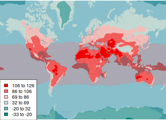
The default plot() on the aggregated rasters above gives the general broad temperature pattern we would expect, with higher temperatures around the equator and lower temperatures at the poles.
To make the map more readable, we add cartographic elements.
- We plot the map blended with a base map from OpenStreetMap to give geographic context.
- We define explicit quantile() breaks to create clear categories that map readers can interpret as specific ranges of values.
- The breaks between categories are based on standard deviation percentiles calculated with pnorm() so that colors express values that can be interpreted relative to the global average.
- We use a diverging colorRampPalette() based on three colors to make high and low values clearer.
- We add a legend() so the reader can know what the color ranges mean.
Sys.setenv(NOAWT=1)

library(OpenStreetMap)

upperLeft = c(80, -179)
lowerRight = c(-75, 179)

basemap = openmap(upperLeft, lowerRight)

basemap = raster(basemap)

breaks = quantile(tasmax.2060, probs=c(0, pnorm(-2:2), 1))

palette = colorRampPalette(c('darkcyan', 'white', 'red'))(6)

tasmax.rgb = RGB(projectRaster(tasmax.2060, basemap), col=palette, breaks=breaks)

blended = (basemap / 255.0) * (tasmax.rgb / 255.0)

plotRGB(blended, scale=1, interpolate=1)

legend("bottomleft", fill = rev(palette), bg = "white",
	legend = paste(round(breaks[6:1]), round(breaks[7:2]), sep=" to "))
Global Precipitation Map
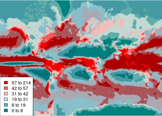
In contrast to the normal distribution of temperature values, the distribution of precipition is highly skewed by a number of areas, so we use quantile breaks that divide the color categories so that an even number of pixels are in each category.
breaks = quantile(pr.2060, probs=(0:6)/6)

palette = colorRampPalette(c('darkcyan', 'white', 'red'))(6)

pr.rgb = RGB(projectRaster(pr.2060, basemap), col=palette, breaks=breaks)

blended = (basemap / 255.0) * (pr.rgb / 255.0)

plotRGB(blended, scale=1, interpolate=1)

legend("bottomleft", fill = rev(palette), bg = "white",
	legend = paste(round(breaks[6:1]), round(breaks[7:2]), sep=" to "))
Global Temperature Change
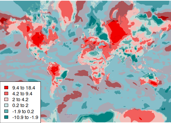
In order to identify areas that could be most affected by climate change, it can be helpful to map the projected change in temperature rather than the absolute temperature values.
tasmax.change = tasmax.2060 - tasmax.2020

palette = colorRampPalette(c('darkcyan', 'white', 'red'))(6)

breaks = quantile(tasmax.change, probs=c(0, pnorm(-2:2), 1))

tasmax.rgb = RGB(projectRaster(tasmax.change, basemap), breaks=breaks, col=palette)

blended = (basemap / 255.0) * (tasmax.rgb / 255.0)

plotRGB(blended, scale=1, interpolate=1)

legend("bottomleft", fill = rev(palette), bg = "white",
	legend = paste(round(breaks[6:1], 1), round(breaks[7:2], 1), sep=" to "))
Global Precipitation Change
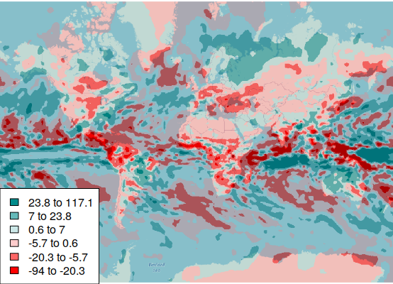
A similar map of precipitation change presents a much more complex spatial distribution.
pr.change = pr.2060 - pr.2020

palette = colorRampPalette(c('red', 'white', 'darkcyan'))(6)

breaks = quantile(pr.change, probs=c(0, pnorm(-2:2), 1))

pr.rgb = RGB(projectRaster(pr.change, basemap), breaks=breaks, col=palette)

blended = (basemap / 255.0) * (pr.rgb / 255.0)

plotRGB(blended, scale=1, interpolate=1)

legend("bottomleft", fill = rev(palette), bg = "white",
	legend = paste(round(breaks[6:1], 1), round(breaks[7:2], 1), sep=" to "))
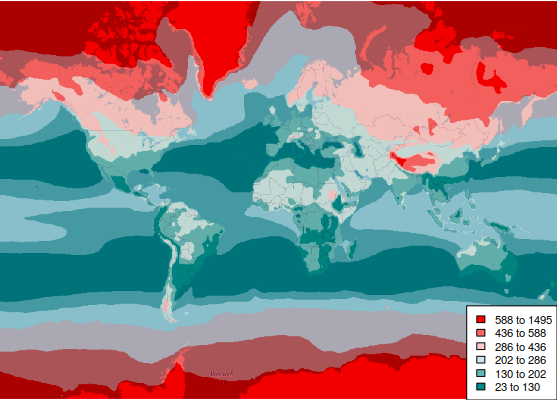
Global HDD + CDD
Totals of heating or cooling degree days can be used to identify areas that are projected to need the least amount of energy in the future for building climate control.
indices = which((tas.dates <= as.Date(paste0("2060-12-31"))) &
		(tas.dates >= as.Date(paste0("2060-01-01"))))

hdd.cdd.2060 = tas.scenes[[1]]

values(hdd.cdd.2060) = 0

for (scene in tas.scenes[indices]) {
	values(scene) = abs(values(scene) - 65)
	hdd.cdd.2060 = hdd.cdd.2060 + scene }

hdd.cdd.2060 = projectRaster(hdd.cdd.2060, basemap)

breaks = quantile(hdd.cdd.2060, probs=(0:6)/6)

palette = colorRampPalette(c('darkcyan', 'white', 'red'))(6)

hdd.cdd.rgb = RGB(hdd.cdd.2060, breaks=breaks, col=palette)

blended = (basemap / 255.0) * (hdd.cdd.rgb / 255.0)

plotRGB(blended, scale=1, interpolate=1)

legend("bottomright", fill = rev(palette), bg = "white", cex=0.7,
	legend = paste(round(breaks[6:1]), round(breaks[7:2]), sep=" to "))
US Temperature Change
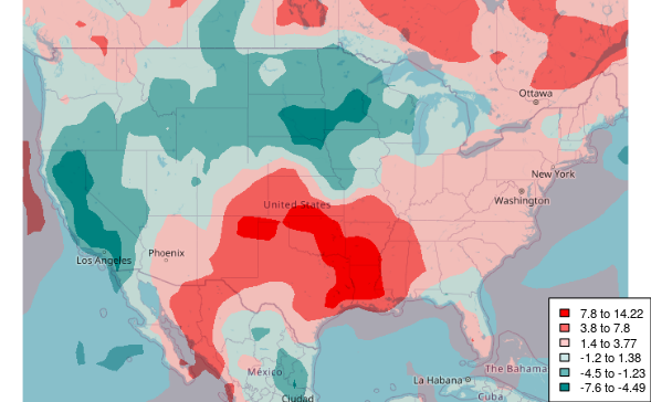
Because anthropogenic climate change is a global phenomenon that is studied by an international collection of researchers, maps of climate change projections are commonly world maps that present a global perspective. Such maps can make the issue seem distant and less relevant than local concerns.
Mapping projections at a national scale with color categories reflecting local variation can provide a different perspective that may be more useful for informing federal, state, and local decision making for planning and adaptation.
Sys.setenv(NOAWT=1)

library(OpenStreetMap)

upperLeft = c(52, -126.15)
lowerRight = c(21, -66.55)

basemap = openmap(upperLeft, lowerRight, zoom=4)

basemap = raster(basemap)

tasmax.change = tasmax.2060 - tasmax.2020

tasmax.change = projectRaster(tasmax.change, basemap)

breaks = quantile(tasmax.change, probs=c(0, pnorm(-2:2), 1))

palette = colorRampPalette(c('darkcyan', 'white', 'red'))(6)

tasmax.rgb = RGB(tasmax.change, breaks=breaks, col=palette)

blended = (basemap / 255.0) * (tasmax.rgb / 255.0)

plotRGB(blended, scale=1, interpolate=1)

legend("bottomright", fill = rev(palette), bg = "white", cex=0.7,
	legend = paste(round(breaks[6:1], 1), round(breaks[7:2], 2), sep=" to "))
US Precipitation Change
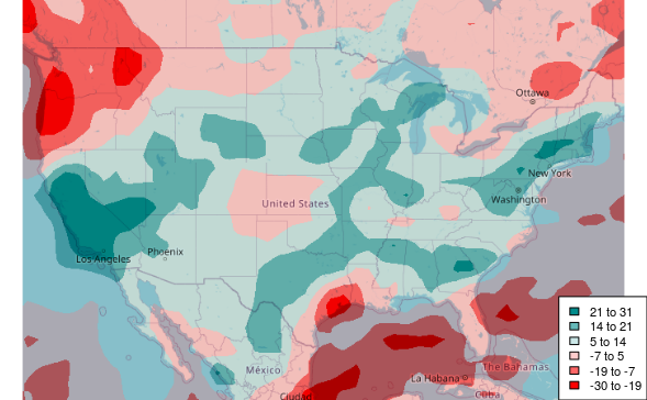
We can create a similar map for precipitation.
pr.change = pr.2060 - pr.2020

pr.change = projectRaster(pr.change, basemap)

breaks = quantile(pr.change, probs=c(0, pnorm(-2:2), 1))

palette = colorRampPalette(c('red', 'white', 'darkcyan'))(6)

prcp.rgb = RGB(pr.change, breaks=breaks, col=palette)

blended = (basemap / 255.0) * (prcp.rgb / 255.0)

plotRGB(blended, scale=1, interpolate=1)

legend("bottomright", fill = rev(palette), bg = "white", cex=0.7,
	legend = paste(round(breaks[6:1]), round(breaks[7:2]), sep=" to "))
US HDD + CDD
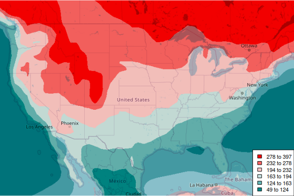
Totals of heating or cooling degree days can be used to identify areas that are projected to need the least amount of energy in the future for building climate control.
indices = which((tas.dates <= as.Date(paste0("2060-12-31"))) &
		(tas.dates >= as.Date(paste0("2060-01-01"))))

hdd.cdd.2060 = tas.scenes[[1]]

values(hdd.cdd.2060) = 0

for (scene in tas.scenes[indices]) {
	values(scene) = abs(values(scene) - 65)
	hdd.cdd.2060 = hdd.cdd.2060 + scene }

hdd.cdd.2060 = projectRaster(hdd.cdd.2060, basemap)

breaks = quantile(hdd.cdd.2060, probs=(0:6)/6)

palette = colorRampPalette(c('darkcyan', 'white', 'red'))(6)

hdd.cdd.rgb = RGB(hdd.cdd.2060, breaks=breaks, col=palette)

blended = (basemap / 255.0) * (hdd.cdd.rgb / 255.0)

plotRGB(blended, scale=1, interpolate=1)

legend("bottomright", fill = rev(palette), bg = "white", cex=0.7,
	legend = paste(round(breaks[6:1]), round(breaks[7:2]), sep=" to "))
Analyze the Data
Projected Local Temperature
The extract() function from the raster library can be used to extract values from a raster at a specific location.
Since we have the modeled temperature output data as a sequence of monthly scenes, we can extract() temperatures at a specific location across time and create a time series.
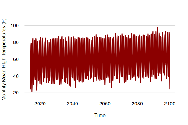
This code creates a time series of monthly high temperatures that can be used to analyze changes in the frequency and severity of summer heat.
The odd calculation of x for time is needed because time series decomposition needs an even time interval, and the monthly data is slightly irregular because of rounding associated with the internal representation of dates.
library(sf)
library(tsbox)

weather_station = st_sfc(st_point(c(-88.27778, 40.03972)), crs=4326)

y = sapply(tasmax.scenes, function(scene)  extract(scene, as_Spatial(weather_station)))

x = 1970 + (as.numeric(tasmax.dates) / 365.25)

tasmax.series = ts(y, start=floor(min(x)), end=floor(max(x)), deltat=1/12)

plot(tasmax.series, col="darkred", ylab="Monthly Mean High Temperatures (F)",
	type="l", lwd=3, bty="n", las=1, fg=NA)

grid(nx=NA, ny=NULL, lty=1)
Local Temperature Trend
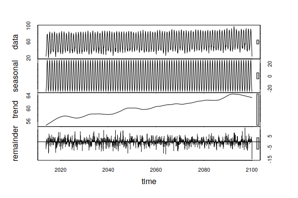
The time-series decomposition shows a clear upward trend in temperatures over the century.
decomposition = stl(tasmax.series, s.window=240, t.window=120)

plot(decomposition)
Projected Local Precipitation
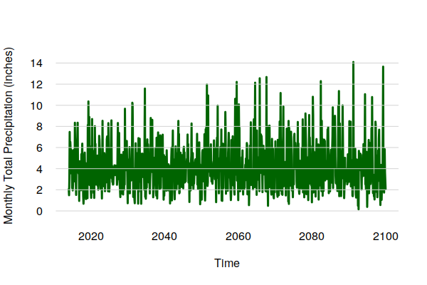
A similar analysis can be performed with precipitation projections.
y = sapply(pr.scenes, function(scene)  extract(scene, as_Spatial(weather_station)))

x = 1970 + (as.numeric(pr.dates) / 365.25)

pr.series = ts(y, start=floor(min(x)), end=floor(max(x)), deltat=1/12)

plot(pr.series, col="darkgreen", type="l", lwd=3, bty="n", las=1, fg=NA,
	ylab="Monthly Total Precipitation (inches)")

grid(nx=NA, ny=NULL, lty=1)
Local Precipitation Trend
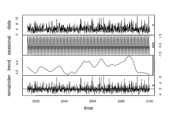
The precipitation trend is more erratic, albeit across a fairly narrow range. This indicates that the projections do not include a significant increase or decrease in precipitation.
However, the random component includes quite a bit of variability, hinting that sporadic episodes of drought and flooding will still be as much a part of the future as they have been in the past.
decomposition = stl(pr.series, s.window=240, t.window=120)

plot(decomposition)
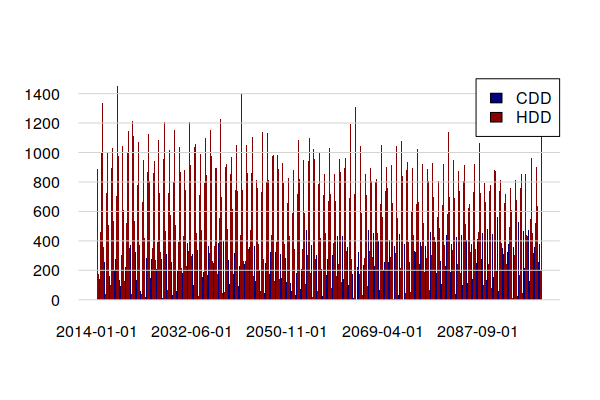
Local Heating and Cooling Degree Days
Changes in local heating and cooling degree days can be estimated using average (tas) rather than high monthly temperatures (tasmax).
library(xts)

y = sapply(tas.scenes, function(scene)  extract(scene, as_Spatial(weather_station)))

x = 1970 + (as.numeric(pr.dates) / 365.25)

hdd = ifelse(y < 65, 65 - y, 0) * 30

hdd = ts(hdd, start=floor(min(x)), end=floor(max(x)), delta=1/12)

cdd = ifelse(y >= 65, y - 65, 0) * 30

cdd = ts(cdd, start=floor(min(x)), end=floor(max(x)), delta=1/12)

barplot(merge.xts(ts_xts(cdd), ts_xts(hdd)),
	col=c("navy", "darkred"), las=1, fg="white",
	space=0, border=NA)

grid(nx=NA, ny=NULL, lty=1)

legend(x="topright", fill=c("navy", "darkred"), legend=c("CDD", "HDD"), bg="white")
Heating and Cooling Degree Day Trend
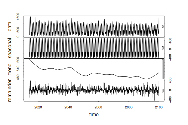
The trend in temperature noted above anticipate an increase in CDD and a decrease in HDD. Adding those two values and performing time-series decomposition shows that the increase in CDD is more than offset by the decrease in HDD.
decomposition = stl(cdd + hdd, s.window=240, t.window=120)

plot(decomposition)
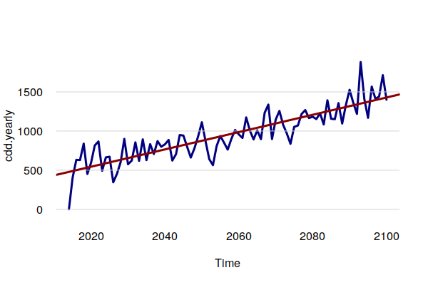
However, plotting an annual aggregation of CDD along with a trendline shows tripling of CDD from around 500 per year to almost 1,500 per year in 2100. While overall energy use may be reduced, increased summer electricity demand will likely require significant investments in additional electrical generation and distribution infrastructure, with surplus capacity for transient summer peaks are considered.
library(tsbox)

cdd.yearly = period.apply(ts_xts(cdd), INDEX = seq(1, length(cdd) - 1, 12), FUN = sum)

cdd.yearly = ts_ts(cdd.yearly)

model = lm(cdd.yearly ~ index(cdd.yearly))

plot(cdd.yearly, col="navy", lwd=3, las=1, fg="white")

grid(nx=NA, ny=NULL, lty=1)

abline(model, lwd=3, col="darkred")
Climate Analogs
Another approach to imagining localized effects of climate change is the analog city, which presents projected climate for a locale in terms of the climate in an existing city (usually more southern) that already has that type of climate (Fitzpatrick and Dunn 2019). This qualitative approach deals with the difficulty of presenting quantitative temperature and precipitation data in a comprehensible manner.
Fitzpatrick and Dunn have created a What will climate feel like in 60 years? web app that displays both the query city and its climate analog, along with the quantitative differences in temperature and precipitation.
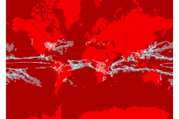
The modeled rasters can be used with simple raster algebra to identify analog areas that have 2020 summer high temperatures and precipitation analogous to forecast 2060 levels for a specific observation point.
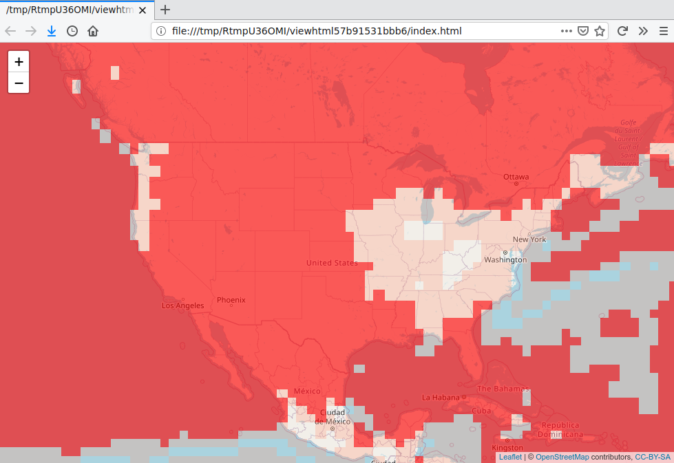
In this map, the intensity of red indicates deviation from the 2060 climate. Clear areas are the closest 2060 climate analog areas for the observation station.
library(sf)

weather_station = st_sfc(st_point(c(-88.27778, 40.03972)), crs=4326)

local.tasmax.2060 = extract(tasmax.2060, as_Spatial(weather_station))

local.pr.2060 = extract(pr.2060, as_Spatial(weather_station))

print(local.tasmax.2060)

	[1] 84.38813

print(local.pr.2060)

	[1] 63.88667

analog = -abs(tasmax.2020 - local.tasmax.2060 + 1) - abs(pr.2020 - local.pr.2060)

upperLeft = c(80, -179)
lowerRight = c(-75, 179)

basemap = openmap(upperLeft, lowerRight)

basemap = raster(basemap)

analog = projectRaster(analog, basemap, method="ngb")

palette = colorRampPalette(c('red', 'white'))(3)

breaks = quantile(analog, probs=c(0, 0.9, 0.98, 1))

analog.rgb = RGB(analog, breaks = breaks, col=palette)

blended = (basemap / 255.0) * (analog.rgb / 255.0)

plotRGB(blended, scale=1, interpolate=1)
Interactive Analog Area Map with Leaflet
The Leaflet for R library can be used to create an interactive web map for exploring the analog raster more closely in a web browser.
library(leaflet)

map = leaflet()

map = addTiles(map)

palette = colorQuantile(c("#ff0000a0", "#ffffff00"), values(analog),
	n=3, alpha=T, probs=c(0, 0.9, 0.98, 1))

map = addRasterImage(map, analog, palette, method="ngb")

map
