Visualizing Polygon Areas of One Variable in R
Spatial polygons can be loaded with the readOGR() function from the rgdal library. For a shapefile of polygons, the function returns a SpatialPolygonsDataFrame object that holds both the polygon shapes and attributes associated with those polygons. Zipped shapefiles of US data are available here
Loading Polygons
Polygons can be accessed and subsetted as if they were arrays. In the example below, the states of Alaska and Hawaii are removed to make the example maps just show the continental USA.
library(rgdal)
counties = readOGR(dsn=".", layer="2017-county-data", stringsAsFactors=F)

# Subset to remove Alaska, Hawaii and other territories so just the continential US is shown
counties = counties[!(counties$ST %in% c('AK', 'HI', NA)),]
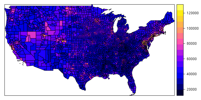
A simple choropleth can be created with plot() or spplot() functions. The zcol parameter is the name of the field used to determine the colors for the polygons, in this case median household income:
spplot(counties, zcol="MEDHHINC")
Plotting over an OpenStreetMap Base Map
While the spplot() visualization may be adequate for a quick exploration of the data, the appearance of the map will usually be improved if a base map is placed under the polygons to give them some context. The OpenStreetMap library has a number of functions for downloading and manipulating OpenStreetMaps that can be used as base maps. The openmap() function creates an object that can be plotted with plot():
library(OpenStreetMap)

upperLeft = c(55, -130)
lowerRight = c(20, -60)
basemap = openmap(upperLeft, lowerRight, type="osm")
plot(basemap)
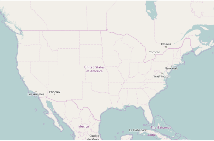
The openmap() function must be passed the WGS 84 latitude/longitude of the upper left and bottom right corners of the desired map area. You can get the bounding box of a SpatialPolygonsDataFrame by examining the bbox slot. The actual upperLeft/lowerRight corners that you use should pad these values a bit to give a margin around the polygons.
> counties@bbox
         min       max
x -124.72584 -66.94989
y   24.49813  49.38436
To plot the polygons over the base map, you must transform the polygons to the projection used by the spherical mercator projection used by OpenStreetMap object. This is the same projection used by almost all web maps. The spTransform() function can be used to transform any Spatial* object as the first parameter, with the osm() passed as the second parameter specifying spherical mercator projection used by OpenStreetMap.
counties = spTransform(counties, osm())
plot(counties, col="gray", add=T)
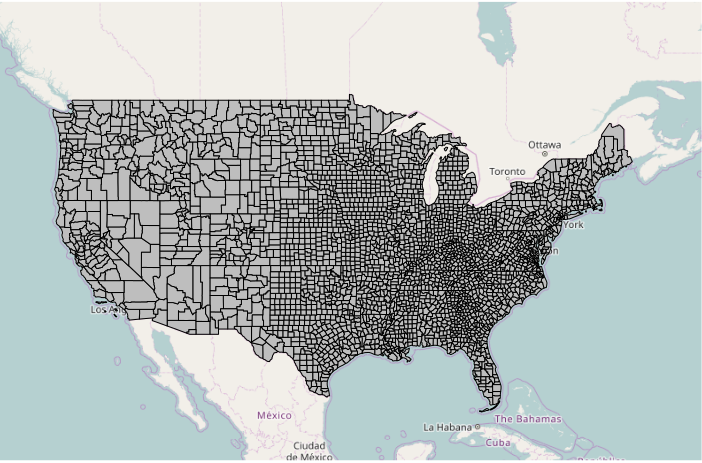
plot() can be used to plot a variety of different choropleths based on color parameter, which contains the colors used to draw each of the polygons.
Plotting a Choropleth with Dichotomous Data
To plot dichotomous data, the ifelse() function can be used to select colors based on whether a field does or does not have a specific value. The add=T parameter indicates that the polygons should be drawn on top of the existing plot. The border=NA parameter indicates not to draw any borders, which would clutter the map, especially in areas with alot of small counties.
# Dichotomous data
ramp = c("navy", "red2")
colors = ifelse(counties$WIN2012 == "Obama", ramp[1], ramp[2])

plot(basemap)
plot(counties, col=colors, border=NA, add=T)
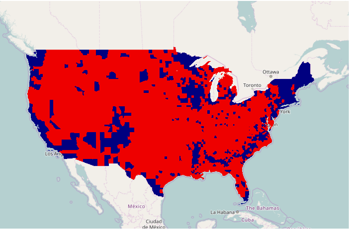
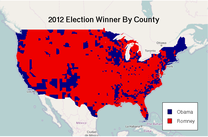
As with any choropleth, a legend() should be provided to indicate what the colrs mean. The legend parameter is the list of names for the legend. The fill parameter indicates the color of the boxes to be drawn beside the names. The bg="white" parameter indicates to fill the box with a white background so it stands above whatever is under it. The inset=0.05 parameter indicates that the legend should be drawn 5% inside of the edge.
The mtext() function can be used to draw a title.
legend(x = "bottomright", legend=c("Obama", "Romney"), fill = ramp, bg="white", inset=0.05)
mtext("2012 Election Winner By County", cex=1.5, font=2)
Plotting a Choropleth With Categorical Data
To plot categorical data:
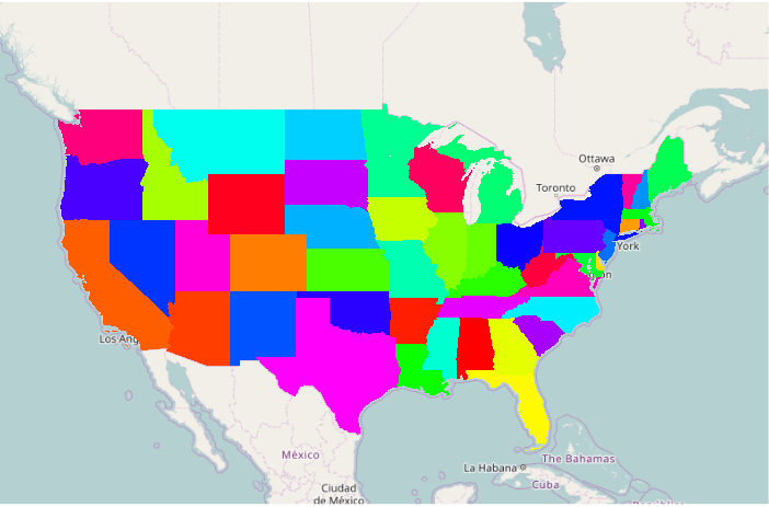
- A rainbow() color ramp can be useful to give a wide variety of bold colors, which may be too bold for some applications
- The unique() function returns the unique values from the ST (state abbreviation) column
- The length() function counts those unique values so the rainbow() function returns a ramp containing colors for all possible values in the column
- The as.factor() function converts the state abbreviations into numeric values, that are then used to index the color ramp
# Categorical data
ramp = rainbow(length(unique(counties$ST)))
colors = ramp[as.factor(counties$ST)]

plot(basemap)
plot(counties, col=colors, border=NA, add=T)
Plotting A Choropleth From Continuous Data (Interval or Ratio)
Quantile Classification
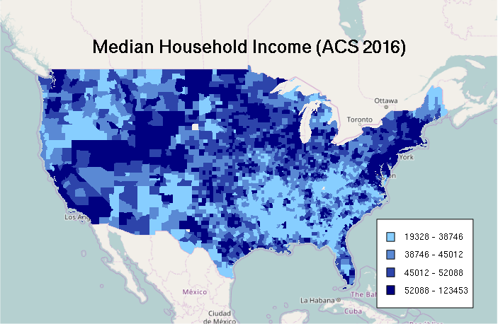
For making a choropleth from a quantitative field, the values must be classified into ranges that are represented with different colors.
- The quantile() function returns five values that divide distribution into ranges of values so that there are the same number of values in each range
- Those quantile breaks can then be passed to the cut() function that classifies the values according to which range they belong to
- The colorRampPalette function returns a function that will interpolate values from the range of colors passed as parameters
In the example below, four colors are interpolated between skyblue1 and navy (dark blue) to create a four-color color ramp of shades of blue:
# Quantile Classification

breaks = quantile(counties$MEDHHINC, na.rm=T)
categories = as.numeric(cut(counties$MEDHHINC, breaks))

palette = colorRampPalette(c("skyblue1", "navy"))
ramp = palette(4)
colors = ramp[categories]

plot(basemap)
plot(counties, col=colors, border=NA, add=T)
A legend for a choropleth where the colors represent ranges of values can be constructed with the sapply() function, which pastes together successive pairs of breakpoints to give labels reflecting those ranges:
labels = sapply(1:4, function(z) paste(round(breaks[z]), '-', round(breaks[z + 1])))
legend(x = "bottomright", legend=labels, fill=ramp, bg="white", inset=0.05, cex=0.8)
mtext("Median Household Income (ACS 2016)", cex=1.5, font=2)
Equal Interval Classification
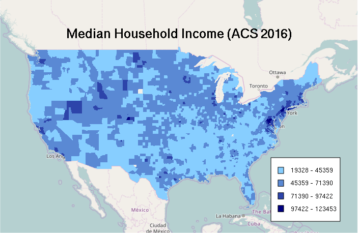
Since quantiles can exaggerate differences, sometimes an equal interval classification is more appropriate. For example, the map below reinforces a narrative of the US with high concentrations of wealth in a very limited number of wealthy urban counties, surrounded by vast, considerably less-well-off rural areas.
- min() and max() find the lowest and highest values in the variable range
- The seq() function gives a sequence of probabilities from 0 to 1 in increments of 0.25 (25%)
- The qunif() uniform distribution quantile function divides that range equally according to the probabilities passed in the first parameter
- Those breakpoints are used to cut() each of the variable values into categories
- Those categories are then used to index a color palette generated with colorRampPalette()
# Equal Interval Classification

breaks = qunif(seq(0, 1, 0.25), min = min(counties$MEDHHINC, na.rm=T), max = max(counties$MEDHHINC, na.rm=T))

categories = as.numeric(cut(counties$MEDHHINC, breaks))
categories = cut(counties$MEDHHINC, breaks)

palette = colorRampPalette(c("skyblue1", "navy"))
ramp = palette(4)
colors = ramp[categories]

plot(basemap)
plot(counties, col=colors, border=NA, add=T)

labels = sapply(1:4, function(z) paste(round(breaks[z]), '-', round(breaks[z + 1])))
legend(x = "bottomright", legend=labels, fill=ramp, bg="white", inset=0.05, cex=0.8)
mtext("Median Household Income (ACS 2016)", cex=1.5, font=2)
Zero-Based Equal Interval Classification
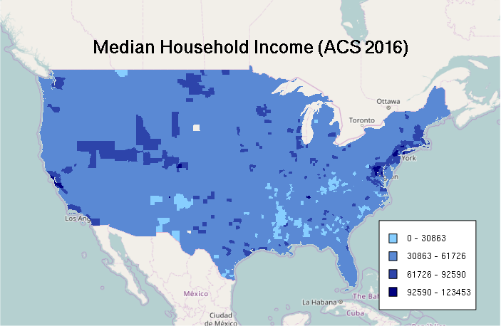
Similarly, stretching the colors between the minimum and maximum can also exaggerate differences. Starting with a minimum of zero creates the map with the least contrast, which accentuates a narrative of the US as a wealthy country with a broadly dispersed middle-class, especially in comparison to many other less-wealthy countries. Whether that story is appropriate is a value judgement.
# Equal Interval Classification

breaks = qunif(seq(0, 1, 0.25), min = 0, max = max(counties$MEDHHINC, na.rm=T))

categories = as.numeric(cut(counties$MEDHHINC, breaks))
categories = cut(counties$MEDHHINC, breaks)

palette = colorRampPalette(c("skyblue1", "navy"))
ramp = palette(4)
colors = ramp[categories]

plot(basemap)
plot(counties, col=colors, border=NA, add=T)

labels = sapply(1:4, function(z) paste(round(breaks[z]), '-', round(breaks[z + 1])))
legend(x = "bottomright", legend=labels, fill=ramp, bg="white", inset=0.05, cex=0.8)
mtext("Median Household Income (ACS 2016)", cex=1.5, font=2)
Transparency
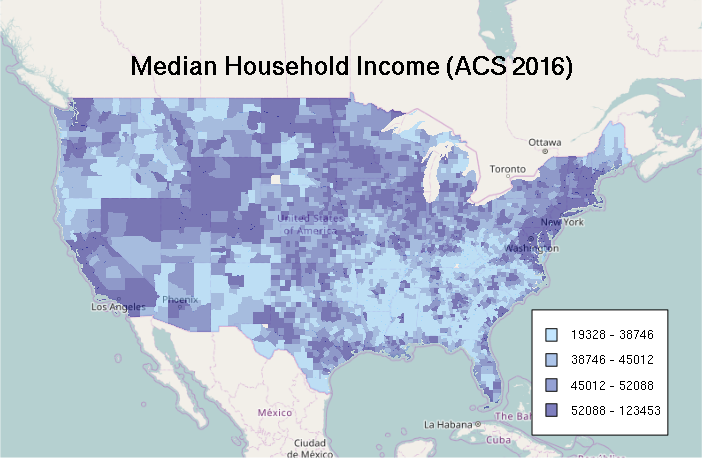
Colors can be specified in the same type of RGB hexadecimal codes used for specifying colors on web pages. A fourth byte can be added for alpha (#RRGGBBAA), with 00 meaning transparent and FF meaning opaque. Specifying colors as semi-transparent will allow the base map features to be visible through the choropleth.
ramp = c("#0000FF80", "#FF000080")
colors = ifelse(counties$WIN2012 == "Obama", ramp[1], ramp[2])

plot(basemap)
plot(counties, col=colors, border=NA, add=T)

With color ramps, the alpha=T parameter needs to be passed to colorRampPalette() so transparency in included in interpolated colors.
breaks = quantile(counties$MEDHHINC, na.rm=T)
categories = as.numeric(cut(counties$MEDHHINC, breaks))

palette = colorRampPalette(c("#87CEFF80", "#00008080"), alpha=T)
ramp = palette(4)
colors = ramp[categories]

plot(basemap)
plot(counties, col=colors, border=NA, add=T)

labels = sapply(1:4, function(z) paste(round(breaks[z]), '-', round(breaks[z + 1])))
legend(x = "bottomright", legend=labels, fill=ramp, bg="white", inset=0.05, cex=0.8)
mtext("Median Household Income (ACS 2016)", cex=1.5, font=2)
Other Base Maps
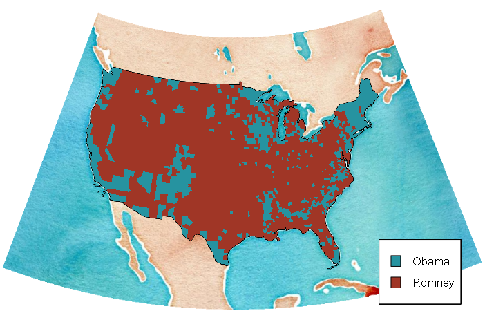
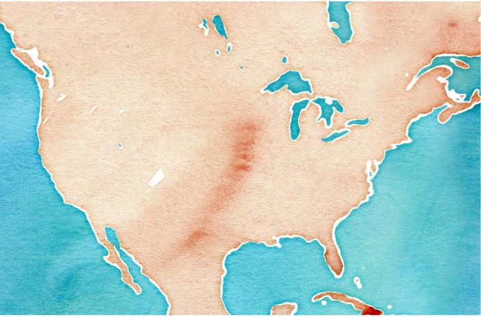
The openmap() function can load base maps from other sources besides OpenStreetMap. See ?openmap documentation page for a list of values for the type parameter. One attractive map is the stamen-watercolor map from Stamen Design:
basemap = openmap(upperLeft, lowerRight, type="stamen-watercolor")
plot(basemap)
Other Projections
While it is usually safest when using OpenStreetMap to just use the default spherical mercator projection, the openproj() function can be used to transform the map and plot to another projection. Note that you must also spTransform() your polygons to the same projection to plot.
With the conic projection below, the edges of the base map are no longer at right angles, which may be undesirable and would require loading and expanded area and cropping to restore.
# EPSG: 102008 North America Albers Equal Area Conic

usa_albers = CRS("+proj=aea +lat_1=20 +lat_2=60 +lat_0=40 +lon_0=-96 +x_0=0 +y_0=0
	+datum=NAD83 +units=m +no_defs")

basemap = openproj(basemap, usa_albers)
counties = spTransform(counties, usa_albers)

ramp = c("#2693a0", "#a03626")
colors = ifelse(counties$WIN2012 == "Obama", ramp[1], ramp[2])

plot(basemap)
plot(counties, col=colors, border=NA, add=T)
legend(x = "bottomright", legend=c("Obama", "Romney"), fill=ramp, bg="white", inset=0.05)
