Area Maps in Python
Geospatial data representing areas is commonly used for describing social and environmental characteristics of our world.
This tutorial covers the basic descriptive analysis and visualization of geospatial area data in Python using GeoPandas and Matplotlib.
Areas
Geospatial data describes what is where. There are locations on the surface of the earth (where) that have names or characteristics (what).
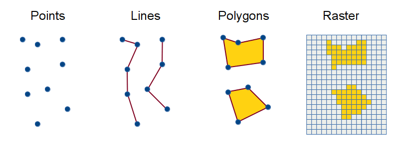
Areas in geospatial data are represented with polygons.
- Polygons are represented with points (nodes) connected by lines (vertices).
- Points are represented with latitude/longitude coordinate pairs. For example, 38.8977, -77.0365 are the latitude/longitude coordinates of the White House, the home of the President of the United States.
- Latitude is an angle north or south across the surface of the earth that represents the distance from the equator (zero degrees latitude). Latitudes range from -90 degrees at the South Pole to +90 degrees at the North Pole.
- Longitude is an angle east or west across the surface of the earth that represents the distance from Greenwich, England (zero degrees longitude). Longitudes range from -180 degrees to +180 degrees.
- Points, lines, and polygons are the vector data model for representing things and characteristics on the earth's surface.
Pandas and GeoPandas
Pandas is a data analysis and manipulation module that can be used in Python.
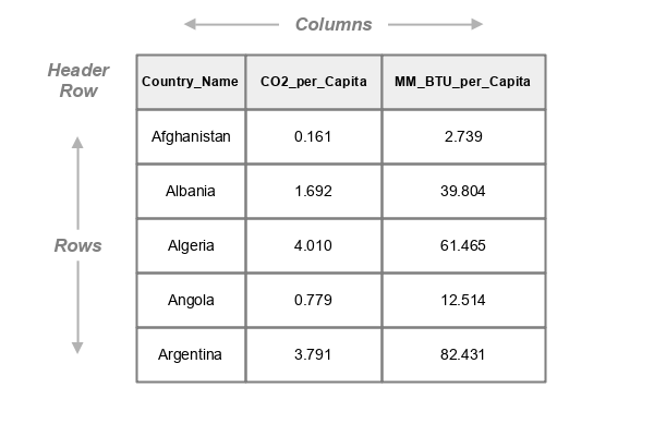
At the core of pandas is a tabular object type called a DataFrame. Pandas DataFrames are conceptually similar to spreadsheet tables.
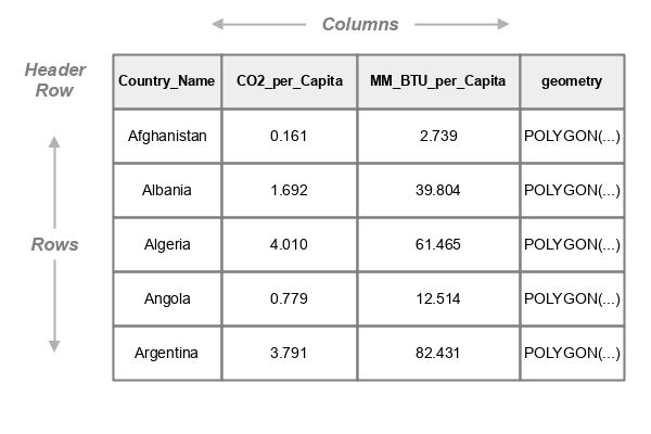
GeoPandas is an extension of pandas and shapely data types and operations for working with geospatial data.
GeoPandas GeoDataFrames are pandas DataFrames with an additional geometry column that contains geometries for representing points, lines or polygons associated with each row.
Columns of values in DataFrames/GeoDataFrames can be accessed the column name inside square brackets:
countries["CO2_per_Capita"]
0      0.161
1      1.692
2      4.010
3      0.779
4      3.741
Name: CO2_per_Capita, Length: 5, dtype: float64
Columns can also be accessed with dot notation, but only if the column names adhere to Python variable naming limitations.
countries.CO2_per_Capita
0      0.161
1      1.692
2      4.010
3      0.779
4      3.741
Name: CO2_per_Capita, Length: 5, dtype: float64
Multiple columns can be accessed by including a list in the brackets.
countries[["Country_Name", "CO2_per_Capita"]]
    Country_Name  CO2_per_Capita
0    Afghanistan           0.161
1        Albania           1.692
2        Algeria           4.010
3         Angola           0.779
4      Argentina           3.741

[5 rows x 2 columns]
Individual rows can be accessed by referencing the DataFrame loc property.
countries.loc[0]
Country_Name               Afghanistan
CO2_per_Capita_                  0.161
MM_BTU_per_Capita                2.739
geometry		   POLYGON(...
Ranges of rows can be accessed with indices separated by a colon.
countries.loc[0:2]
   Country_Name		CO2_per_Capita		MM_BTU_per_Capita	geometry
0  Afghanistan          0.161			2.739			POLYGON(...
1  Albania		1.692			39.804			POLYGON(...
2  Algeria		4.010			61.465			POLYGON(...

[3 rows x 4 columns]
The head method can be used as a shortcut for accessing the top five rows.
countries.head()
   Country_Name		CO2_per_Capita		MM_BTU_per_Capita	geometry
0  Afghanistan          0.161			2.739			POLYGON(...
1  Albania		1.692			39.804			POLYGON(...
2  Algeria		4.010			61.465			POLYGON(...
3  Angola		0.779			12.514			POLYGON(...
4  Argentina		3.791			82.431			POLYGON(...
Acquire and Examine the Data
Load the Data
For this tutorial, the example data is country-level energy and socioeconomic data collected by the U.S. Energy Information Administration (EIA), The World Bank, and The V-Dem Institute. A GeoJSON file and metadata are available here..
- GeoPandas is a Python package for working with geospatial data.
- To create plots you will need the pyplot module from Matplotlib.
- The as keyword creates an alias (plt) that saves you from having to type the whole module name (matplotlib.pyplot) when referencing a function from that module.
- Read geospatial data from a file or web source into a GeoDataFrame object using the read_file() function.
- For this example, we will use the GeoJSON file of country-level energy indicators described above.
- The to_crs() method is used to reproject the data to the commonly-used (but problematic) Web Mercator projection that is suitable for mapping and avoids the visual distortions associated with the unprojected lat/long data from the GeoJSON file.
import geopandas

import matplotlib.pyplot as plt

countries = geopandas.read_file("https://michaelminn.net/tutorials/data/2019-world-energy-indicators.geojson")

countries = countries.to_crs("EPSG:3857")
Depending on your configuration, maps and other figure images generated in Jupyter notebooks can be small and difficult to read. You can increase the size by setting the figure.figsize plot parameter at the top of your notebook. The first value in the array is the width and the second is the height, in inches.
plt.rcParams['figure.figsize'] = [9, 6]
List Fields
You can get a list of field (column) names from the .columns property of the GeoDataFrame.
countries.columns
Index(['Country_Code', 'Country_Name', 'Longitude', 'Latitude', 'Population',
       'GNI_PPP_B_Dollars', 'GDP_per_Capita_PPP_Dollars', 'MJ_per_Dollar_GDP',
       'Fuel_Percent_Exports', 'Resource_Rent_Percent_GDP',
       'Exports_Percent_GDP', 'Imports_Percent_GDP', 'Industry_Percent_GDP',
       'Agriculture_Percent_GDP', 'Military_Percent_GDP', 'Gini_Index',
       'Regime_Type', 'Democracy_Index', 'CO2_Emissions_MM_Tonnes',
       'Primary_Consumption_Quads', 'Coal_Consumption_Quads',
       'Gas_Consumption_Quads', 'Oil_Consumption_Quads',
       'Nuclear_Consumption_Quads', 'Renewable_Consumption_Quads',
       'Primary_Production_Quads', 'Coal_Production_Quads',
       'Gas_Production_Quads', 'Oil_Production_Quads',
       'Nuclear_Production_Quads', 'Renewable_Production_Quads',
       'Electricity_Capacity_gW', 'Electricity_Generation_tWh',
       'Electricity_Consumption_tWh', 'Oil_Production_Mbd',
       'Oil_Consumption_Mbd', 'Oil_Reserves_B_Barrels', 'Gas_Production_bcf',
       'Gas_Consumption_bcf', 'Gas_Reserves_tcf', 'Coal_Production_Mst',
       'Coal_Consumption_Mst', 'Coal_Reserves_Mst', 'MM_BTU_per_Capita',
       'Renewable_Percent', 'geometry'],
      dtype='object')
For a more-detailed listing with the data types and number of features, you can use the GeoDataFrame info() method.
countries.info()
RangeIndex: 175 entries, 0 to 174
Data columns (total 51 columns):
 #   Column                       Non-Null Count  Dtype
---  ------                       --------------  -----
 0   Country_Code                 175 non-null    object
 1   Country_Name                 175 non-null    object
 2   Longitude                    175 non-null    float64
 3   Latitude                     175 non-null    float64
 4   WB_Region                    171 non-null    object
 5   WB_Income_Group              170 non-null    object
 6   Population                   170 non-null    float64
 7   GNI_PPP_B_Dollars            162 non-null    float64
 8   GDP_per_Capita_PPP_Dollars   162 non-null    float64
 9   MJ_per_Dollar_GDP            166 non-null    float64
 10  Fuel_Percent_Exports         148 non-null    float64
 11  Resource_Rent_Percent_GDP    168 non-null    float64
 12  Exports_Percent_GDP          161 non-null    float64
 13  Imports_Percent_GDP          161 non-null    float64
 14  Industry_Percent_GDP         167 non-null    float64
 15  Agriculture_Percent_GDP      167 non-null    float64
 16  Military_Percent_GDP         150 non-null    float64
 17  Gini_Index                   126 non-null    float64
 18  Land_Area_sq_km              169 non-null    float64
 19  Arable_Land_HA_per_Capita    168 non-null    float64
 20  HDI                          164 non-null    float64
 21  Regime_Type                  164 non-null    object
 22  Democracy_Index              164 non-null    float64
 23  CO2_Emissions_MM_Tonnes      172 non-null    float64
 24  Primary_Consumption_Quads    172 non-null    float64
 25  Coal_Consumption_Quads       172 non-null    float64
 26  Gas_Consumption_Quads        172 non-null    float64
 27  Oil_Consumption_Quads        172 non-null    float64
 28  Nuclear_Consumption_Quads    31 non-null     float64
 29  Renewable_Consumption_Quads  172 non-null    float64
 30  Primary_Production_Quads     172 non-null    float64
 31  Coal_Production_Quads        172 non-null    float64
 32  Gas_Production_Quads         172 non-null    float64
 33  Oil_Production_Quads         172 non-null    float64
 34  Nuclear_Production_Quads     31 non-null     float64
 35  Renewable_Production_Quads   172 non-null    float64
 36  Electricity_Capacity_gW      172 non-null    float64
 37  Electricity_Generation_tWh   172 non-null    float64
 38  Electricity_Consumption_tWh  172 non-null    float64
 39  Oil_Production_Mbd           172 non-null    float64
 40  Oil_Consumption_Mbd          172 non-null    float64
 41  Oil_Reserves_B_Barrels       169 non-null    float64
 42  Gas_Production_bcf           172 non-null    float64
 43  Gas_Consumption_bcf          172 non-null    float64
 44  Gas_Reserves_tcf             161 non-null    float64
 45  Coal_Production_Mst          172 non-null    float64
 46  Coal_Consumption_Mst         172 non-null    float64
 47  Coal_Reserves_Mst            172 non-null    float64
 48  MM_BTU_per_Capita            169 non-null    float64
 49  Renewable_Percent            172 non-null    float64
 50  geometry                     175 non-null    geometry
dtypes: float64(45), geometry(1), object(5)
memory usage: 69.9+ KB
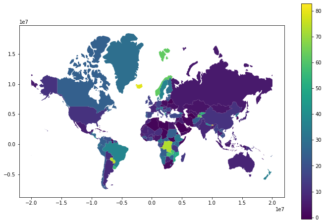
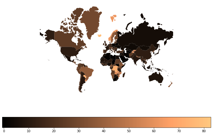
Default Choropleth
A thematic map "is used to display the spatial pattern of a themes or attributes" (Slocum et al. 2009, 1). This is in contrast to a reference map (like Google Maps) which provides a general overview of information, often representing multiple variables.
A choropleth is a type of thematic map where areas are colored based on a single variable that describes some characteristic of those areas.
To display a default choropleth map:
- Call the GeoDataFrame plot() method with the name of the attribute to visualize.
- Add the legend = True parameter to show the colorbar indicating what values are associated with the colors.
- Call the Matplotlib show() function to display the plotted map.
axis = countries.plot("Renewable_Percent", legend=True)

plt.show()
Descriptive Statistics
Distributions
The distribution of a set of values is the manner in which the values are spread across the possible range of values.
A histogram is "a representation of a frequency distribution by means of rectangles whose widths represent class intervals and whose areas are proportional to the corresponding frequencies" (Merriam-Webster 2023).
Histograms are commonly used to examine variables and determine their distribution.
The type of distribution can influence the design choices you make with your visualizations.
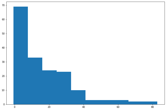
The hist() function from the pyplot module can be used to create histograms.
The parameter should be the column from the GeoDataFrame.
axis = plt.hist(countries["Renewable_Percent"])

plt.show()
The histplot() function from the Seaborn module can be used to draw a histogram with a smoothed density curve line that can make the general shape of the histogram clearer when the data is noisy.
import seaborn as sns

axis = sns.histplot(countries["Renewable_Percent"], kde=True)

plt.show()
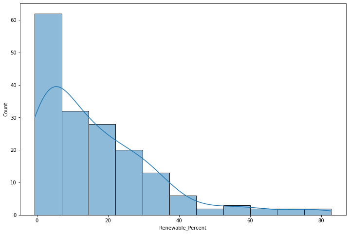
The Pandas skew() method can be used to quantify the level of skew, with positive numbers representing skew to the right and negative numbers representing skew to the left.
The high positive value clearly supports the observation from the histogram that the distribution is clearly skewed to the right (positive skew).
countries["Renewable_Percent"].skew()
1.5836553372979751
Central Tendency
Central tendency statistics (means, medians, modes) aggregate a set of values into a single value that is a representative central value for comparison with other central values.
The Pandas describe() method lists the central tendency values for a variable, along with the range and the quantiles.
- With normally distributed variables, the mean (average) is usually the most appropriate central tendency variable to use to describe the variable.
- For other distributions, the median may be more appropriate since means are distorted by skew or multimodality. The median is the 50% quantile (50% of the values are below the median and 50% are above).
countries["Renewable_Percent"].describe()
count    170.000000
mean      33.420588
std       27.956439
min        0.000000
25%       10.882500
50%       24.990000
75%       53.037500
max       96.240000
Ordinal Ranking
In some cases, you might like to know information about the areas with the highest and lowest values in the distribution.
- To preserve the original GeoDataFrame, we make a copy with just the columns that we want to display.
- We use the dropna() method to remove blank (NA) values that would clutter the displayed list.
- We add a new column with the ordinal rank() of each value within the distribution.
- We use the sort_values() method to order the GeoDataFrame by the ranking column.
- We use the head() method to display the top rows.
- We use the tail() method to display the bottom rows.
The countries with the highest percentage of renewable energy usage tend to be countries with robust hydroelectric power, and the countries with the lowest percentage of renewable energy use are petrostates or fossil-fuel dependent island states.
renewables = countries[["Country_Name", "Renewable_Percent"]].dropna()

renewables["Rank"] = renewables["Renewable_Percent"].rank(ascending=False)

renewables = renewables.sort_values("Rank", ascending=True)

renewables.head()
Country_Name 	Renewable_Percent 	Rank
Bhutan 			82.766 		1.0
Iceland 		79.135 		2.0
Paraguay 		74.106 		3.0
Dem. Rep. Congo 	72.897 		4.0
Tajikistan 		62.814 		5.0
renewables.tail()
Country_Name 	Renewable_Percent 	Rank
Oman 			0.011 		168.0
Brunei 			0.010 		169.0
Trinidad and Tobago 	0.007 		170.0
W. Sahara 		0.000 		171.0
Turkmenistan 		-0.615 		172.0
Continuous Color Choropleths
Single Hue
Choropleths that use a range of levels of brightness of a single hue are commonly used for mapping continuous variables.
- A colormap (cmap) defines ranges of colors that are used to plot a map.
- Matplotlib has a a variety of predefined colormaps that you may find suitable.
- This example uses the copper single hue colormap passed to plot() with the cmap parameter.
- A colorbar displays the range of values associated with the colors in a colormap.
- Some kind of colorbar or legend is needed on choropleths so the reader can know what values go with which color.
- The legend = True parameter turns on the colorbar.
- The legend_kwds parameter orients the colorbar to horizontal so it is placed below the map.
- The set_axis_off() method turns off the unnecessary axis labels.
axis = countries.plot("Renewable_Percent", cmap = "copper", \
	legend=True, legend_kwds={"orientation":"horizontal"})

axis.set_axis_off()

plt.show()
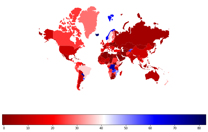
Diverging Color
A diverging color choropleth uses a colormap based on two opposite hues separated by a neutral color like white or gray.
The use of diverging color makes it easier to see the difference between areas of low or high values.
The two colors should be complementary (opposite or nearly opposite sides of the color wheel).
Note that attaching an _r reverses the colors of a color map. In this example the seismic colormap goes from blue (low values) to red (high values), while seismic_r goes from red (low values) to blue (high values).
You should generally avoid any color choices that require being able to distinguish between red and green in order to make your maps accessible to the 8% of men of European ancestry who are red-green color blind.
axis = countries.plot("Renewable_Percent", cmap = "seismic_r", \
	legend=True, legend_kwds={"orientation":"horizontal"})

axis.set_axis_off()

plt.show()
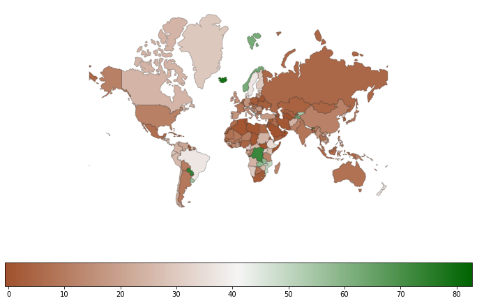
Custom Colormap
Custom colormaps can be created by passing a list of colors to the LinearSegmentedColormap.from_list() function from the Matplotlib colors module.
Colors can be specified in a number of ways. In this example, we use CSS color names.
import matplotlib.colors as colors

cmap = colors.LinearSegmentedColormap.from_list('cmap', ["sienna", "whitesmoke", "darkgreen"])

axis = countries.plot("Renewable_Percent", cmap = cmap, edgecolor = "#00000040",
	legend=True, legend_kwds={"orientation":"horizontal"})

axis.set_axis_off()

plt.show()
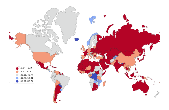
Classified Choropleths
A classified choropleth groups ranges of variable values into classes displayed with a limited set of colors (usually five to seven) that make it easier to identify areas with similar values.
The classification scheme for a classified map indicates how to divide values into classes. The choice of classification scheme depends on the type of distribution and the ultimate purpose of your map.
The classification scheme can be specified in the plot() function call using the scheme parameter.
- naturalbreaks is a k-means classification scheme that looks for clumps of similar values. This is generally your safest bet because it is commonly used with a variety of different types of distributions.
- stdmean creates classes based on the mean and standard deviation. Accordingly it is most appropriate when working with normally distributed data.
- quantiles creates classes where each class contains the same number of features. This is appropriate for uniform or highly skewed distributions, but may visually exaggerate minor differences in some cases.
- equalinterval breaks the range into an equally spaced This classification scheme is good for uniform distributions, or when any skewing of the distribution should be reflected in an imbalanced appearance of the map. This is the plot() default that should usually be replaced with most distributions.
Classified scheme plots create boxed legends rather than colorbars.
- The legend_kwds parameter can be used
to specify formatting and placement of the legend so it
fits in a blank area of the map.
- bbox_to_anchor indicates the x/y location on a scale of zero to one, with 0, 0 being the bottom left corner.
axis = countries.plot("Renewable_Percent", legend=True,
	cmap = "coolwarm_r", scheme="naturalbreaks", edgecolor = "#00000040",
	legend_kwds={"fontsize":8, "bbox_to_anchor":(0.2, 0.4)})

axis.set_axis_off()

plt.show()
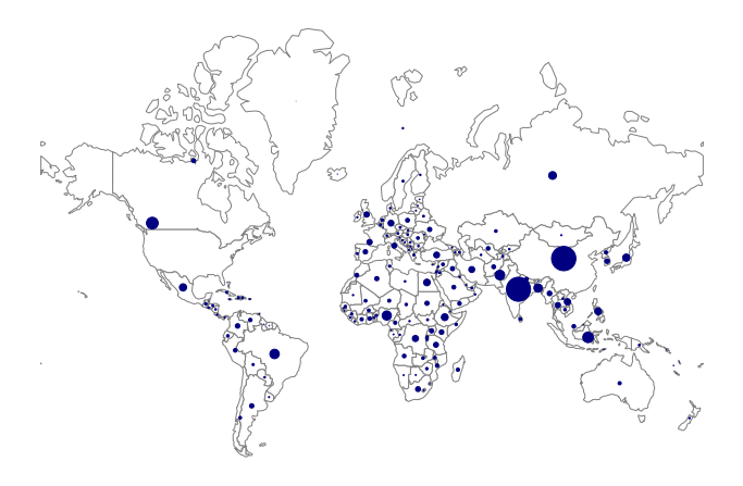
Bubble Maps
A graduated symbol map uses differently sized symbols to map variable values. A common example of a graduated symbol map is the "bubble" map that uses differently sized circles based on the variable being mapped. Although circles are most common, other types of icons can be used for aesthetic variety.
When mapping counts or quantities, graduated symbol maps are more appropriate than choropleths when mapping counts rather than amounts (rates).
- Counts are variables that indicate size, such as the size of the population.
- With choropleth maps our eyes see the land area as the size, and when the size indicated by the variable is not the same as the sizes of the areas, we get an incorrect impression of where the larger and smaller values are located.
Because bubble maps do not have outlines of areas, a base map will need to be plotted before the bubbles so the base map sits under the bubbles and provides geographic context. For this base map, we use the country polygons.
centroids = countries.copy()

centroids["geometry"] = centroids.centroid

centroids = centroids.dropna()

centroids["size"] = 500 * centroids["CO2_Emissions_MM_Tonnes"] / max(centroids["CO2_Emissions_MM_Tonnes"])

basemap = countries.plot(facecolor='white', edgecolor='gray')

axis = centroids.plot(ax=basemap, markersize="size", color="navy", categorical=False, legend=True)

axis.set_axis_off()

plt.show()
Filters
If you want to show only a subset of your data, you can filter specific rows of your data. Filtering is also sometimes called selection or subsetting.
For example, this code filters only the member states of the Association of Southeast Asian Nations.
The isin() method on the Country_Code column returns an boolean array with a true/false value for each row based on whether the strings are contained in the array.
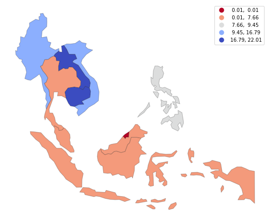
asean = countries[countries.Country_Code.isin(["BRN", "KHM", "IDN", "LAO",
	"MYS", "MMR", "PHL", "SGP", "THA", "VNM"])]

axis = asean.plot("Renewable_Percent", legend=True,
	cmap = "coolwarm_r", edgecolor = "#00000040", scheme="naturalbreaks")

axis.set_axis_off()

plt.show()
Categorical Maps
Categorical Variable
Categorical variables are variables that have a fixed number of values representing categories.
For example, in this data set, the Regime_Type is the type of national government based on the V-Dem Democracy Index, using the regime classification by Lührmann et al. (2018).
- LD Liberal Democracy
- ED Electoral Democracy
- EA Electoral Autocracy
- CA Closed Autocracy
axis = countries.plot("Regime_Type", cmap = "coolwarm_r", edgecolor = "#00000040",
	legend=True, legend_kwds={"bbox_to_anchor":(0.2, 0.4)})

axis.set_axis_off()

plt.show()
Categorical Selection
Categorical variable mapping can be used to map selected areas within a GeoDataFrame.
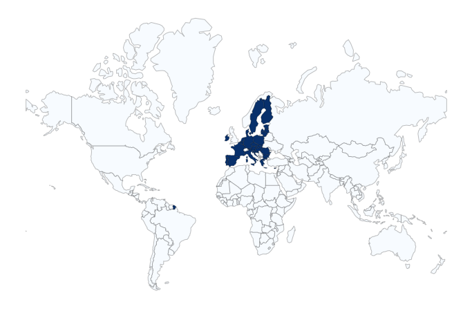
countries["EU"] = countries.Country_Code.isin(["AUT", "BEL", "BGR", "HRV", \
	"CYP", "CZE", "DNK", "EST", "FIN", "FRA", "DEU", "GRC", "HUN", \
	"IRL", "ITA", "LVA", "LTU", "LUX", "MLT", "NLD", "POL", "PRT", \
	"ROU", "SVK", "SVN", "ESP", "SWE"])

axis = countries.plot("EU", cmap = "Blues", edgecolor = "#00000040")

axis.set_axis_off()

plt.show()
Base Maps
Maps of world countries are generally recognizable by anyone with at least a rudamentary knowledge of how countries of the world are represented on maps. However, there are situations where the areas being depicted are less obvious, especially with local maps. For those situations it can be helpful to provide a base map that gives a broader context for where the mapped features are located.
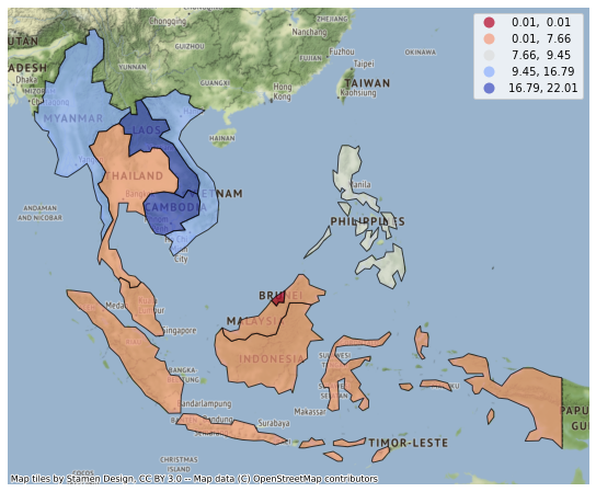
The contextily package can be used to plot a base map under your features.
import contextily as cx

asean = countries[countries.Country_Code.isin(["BRN", "KHM", "IDN", "LAO",
	"MYS", "MMR", "PHL", "SGP", "THA", "VNM"])]

asean = asean.to_crs("EPSG:3857") # Web Mercator

axis = asean.plot("Renewable_Percent", legend=True,
	cmap = "coolwarm_r", edgecolor = "#00000040",
	scheme="naturalbreaks", alpha=0.7)

cx.add_basemap(axis)

axis.set_axis_off()

plt.show()
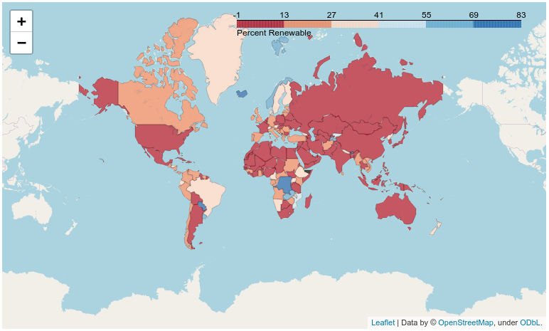
Interactive Maps with Folium
You can embed interactive maps in Jupyter notebooks with the Folium library.
Choropleths can be created using the folium.Choropleth() function, which has some quirks when working with GeoDataframes:
- You must pass GeoDataFrame as both the geometries and the associated data in separate parameters: geo_data and data, respectively.
- The key_on column names a unique value to join the two, even though they are
actually the same GeoDataFrame object).
- In this example with country level data, the join column is Country_Code.
- The folium syntax requires specifying key_on with feature.properties. preceding the name of the join column.
- fill_color is a colormap name.
import folium

renewables = countries[["Country_Code", "Renewable_Percent", "geometry"]]

renewables = renewables.to_crs(epsg=4326)

fmap = folium.Map(location=[30,0], zoom_start=1)

folium.Choropleth(
    geo_data = renewables,
    data = renewables,
    columns=["Country_Code", "Renewable_Percent"],
    key_on="feature.properties.Country_Code",
    fill_color="RdBu",
    fill_opacity=0.7,
    line_opacity=0.2,
    legend_name="Percent Renewable"
).add_to(fmap)

fmap
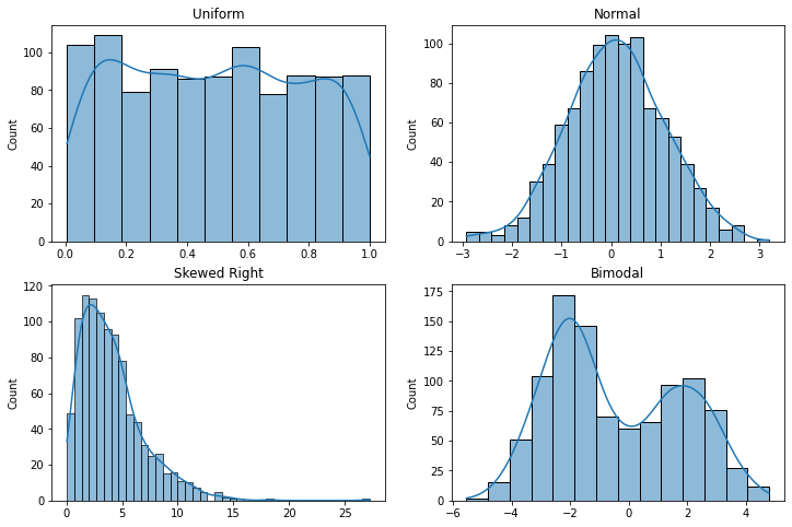
Appendix: Example Distributions
import numpy

import seaborn as sns

fig, axis = plt.subplots(2, 2)

numpy.random.seed(42)

axis[0, 0].set_title("Uniform")

x = numpy.random.uniform(0.0, 1.0, 1000)

sns.histplot(x, ax=axis[0,0], kde=True)

axis[0, 1].set_title("Normal")

x = numpy.random.normal(0, 1, 1000)

sns.histplot(x, ax=axis[0,1], kde=True)

axis[1, 0].set_title("Skewed Right (Positive)")

x = numpy.random.chisquare(4, 1000)

sns.histplot(x, ax=axis[1,0], kde=True)

axis[1, 1].set_title("Bimodal")

x = 25 - numpy.random.chisquare(3, 1000)

x = numpy.concatenate((numpy.random.normal(-2,1, 600), numpy.random.normal(2,1,400)))

sns.histplot(x, ax=axis[1,1], kde=True)

plt.show()