Academic Posters With Geospatial Data
Rev. 27 April 2025
This tutorial describes steps for the creation of an academic poster based on geospatial data.
This tutorial draws heavily on Tullio Rossi's (2018) web page "How to Design an Award-Winning Conference Poster."
Overview
Purpose and Lifecycle
Academic posters are large-format paper displays created to summarize research for presentation at academic conferences.
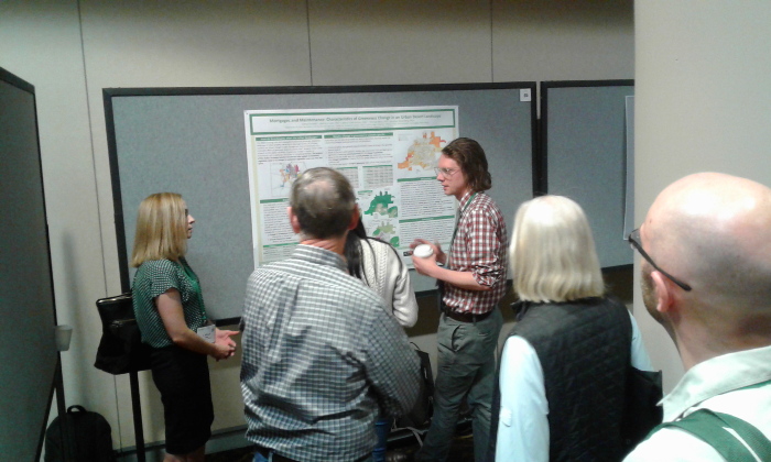
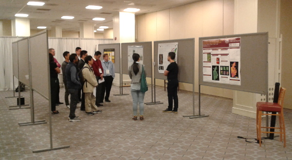
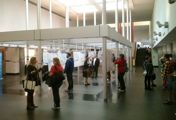
Posters can be presented in large rooms with hundreds of other presenters, but can also be presented in smaller guided poster sessions where presenters use their posters as the basis of short presentations to the audience that circulates around the room as a group.
Given that posters are initially created to support in-person presentation of information, they serve as a visual abstract of your research that serves two broad purposes:
- Posters are a networking tool that attract attention and serve as a conversation starter.
- Posters are a communication tool that provide background information needed to put your work in context, understand what you have done and why you have done it, and assess its broader impact.

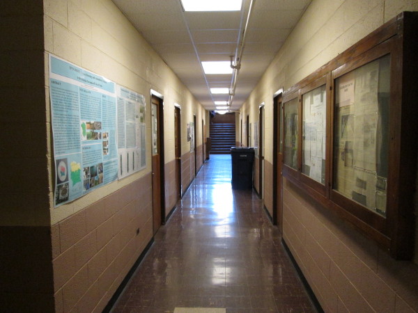
After the conference, posters frequently have a secondary purpose as informative decoration on the walls of academic departments that are used to highlight the research being done in that department. In the absence of active maintenence, posters can linger for many years after their authors have moved on. So, while posters need to be concise, they also need to have enough detail to permit understanding of the content in the absence of a live presenter.
Poster Styles
Traditional Multi-Column Layout
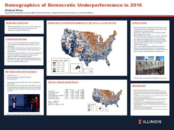
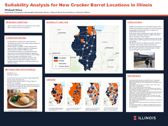
The traditional academic poster is a multi-column layout with sections analogous to the traditional empirical science research paper.
Map Tour
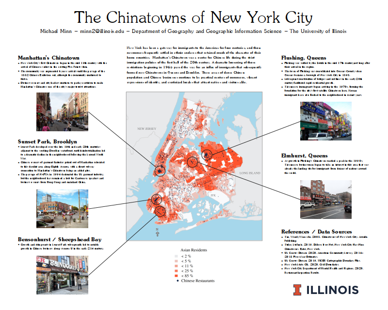
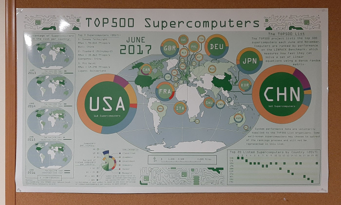
For posters presenting content that is geographic description rather than a formal presentation of deductive or inductive scientific research, a poster with a central map and descriptive insets or callouts may be effective.
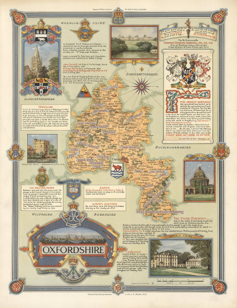
This style of poster has a long tradition in cartography. Accordingly, these require extensive design work and time to produce.
Infographic
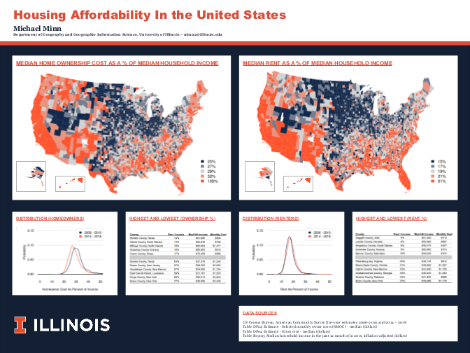
If your graphics can largely explain themselves with minimal text you might be able to use an infographic poster layout.
#betterposter
In 2019, organizational psychologist Mike Morrison devised the #betterposter template that features (Flaherty 2019):
- A main finding in big type and plain language
- An ammo bar of notes to guide presenters
- A silent presenter bar with traditional bullet points introducing the study, its methods and results
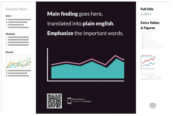
While this format has not (as yet) gained universal acceptance, it is a provocative design that challenges us to reconsider our own design choices.
Novel Layouts
There are common conventions and specifications (such as sizes) for academic posters that you should be aware of, most academic connferences do not have hard stylistic rules. If your content warrants, you may be able to come up with an original layout style that will attract attention and facilitate more-effective communication.
If you choose to make a novel design choice, be aware that you will open yourself to comparison with skilled professional artists, and that you will be judged by professional design standards. Also, make sure that your design choices match the audience and what you are trying to communicate to that audience. If you lack the design skills to fully execute a novel design vision, or if your design choice will detract from the core message you want to get across, you may want to make a more-conventional choice.
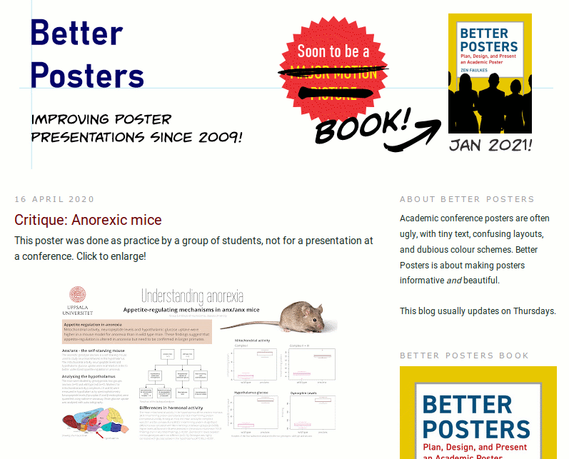
Zen Faulkes Better Posters blog includes commentary about academic poster construction, as well as reviews of both conventional and novel academic poster layouts. Accordingly, the blog is an excellent source for ideas about how to make your conventional poster more compelling, and other possibilities for layout that might make your presentation both more effective and visually compelling.
Define Your Audience
The first step in poster design is to consider who will be your target audience. The content and design of your poster will reflect the audience for that poster.
- General vs. specialized audience: Presentation to a general audience may require (over)simplification of complex technical concepts, while specialized audiences of experts may want clearer technical detail.
- Open vs. guided session: Open sessions require vivid (and, perhaps, audacious) graphics to capture attention, while content for guided sessions should have a clear sequential story line that will maintain attention during the brief, linear presentation.
- Targeted vs. general appeal: There may be situations with highly specialized or controversial research where the objective is is to attract the attention of a specific group of people rather than as many people as possible. For example, bold design choices or highly simplified results may be viewed negatively by members of a conservative sub-discipline.
Write a Script
While the focus of posters should generally be on visual elements, you should continue the design process by creating a clear text script in a word processor that can be used to organize your thoughts. Rossi (2018) suggests that the script have the following characteristics:
- Use short bullet points: Large blocks of text on posters will not be attractive and will not be read. Short bullet points that summarize highlights are easier for an audience to read and easier for the presenter to use as a discussion prompt.
- Keep your word count low: Rossi recommends that your script be 250 words or less. The poster is a conversation starter rather than the conversation itself. While this will be challenging, especially for complex research, production of the poster can also help clarify your message and improve your communication to a wider audience.
- Use short, descriptive section headers: Academic posters have
sections that need headers, so your script should be used to divide your work
into logical sections with pithy section headers. Typical headings modeled
after standard research paper format include:
- Background / Literature Review
- Questions
- Methods (consider if this is really necessary, especially if your methods are complex)
- Conclusions / Significance
- References / Acknowledgement
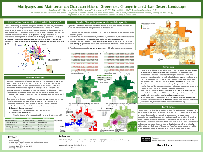
- Plan To Keep Only Essential Maps and Charts: While your poster needs to focus on graphical elements more than text, it is also possible for an abundance of graphical elements to be as overwhelming and repellant as an abundance of text. While the appropriate count will be dependent on the complexity of your individual graphic elements and the type of content being presented, a count of two to four clear, essential graphical elements is probably a good starting point when presenting geospatial data.
Start With a Template
For traditional academic posters, presentation software like PowerPoint (or Libreoffice Impress) will likely be more than adequate for layout. PowerPoint is ubiquitous, fairly simple to use, and still offers a variety of design options for folks willing to spend the time to explore the drawing tools.
For more radical designs requiring complex layout elements, a professional design program like Adobe Illustrator or InDesign will be needed. Effective use of these tools requires experience and is time consuming even for professionals, so you should only resort to Illustrator if absolutely necessary to execute your vision.
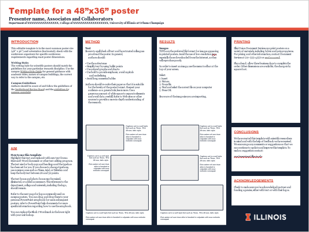
Another advantage to using PowerPoint is that predefined templates are available to speed poster production. Units within universities will often make suggested templates available within the organization. For example, the University of Illinois Public Affairs office makes this PowerPoint template available with pages in blue and orange styles.
Note that the four-column U of I template is text-heavy and that a reduction to three wider columns (or merging the center two columns) would probably be more appropriate for posters featuring maps.
A variety of variants on the Mike Morrison's #betterposter are also available as templates, such as this template from the Center for Open Science.

Build Your Poster
Size
Check your conference information to make sure your poster will fit into your alloted area.
- The standard poster sizes are 36" x 48" and 48" x 60" in landscape or portrait format.
- Some conferences make space for double-width 48" x 96" landscape posters which are eye-catching, but unweildy to transport.
Negative Space
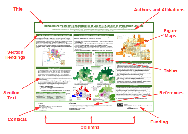
Empty space on the poster (negative space) makes it easier for the viewer to scan, while densely packed posters (such as the example above) are tiring on the eyes. Rossi (2018) recommends that 40% of your poster should be negative space.
Backgrounds
Backgrounds for academic posters should generally be white, a neutral grey, or a light color from your color palette. This will promote legibility.
Unless they are a key element of the overall design, image backgrounds will be distracting and eliminate the negative space needed for clarity.
Imagery
As mentioned above, two to four essential graphical elements will usually be adequate to communicate your findings while not overwhelming the viewer. This number may vary according to the content of your poster, with fewer constraints on descriptive posters compared to research results posters.
Because maps are an excellent medium for presenting detailed information in a concise way, they are a perfect element for inclusion on posters where location is a meaningful component.
A single, iconic image can make your poster distinctive in a room full of columnar text posters.
Color
You should use a consistent palette of colors across your poster, including charts and, where possible, thematic maps.
Rossi (2018) suggests a palette of three to five colors:
- Two or three shades of a fundamental color
- An accent color
- Two text colors
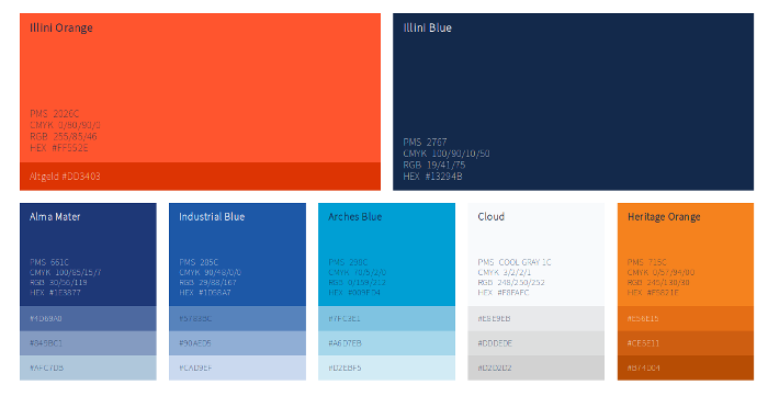
Your school or organization will often have a branded color palette created by professional designers that will reinforce your identity with your institution while also facilitating a harmonious blending of complimentary colors across your poster. If the institution provides a template, these colors will be part of that template.
Fonts
There are a wide variety of different typefaces or fonts used for map text. Typefaces generally fall into two categories. Serifs are short lines or ornamentations stemming from the upper and lower ends of the strokes of a letter. Fonts that have letters with serifs are called serif fonts. Fonts without serifs are called sans-serif fonts.
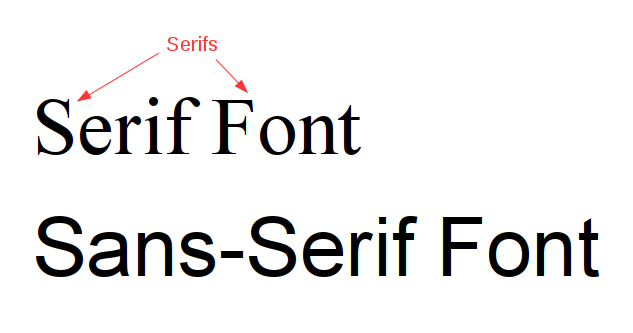
Rossi (2018) recommends using only one or two different fonts, including your charts and maps.
Use of sans-serif fonts on posters is very common and gives the posters a clean, contemporary look fitting for current research. Arial (Microsoft's version of the classic Helvetica font) is a safe choice that will also minimize potential printing issues associated with unusual fonts.
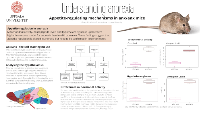
Fonts are low in the intellectual hierarchy of importance and should generally not call attention to themselves. Highly stylized fonts should be reserved for posters where they will clearly reinforce the core message of the poster, such as on the supercomputer example poster above.
Headings generally use a bolded version of the general poster font, although use of a different complimentary font can be effective.
Recommended font sizes that should be readable from three to six feet away include:
- 90pt for the main title
- 60pt for the section headings
- 36pt for body text
Avoid comic sans unless you are being intentionally ironic or provocative.
Maps
Where possible, thematic map feature colors should use the same color palette as the rest of the poster, or at least varying lighness or saturation levels for hue(s) from the poster color palette. This will promote visual harmony (balance) across the poster and allow the viewer to focus on the poster content rather than the color choices.
Maps should be set up in GIS software using layouts that match the size that they appear on the poster. This will enable you to define sizes (such as font sizes) in the layout that will match what will appear on the physical poster.
You have two file format choices when exporting map images from GIS software for insertion on the poster.
- PNG (portable network graphics) files are your safest choice for transferring map imagery from GIS to a poster. PNG files are image (raster) files similar to photographic image files that preserve all layout and colors exactly as they were setup in the GIS software. A key with PNG files is that you should verify that you are exporting at 300 DPI (dots per inch), which will usually be adequate to assure a clear image when printed at full size.
- EMF (extended metafile) files are vector graphics files that represent the individual points, lines, and polygons of maps as drawing instructions. Vector files ideally preserve the highest possible resolution when you print, and can be resized on the poster without blurring or aliasing associated with image files. However, EMF files can have compatibility problems when the poster is sent to the printer.
Avoid EPS, GIF, JPEG (JPG), or SVG file formats, which can result in undesirable image quality, or be incompatible with software.
Contact Information
Remember to put contact information somewhere on the poster in an unobtrusive, but obvious location. Posters are a networking tool and if someone happens to view your poster when you are not around, you would like them to be able to contact you.
Rossi (2018) also suggests adding a photo, which humanizes the poster and will allow someone to recognize you if they bump into you later.
Print Your Poster
Before sending your poster to print, you should always make a test print on 8.5 x 11 or 11 x 17 paper. Design choices that look good on a small electronic screen may have a very different effect on paper.
You should also circulate your poster to collaborators, trusted colleagues, and/or advisors for feedback. Posters often take a significant amount of effort that can blind you to deficiencies or potential improvements that others might see.
Poster printing is available from major office supply stores and, sometimes, from campus print shops. However, printing can take some time depending on workload and you will want to plan for both printing delays and reprinting of corrections if you see a problem on the printed poster that was not obvious on the screen or draft print.
Rossi (2018) suggests matte papers as optimal poster prints. Glossy papers are pretty but create annoying reflections. Cloth or canvas prints can be convenient to transport, but the print quality is erratic.
Remember to invest in an adequately sized cardboard poster tube for transporting your poster.
Present Your Poster
You should develop a one-minute pitch summarizing your poster comments.
You should practice this pitch repeatedly, well in advance of the conference. Having the pitch down cold will make you look organized and confident, and will free your mental energy for constructively interacting with the people who stop by to see you.
Always plan to arrive early during the setup time. Aside from allowing you to relax, this will also be a good time to meet and network with your neighbors at the session, so you can focus on visitors when the session opens to the public.
Good luck!
