Basic Map Layout in ArcGIS Pro
Revised 6 March 2026
While web and mobile maps have become a dominant medium for communicating geospatial information, there are still situations you may encounter where printed or print-like maps are needed:
- Figures in research papers, reports, and publications
- Posters and large-format graphics for conferences and public meetings
- Slides in public presentations
This tutorial covers some basics of printable map layout in ArcGIS Pro that are useful in a variety of situations, and can also serve as a starting point for developing more complex graphic designs.
- Map Elements
- Intellectual and Visual Hierarchy
- Example Data: World Bank Indicators
- Starting ArcGIS Pro
- Create the Map
- Figure Layout
- Standalone Layout
- Managing Maps and Layouts
- Project Packages
All videos are silent.
Map Elements
Cartography is "the science or art of making maps" (Merriam-Webster 2020). People who make maps are called cartographers.
The two broad objectives of cartography are creating maps that are useful and creating maps that are beautiful.
The optimal balance between utility and beauty will be determined by the application of the map. However, there are cartographic techniques and conventions that have been developed by cartographers over hundreds of years of map making that are commonly accepted in the cartographic community.
One common cartographic convention is the use of a standard set of map elements as building blocks to construct maps. There are a wide variety of map elements and not all maps need to contain all of these map elements. The diagram below shows examples of commonly used map elements:
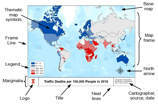
Map Frame / Mapped Area
A map is "a representation usually on a flat surface of the whole or a part of an area" (Merriam-Webster 2021).
A map is composed of map symbols that represent objects or characteristics on the surface of the earth. In vector GIS, map symbols are created by the GIS software based on geospatial data (what is where) with features (where as points, lines, polygons) symbolized by color, size, or shape (the what part).
- A reference map displays symbols that provide general information about a variety of different features or characteristics. Examples of reference maps include road atlas maps or Google Maps.
- A thematic map focuses on symbols that represent a specific characteristic or type of feature.
The theme of the example thematic map above is reflected in the title: Traffic Deaths per 100,000 People in 2016.
The map above is also an example of a specific type of thematic map called a choropleth. A choropleth map is a thematic map where areas are colored to represent different data values.
In ArcGIS Pro, a mapped area with the symbols is built in a window called a map. One or more maps can then be incorporated as map frames into layouts where you can add additional graphical elements and marginalia.
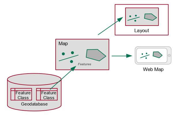
Marginalia is a term that covers all the other map elements separate from the main mapped area that provide additional information about the map to help readers interpret the map. The name comes from the tradition of placing such information in the margins of a map, although the content today is commonly integrated into the overall map design (Intergovernmental Committee on Surveying and Mapping 2021).
Title / Subtitle
Most layouts have a short, prominent title that quickly summarizes for a reader what the map shows. Maps often also have subtitles that provide additional identity information that is removed from the title to keep the title pithy.
Legends
A legend shows what the different map symbols represent. Legends are vitally important when the map uses symbols whose meaning is not intuitively obvious, or when data values are expressed with different colors and/or sizes of symbols.
In the example choropleth above, the legend associates ranges of percents of Democratic voters in the 2012 election with specific colors. The colors range from red (low percentages of Democratic voters = high percentages of Republican voters) to blue (high percentages of Democratic voters).
Context Elements
Mapping symbols often need additional symbols or elements to provide geographic context so the map reader can get a sense of where the features represented on the map are actually located in space, and how those features are related to each other in space.
Thematic map symbols are commonly overlaid on top of a base map. A base map is a simplified reference map that provides geographic context for the thematic map symbols.
Orientation elements indicate direction. While maps commonly treat up as north, that is not always the case, especially with local maps of features (such as irregularly shaped college campuses) that are experienced without a clear sense of where north is.
- A north arrow is a graphic arrow added to the layout that shows which direction is north on a map. While commonly omitted to reduce visual clutter, they are essential when mapping areas that are oriented so that the top of the map is a direction other than north.
Scale elements help the map user in knowing what distances are represented on a map.
- A scale bar is a symbol that looks like a ruler and shows how distance across the map relate to distances on the ground. Scale bars are only valid only where maps preserve distance across the entire area depicted in the map, and are especially useful when maps will be used for navigation.
- Grid lines are evenly spaced lines placed vertically and horizontally across the map, where the space between lines represents a fixed distance (feet, miles, kilometers, etc.).
- A graticule is a set of latitude and longitude lines placed across the map.
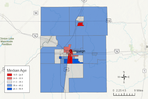
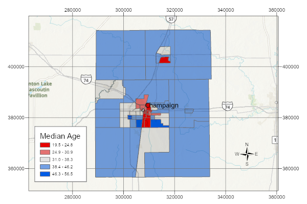
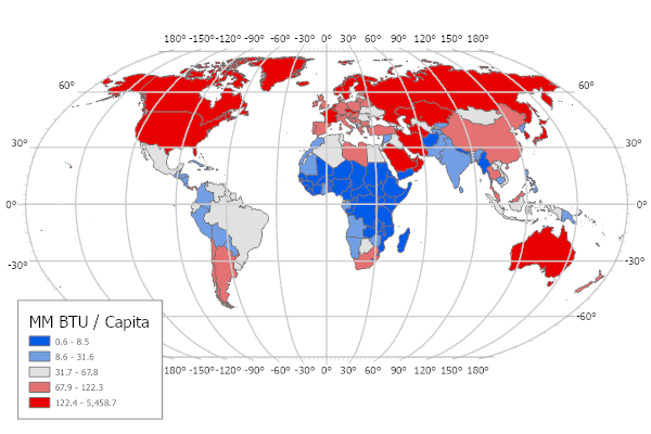
A key map is a small inset map that shows where the mapped area is relative to a larger area that should be familiar to most readers. These are especially helpful when mapping small areas that are unfamiliar to the viewers, and these are commonly seen in news stories.

Graphical Elements
Layouts designed for printing on paper commonly have a frame line that wraps around all map elements and provides a clear demarcation of where the layout starts and ends. When maps were hand drawn, these frame lines could be very ornate, although that practice is less common with electronic cartography.
Borders that cleanly separate individual map elements from each other and keep the layout neat can be called neat lines, although that term is sometimes reserved for the internal border of the map frame inside the overall map frame line.
In design, negative space is the space around the subject of an image (Wikipedia 2021). On layouts and maps, negative space is blank area between map elements that is commonly called white space, although it can be filled with a background color, subdued patterns, or the base map. Negative space reduces clutter and gives the eyes some resting points as it scans the layout.
On layouts designed for printing on paper, a margin is negative space placed around the edge of the layout. This convention is often useful because some printing processes cannot print all the way to the edge of the paper. It also provides space to physically hold a paper map without covering any map elements.
Negative space between frame and neat lines and the elements themselves is sometimes called padding. In the example above, padding is used between the entries in the legend and the neat line around the legend. Unfortunately, ArcGIS Pro does not add padding to legends by default, which requires tedious manual changes anytime you use the automatic border around a legend.
Metadata
Metadata is data about the data, such as who created the data, when they created the data, etc. Metadata is commonly displayed on layouts so that readers can know where the information conveyed on a map came from and whether that information is relevant (or trustworthy) for a particular application. While this documentation is important over the life of a map, it is not usually the primary focus of the map design, so metadata is often placed in small text away from the center of the layout.
Typical metadata displayed as text boxes on layouts includes:
- The name of the cartographer and/or organization that produced the map (with a URL or other contact information, where applicable)
- Data source, when not obvious from the map title
- The dates of the data and when the map was produced
- A reference name for the production files. These are especially useful when maps need to be revised.
- Copyright or registered trademark information where applicable
- Disclaimer: Maps that could potentially expose the creator to legal liability should have appropriate disclaimers.
When a map is produced by or for an organization, a logo is commonly placed on the layout to clearly associate the map with that organization.
Intellectual and Visual Hierarchy
Maps tell stories about the world and the relationship between aspects of that world in space. Accordingly, there is a hierarchy to the different elements in a map. Some elements are important to the story and need to be emphasized, while other elements are supporting characters that need to stay in the background visually.
Monmonier (1993) asserts that there is a intellectual hierarchy or scale of concepts that governs what should be considered most and least important on a map (Slocum et al. 2009, 214).
The size, content, and arrangement of layout and thematic elements can be adjusted to increase or decrease visual weight.
The choice of which map elements get greater or lesser visual weight communicates a visual hierarchy about what is most and least important on a map.
One definition of good basic cartographic design is that the visual hierarchy in the design reflects the intellectual hierarchy. Monmonier's hierarchy (from most to least important) is:
- Thematic symbols, and labels directly related to the theme
- The title, subtitle, and legend
- Base map information (boundaries, roads, place-names, etc.)
- Scale bar and north arrow
- Data source information
- Frame and neat lines
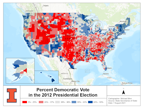
In this example, there is a mismatch between the visual hierarchy and the intellectual hierarchy. Unimportant elements are large and / or brightly colored, while important elements are less prominent.
Example Data: World Bank Indicators
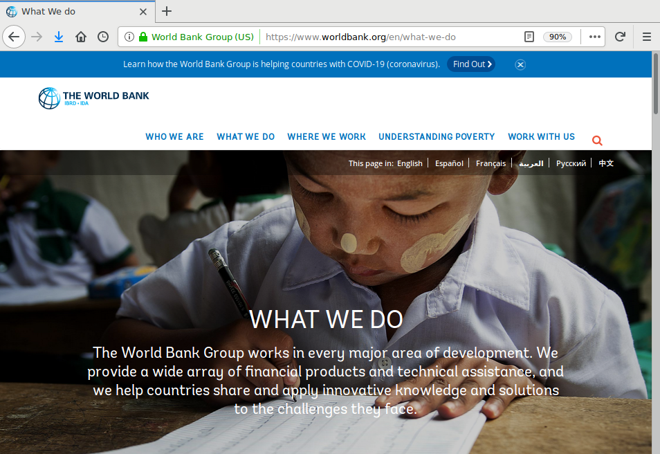
The examples in this tutorial use data from the World Bank. The World Bank is a group of international agencies that provide funding and knowledge to promote economic development in developing countries. The World Bank was one of the "Bretton Woods institutions" founded as part of an international agreement made during a 1944 conference in Bretton Woods, NH that was convened to plan for reconstruction after World War II and promote international cooperation that would help avoid World War III.
The World Bank collects a vast array of country-level data, and makes it available to the general public on their data.worldbank.org data portal as part of their mission to be a source of knowledge that promotes economic development. Many of these variables are associated with public health, which is firmly intertwined with economic development.
This data is available as the Minn 2023 World Bank Indicators feature service in ArcGIS Online. The metadata describing the variables in that layer is available here.
Starting ArcGIS Pro
ArcGIS Pro is the industry standard desktop software for enterprise GIS (GIS done in businesses and government organizations).
ArcGIS Pro only runs on Windows machines. Installation and licensing of that software is complex and usually handled by an organization's information technology (IT) department.
The following video demonstrates how to start and log in to ArcGIS Pro with an enterprise login - in this example the univofillinois organization at U of I.
Create the Map
This example will be based around a simple choropleth map.
- After you start and log in to ArcGIS Pro, you will be asked to start a project. A project is a workspace keeps related groups of maps and analysis together in one package.
- Like a spreadsheet or word processing document, you can save a project and return to it later to continue adding material or to revise previous work.
- You should give your project a meaningful name so you can keep track of what is in your different projects.
- Give the map a meaningful name by right-clicking on the map in the Contents pane, Properties, General, Name (World Bank). This will make it easier for you to keep your maps organized if you have multiple maps in a project (0:30).
- Add Data to the map. For this example we use the Minn 2023 World Bank Indicators feature service from ArcGIS Online (0:50).
- Right click on the new layer and select
Symbology
to select the variable to be displayed (1:15).
-
In this case we use
Mortality Traffic per 100K, which is
an estimated rate of the number of people in a country that died in traffic
accidents per 100,000 population in the year with the
most recent data (2023 for most countries).
- For a variable like this, keep the Graduated Colors and change the color scheme, if desired.
- In ArcGIS Pro the default classification Method is Natural Breaks (Jenks), which assigns groupings of values based on clumps of values that appear together in the data.
- By default, ArcGIS Pro (annoyingly) shows six decimal places for numeric values, which implies a level of accuracy that is rarely present. Change the Symbology, Advanced symbology options, Rounding to remove the unnecessary decimal places (2:10).
- Depending on what colors you choose, you might also consider changing the Base Map, although in this case, the default topographic map looks OK (2:40).
- If you are designing a map to print on paper (as opposed to a web map) you will want to use a light colored base maps and avoid the dark base maps since dark base maps distract from more important map elements (visual hierarchy).
Figure Layout
Once we have gotten the map content the way we want it, we create a new Layout that will allow us to add cartographic elements.
Figure layouts are layouts with a minimal set of cartographic elements that can be included as figures in documents. Items like titles and metadata are included in the text of the document and can be omitted from the layout to maximize the use of limited figure space for essential elements.
- On the Insert tab, insert a
new Layout.
- For this example we create a Custom page size of 6" x 4" (width x height) for a figure that usually fits nicely in a report.
- Give the layout a meaningful name by right-clicking on the layout in the Contents pane, Properties, General, Name. This will make it easier for you to keep your maps organized if you have multiple layouts in a project.
- Add a Map Frame for the map you created (0:30).
- Right click on the frame, select Properties, Size the frame to fill the entire figure and Position the frame at the edge.
- Remove the black border around the map frame since it may not come in cleanly when the map is exported and inserted in the document.
- If you need to move the map inside the map frame, right click on the map and Activate the map so that dragging and zooming affect the map in the frame rather than the map layout.
- When you are done adjusting the map, click the arrow at the top of the window to deactivate the map.
- Hide the base map service credits information by inserting a Dynamic text box for the Service layer credits and drawing a small box outside of the printable area of the figure (1:35).
- With a thematic map like a choropleth, you need to indicate what
the symbols mean by inserting a legend (2:00).
- If nothing appears, expand the box size to be large enough for the text. You can then drag the sides to reduce the side if needed.
- Right click on the legend and select Properties the Display (paint brush) icon, and give the legend a white background, black border, and 0.1" padding around the edges. This makes the text more readable and less cramped.
- The legend gets its titles from the layer and variable names, so you may need to change those if they are not particularly meaningful. For example, with a simple legend, the heading "Legend" is unnecessary and a waste of space. You can change titles by right-clicking on the layer and selecting Properties -> General.
- Since this displays one variable, remove the the layer name by right clicking on the legend, selecting Properties -> Legend Items -> Show Properties and turning off the Layer Name.
- Share and Export the layout
to a PNG file (3:10)
- Portable Network Graphics (PNG) is a type of file that, unlike JPEG files, does not degrade the quality of the image to reduce file size. For small figure images, file size is not usually a major issue.
- You can then Insert the PNG file as a Picture in a Word or Word 365 document.
Standalone Layout
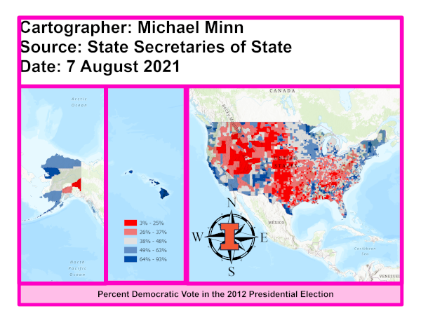
Standalone layouts are maps that contain a full set of cartographic elements needed to communicate vital information about the map to the reader. Standalone layouts can be used as presentation slides or complete pages in reports.
Cartographic convention dictates adding additional marginalia information to the margins of standalone maps to communicate to the reader what they are looking at and where the information came from.
This layout format places the marginalia at the bottom of the page and places neat lines (borders) around elements in a manner similar to the format commonly used for engineering diagrams.
- Insert a new Layout.
- For this example we choose a standard US 8.5" x 11" paper size.
- If your desired map area is wider than it is tall, choose Landscape orientation. Otherwise, choose Portrait.
- Give the layout a meaningful name by right-clicking on the layout in the Contents pane, Properties, General, Name. This will make it easier for you to keep your maps organized if you have multiple layouts in a project.
- Insert a Map Frame and center it on the page (0:25).
- Using numeric sizing and positioning can assure consistent formatting (6.7" tall, 10" wide @ 0.5 x 1.3).
- If you need to move the map inside the map frame, right click on the map and Activate the map so that dragging and zooming affect the map in the frame rather than the map layout.
- Zoom your mapped content to fully utilize the area within the map frame.
- When you are done adjusting the map, click the arrow at the top of the window to deactivate the map.
- If there is only one map frame, leave the default black border on to serve as a frame line.
- Insert Rectangles to add neat lines to the areas below the map frame (1:40).
- While you can do this by sight, using specific dimensions and locations as demonstrated in the video assures the layout is symmetrical and the neat lines align with no slivers between them.
- logo: 1 x 0.8 @ 0.5 x 0.5
- title: 7 x 0.8 @ 1.5 x 0.5
- credits: 2 x 0.8 @ 8.5 x 0.5
- You should leave an even margin of around 1/2" between the edge of the paper and the outer edges of your map elements. This will improve readability and give paper map users a place to put their fingers (Wikipedia 2022).
- Insert a title (3:20).
- Insert a Straight Text box.
- Drag the box where you want the title, and type the title into the text box (Traffic Deaths per 100,000 People in 2023).
- The box will expand to fit the text, and you can drag the edges in to resize the text.
- If desired, you may want to change the font, make it bold, and center the text.
- Unless dictated by the stylistic conventions of your organization, titles should probably be in title case.
- Insert a Rectangle text box for the standard marginalia credits (metadata) text in 12pt font or smaller (4:45).
- The Cartographer (you)
- The Date the map was created
- The Source for the mapped data
- Hide the base map service credits by inserting a Dynamic text box for the Service layer credits and drawing that box outside the printable area of the layout (6:10).
- While giving credit to the source for the base map information can be useful (and may be required depending on your organization's adherence to license requirements), that information can be confusing on thematic maps where the data comes from a different source than the base map.
- Add a Legend (6:50).
- If nothing appears, expand the box size to be large enough for the text. You can then drag the sides to reduce the side if needed.
- The legend gets its titles from the layer and variable names, so you may need to change those if they are not particularly meaningful. You can change them by right-clicking on the layer and selecting Properties -> General.
- The legend in this style sits over an unimportant area along the edge of the map frame.
- Right click on the legend and select Properties the Display (paint brush) icon, and give the legend a white background, black border, and 0.1" padding around the edges.
- Depending on how many variables you are displaying and how you have titled your map, you may wish to remove redundant or unnecessary headings, such as the default "Legend" title. Right-click on the legend, select Properties -> Legend Items -> Show Properties and turn off the unneeded names.
- Make sure your legend labels have the number of decimal places appropriate to the accuracy of the underlying data. Unnecessary decimal places should be removed on the map Symbology under Advanced symbology options, Rounding.
- If you have a logo image, you can Insert Picture in the margin to give the map a brand identity (7:50).
- Finally, Share and Export a PDF of the map that you can print (8:45).
- PDF is the preferred output format for printable maps.
- Portable Document Format (PDF) is a type of file developed by Adobe that preserves the formatting of a document as you created it so that documents appear the same on different computers or printers.
Managing Maps and Layouts
Opening the Catalog Pane
When working on a project for an extended period of time, you may accumulate multiple maps and / or layouts. In order to avoid confusion now and in the future about which maps and layouts are valid and what they contain, you should give your maps and layouts meaningful internal names, and remove unneeded maps and layouts.
You can manage your maps and layouts in the Catalog Pane.
Open the View ribbon and select Catalog Pane.
You can then view the maps and layouts by expanding the triangles beside the Maps or Layouts subheadings.
Renaming Maps and Layouts
You can rename maps or layouts in the catalog pane.
Closing and Reopening Tabs
If you close a map or layout tab in ArcGIS Pro, that map or layout remains a part of the project. You can reopen it in the catalog pane by double clicking on it.
Duplicating Maps and Layouts
If you are creating a map or layout similar to one that already exists, you may be able to save time by duplicating your map or layout in the catalog pane.
Select the map or layout, Copy it, and then Paste it under the map or layout subheading in the catalog pane.
Note that maps or layouts must have unique names in ArcGIS Pro, so the software will append a "1" to the end of the duplicated layout. You can change that by renaming.
Deleting Unused Maps and Layouts
Over the life of a project you may accumulate maps or layouts that you no longer need. In such cases, it can be helpful to remove those unneeded maps or layouts so they do not confuse you if you reopen the project at a later date.
Note that closing a window tab does not delete a map or layout. If you try to create a new map layout with the same name as an existing map or layout, the software will automatically add a sequence number to the name to keep internal names unique (Figure_Map, Figure_Map1, Figure_Map2, etc.). If you want to reuse a name, you need to delete the existing map or layout.
Project Packages
An ArcGIS Pro project package is a file you can export from ArcGIS Pro that contains all the information about how your maps and layouts are set up, as well as any data you have added to the project database.
When you are finished working on a project you should save it as a project package so that you can resume work on, fix problems, or use it as the basis for another project.
Direct Upload
The easiest way to save project packages is to upload them directly to ArcGIS Online. This will enable you to reopen the project on any computer with ArcGIS Pro installed. It will also allow you to share your work with collaborators or instructors.
- On the Share tab and Package area, select Project.
- Check Upload package to Online account option.
- If this option is unavailable, make sure you are logged in to ArcGIS online at the top right corner of the ArcGIS Pro window.
- Give your project a meaningful Name that will allow you to remember what this package is when you see it listed in your ArcGIS Online content.
- The default Name is the name you gave your project, which will usually be fine if you gave your project a meaningful name.
- Unless you are working with a group, you can usually just leave the Summary and Tags boxes blank.
- Check the Share outside of organization box so that all files from your computer are included in your project package.
- This box is not set by default and you must check it any time you create a project package.
- This sharing feature will allow you to reopen your project on a computer different from the one on which it was created or last updated.
- Uncheck the Include Toolboxes option unless you have added ModelBuilder diagram(s) or Python notebook(s) to your project.
- Uncheck the Include History Items option.
- Checking this box will cause your upload to fail with a cryptic message if you have ever run a tool in your project that failed to complete because of errors.
- Click Analyze and fix any identified problems.
- Analyze is generally useless because it will fail to catch many problems that can cause packaging to fail.
- Click Package to create the package and upload. This can take a few minutes if your project contains large data files like rasters.
- To get a link to your project package, click the Manage the package link in the completion message to view your Contents page in ArcGIS Online and copy the URL from the location bar.
Save to File and Upload
If your project contains exceptionally large data files or your organizational data store has limited available space, saving a project package from ArcGIS Pro may fail with a message like, "There is not enough space in your online account to upload the file."
In such cases, it is usually possible Save package to file and then upload the .ppkx file to your ArcGIS Online account through the Content web page.
- On the Share tab and Package area, select Project.
- Check Save package to file.
- Check the Share outside of organization box so that all files from your computer are included in your project package.
- Uncheck the Include Toolboxes option unless you have added ModelBuilder diagram(s) or Python notebook(s) to your project.
- Uncheck the Include History Items option.
- Click Analyze and fix any identified problems.
- Click Package to create the package and upload. This can take a few minutes if your project contains large data files like rasters.
- To get a link to your project package, click the View the file to find out where ArcGIS Pro saved the .ppkx file.
- In your ArcGIS Online Content page, select New Item, find the .ppkx file, and upload it.
- Change the sharing to Everyone if you are sharing the package with an instructor.
Reopening a Project Package
You can reopen a project you have saved as a project package by clicking Open another project from the ArcGIS Pro home screen.