Color in ArcGIS Pro
Objects reflect, absorb, and emit energy at all times. This energy is called electromagnetic radiation and it is emitted in waves that are able to transmit energy from one place to another. These waves originate from billions of vibrating electrons, atoms, and molecules, which emit and absorb electromagnetic radiation.
Different types of electromagnetic radiation are distinguished by the speed of their vibration. As these waves travel through space at 300,000 kilometers per second (186,000 miles/sec) the distance between the vibrating pulses is called the wavelength and is usually measured in meters or nanometers (one billionth of a meter). The speed of the vibration is called frequency and is usually measured in Hertz (1 Hz = one vibration per second)
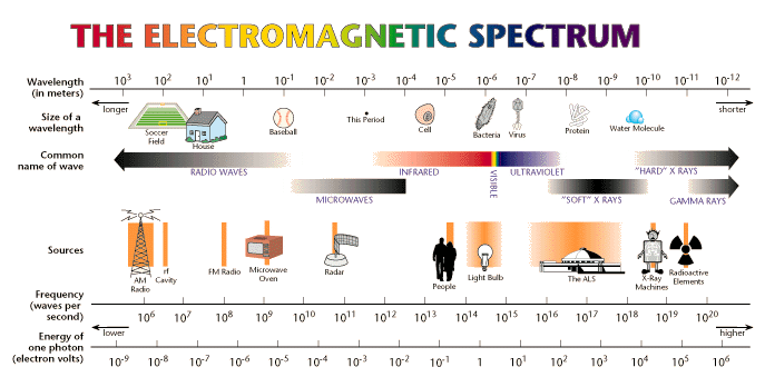
Visible light is a narrow range of frequencies of electromagnetic radiation (around 400,000,000,000,000 to 800,000,000,000,000 Hertz or 400 - 800 THz) that is perceived by our eyes.
Different cells in our eyes are sensitive to different frequencies, and color is the mix of different light frequencies as perceived by our eyes.
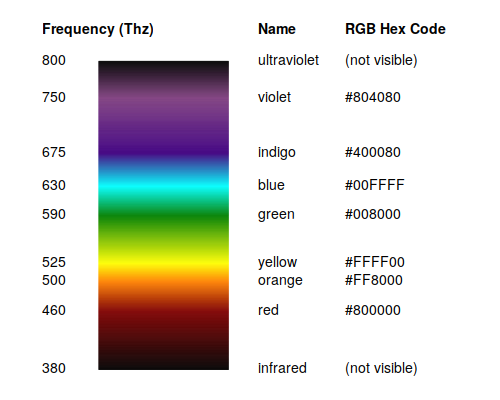
(R code)
Color Models
There are a wide variety of models for understanding how colors relate to each other. Two that are useful in cartography are the RGB model and HSV model.
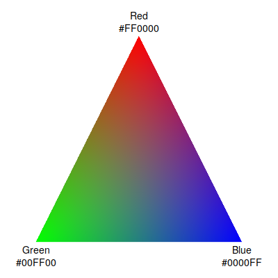
The retnas in the backs of our eyes have different types of cells (cones) that are sensitive to different frequencies of light. Trichromatic theory (Young 1802) defines colors as different levels of red, green, and blue light (primary colors). This is called the red-green-blue (RGB) model.
While the RGB model captures how our eyes process color and how most electronic displays produce colors, in cartography we commonly distinguish colors based on our mental perception of colors as hue, saturation, and lightness. The hue-saturation-lightness (HSV) model defines any color as a combination of these three characteristics, each of which can be used as visual variables in cartography.
Light rarely occurs as a single frequency. Rather, it is usually a combination of frequencies. Hue is our perception of the particular combination of different frequencies of light present. Because the cells in our eyes are individually sensitive to red, blue, or green frequencies, hue can be specified as the mix of these three different colors of light.
Although light is almost always a complex mix of frequencies, when particular, specific frequencies predominate, they are perceived more clearly as saturation. White, black, or shades of gray have low saturation because they are a fairly even mix of all frequencies of light.
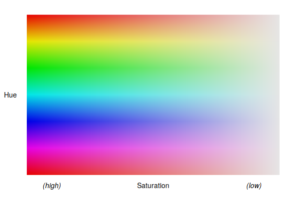
Lightness is our eye's perception of the high or low overall level of light radiation. Darkness is a low level. Lightness and saturation are commonly perceived together.
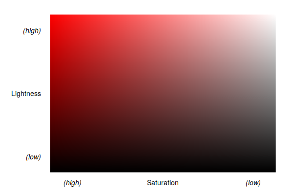
Naming Colors
While colors often have commonly-used colloquial names (red, purple, chartreuse), those names are not specific enough to indicate in software exactly what combination of red / green / blue levels should be used for a specific color.
There are two commonly used ways of expressing these RGB levels as clear numbers:
- RGB hexadecimal codes: A collection of seven characters starting with the pound symbol (#), and followed by three hexadecimal numbers (base-16, again for computational reasons) ranging from 00 to ff.
- RGB levels: three numbers, each ranging from 0 - 255 for computational reasons, that give the levels of red, green, and blue, respectively.
For both of these RGB formats, a fourth number for alpha (transparency) can be added.
Custom colors in ArcGIS Pro are specified in a dialog that shows these different types of values. When working with colors, you can specify one using an RGB hex code, or use the different sliders to find a color visually and then get the RGB hex code.
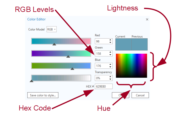
When working with printed documents, colors are often expressed as cyan-magenta-yellow-black (CMYK) numbers. On electronic screens (RGB) more color means more light. In print (CMYK) more ink means less light, so CMY is the opposite of RGB. Black (K) is an additional ink color that is used because documents often contain extensive amounts of black text that is easier to print with one type of ink (black) than a dense and unnecessarily expensive combination of cyan, magenta, and yellow ink.
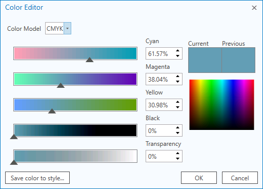
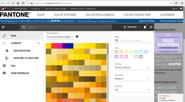
With color inkjet or laser printers, the printing software handles the conversion between RGB values stored in the software and CMYK values used in the physical printer. However, in moving to the printed page, there are a wide variety of variables (paper type, coatings) that affect how printed colors are perceived on the page. The Pantone Matching System is one commonly used method of specifying printed colors using a proprietary system of codes (Wikipedia 2020).
Professional color printing is a complex art, and if you will be working extensively with printed maps, you should consult a book like Slocum et al's (2009) Thematic Cartography and Geovisualization.
Using Colors
Color is used in maps for both aesthetic reasons and for functional reasons.
Functionally, hue, saturation, and lightness are three of the fundamental visual variables used to represent data variables on thematic maps.
Lightness and Saturation
Lightness and/or saturation are common as a quantitative visual variable with choropleth area maps.
Hue
Hue is qualitative and there is no obvious visual order for hue when multiple distinct hues are used on a map. For example, with red, green, and blue, it is not intuitively clear whether red is higher or lower than green or blue. Accordingly, use of multiple hues, such as a rainbow (spectral) color scheme, is appropriate for qualitative variables, but may be confusing for quantitative variables.
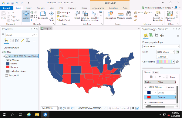
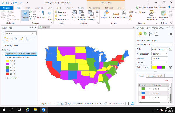
Use of two hues with a quantitative variable can be effective when high and low values represent qualitatively different things (such as low percentages of Democratic vote meaning higher percentages of Republican votes), a diverging color scheme that has an unsaturated (gray) central color can be effective.
Transparency
Transparency (also called alpha) is a percentage indicating how much of the features or base map under an area will be visible through the colored area. Transparency is useful when features overlap, or when features cover the base map but you still want to be able to see the base map.
Because transparency results in a mixing of colors from the overlapping objects, it can effectively change the hue, lightness, or saturation of the features.
Transparency can be set when defining the fill colors, or it can be applied to any layer as a whole.
Color and Point Maps
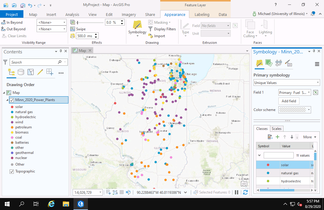
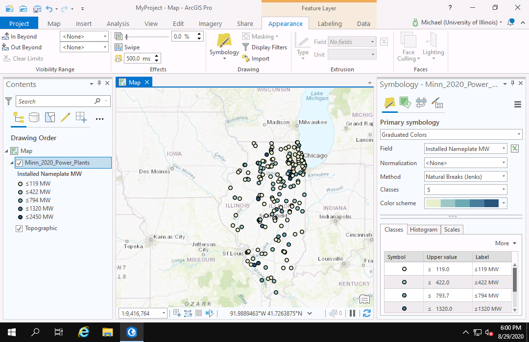
Color can also be used as a visual variable with point maps, although with quantitative variables it arguably offers less effective feature contrast than size.
Choosing Colors
The collection of colors used in a document is called the palette.
While there are aesthetic (artistic) and subjective considerations in choosing the colors that will go into a palette, there are functional considerations that are somewhat clearer and need to be considered by a cartographer when designing a map.
Color choices are especially crucial for maximizing feature contrast (contrast between different features) and clear figure-ground relationship (contrast between the features and the base map).
Predefined Palettes
The easiest approach to selecting colors for use in a map or any other kind of visualization is the use of the pre-defined colors provided in the software.
When selecting graduated or continuous colors, ArcGIS Pro provides a drop-down with a variety of pre-defined color schemes.
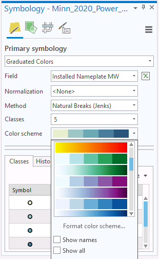
Complementary Colors
When you have one specific color you wish to use, one approach for choosing additional contrasting colors is the use of Eyton's (1984) concept of complementary colors.
The example below shows the use of one of the numerous web apps for building palettes of complementary colors, to build a palette around University of Illinois "Urbana orange" (#E84A27).
Accessibility
Color vision deficiency (CVD) affects around 8% of men and 0.5% of women worldwide. The most common deficiency is the inability to distinguish red and green (NIH 2020).
Design for accessibility by the broadest possible population often also improves overall usability. Accordingly, you should avoid color schemes that require distinguishing between red and green, and maintain strong color contrast to improve the effectiveness of communication.
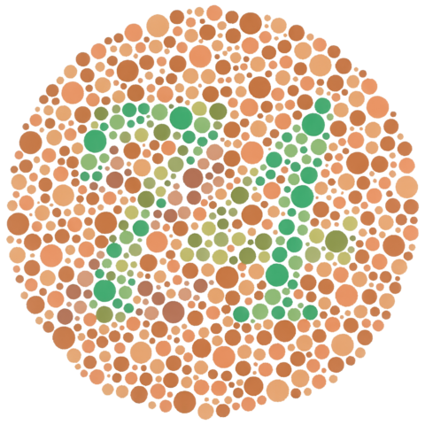
The video below shows how to test a map for color accessibility using a color blindness simulator web app.
In this example, the complementary red, blue, and green colors are still somewhat distinguishable with the different red and green deficiencies that can be simulated in the web app.
Grayscale Compatibility
If you are preparing a map that will be photocopied or printed in a publication that does not support color, you need to make sure your color map will be legible in that environment. While this kind of printing is commonly called "black-and-white," the more-descriptive term is grayscale because colors are rendered in multiple shades of gray between black and white. A display medium that truly only displays black and white is more-appropriately referred to as monochrome.
There are multiple options for providing grayscale compatibility:
- One approach to this issue is preparing a graphic using a palette that only uses shades of gray. The challenge with this is that maps and other graphic are commonly viewed on electronic devices that display color, and a grayscale image will look unnecessarily plain when displayed on a computer screen or cell phone.
- Another approach is to use a color scheme that varies lightness, often in conjunction with varying hue and / or saturation. Although the algorithms used by software to translate color images into grayscale are complex because they consider the different sensitivities that human eyes have to different colors, making sure your palette has a variety in lightness will probably translate into distinguishable shades of gray.
- A classical approach with categorical choropleths is to use different textures for the different categories. This can be limiting with ordinal or quantitative variables since it may not be clearly evident from the map which texture represents low values and which represents high values.
- With categorical point maps, you can use different point symbol shapes, with different colors as aesthetic enhancement. This is actually a good accessibility practice in general, although it can present legibility issues if you have a large number of points or a large number of categories.
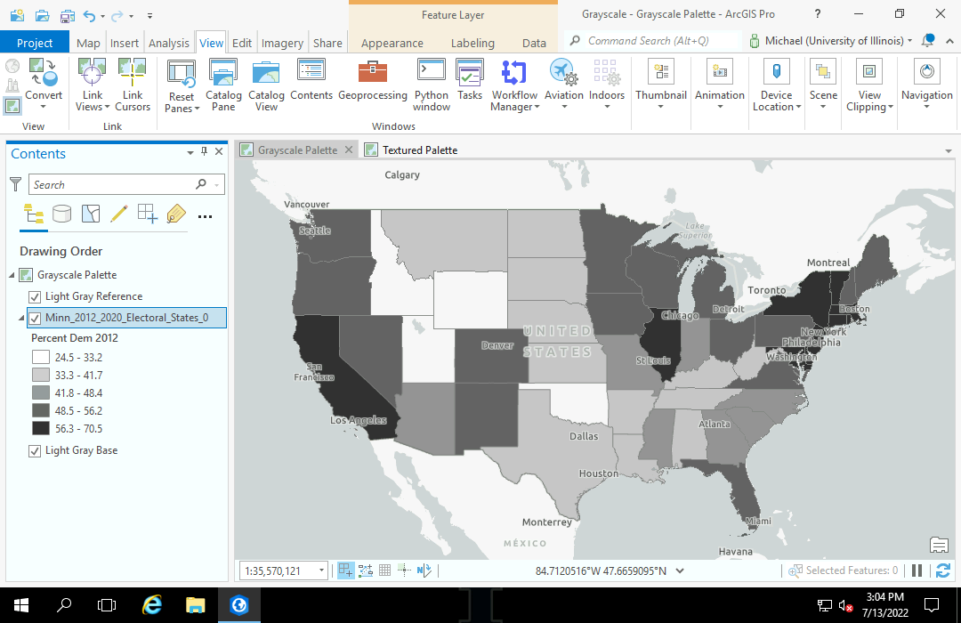
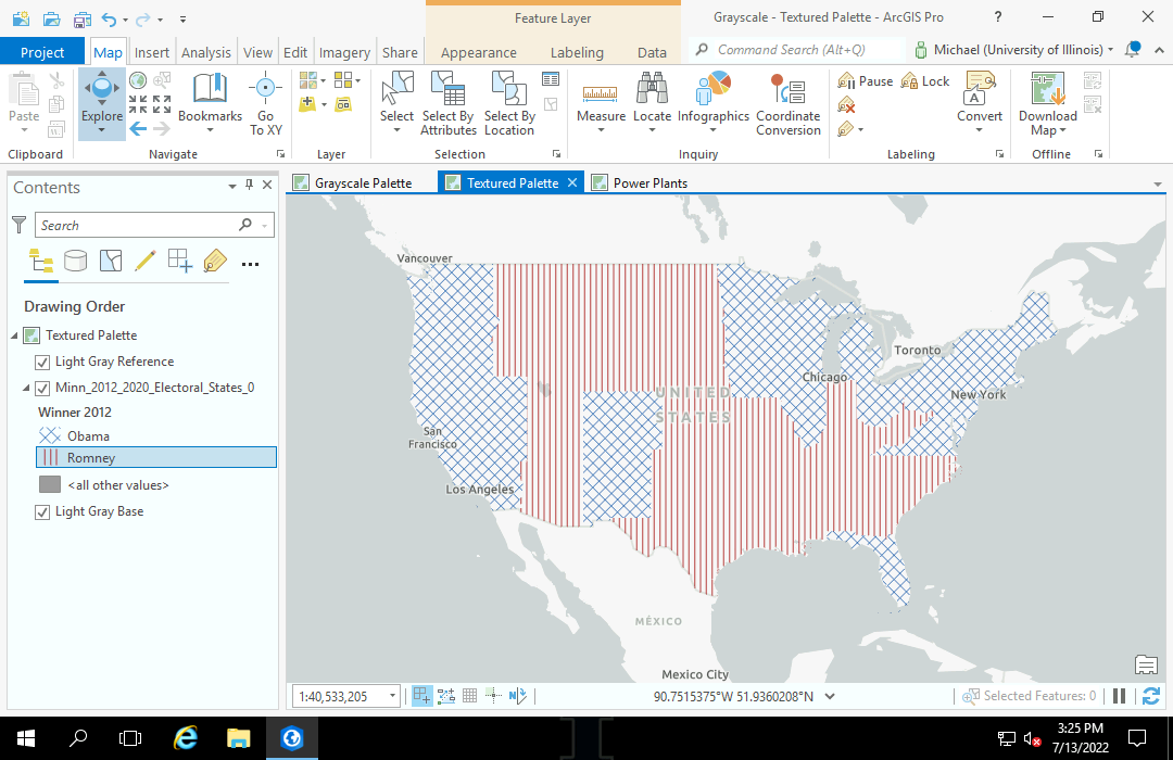
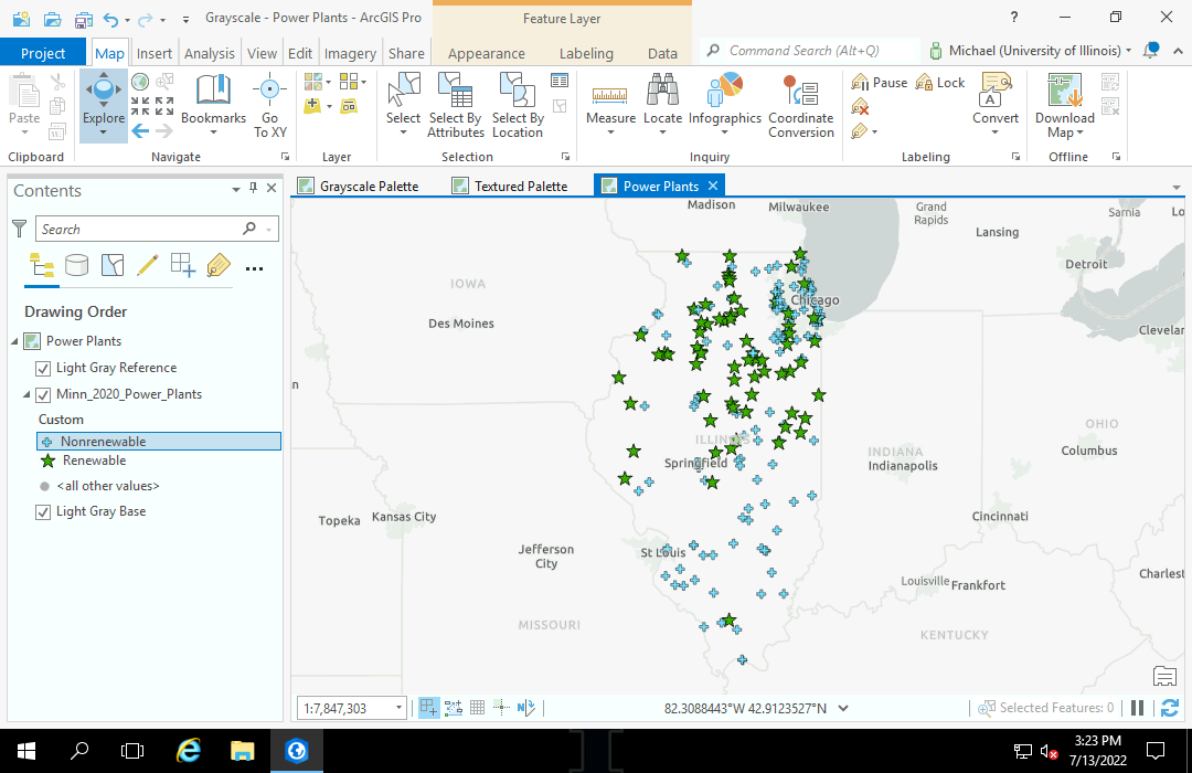
The color blindness simulator linked above can also simulate what your color map will look like when printed in grayscale.
In this case, the lightness of the wind color gives good feature contrast, but the contrast between solar and hydroelectric is weak. In this case, if the plan is to print this map in grayscale, use of a grayscale palette might be called for.
Organizational Palettes
Organizations will commonly hire or consult with graphic designers to develop visual branding that reinforces the public identity of the organization and aids in marketing the organization and its services. Part of that branding can include recommended or required palettes of colors that should be used on websites or printed materials. Such paletttes are developed with a consideration of both aesthetics and technical issues like contrast. Accordingly, these palettes should be considered when developing thematic maps for an organization.
The following video demonstrates creation of a qualitative choropleth using the University of Illinois branding color palette.
Color Appeal
When you have complete freedom to choose a starting or dominant color, or choose a starting color from a set of colors, you can consider general rules for what colors humans find appealing.
Guilford and Smith (1959) published a result of a study ranking the general appeal of colors in the following descending order. While McManus et al. (1981) the extent to which the limited sample in that study could be use to make an inference about human beings in general, they also found a general preference for blue and distaste for yellow.
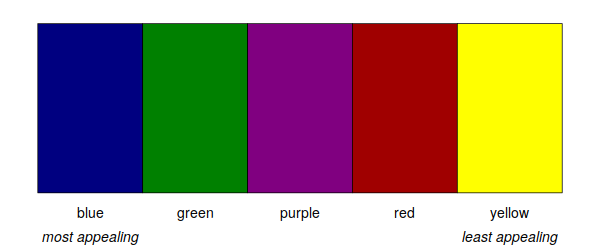
The extent to which such preferences are inherent to human perception versus being socially-constructed is open to debate. While the color red in the West is often associated with danger, Wu et al. (2018) found red to be positively associated with social status in the UK and China.
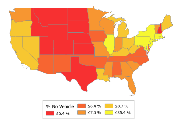
Additionaly, there may be situations where you are depicting a phenomena that you consider unappealing, and you might choose unappealing colors to emphasize your point.
Base Maps
Thematic maps are commonly created on top of a base map that shows the underlying social or environmental characteristics of an area, and gives geographic context. However, this can introduce a trade-off between contrast and clarity.
ArcGIS Pro provides a collection of ready-to-use base maps, although these base maps are designed for web mapping and may have inadequate resolution (fuzziness) for print applications where image quality is a priority. However, creating
The dominant colors of base maps will need to be considered when choosing a color palette for the thematic map.
When the transparency of a thematic map layer is increased so the base map is somewhat visible under the polygons, this will change the perceived color of the polygons as they blend with the underlying base map. Accordingly, this may reduce the
The amount of detail that is desired in a base map is also a consideration. Highly detailed base maps with numerous features and or labels can be distracting when also mapping highly detailed thematic polygons.
With a map like a red-state / blue-state map where you can assume that most audience members know what region is being displayed, a base map may be unnecessary. However, if a mapped area is local or regional and possibly unfamiliar to the audience, conveying such information in a base map may be important.