CDC Public Health Data and ArcGIS Online
This tutorial covers basic public health geospatial data concepts and the visualization of public health data using state-level data from the US Centers for Disease Control and Prevention.
The Centers for Disease Control and Prevention
The Centers for Disease Control and Prevention (CDC) is the US federal government's premier public health agency. The CDC works to "protect America from health, safety and security threats, both foreign and in the U.S. Whether diseases start at home or abroad, are chronic or acute, curable or preventable, human error or deliberate attack, CDC fights disease and supports communities and citizens to do the same" (CDC 2019a).
The CDC began operation in 1946 as Communicable Disease Center, with a focus on malaria prevention. The CDC is an agency under the US Department of Health and Human Services (HHS) and is headquartered in Atlanta, GA (CDC 2019b).
A fundamental part of the agency's mission is surveillance, and in that role the CDC collects and disseminates a vast array of public health data, contributing to the work of public health researchers around the world.
Measuring Public Health
Incidence vs. Prevalence vs. Mortality
There are three common types of values used to measure the extent of health conditions:
- Incidence is the number of new diagnoses of a health condition within a specific area and time
- Prevalence is the number of people that have a health condition within a specific area and time
- Mortality is the number of people that have died as a result of a health condition within a specific area and time
Incidence is often most appropriate for acute conditions, like influenza, where the beginning of symptoms is fairly clear, but the duration of the illness is comparatively short.
Prevalence rather than incidence is often a more appropriate measure for chronic diseases such as diabetes or osteoarthritis which have long duration and where it can be difficult to detect or assign the exact date of onset.
However, accurate prevalence information is often more-difficult to capture than incidence information, since incidence data can be collected from doctors through public health reporting systems, but individuals who have chronic health conditions may not be under the regular care of medical professionals.
Mortality data is widely available, since deaths are vital records tracked by local government officials. However, since there can be multiple factors contributing to a person's death, cause of death information may not fully reflect the extent of specific health conditions.
Counts vs. Rates
Incidence, prevalence, and mortality can be expressed as counts or rates:
- Counts are the number of people affected in a specific area and time
- Rates are the proportion of people affected in a specific area and time
Rates are often more useful than counts because rates permit comparison between different geographic areas (especially when they have different populations) or across different times.
A rate is calculated by dividing the count by the population, and represents the frequency with which a health condition occurs.
For example, a large city will almost always have a higher count of a health condition compared to a small rural county, but the small county can have a higher rate if they are being more seriously impacted by an epidemic than the large city. Likewise, if a city grows over time, the count of people affected by a health condition will increase, but if the rate is the same, you can know that the effect of that condition is still largely the same.
Crude Rates vs. Age-Adjusted Rates
Rates are commonly presented in one of two forms:
- Crude rates are calculated by simply dividing counts by population
- Age-adjusted rates are crude rates that have been modified so they reflect the rate that would be expected if a particular group of people had the same distribution of ages as the general public
As people age, they tend to have more health problems than they did when they were younger. As such, places that have a higher proportion of older residents will tend to have higher rates of health conditions that affect older people. This can skew the results of analysis or visualization by indicating that a particular area has been unusually affected by a health condition when the reality is that there are simply more senior citizens there.
As with the choice of rates over counts, age-adjusted rates allow comparisons of different areas or places to determine which areas have unusually high or low rates of a specific health condition rather than just where there are large numbers of older residents.
If you are a local public health official attempting to target the maximum number of people with an intervention, counts or crude rates might be more appropriate than age-adjusted rates. However, if you are making some kind of comparison or analysis involving different areas and/or time periods, age-adjusted rates are usually more appropriate.
Units
A unit is "a determinate quantity (as of length, time, heat, or value) adopted as a standard of measurement" (Merriam Webster 2019). A unit defines what a number is counting or measuring. A number without a unit has no meaning.
Rates are commonly expressed as percents: the number of people per 100 residents who have a condition. For example, in 2017 the prevalence of diagnosed heart disease in the US was 11.5%: out of every 100 US residents, 11.5 of them had diagnosed heart disease (CDC 2019c).
By contrast, HIV and AIDS are, thankfully, comparatively rare in the United States. In 2017, the mortality rate from HIV/AIDS was 0.0017% (CDC 2019d).
Very small percentages like 0.0017% are difficult to read and compare, so small rates are commonly expressed as per 100,000 population, abbreviated as per 100K. The 2017 HIV/AIDS mortality rate was 1.7 per 100K.
Margin of Error and Confidence Interval
Because the United States, and most countries in the world, for now, do not have a totalitarian government with unlimited power to observe their citizens, it is not possible to capture a perfectly accurate count of the incidence or prevalence of health conditions or risk factors.
Most public health data captured by the CDC is sampled with surveys of a limited number of doctors and health departments. Using statistical techniques, it is possible to make an inference from that sampled data about the population as a whole.
However, there is a possiblity that that sample happened to include a group of medical professionals who have dealt with an unusually high or low number of cases of a health condition. This means that sampled data always has a margin of error (MOE) indicating how much higher or lower the actual rate or count may be compared to the one resulting from the survey. The range of possible values (plus or minus the margin of error) is referred to as the confidence interval.
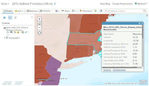
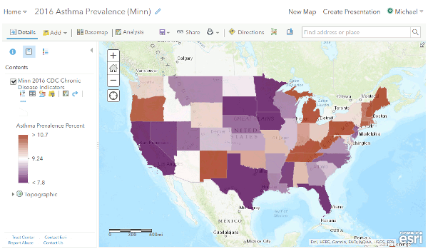
For example, in 2016 the asthma prevalence rate in Massachusetts was 10.3%, while in neighboring Connecticut it was 10.6%. On the map, the color ramp shows Connecticut with a darker color, indicating a higher rate.
However, the MOE in Massachusetts is 0.9%, meaning that we are 95% confident that the actual asthma rate in Massachusetts is 10.3 +/ 0.9, or within the confidence interval of 9.4% to 11.2%. The MOE in Connecticut is also 0.9, meaning the confidence interval is 9.7% to 11.5%. This means that it is possible that the asthma rate is actually higher in Massachusetts, even though the published prevalance value says the opposite.
You should consider the confidence interval when making comparisons between areas and note in your analysis when the differences in the numbers may not actually reflect the conditions on the ground.
Cartographic Considerations
Choropleths vs. Graduated Bubbles
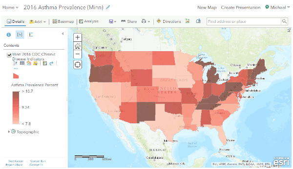
Geospatial health data is commonly visualized using choropleths, which are maps where areas are colored based an attribute. In ArcGIS Online, choropleths are created by styling by Choose an attribute to show and then Select a drawing style of Counts and Amounts (Color).
Numeric geospatial values can also be visualized as graduated bubbles, by styling with Counts and Amounts (Size).
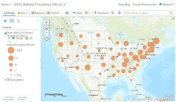
While choropleths are a very common, intuitive, and aesthetically-pleasing way to visualize geospatial data, bubble maps can be a more-accurate way of communicating information, depending on the nature of your data and the story you are trying to tell with your visualization.
When areas have significantly different sizes and levels of population, choropleths can make large, sparsely-populated areas seem more important than they are.
In the examples given above, large, sparsely-populated western states draw focus away from the high concentrations of asthma in the northeast and Appalachia.
This issue is especially important when mapping counts, as the eye will be drawn to larger areas, so high counts in densely-populated cities will be de-emphasized in favor of large sparsely-populated areas that will have comparatively lower counts.
Mapping Counts vs. Rates
If you are a practitioner seeking to find the locations where the largest number of people with a condition are located, mapping counts is appropriate.
However, if you are seeking to locate areas where a condition is more-seriously affecting the population, you should map rates.
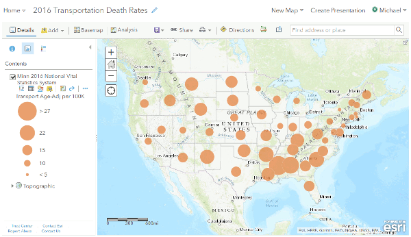
When you map counts, you are generally just mapping population. For example, the map of deaths from transportation accidents (car wrecks, pedestrian accidents, etc.) is almost identical to a map of state population size.
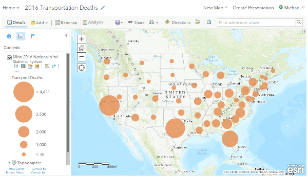
However, when you map rates, you then see that the populous states are actually fairly safe compared to areas in the Deep South or in the Northern Plains, where people regularly have to drive long distances.
Color Ramps
A color ramp is the range of colors assigned to different values of the attribute being mapped. The default choropleth color ramp in ArcGIS Online is based on shades of blue.
You can change the color ramp for a layer with Change Style -> Counts and Amounts Color -> Options -> Symbol.
The choice of a ramp can be changed to reflects the story you want to tell with your map. For example, since asthma is considered bad, a map with a red color ramp indicates the seriousness of the problem, since red is generally associated with danger in American society, which is the opposite of Chinese society (Lee 2017).

Since rates generally follow a normal distribution, you can think of areas as being above or below what is average. Use of a two-color ramp makes it clearer which areas are better and which areas are worse than average. You can select from two-color ramps with Change Style -> Counts and Amounts Color -> Options -> Theme -> Above and Below.
Titles
In order to clearly indicate what is being shown, titles of maps should contain:
- The name of the condition being mapped
- The time period covered by the data being mapped
- The unit and type
- If the audience may not know from looking at the map what area is being covered, you should name the geographic area covered by the map
- If you are working in an ArcGIS Online organization where multiple people may be creating similar maps, you may also want to include a part of your name in the title
Metadata and Citation
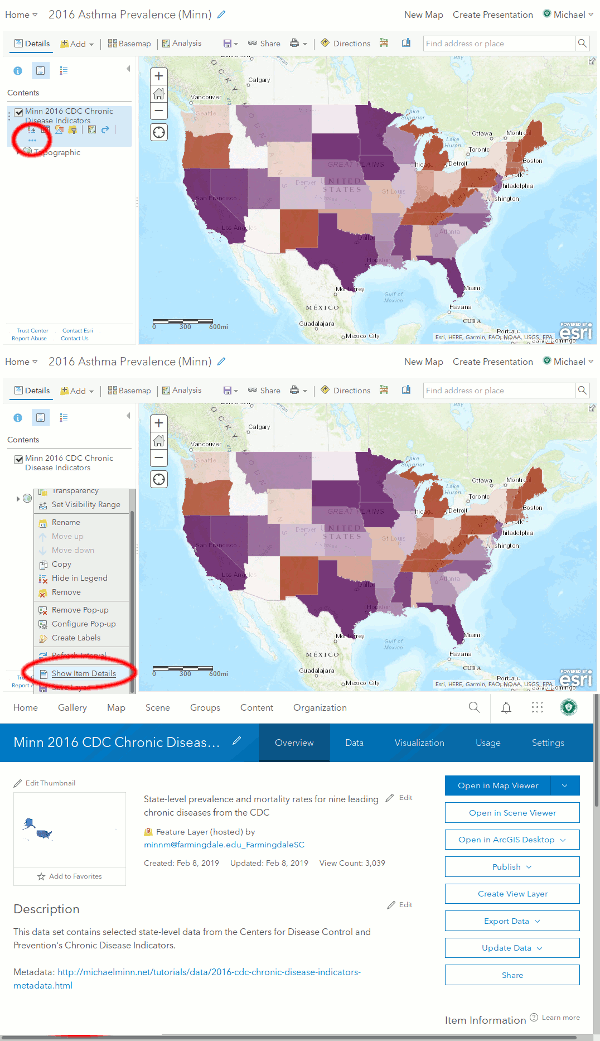
Metadata is data about your data. This includes information about the source, the names of the fields, the dates of collection and release, etc. Data portals from reputable sources usually present metadata directly or provide a link to a page or PDF containing that metadata. Existing layers in ArcGIS Online often provide metadata under the Show Item Details link, although users commonly fail to add metadata when creating layers.
When describing data sources, detailed citations allow a reader to make a critical evaluation of the validity of your information, and allows researchers to validate your work and build upon that work for future research. Citation is especially vital when your finding are counterintuitive or controversial.
The choice of citation format depends on the conventions of your organization. For example, CMS author-date bibliographic reference format can be used to cite a source:
Centers for Disease Control and Prevention. 2019. "Chronic Disease Indicators." Accessed 8 July 2019. https://www.cdc.gov/cdi/.
Specific CDC Data Programs
Natality and Mortality: The National Vital Statistics System
Vital statistics are information about vital events: births, deaths, marriages, divorces, and fetal deaths (CDC 2019f).
While vital statistics data is captured by local government officials around the country, the CDC operates the National Vital Statistics System (NVSS) as a central location for sharing vital statistics data among government agencies at all levels. This centralization also includes the development of standards and procedures that insure quality and comparability.
NVSS data is available through the CDC's Wide-ranging Online Data for Epidemiologic Research (WONDER) portal.
2016 state-level NVSS data is also available from the FSC ArcGIS Online organization as a layer named Minn 2016 National Vital Statistics System.
- Create a new Map
- Add -> Search for layers -> My Organization and search for Minn 2016 National Vital Statistics System
- Change Style and select the Choose an attribute to show
- Choose the Counts and Amounts (Color) -> Options and choose an appropriate color ramp
- Save the map under a name containing the year, health condition, and your name
- Share the map to get a link
Chronic Disease: The Chronic Disease Indicators
Chronic diseases are health conditions that "last 1 year or more and require ongoing medical attention or limit activities of daily living or both" (CDC 2019e). Examples of chronic diseases include heart disease, cancer, and diabetes.
Chronic diseases are distinguished from acute conditions which are sudden in onset and often severe (Vorvick 2019). While heart disease is a chronic condition, a heart attack (myocardial infarction) is an acute condition. Other examples of acute conditions include broken bones, common colds, and influenza,
The CDC's Chronic Disease Indicators (CDI) is a set of indicators for major chronic diseases and their risk factors. The CDI "enables public health professionals and policymakers to retrieve uniformly defined state and selected metropolitan-level data for chronic diseases and risk factors that have a substantial impact on public health. These indicators are essential for surveillance, prioritization, and evaluation of public health interventions" (CDC 2018a).
CDI data is available directly from the CDC through their Socrata data portal.
2016 state-level CDI data is also available from the FSC ArcGIS Online organization as a layer named Minn 2016 CDC Chronic Disease Indicators.
Risk Factors: The Behavioral Risk Factor Surveillance System
Risk factors are characteristics that increase the likelihood of disease. Common risk factors for a variety of diseases include smoking, obesity, family history, etc.
Protective factors are characteristics that decrease the likelihood of disease. Common risk factors for a variety of diseases include diets high in fresh fruits and vegetables, regular exercise, regular physician checkups, etc.
The CDC's Behavioral Risk Factor Surveillance System is a "system of health-related telephone surveys that collect state data about U.S. residents regarding their health-related risk behaviors, chronic health conditions, and use of preventive services...BRFSS completes more than 400,000 adult interviews each year, making it the largest continuously conducted health survey system in the world" (CDC 2019g).
BRFSS data is available in a variety of CDC portals and is also part of the Chronic Disease Indicators data described above.
2017 state-level BRFSS data is also available from the FSC ArcGIS Online organization as a layer named Minn 2017 Behavioral Risk Factor Surveillance System.
Substance Abuse and Mental Health: National Survey on Drug Use and Health
The Substance Abuse and Mental Health Services Administration (SAMHSA) is "the agency within the U.S. Department of Health and Human Services that leads public health efforts to advance the behavioral health of the nation. SAMHSA's mission is to reduce the impact of substance abuse and mental illness on America's communities" (SAMHSA 2019a).
One notable SAMHSA surveillace program is the National Survey on Drug Use and Health, which since 1971 has used face-to-face interviews to collect information on the use of illegal drugs, prescription drugs, alcohol, and tobacco, and on the prevalence of mental disorders, mental health treatment, and co-occurring substance use and mental disorders (SAMHSA 2019b).
While the SAMHSA makes a a wide variety of data available on its website, much of that data is distributed in documents and spreadsheets that have high levels of detail and complex layouts, requiring a significant amount of processing to get into a CSV format that can be imported into ArcGIS Online.
2015-2016 state-level NSDUH data is available from the FSC ArcGIS Online organization as a layer named Minn 2015-2016 National Survey on Drug Use and Health.
Infectious Disease: National Center for HIV/AIDS, Viral Hepatitis, STD, and TB Prevention
Infectious diseases are disorders caused by organisms such as bacteria, viruses, fungi or parasites (Mayo Clinic 2019). Different diseases have different pathways:
- Passed from person to person (contagious): influenza, tuberculosis, HIV, etc.
- Passed from or through animals to humans (zoonotic): zika, malaria, rabies, etc.
- Ingested from contaminated food or water (foodborne or waterborn): cholera, botulism, etc.
Infectious diseases can also be acute (like influenza) or chronic (like HIV/AIDS or tuberculosis).
The surveillance of infectious diseases and intervention to stop their spread is one of the oldest and most visible tasks of public health professionals. Interventions to prevent the spread of infectious diseases range from public education, to vaccination programs, to quarrantines, to promotion of large public infrastructure projects. Accordingly, the CDC has a wide variety of programs that focus on infectious disease surveillance.
One notable program covering a collection of common infectious diseases is the National Center for HIV/AIDS, Viral Hepatitis, STD, and TB Prevention (NCHHSTP). These conditions exhibit significant comorbidity: a person with one of the conditions frequently as one or more of the other conditions, reflecting common social risk factors. This comorbidity makes it useful to join surveillance and interventions into common programs.
The NCHHSTP's data portal is Atlas Plus. Unlike some of the other CDC portals, Atlas Plus is fairly easy for casual users to download data for use in ArcGIS Online.
- Go to Atlas Plus table page
- Select the health condition (indicator)
- Select a geography of State and Select all states
- Choose a single Year to view
- Choose any specific Demographics groups you want to view. The default is everyone
- Create my table
- Export the table and open it in a spreadsheet program like Excel or OpenOffice
- Delete the documentation rows at the top so the top row is the column headers
- Save the sheet as a comma-separated-value (CSV) file to your desktop
- Create a new Map in ArcGIS Online
- Add -> Add Layer from File and select the CSV file you just saved
- When asked to Add CSV Layer, select Locate features by and choose Addresses or Places
- Beside the Geography column, select Location Fields of State
- Symbolize bubbles by the rate
Bibliography
Centers for Disease Control and Prevention (CDC). 2016. "Chronic Disease Indicators (CDI) Data". Accessed 1 February 2019. https://nccd.cdc.gov/cdi.
Centers for Disease Control and Prevention (CDC). 2018a. "Chronic Disease Indicators (CDI)". Accessed 8 July 2019. https://nccd.cdc.gov/cdi.
Centers for Disease Control and Prevention (CDC). 2019a. "Mission, Role and Pledge." Accessed 7 July 2019. https://www.cdc.gov/about/organization/mission.htm.
Centers for Disease Control and Prevention (CDC). 2019b. "Our History - Our Story." Accessed 7 July 2019. https://www.cdc.gov/about/history/.
Centers for Disease Control and Prevention (CDC). 2019c. "Heart Disease." Accessed 7 July 2019. https://www.cdc.gov/nchs/fastats/heart-disease.htm.
Centers for Disease Control and Prevention (CDC). 2019d. "AIDS and HIV." Accessed 7 July 2019. https://www.cdc.gov/nchs/fastats/aids-hiv.htm.
Centers for Disease Control and Prevention (CDC). 2019e. "About Chronic Diseases." Accessed 7 July 2019. https://www.cdc.gov/chronicdisease/about/.
Centers for Disease Control and Prevention (CDC). 2019f. "National Vital Statistics System." Accessed 7 July 2019. https://www.cdc.gov/nchs/nvss/.
Centers for Disease Control and Prevention (CDC). 2019g. "Behavioral Risk Factor Surveillance System." Accessed 7 July 2019. https://www.cdc.gov/brfss/.
Lee, Chris. 2017. "Why is red considered a lucky color for the Chinese?" Accessed 8 July 2019. https://medium.com/story-of-eggbun-education/why-is-red-considered-a-lucky-color-for-the-chinese-2ebe2b044275.
Mayo Clinic. 2019. "Infectious Diseases." Accessed 9 July 2019. https://www.mayoclinic.org/diseases-conditions/infectious-diseases/symptoms-causes/.
Merriam-Webster. 2019 "Unit." Accessed 8 July 2019. https://www.merriam-webster.com/dictionary/unit.
Substance Abuse and Mental Health Services Administration (SAMHSA). 2019a. "About Us." Accessed 9 July 2019. https://www.samhsa.gov/about-us.
Substance Abuse and Mental Health Services Administration (SAMHSA). 2019b. "National Survey on Drug Use and Health." Accessed 9 July 2019. https://www.samhsa.gov/data/data-we-collect/nsduh-national-survey-drug-use-and-health.
Vorvick, Linda. 2019. "Acute vs. Chronic Conditions." Accessed 8 July 2019. https://medlineplus.gov/ency/imagepages/18126.htm.