Art Moderne
In the late 1930s and early 1940s, Art Moderne followed Art Deco and the two styles have similarities. Although they share the same penchant for streamlining, Art Moderne emphasizes horizontal lines while Art Deco emphasizes vertical lines. Art Moderne also tends to have a simpler, more functional quality than Art Deco. Rounded corners and glass block walls are givaways that you are looking at Moderne rather than Deco.
A pair of towers on Central Park West make a nice side-by-side distinction between Art Deco and Art Moderne. Both were designed by Emery Roth (1871-1948), who also designed the twin-towered San Remo to the south and was responsible for a large number of luxury residences in Manhattan during his life.
The Art Deco El Dorado at 300 Central Park West embodies the soaring vertical aesthetic of Art Deco, with it's setback twin towers and elegant geometric detailing. By contrast, the Art Moderne 295 Central Park West is comparatively plain, reflecting a more austere depression era aesthetic. The blocky tower has a more horizontal orientation, with less dramatic setbacks, rounded corners, and very limited ornamentation. Both contrast even more dramatically Further contrast can be drawn with The St. Urban (285 Central Park West), a Beaux Arts building just to the south which was designed by Robert T. Lyons and completed in 1906.
Unlike Art Deco, which was most popular in cities that suited its vertical orientation, Art Modern was commonly expressed in the hinterlands, where its horizontal orientation was suited to low-rise buildings. This well preserved gas-station-turned-used-car-lot in Hampton, AR has all the distinctive Art Moderne characteristics: rounded corners, horizontal bands, glass brick, casement windows and even a little bit of glazed black tile trim around the front stoop.
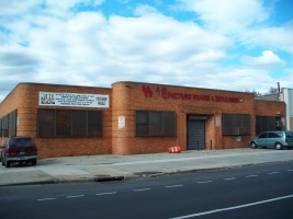
Fifth Avenue, Sunset Park, Brooklyn
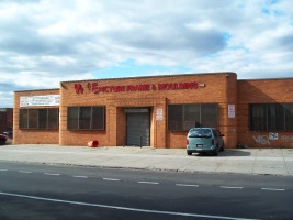
Fifth Avenue, Sunset Park, Brooklyn
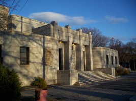
Williamsbridge Park - The Bronx (1937)
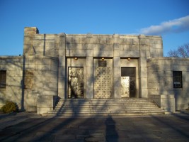
Williamsbridge Park - The Bronx (1937)
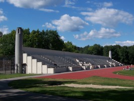
Van Cortland Park, The Bronx
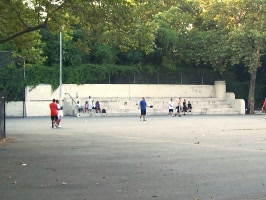
Evergreen Park, Queens
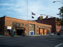
Amsterdam Depot - 129th Street @ Amsterdam Ave
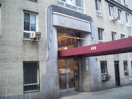
411 West End Avenue (1936)
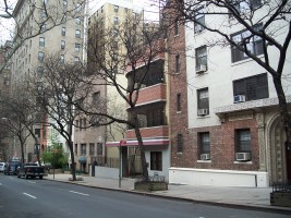
Godmothers League Building - 255 West 71st Street (1948-1950)
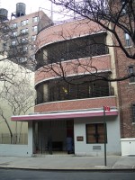
Godmothers League Building - 255 West 71st Street (1948-1950)
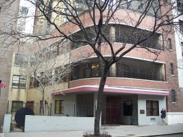
Godmothers League Building - 255 West 71st Street (1948-1950)
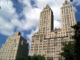
295 Central Park West / 300 Central Park West
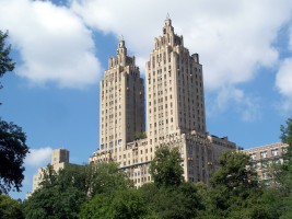
The El Dorado, 300 Central Park West
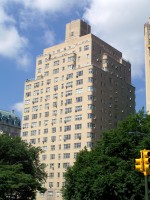
295 Central Park West
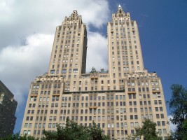
300 Central Park West
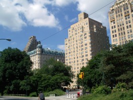
285 Central Park West / 295 Central Park West
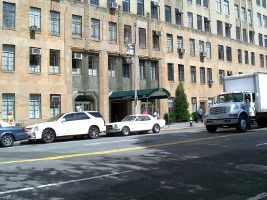
300 Central Park West
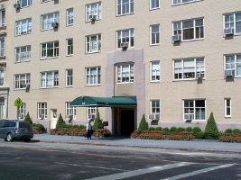
295 Central Park West
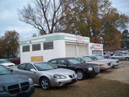
Quality Auto Sales - Hampton, AR
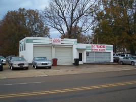
Quality Auto Sales - Hampton, AR