Polygon Visualization of Multiple Variables in R
Choropleths are primarily useful for mapping areas with single variables. When more than one variable needs to be mapped in association with areas, other visualizations are needed.
Example data for this tutorial is in 2017-state-data.zip.
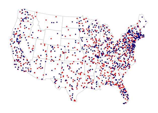
Dot-Density Maps
One common visualization when mapping counts is the dot-density map, where dots are placed randomly in areas based on a count associated with that area. A second variable can be mapped by varying the color or size of the dots accordingly.
One drawback of this technique is that if locations associated with those dots are not also randomly-dispersed, the map is deceptive. The following script creates a dot-density map of Democratic (blue) and Republican (red) votes, with each dot representing 100,000 people. While this map illustrates the sparse population of some states better than a choropleth, it does not clearly show concentrations of populations in large urban areas.
# Load state-level polygons with election data

library(rgdal)
states = readOGR(dsn=".", layer="2017-state-data", stringsAsFactors=F)
states = states[!(states$ST %in% c("HI", "AK")),]

# Reproject to Albers Equal-Area Conic and draw state outlines

usa_albers = CRS("+proj=aea +lat_1=20 +lat_2=60 +lat_0=40 +lon_0=-96 +x_0=0 +y_0=0 +datum=NAD83 +units=m +no_defs")
states = spTransform(states, usa_albers)
plot(states, col="white", border="gray")

# Create random dots based on counts of votes for the two parties
# Each dot represents 100,000 people

library(maptools)

gop = as.integer(ceiling(states$GOP2012 / 100000))
gopdots = dotsInPolys(states, gop)

dem = as.integer(ceiling(states$DEM2012 / 100000))
demdots = dotsInPolys(states, dem)

# Add the dots to the plot

plot(gopdots, pch=19, cex=0.5, col="red2", add=T)
plot(demdots, pch=19, cex=0.5, col="navy", add=T)
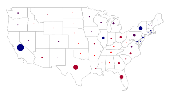
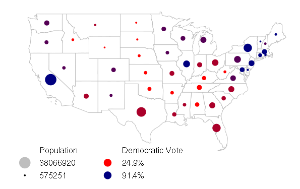
Bubble Charts
Graduated bubbles with varying colors are another way of visualizing two different variables for both points and areas.
For this example, we map the percentages of democratic votes in the 2012 US presidential election (bubble color) and the populations of the states (bubble size):
library(rgdal)
states = readOGR(dsn=".", layer="2017-state-data", stringsAsFactors=F)
states = states[!(states$ST %in% c("HI", "AK")),]

plot(states, col="white", border="gray")

breaks = quantile(states$PCDEM2012)
categories = as.numeric(cut(states$PCDEM2012, breaks))

palette = colorRampPalette(c("red", "navy"))
ramp = palette(4)
colors = ramp[categories]
The gCentroid() function from the rgeos library creates centroids for each of the polygons (byid=T). A centroid is the geometric center of a polygon that minimizes the total distance from every possible point in the polygon:
library(rgeos)
centroids = gCentroid(states, byid=T)
The cex parameter to plot() adjusts the size of symbol, with a value of one being the default size. Sizes in this example are calculated relative to the max() (largest) value of the variable.
The pch=19 parameter chooses the character code for the plot symbol - 19 is a circle.
You may need to tweak the scaling factor used to convert your variable to the cex value that makes your bubbles large enough to be visible but not so large that they overlap excessively or obscure the polygons.
scale_factor = 3
sizes = scale_factor * states$POP2014 / max(states$POP2014)

plot(centroids, pch=19, cex=sizes, col=colors, add=T)
If the range of your variable is so wide that the small bubbles are hard to see, taking a square root of that ratio will decrease the range of bubble sizes
scale_factor = 3
sizes = scale_factor * sqrt(states$POP2014 / max(states$POP2014))

plot(centroids, pch=19, cex=sizes, col=colors, add=T)
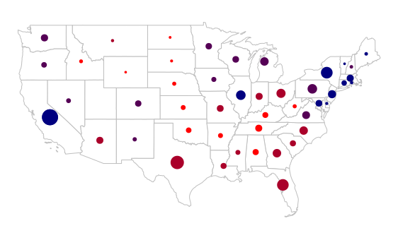
Adding a legend for such a map is a bit more complex because it needs to have symbols for both the size and the colors, as well as headings for the two variables:
- legend is a vector of labels
- pt.cex is the size scaling for the symbols
- x.intersp and y.intersp space the entries out horizontally and vertically
- ncol places the legend in two columns, which is helpful for a legend with this many entries
labels = c("Population",
	max(states$POP2014),
	min(states$POP2014),
	"Democratic Vote",
	paste0(min(states$PCDEM2012), "%"),
	paste0(max(states$PCDEM2012),"%"))
pch = c(NA, 19, 19, NA, 19, 19)
cex = c(NA, max(sizes), min(sizes), NA, 2, 2)
col = c(NA, "gray", "black", NA, "red", "navy")

legend(x="bottomleft", legend=labels, pch=pch, pt.cex=cex, col=col,
	bg="white", bty="n", y.intersp=1.3, x.intersp=2, ncol=2)
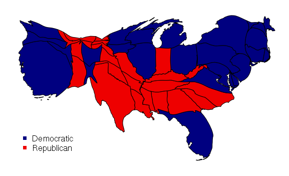
Cartograms
Cartograms are two-variable visualizations where polygon colors are used as a choropleth and the geographic areas of polygons are distorted to represent a second value, often a count like population.
Cartograms can be created in R using the cartogram() function from the cartogram library. The data for this example is in 2017-state-data.zip.
library(rgdal)
states = readOGR(dsn=".", layer="2017-state-data", stringsAsFactors=F)
states = states[!(states$ST %in% c("HI", "AK")),]

library(cartogram)
carto = cartogram(states, "POP2010")

ramp = c("navy", "red2")
colors = ifelse(states$WIN2012 == "Obama", ramp[1], ramp[2])

plot(carto, col=colors)
legend(x="bottomleft", pch=15, col=ramp, legend=c("Democratic", "Republican"))