Basic Mapping With ArcGIS Online
Rev. 8 January 2025
The dominant company in geographic information systems is ESRI, which was one of the pioneers of GIS in the late 1960s. If you do GIS professionally, you will probably be working with ESRI software.
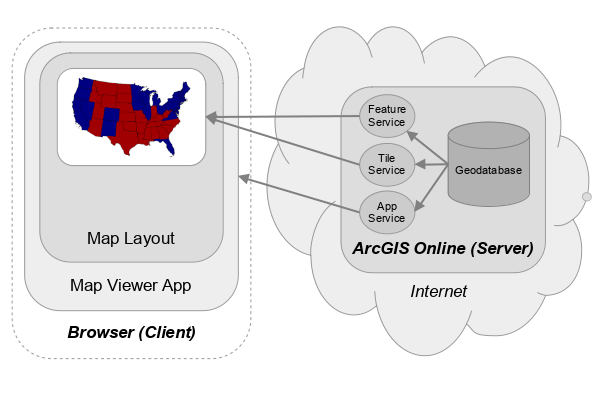
ESRI's cloud-based service is called ArcGIS online, which is available by subscription, and which can be used to create online geospatial apps and maps.
The ArcGIS Online Map Viewer web app makes web map creation comparatively easy by providing online access to a flexible visualization and analysis tool, as well as easy access to both public and proprietary data.
This tutorial will cover the creation of basic maps in ArcGIS Online.
- Getting ArcGIS Online
- Single Symbol Point Maps
- Thematic Point Maps
- Mapping Shapefiles
- Living Atlas Layers
- Reopening a Map
Getting ArcGIS Online
You can get an ArcGIS Online account in one of three ways.
Enterprise Account
If your school or employer has an ESRI site license, you can get an account from your instructor or IT staff. The video below shows how to log in to ArcGIS Online using an enterprise account such as that used at The University of Illinois.
ArcGIS For Personal Use
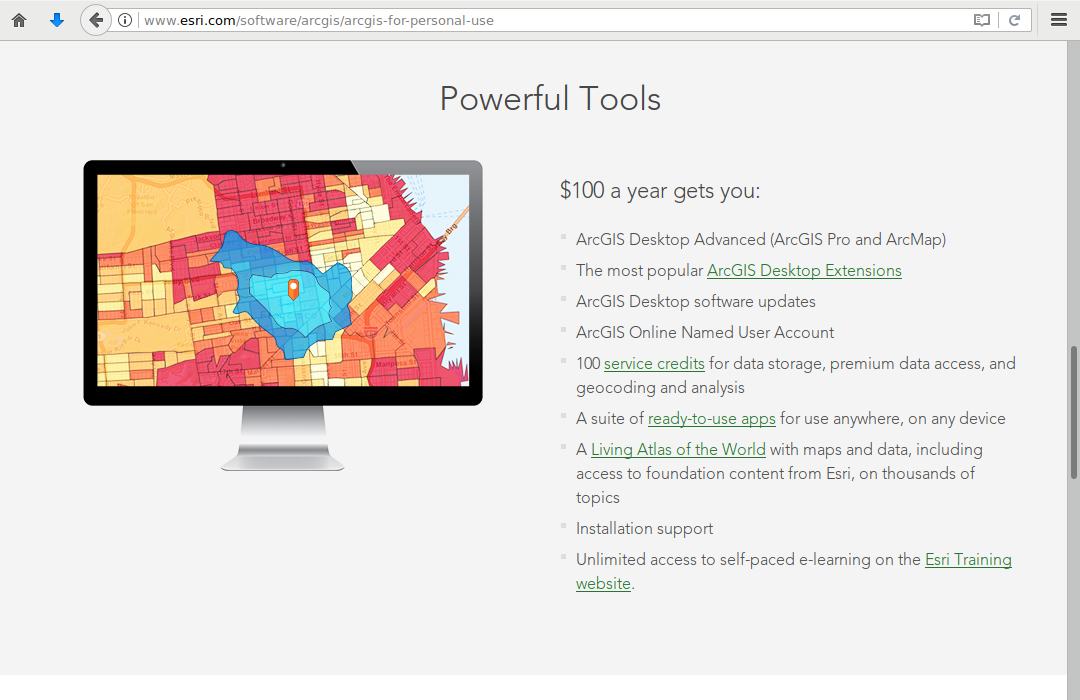
If you do not have access to an enterprise account, you can purchase an annual license from ESRI for personal use (as opposed to commercial use) for $100 that includes not only authorization for their desktop software (ArcGIS Pro) but also ArcGIS Online. The ArcGIS Online subscription comes with a limited number of credits, although you can purchase more as needed for a significant cost.
Free Public Accounts
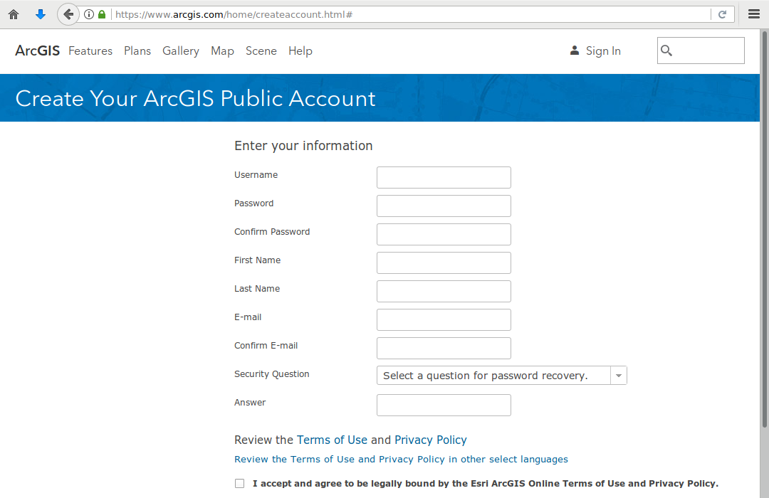
ESRI provides free public accounts that provide basic capabilities to give you a feel for what ArcGIS Online can do. Public accounts include no proprietary data or analysis tools, which limits users to creating simple maps.
Single Symbol Point Maps
Creating a CSV File In Excel
To create a map, you need geospatial data.
Geospatial data is what is where. Geospatial data indicates what things or characteristics (what) are at specific locations on the surface of the earth (where).
Comma-separated variable (CSV) files are simple text files that contain rows of data separated by commas to form columns.
- CSV files are commonly used in GIS because they can omit complex proprietary formatting information and can easily be read by a variety of different GIS software and programming libraries.
- CSV files that contain addresses or latitudes / longitudes can be imported as layers in ArcGIS Online.
- CSV files can be created in and saved from any desktop spreadsheet program (like Excel).
Latitudes and longitudes are numeric coordinates that can be used to uniquely identify locations on the surface of the earth. Latitude is the angular distance of a point north or south of the equator, and longitude is the angular distance of a point east or west of the prime meridian in England.
This video shows the creation of a CSV file in Excel of historic houses of worship near the U of I campus in Urbana-Champaign, IL.
- Create a new Blank Workbook in your spreadsheet program.
- Add the headers to each column that represent the attributes you want to map for each location. Add columns titled Latitude and Longitude where you will provide the coordinates for the locations
- Right click on locations in Google Maps to find the latitudes and longitudes of locations that you can add to your spreadsheet.
- When you are done, Save As the file as a CSV (Comma delimited) file under a meaningful name.
Creating a Feature Service
Creating a web map from your own data in ArcGIS Online involves two steps:
- Uploading your data to create a feature service
- Adding that feature service to a web map and configuring the web map
Feature services are streams of vector data (points, lines, and polygons) that can be accessed by GIS software directly through application programmer interfaces (APIs).
To create a new feature service and web map from the CSV file you created above:
- From your ArcGIS Online home page, select Content and click New Item.
- Click Your device and select the CSV file you created above (2021-chambana-worship.csv).
- Click ...create a hosted feature layer and add it to the map (Next)
- Under Fields, check to make sure your fields have come in with appropriate types. Numeric values (like latitude and longitude) should be Double (double precision floating point) (Next).
- Under Location settings, check to make sure your latitude and longitude fields are selected. If you misspelled one of these, they may not appear by default and you will need to change them (Next).
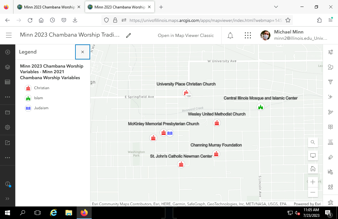
- Modify the Title of the new feature layer to something meaningful (Minn 2023 Chambana Worship) Note that some characters like dashes cannot be used in layer titles.
- Save to create the feature service.
Mapping the Points
- From your ArcGIS Online Content page, select the feature layer you want to map and select Open in Map Viewer.
- Change the styling for the points.
- In the Properties tab under Symbology, Edit Layer Style and Style options.
- Click on the Symbol style to browse for an appropriate symbol for the points. The Vector Symbols, POI category has pictograms that you can resize and recolor.
- Adjust the Size if needed to make the symbols visible.
- Select Done.
- Label the points.
- In the right panel, select Labels.
- Add label class and choose the field to label your features.
- Select the Label field that will provide the text for the labels (Name).
- If the labels are not clearly visible, Edit label style and modify the size, color, or font boldness as needed.
- Note that the app uses scale-dependent rendering that will hide some labels if there would be an overlap that would make them illegible. You can see all labels by zooming in to the points.
- You may want to try different Basemap to something unobtrusive if the base map conflicts visually with the points (Light Gray Canvas).
- Save the map under a meaningful name. This can (and probably should) be the same as your hosted feature layer (Minn 2023 Chambana Worship).
- Click Share map and share the map with Everyone (public) (3:28).
- Copy the URL from the location bar to get a shared link that you can e-mail or submit for an assignment.
Thematic Point Maps
A thematic map is a map "used to display the spatial pattern of a theme or attribute" (Slocum et al. 2009, 1).
With point maps, the types of symbols (styling) used for points can be used to convey additional information about the locations represented by the points.
Variables
An advantage of GIS is the ability to change the styling of points based on fields (variables) in the data used to create the map. There are two broad types of fields (variables):
- Categorical variables divide features into categories. For this example, we will add a Tradition column for the religious tradition associated with each house of worship.
- Quantitative variables are numeric values that specify a quantity (count or measurement) associated with each feature. For this example, we add a Capacity column contains values for the seating capacity of each of the houses of worship.
The video below demonstrates adding fields to the spreadsheet created above and then uploading the CSV file to ArcGIS Online to create a hosted layer.
Categorical Pictogram Maps
A categorical variable can be used in ArcGIS Online to specify the types of pictograms used at each point.
Pictograms are small images that have literal or metaphorical relationships to the locations being mapped.
- From your ArcGIS Online Content page, select the feature layer you want to map and select Open in Map Viewer.
- Style the layer features by the categorical variable.
- Under Styles and Choose attributes in the right pane, select Field and choose the categorical variable.
- Under Pick a style choose Types (unique symbols) and Style options.
- Click on the symbols you want to change and select symbols from one of the different category lists.
- Modify the Fill color, if needed.
- Edit the Symbol style and under Symbol and Size increase the size for the symbols. 20 points is usually a good size for a few pictograms, although that may be too large if there are many points.
- Repeat for all symbols.
- Select Done.
- Check the Legend to make sure it displays the desired labels.
- Label the points.
- In the right panel, select Labels.
- Add label class and choose the field to label your features.
- If the labels are not clearly visible, Edit label style and modify the size, color, or font boldness as needed.
- Note that the app uses scale-dependent rendering that will hide some labels if there would be an overlap that would make them illegible. You can see all labels by zooming in to the points.
- You may want to try different Basemap to something unobtrusive if the base map conflicts visually with the points (Light Gray Canvas).
- Save the map under a meaningful name (Minn 2023 Chambana Worship Tradition).
- Click Share map and share the map with Everyone (public).
- Copy the URL from the location bar to get a shared link that you can e-mail or submit for an assignment.
Quantitative Bubble Maps
For quantitative variables, ArcGIS Online can be used to create graduated symbol (bubble) maps.
- From your ArcGIS Online Content page, select the feature layer you want to map and select Open in Map Viewer.
- Change the styling to a bubble map.
- Under Styles and Choose attributes in the right pane, select Field and choose the quantitative variable.
- Under Try a drawing style choose Counts and Amounts (size) and Style options.
- Edit the Symbol style and Fill to the desired color. This color should reflect what the symbols represent and should contrast with the base map without being too jarring.
- Adjust the Size range so the bubbles cover a good range of values but aren't too big or too small.
- Select Done.
- Label the points.
- In the right panel, select Labels.
- Add label class and choose the field to label your features.
- If the labels are not clearly visible, Edit label style and modify the size, color, or font boldness as needed.
- Note that the app uses scale-dependent rendering that will hide some labels if there would be an overlap that would make them illegible. You can see all labels by zooming in to the points.
- You may want to try different Basemap to something unobtrusive if the base map conflicts visually with the points (Light Gray Canvas).
- Save the map under a meaningful name (Minn 2023 Chambana Worship Capacity).
- Click Share map and share the map with Everyone (public).
- Copy the URL from the location bar to get a shared link that you can e-mail or submit for an assignment.
Mapping Shapefiles
Many organizations, including federal, state and local governments, make data available to the public as zipped shapefiles, which use an old file format developed by ESRI in the 1990s that is still commonly used for sharing data. A shapefile is actually multiple files, but shapefiles are often packaged as single .zip files for easier distribution.
For this example, we use a shapefile of neighborhood boundaries from the Chicago Open Data portal.
- Download the zipped shapefile to your local storage drive (Boundaries - Neighborhoods).
- From your ArcGIS Online home page, select Content and click New Item.
- Click Your device and find the zipped shapefile you downloaded above (Boundaries - Neighborhoods).
- Click Create a hosted feature layer and add it to the map (Next)
- Modify the Title of the new feature layer to something meaningful (Minn 2023 Chicago Neighborhoods). Note that some characters like dashes cannot be used in layer titles.
- Select Save to create the layer.
- Select Open in Map Viewer to create a new map.
- Style the layer.
- Change the style of the layer to distinguish features.
- If your data contains a categorical or quantitative attribute, consider styling based on that variable.
- Set the Blending Mode to Multiply so the underlying features are visible through the layer.
- Add labels, if desired.
- Change the Basemap and remove the place names (reference) if desired.
- Save the map under a meaningful name.
- Share the map and copy the URL from the location bar to share.
Living Atlas Layers
ESRI's Living Atlas of the World is a collection of open and proprietary data that is made available in ArcGIS Online. Living Atlas layers cover a wide variety of topics.
One disadvantage to Living Atlas layers is that many are are tile layers where the styling is predefined and cannot be changed.
Also, note that Living Atlas layers are often configured to be scale dependent and the types of areas shown depend on how zoomed in you are on the map. This can be useful when exploring data, but is less useful if your map is supposed to communicate information about specific sizes of areas (like counties or states).
This video demonstrates how to create a map with a Living Atlas layer of median household income.
- Select Map from your ArcGIS Online home page
- Under Add Layer, Browse Layers in Living Atlas and Search for the desired data.
- View the legend to see what the colors or symbols mean
- If mapping areas, change the Properties, Blending Mode to Multiply so you can see the base map under the features.
- With many layers, you can click on a region to display a pop-up displaying information about that region
- Save the map under a meaningful name (Minn 2023 Chicago Income).
- Share the map as needed. Note that access to some Living Atlas layers is limited to users with ArcGIS Online licenses.
Reopening a Map
Maps that you save are listed on your Content page in ArcGIS Online. To reopen the map for modification or revision, select the link on your content list and then Open in Map Viewer.