Sans Serif Fonts
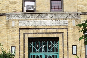
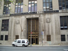
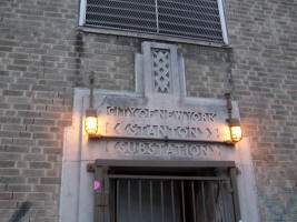
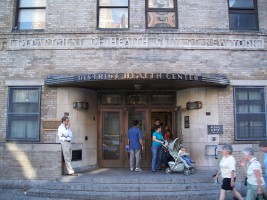
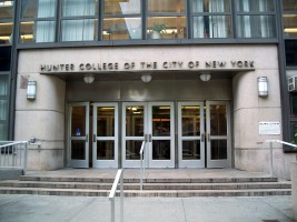
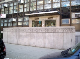
Fonts used for lettering on Art Deco buildings are distinctive and then, as now, had a clean, modern and sophisticated quality. They were almost universally sans serif and often entirely capitalized. Typical representatives include Eric Gill's Gill Sans and Perpetua fonts and Paul Renner's Futura fonts (frequently featured on posters of the time). On occasion, more radical fonts were created based on geometric shapes (notably circles) and were often multi-lineal.
